10 JavaScript & CSS Tools to Make Your Forms look Good
According to research, 86% of surveyed people fill out at least one web form per week. About 34% of those surveyed said they fill out even more. Regardless of the purpose of your website, it should definitely contain at least one web form. To make sure your visitors want to interact with your site, it’s crucial to keep it simple and convenient for them to fill in your forms.
In this article, you will learn how to create a trouble-free web form. There are 10 JavaScript and CSS tools with amazing functionality. With their help, you will enhance the web forms on your website and provide a positive user experience!
The good news is that these tools will suit both beginners and experienced developers. Let’s get started.

10 Resources to Enhance Web Forms on Your Site
Foxholder
Foxholder provides placeholder animations that will work when a visitor to your website interacts with a web form. Besides the fact that it’s a simple way to liven up your website, your users will easily know where they are on the form.
Once the person starts typing something in a certain field, a specific symbol appears near this field. For instance:
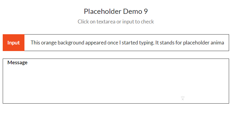
The website contains 15 demos – all possible placeholder animations.
By the way, the resource offers 8 cool button animations. Checkboxes and radio button animations are coming soon.
Dirrty
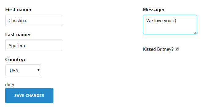
Christina Aguilera inspired the guys from jQuery to create a plugin that detects when all the required fields of the web form are filled in. When all the fields have been modified, the required button (e.g. Save Changes) becomes active (clickable and colorful).
For instance:
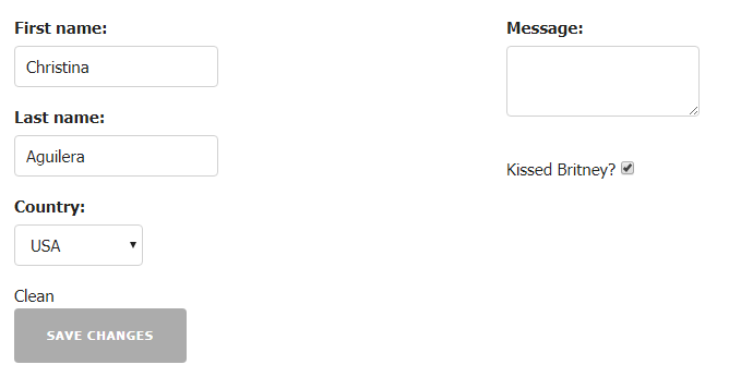
When the user gives all the required information, the button becomes blue:
jQuery Validation Plugin
This jQuery Validation Plugin allows you to check out the accuracy of the information filled out in the fields according to specific rules.
Here is a list of possible rules (commands):
- required – the field must be filled
- maxlength or minlength – maximum or minimum number of characters
- email or URL – validity of email/URL
- remote – it points out the file that checks out the field (e.g. check.php)
- date – the date accuracy check
- dateISO – the accuracy of ISO date
- number – check with a number
- digits – numbers only
- creditcard – validity of the credit card number
- equalTo – the field is equal to another field (the same information)
- accept – the right extension check
- rangelength – the range of characters number: minimum and maximum (e.g. rangelength: [2,6])
- range – the number should be from … to… (e.g. range: [13,23])
- max and min – maximum or minimum
Choices.js
Choices.js is a lightweight alternative to such plugins as Select2 and Selectize. It stands for the fresh select box and text features of the web forms. As the person starts typing something in the field, a drop-down window appears and offers a couple of possible input variations.
Multipicker
Multipicker provides an appealing way for visitors to select one or several variants. It’s possible to set it up in the form of radio button
or checkboxes
to pick up multiple variants. If you are an advanced user and work with CSS options, you can add custom designs.
Formbase
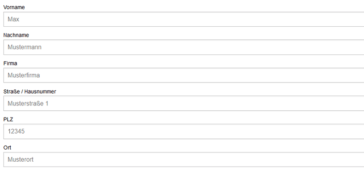
This tool provides a solid number of the default styles for your existing web forms. Once you make the forms look appealing with one of these styles, you can improve the UX of your website.
The effectiveness of marketing techniques is individual, to find out which play well for you, try as many as you can.
The demos are available on the codepen.
Inputmask
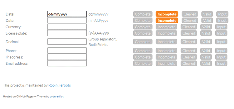
This plugin helps users figure out if the information they filled out is valid/correct/complete. It signals if the data has the wrong format. If an issue appears, an appropriate button becomes colorful. If everything is okay, an appropriate button will also show it:
DependsOn
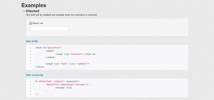
With this tool, web form dependent fields appear based on the information typed in the previous field. For instance, you can make the State field dependent on the Country field. When the user chooses the USA in the Country field, the State field will appear automatically.
Here is an example:
Cascading Drop-Down Menu
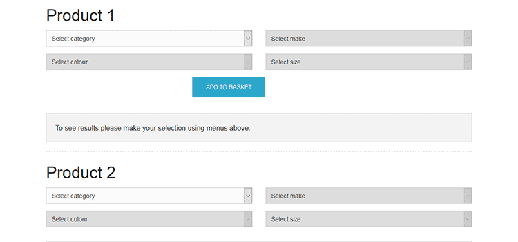
If you want to provide choices for your visitors, consider this plugin. It stands for creating drop-down options that will appear right after the user starts typing specific information.
For instance, when a person starts selecting a car, it will ask for the car make first, then a model, then a year, and other characteristics. The cascading options will appear automatically if you set up this plugin.
jQuery Form Plugin
With this plugin, you can switch HTML forms to AJAX easily. Using this plugin, you will set up the process of submitting information. The plugin offers two methods to implement that (ajaxForm and ajaxSubmit).
Remember: all elements of your website matter and appealing web forms also contribute to good UX. Here are a couple of things to consider when filling your website with forms.
How to Create Attractive and Convenient Web Forms: Brief Guideline
So, let’s structure the information – here are 7 things to consider before creating a web form and using the aforementioned tools.
Create as Few Fields as Possible
While on the internet, people face several web forms per day – they could simply get bored from filling in the same information endlessly.
Fewer form fields lead to higher converts.
If the value of what the user can get is lower than the effort they have to make to fill the web form, they will more likely leave your website. It simply isn’t worth their time.
According to HubSpot research, the optimal number of form fields is between three and five.
If you require a lot of information and, therefore, more fields, you can divide the process of filling out the web form into several steps/pages. Multi-step forms appear less intrusive.
Furthermore, you can use progress bars to show when the collection of information will be complete. The recent Clutch research showed that 90% of people prefer to fill out web forms with progress bars. Knowing they may be close to the end gives the user a little motivation to keep going.
Allow Your Visitors to Type Less
Excessive typing is not only irritating; it might also lead to errors, especially when using a mobile. Choosing buttons, sliders, or auto-completion in place of making people type in data is the best idea ever!
Don’t Overdo it with Duplicate Fields
Doesn’t it seem irritating for you to retype your email, password, date of your graduation, blood type, etc. just to get one-time access to a private account? Yes, it is.
Although the duplicate fields do prevent errors while filling out forms, it is still better to facilitate the form filling process and deal with issues if they appear.
Remember:
Simple and convenient web forms = Save the user’s time = Better UX
Remove the Clear and Reset Buttons
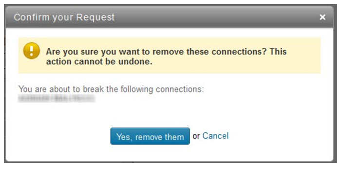
When you add the Clear and Reset buttons to a web form, there is a huge risk that a person will delete all their information accidentally. We’ve all done it and it is so annoying to start over!
If you still want to use these buttons, then know that you can add a plugin that will confirm the request to delete all information (as LinkedIn did):
Choose an appropriate Size for the Inputs and Ensure the Right Proportions
Appealing web forms have the right proportions. For instance, the length of the field title should be equal to the required input information. If you ask a person to type a name, the field shouldn’t be too long. According to the Baymard Institute research, it might confuse a person.
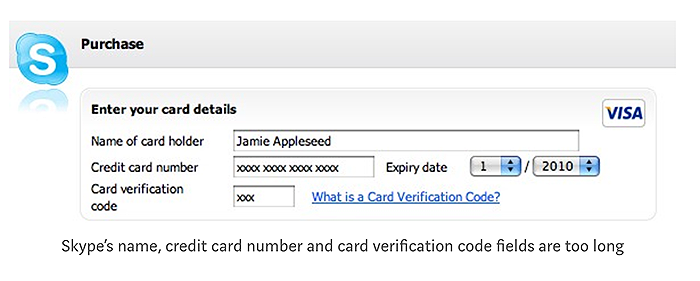
For example, the credit card number and credit card verification code fields are too long.
In addition, if a form has a drop-down menu with only two or three options, it’s better to use radio buttons. They are quick to click and will look more attractive for this purpose.
Remove Optional Fields
If you don’t really need certain information for a fast and smooth process, it’s better to free your visitors from typing it in or even clicking on the buttons.
If you still want to leave the optional fields, it’s crucial to mark them as optional. You can mark the required fields with stars or leave the word “Optional” in brackets near the field itself. Making it clear to the form user will make their entry time faster.
Use Smart Defaults to Save User’s Time
We have already mentioned the dependsOn tool that stands for the smart default functionality. You can save the user’s time by providing multiple answers (variants) based on the previously given information (country – state).
Plus, it would also be good to use the IP address of the visitor to identify the country and offer it in the Country field.
When it comes to optimizing a website, everything that makes each process and action simpler and more convenient will work to give the visitor the best experience possible.
Along with providing high-quality services or sharing useful and unique content, it’s crucial to think about the convenience of the website. Make a checklist with the things that irritate or frustrate you as a user and check to see if your own website has any of these same issues.

Read Also
30+ Original Solutions for Your Site’s Contact Us Page
Free HTML & CSS Material Design Code Snippets
How To Create A Catchy Search Field With CSS?
Don’t miss out these all-time favourites
- The best hosting for a WordPress website. Tap our link to get the best price on the market with 82% off. If HostPapa didn’t impress you check out other alternatives.
- Monthly SEO service and On-Page SEO - to increase your website organic traffic.
- Website Installation service - to get your template up and running within just 6 hours without hassle. No minute is wasted and the work is going.
- ONE Membership - to download unlimited number of WordPress themes, plugins, ppt and other products within one license. Since bigger is always better.
Get more to your email
Subscribe to our newsletter and access exclusive content and offers available only to MonsterPost subscribers.

Leave a Reply
You must be logged in to post a comment.