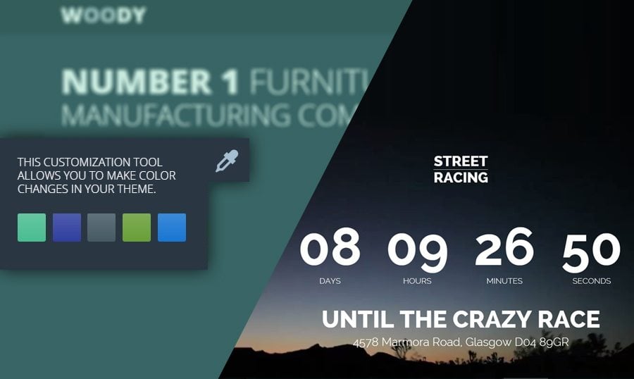
TemplateMonster’s team is happy to spread the word about the new cool features available in our landing page templates. Have you already tested our landing pages? If not, now is a good time to try one.
What are landing pages (lead capture pages or landers) usually used for? The general goal of a landing page is to convert site visitors into sales or leads. In fact, landings are online marketing traps that appear in response to clicking on a search engine optimized search result or an online advertisement. If the goal is to obtain a lead, the landing page will include some method for the visitor to establish contact. This may be a phone number, or an inquiry form. If a sale is required, the landing page will usually have a link for the visitor to click, which will then send them to a shopping cart or checkout area. Unquestionably our landing pages are designed in accordance with all online marketing rules.
However TemplateMonster never stops in its constant strive for improvement. This time our developers have added counters and eyedroppers to the list of landing page features. You can see examples of these innovations below (landing pages with counters and eyedroppers.
Let’s begin with the counters, you may call it landing page with timer. Actually, counters are not something completely new. You might have seen them in some of TemplateMonster’s themes, excluding the landing pages. Currently they are inserted into some of the landing page layouts. But for what reason do our customers need them on their landing pages? As a rule, counters show the time left to some event (maybe promo action, discount, special offer or some other time-constrained event). They create the atmosphere of urgency and make the users come back to your web page every now and again to check out the time left to the anticipated event. Counters urge the visitor to take actions that the site owner wants them to, which raises the conversion rate as a result.
Do you think that a landing page with a counter is exactly what you need for your business? Then browse the templates listed below and take your pick.
* * *
Lintense - All-in-one Landing Page Template
Creating a landing page is only the first step in organizing a fully-fledged campaign to promote the product and increase sales. This is a pleasant and easy process if you have a ready-made template handy. Lintense is your perfect choice of the landing page template to reach the conversion goals. The package comes with Novi Builder, the developers of which in addition to advanced technologies corrected the competitors' mistakes. Moreover, you will be happy with numerous effective plugins, SEO-friendly coding, and 5 pre-made templates. The template is good for various needs like corporate landing pages, mobile applications, digital agencies, and etc. You can rely on regular updates and 24/7 support which will help you to get the most of your landing page.
More features:
- Incredible speed and performance
- Easy installation
- 100% responsive design
- Cross-browser compatible
- Bootstrap framework
- Parallax effect
- Cutting-edge technologies
- Accurate documentation
* * *
* * *
* * *
* * *
* * *
* * *
* * *
* * *
That’s it with the landing page counters for now. Next we can move on to landing pages with eyedroppers. There are only two landing pages with eyedroppers in TemplateMonster’s stock at the moment, but you can try them out straight away.
The solution with pre-installed color schemes for clients has been on our mind for a long time, and finally, that day has come. The pre-installed color schemes feature in responsive templates is a traditional practice worldwide. The process of production of our responsive themes and landing page templates is more or less the same, so we just included the same sort of function into landing pages. Now you can click the eyedropper at the left hand side of the web page and see the default color schemes from which you can choose. It’s like an element of some engaging game which sparks user’s interest in your website and the products you offer. You provide them with the opportunity to change the color of some elements on the page, to play with colors and stop when the scheme has the most visually appealing look for them. It’s fun and interesting isn’t it?
You can test the feature yourself by clicking the screenshots below.
* * *
* * *
* * *
* * *
* * *
We guess it’s time for us to roll up this article. But before we finish, let us ask you a couple of questions about the information you’ve just read. Do you like our landing page new features? Do you think they are useful? Are you more inclined to get a landing page with a counter or an eyedropper than the regular one? Please, let us know; your opinion on the subject is really important to us.
