Metro Style. Website-Mimics: a Fresh Whiff in Design
What design styles do you prefer? Do you adhere to classical time-tested scenarios or maybe you start testing the hottest trends as soon as they appear? This entry will interest progressive design nerds at first turn because we are going to showcase some inspiring metro-style website designs at the end of this brief preamble.
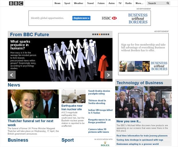
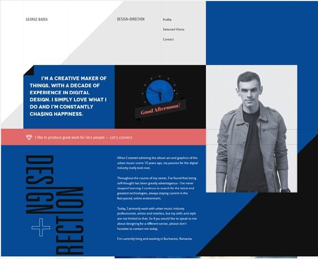
First of all, let’s clear up what is covered under the term “metro-style design”. Actually it’s a typography-based design language developed by Microsoft on the principles of Swiss graphic design. Swiss style was created in Switzerland in 1950s. It is denoted by the hallmarks of cleanliness, readability and objectivity. Asymmetric layouts, grids, sans-serif typefaces, flush left, ragged right text and photos instead of illustrations are characteristic for Swiss style standards.
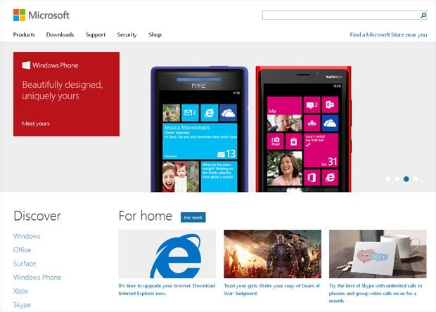
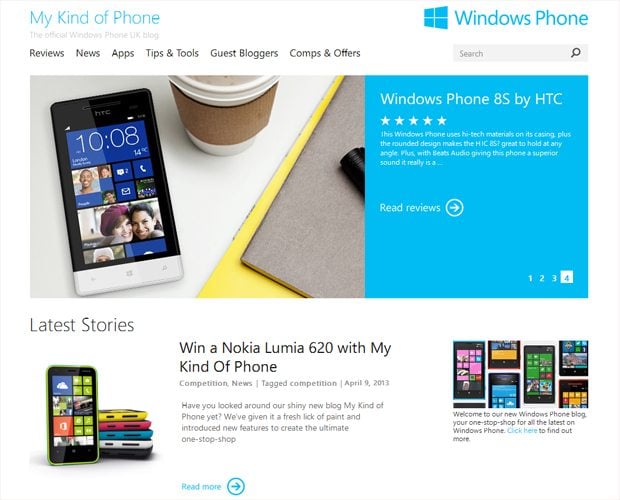
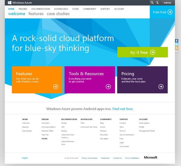
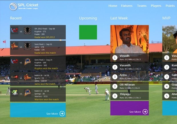
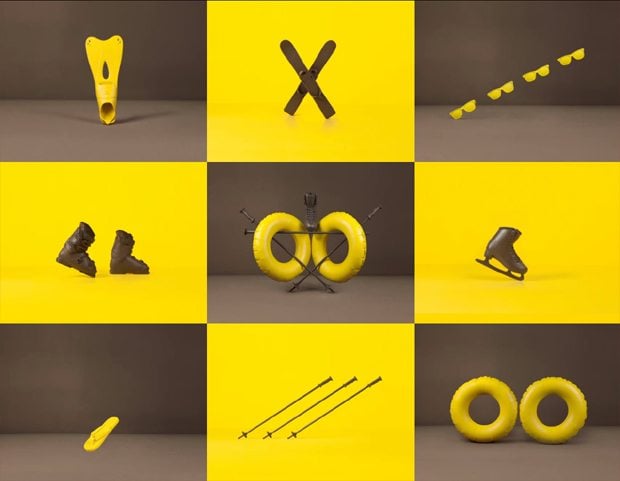
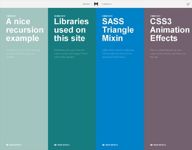
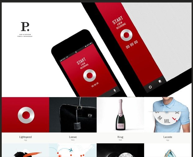
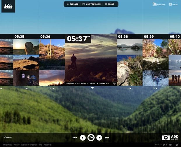
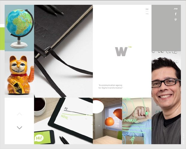
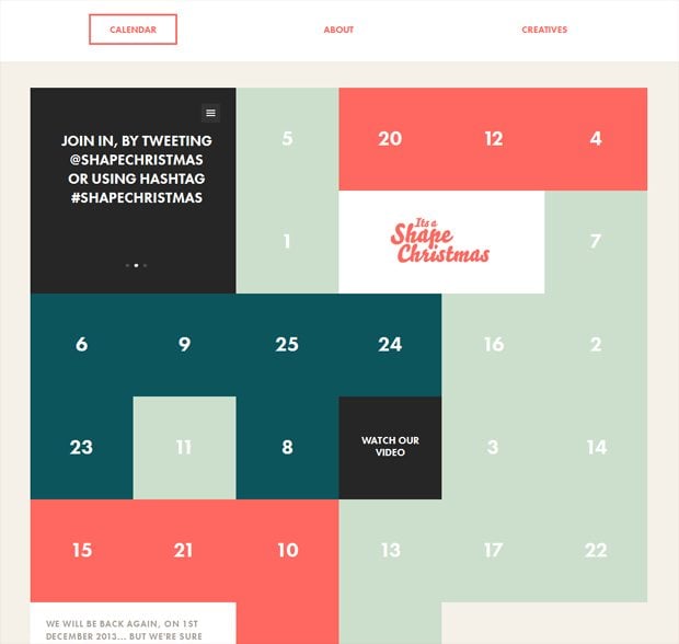
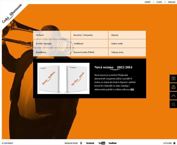
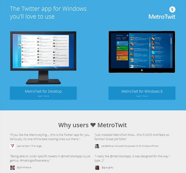
As you might have already noticed, fresh and sleek metro-style is focused on the content, emphasized with prominent typography and less graphics. Flat colored "live tiles" and laterally scrolling canvas can also be faultlessly reckoned among the recognizable metro-style features. Windows Phone, Microsoft's website, Xbox 360 dashboard and Windows 8 are just few bright examples of the implemented metro-style principles.
By the way, did you know that some brilliant ideas for metro-style design have spawned in Microsoft's developer minds owing to common language signs, which we come across every day at public transport systems and King County Metro transit system (Seattle area, not far from Microsoft’ headquarters) in particular? By parity of reasoning, awesome typography and large text inevitably catch our eyes, just like the above mentioned signs. In fact, avoiding the excessive graphics, collating regular tasks into groups and letting the content work as main UI were to make user experience simple, intuitive and prompt.
Speaking about metro-style design it’s impossible to miss the animation as according to Microsoft’s suggestions, the website should seem “alive” and respond all user actions.
If you are interested in deeper investigation of Microsoft design language principles, click here to see their compilation. You may also have a look at the recently posted interview with Arturo Toledo, an experience architect and UI designer, who worked for Microsoft in Redmond for 7 years and personally took part in metro-style development.
Now it’s a good time to browse the collection of website designs inspired by metro-style.
* * *
* * *
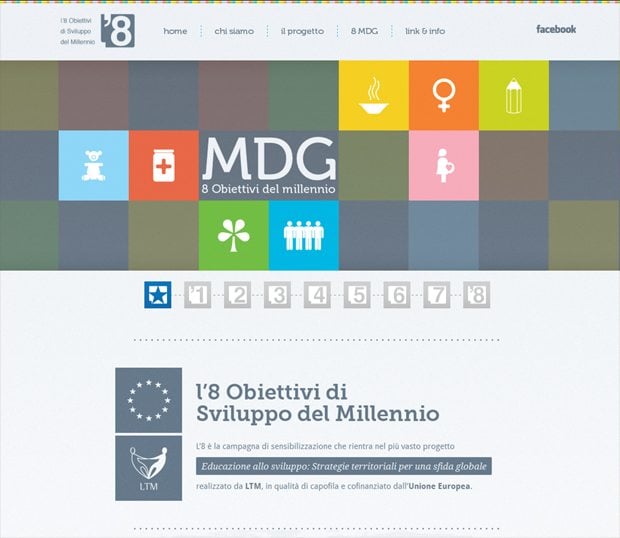
8 MDG
* * *
* * *
* * *
* * *
* * *
* * *
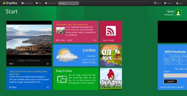
Droptiles
* * *
* * *
* * *
* * *
* * *
* * *
* * *
* * *
* * *
* * *
* * *
* * *
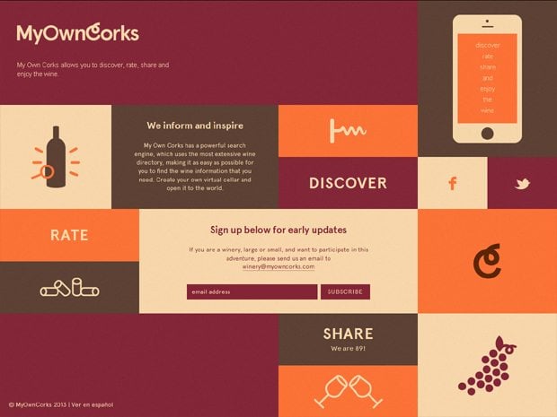
My Own Corks
* * *
* * *
* * *
* * *
* * *
* * *
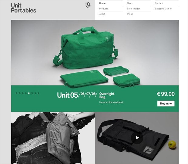
Unit Portables
* * *
* * *
Wrapping Up
In general, public response to metro-style emergence was mainly positive. The trend was called daring, innovative, functional and attractive. Surely, the opposite opinions exist as well. We would be happy to know what do you personally think about the style itself and websites picked out for today’s post. Leave your feedback in the comment section below.
Don’t miss out these all-time favourites
- The best hosting for a WordPress website. Tap our link to get the best price on the market with 82% off. If HostPapa didn’t impress you check out other alternatives.
- Monthly SEO service and On-Page SEO - to increase your website organic traffic.
- Website Installation service - to get your template up and running within just 6 hours without hassle. No minute is wasted and the work is going.
- ONE Membership - to download unlimited number of WordPress themes, plugins, ppt and other products within one license. Since bigger is always better.
Get more to your email
Subscribe to our newsletter and access exclusive content and offers available only to MonsterPost subscribers.

Leave a Reply
You must be logged in to post a comment.