10 Things That Mobile App Developer Can Learn From Successful Website Designers
A successful website primarily consists of an extremely usable interface, rich features and functionalities, an amazing design and many other factors, that make it a joy to use.
It is these factors, which have a role to play in the success of mobile applications as well. The factors that determine the success or failure of mobile applications are the same as those that separate successful websites from those that fail to leave a mark. This is why, mobile app developers can take a cue from some of the best website designers while developing apps for their end-users.
Here are ten pointers, which mobile app developers can learn from their web counterparts and use in their projects.
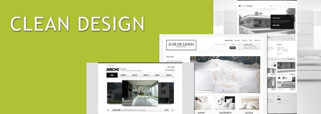
- Clean Design
A clean design has visual hierarchy, has proper layout structure, is simple and most importantly, it is devoid of clutter. What this essentially means is there is no graphic, animation, text or any design element for that matter, which look out of place on such websites because the main focus is to present important information to the end-users in a well-organized way. This is what a web designer puts into practice and this is something that even somebody developing mobile apps can follow to give users an app with a clean design, which meets their purpose.
- Effective Typography
The typography used on a website creates maximum impact on end-users. Successful designers know this fact and make an extra effort to know their target audience thoroughly so that they can choose a typeface, which appeals to the users and helps them connect to the website. They don’t use a typeface that is relevant to the purpose of the website and its target audience! This holds true for mobile apps as well and so, while creating an app, developers should choose an apt typeface depending on their target audience.
- An Intuitive Interface
An intuitive interface enables users to use the website without any glitches, even if they are using the site for the first time. This is why the best designers consider an intuitive interface an ‘all-important’ part while designing their websites and hence, ensure that the function of each and every feature and element of their website is clear to the users. This is again something which you must replicate in your apps so that even when your users run an app for the first time on their mobile, they can use it without any hiccups.
- Easy Navigation
Web designers follow various techniques like – breadcrumbs, Parallax scrolling, contextual menus, search boxes and design elements like banners, sidebars and text boxes on their websites to make it easy for their users to navigate. This is what makes the site easy to browse for the visitors. Obviously, you can’t use all of these techniques for developing mobile apps, but what you can do, is make your app easily navigable by providing large back and forth buttons, using various gestures like – swipe, pinch, double tap etc.
- Less Loading Time
Image Credit Stopwatch by Shutterstock
Usually, website visitors tend to browse a number of sites at a given time and when a website takes too much time to load, they simply abandon it and move on to browse the next site. As a solution to this common problem, web designers strategically reduce the loading time of their websites by using a limited number of graphics and animations on the web pages, avoiding Flash animations and doing away with fancy landing pages. Apply the same thought process while developing your apps; don’t use a splash page and use Flash or other graphics and animations only if they are absolutely essential to the purpose of your website; this ensures that your apps load faster on the devices of your users.
- Minimum Color Palette
Image Credit Pouring Ink by Shutterstock
Almost all web designers believe in the “less is more” principle and adhere to it while designing their websites. This minimalist approach, contributes in making their website successful. An essential part of minimalist web design is using a color scheme with a limited color palette consisting of at the most 2-3 color combinations, depending upon the type of the website being developed and its target audience. Similarly, when you develop an app, do use a limited color palette depending upon the type of the app and the preferences of the end-users.
- Choosing the Right Visuals
One of the main traits of successful web designers is the inherent ability to choose the best visuals for their websites. This helps them convey a clear message to the visitors and also helps them take an informed decision. This is exactly what users expect from mobile apps as well, and it is your responsibility as a developer, to select the correct visual elements for your apps.
- Minimum Scrolling
Top web designers don’t make their visitors scroll either horizontally or vertically, since most of them use touch screen devices to browse websites. Juxtapose the same thinking while developing a mobile app; fit in the features and functionalities of the app in the limited screen space of various mobile devices without making your end-users scroll endlessly and needlessly.
- Placement of Call-to-action Buttons
Image Credit Red Button by Shutterstock
The success of any website depends upon the call-to-action taken by its users. This is the reason why some web designers astutely place call-to-action buttons at places, where their users are most likely to notice them.
This is exactly what you need to learn from these designers i.e. know where to place a call-to-action button in an app built for mobile devices. For instance, if you want your users to upgrade to a paid version of your app or subscribe to your newsletter, give them the option in the end, when they have finished using the app.
- Interactive Elements
Web 2.0 made it possible for web designers to create interactive websites that engaged users and retained their interest, making their sites a resounding success. This applies to mobile apps too; the more interactive an app, the more popular it will be with your end-users. Hence, try and make your app as interactive as you can, by using various interactive elements to maximize user engagement.
In Conclusion
As you can see, mobiles may have smaller screen sizes and a different interface, but the basics of designing and UI remain the same. After all, you are designing and developing apps for the same people. A clear, accessible and intuitive interface makes app browsing effortless; appropriate visuals combined with minimal color palette shift the focus to the functionality of the app; judicious use of interactive elements breathes life into the app; and prominently placed call-to-action buttons increase conversions. Stick to these basics of designing, and you will never go wrong.
Don’t miss out these all-time favourites
- The best hosting for a WordPress website. Tap our link to get the best price on the market with 82% off. If HostPapa didn’t impress you check out other alternatives.
- Monthly SEO service and On-Page SEO - to increase your website organic traffic.
- Website Installation service - to get your template up and running within just 6 hours without hassle. No minute is wasted and the work is going.
- ONE Membership - to download unlimited number of WordPress themes, plugins, ppt and other products within one license. Since bigger is always better.
Get more to your email
Subscribe to our newsletter and access exclusive content and offers available only to MonsterPost subscribers.


Leave a Reply
You must be logged in to post a comment.