


This was determined by time and history that everyone who is somehow related to the field of web design and development approached the desktop side of any web project first, with the mobile version being set a secondary goal. As soon as responsive designs started evolving, the tendency didn't change either.
A full-size web resource still remained as the top priority.
However, the web is changing.
It seems that handheld devices will soon replace the desktop PCs. So, there is a growing trend in the web design industry to begin website development with a mobile version of an online resource, and only afterward move to the "full site" version.

Still, mobile-first designs are gaining their full power, with more webmasters shifting to the whole new approach to web development.
The main objective of writing this blog post is to reveal the top reasons why we need to re-think our web design strategies (if we haven't done this yet), as well as ask for an expert opinion of SEO and marketing specialists who will help us decide on whether or not the contemporary web should go mobile-first. So, let's dig deeper into details.
Mobile-first vs Adaptive vs Responsive Design
Although these three terms may sound synonymous at the first glance, each of them bears a different meaning. In order for us not to confuse their meanings, let's specify what exactly stands behind each of them.
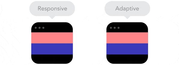
- The notion of responsive design was first coined by Ethan Marcotte back in 2010. According to him, a responsive design refers to a technique, as part of which a website design adjusts to any screen size that a user has chosen to browse the content. Due to this, no matter on what screen size the content is displayed, every piece of data and every layout element will change based on the width of the browser window. In order to determine whether a website features a responsive layout or not, you can zoom in and out a browser window manually.
- Unlike responsive designs that adjust to all screen sizes, adaptive layouts are designed to adapt to the specific width of the screens of desktop computers, tablets, and laptops. Different devices have set browser widths, which are widely-known to developers. Creating an adaptive website is less time-consuming than working on a responsive layout because the latter must be displayed optimally on any browser window (even if a person zooms it in or out).

- Different from a responsive design (which is generally considered to be a technical approach to building websites), a mobile-first design is a separate design strategy that was first introduced by Luke Wroblewski back in 2009. Instead of starting off with the development of a desktop version of a website (which later on scales down to the screens of tablets and smartphones), mobile-first concepts suggest that a mobile version of a website is put in the heart of the design strategy. Taking into account the size of the screens of smartphones, mobile-first designs should be built with attention to details, with every single element being analyzed and structured properly. Additional layers of content are further added for the visitors who access a website from larger screens.
Is Mobile-first the Right Strategy for You?
A mobile-first strategy can be an immense success. However, far not every web design agency can adopt it due to the expenses that it involves. That's why, many companies still give preference to the desktop-first approach, meaning that a desktop-first website running on a fully responsive framework will further on adapt to smaller screen sizes. So, opting for a mobile-first strategy you need to understand who are your clients and what are they looking for on your site.
However, far not every web design agency can adopt it due to the expenses that it involves. That's why, many companies still give preference to the desktop-first approach, meaning that a desktop-first website running on a fully responsive framework will further on adapt to smaller screen sizes. So, opting for a mobile-first strategy you need to understand who are your clients and what are they looking for on your site.
In order to understand whether a mobile-first strategy will work for you, answer these two simple questions:
- Do your customers prefer searching the web from desktop or handheld devices?
- Do your clients mainly use mobile gadgets to browse the web?
If both answers are geared towards mobile devices, then do not hesitate to opt for a mobile-first strategy.
Top 4 Reasons to Go Mobile-first
Creating mobile-first design involves a number of benefits for both end-users and web developers. Let's enumerate the core ones.
- As you design mobile-first, you bring more focus to the content and functionality of your site. When you create a design that is limited to 320 x 480px screen size or less you have to rethink your approach to building web layouts. Unlike a desktop version of a website where there is enough space to display all the things related to a particular business, a mobile design cannot afford this. So, when designing mobile-first, every tiny element added to a web page matters.
- There are so many devices featuring different screen sizes available now. There will be even more of them in the future. So, making your size adapt to the screen size and layout of every new device is an unaffordable luxury. That's why, making your mobile-first design fluid rather than adaptive you let it "flow" and look stunning on any device, without investing a fortune in the web development.
- Designing a desktop-first site, one needs to mind the fact that the web audience might be using old and outdated browser versions, which may not support new and evolving technologies. The situation is different with mobile devices. Once in a while, we receive automatic software updates, which gives us wider possibilities to use new technologies in mobile-first designs. For example, you can include multi-touch interaction from various gestures, audio and video input, location information from GPS, etc.
- Mobile-first designs are all about progressive enhancements. When working on a design that is intended to perform well on smaller screens, we pay attention to words, images, and forms that it contains. Next, we add styling elements in CSS to beautify the layout of the site, when it's accessed from bigger screens. Next, we add extra touches and features in JavaScript, which is intended to add some extra value to the use of a site.
How Mobile-friendly is Your Site?
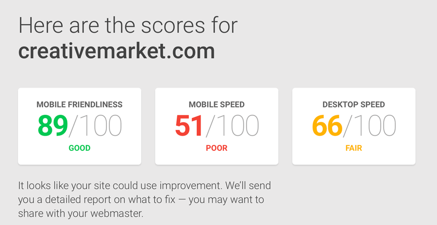
There are plenty of tools to test the responsiveness of web resources. We have decided to check how well templatemoster.com performs on various devices with the help of Mobile Website Speed Testing Tool from Google. Here are the results that we have attained:


Inspired and enthusiastic by the high score, we have decided to go even further and see how well the things are going with several other well-known names in the industry. So, the next URLs we entered were: creativemarket.com

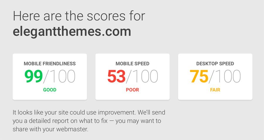

themeforest.net
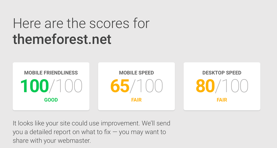

Not bad... yet there is still some place for further improvement of the mobile versions of their web presences.
What Experts Think about Going Mobile-first?
It's always a good idea to learn from experts specializing in a particular niche.
So, we have decided to reach Sergio Blanco (SEO specialist at TemplateMonster), John Doherty with Credo, and Cesare Marchetti with CM Online Marketing.
We wondered on their expert opinion about:
- the importance of being mobile-first in 2017;
- as well as the tools that site owners and online marketers should use in order to check the performance of their web projects on different gadgets.
Here go the answers.


Mobile-first index by Google suggests that the search giant will be looking for a mobile user agent to view and index websites. So, does this mean that everyone who doesn't have a mobile version of a website is doomed to failure? Never! The search engine will simply scan your web page with the help of its mobile Googlebot. This doesn't mean that Google stops seeing and ranging desktop sites. So, if everything seems to be left unchanged, maybe there is no reason to design mobile-first? It's up to you to make the choice.
What I advise you to do is to examine the web analytics stats of your site and determine the number of users who access your web page from the screens of handheld devices. If mobile traffic is not that impressive and the desktop version your site generates most of the income, then it's likely that designing mobile-first is not the thing that will work for you. However, if the total number of mobile views makes up more than 50%, then go ahead and do something! Mobile phone users - that is your target audience.
How can you find out whether Google sees and how the search sees your mobile-optimized pages?
- Google Search Console (former Webmaster Tools) is the easiest free way to get an answer to this question.
- Using Fetch and Render tool, select Mobile:smartphone user agent. It's likely that Google will see your pages that way.
- Google can give preference web pages. So, it makes sense to test the pages of your site with this tool.
Do not panic. Google keeps on ranging desktop websites. The search engine also continues experimenting with mobile-first index, so if you want to keep up with the times and make use of every opportunity to optimize your site for a better performance, making a web page look good on mobile screens you will never lose in you online strategy.
Sergio Blanco, SEO guru at TemplateMonster

It's no longer enough to be mobile-friendly or mobile aware, as in "I'm aware that people use mobile phones". In 2017, almost everyone has an iPhone or Android phone. We are all mobile. The world is mobile. Therefore, your website must be not only functional but optimized for mobile phones large and small. At the same time, you have to recognize that people's habits are different depending on their device of choice, laptop or phone. Phone users tend to browse and do research more while on the go, but they are rarely ready to purchase. Smaller purchases, like ordering something small on Amazon, are likely done often on their phones. Larger purchases that involve more research, such as planning a vacation or buying clothes, are still often done on the laptop.
This also underscores the necessity of broadening a digital marketing strategy. Instead of simply thinking that you are covered in your business because you rank #1 in Google for your major search terms (and this itself is becoming less lucrative as the search engines insert more ads and features into search results), you also need to layer on retargeting campaigns to bring these mobile visitors back to your site when they are on their laptop.
There are a few tools I use to ensure mobile functionality while building new websites. They are, in order:
- Google's Inspect Element tool in Device Mode
- Responsinator
- Actual devices of different sizes
I personally have every iPhone since the iPhone 4 to use for testing, iPads from Mini through 3, as well as access to a few Android phones and a Google Pixel. The best way to ensure that your content looks good on all devices is to actually use those devices to test.
John Doherty with Credo

Mobile-first design? That's definitely a good strategy, but not so easy to implement. It's old stuff already...Honestly, it's no my 1st priority...
AMP (Accelerated Mobile Pages)
Instead of mobile-first, I would rather focus on implementing the new AMP (Accelerated Mobile Pages) Standard backed by Google and designed only for mobile devices. This kind of pages loads much much faster than non AMP pages. AMP pages are cached by Google servers around the world. Google will use these cached pages when serving up web search results. AMP search results are shown with a lightning bolt, i.e. they stand out in the search results and lead to a higher CTR. Better loading time improves the user experience for sure and is an element of SEO.
Tools I use in this context:
Cesare Marchetti with CM Online Marketing
As you can see, opinions differ. And what's your attitude to designing mobile-first? Is it worth the effort?
What's your preferred web development strategy?
Your feedback is highly appreciated.