11 Mobile UI/UX Design Trends That Will Dominate In 2020
How will mobile UI design change in 2020? Which UI & UX trends are to go? We’ve looked through a bunch of UI/UX designer portfolios on Dribbble to see what’s good. As a result, we’ve put together a stunning collection of mobile UI prototypes to get you inspired. By the way, if you're looking for trendy website templates to rock in 2020, visit TemplateMonster Marketplace!
Check out the video Mobile UI & UX Design Trends 2020 | TemplateMonster
Subscribe to our YouTube channel to see more videos about trends in graphics or web design for 2020!Here you will also find Product Mockups to use for your design projects.
And now, let’s take a closer look to the mobile UI design trends that will dominate in 2020.
Buttonless design & Liquid Swipe
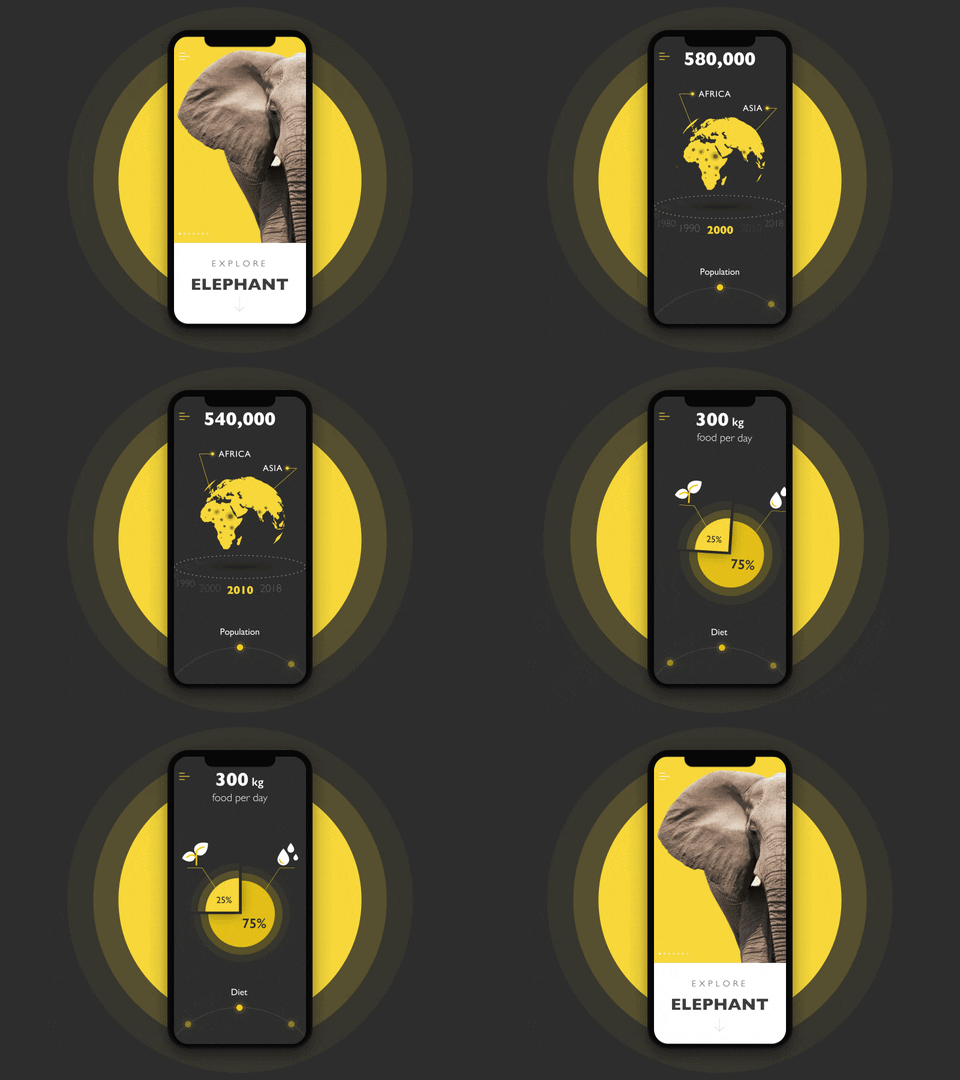
It’s been a long time since any of us used a mobile with real physical buttons. With screen space freed, product designers can provide users with more information. All the attention is focused on the content, while gestures are used instead of digital buttons.
Source: Nature Encyclopedia App
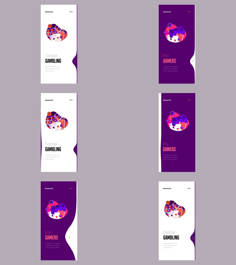
Liquid swipe effect is taking the use of gestures to the next level. This amazing effect is available on GitHub as an open source.
Source: Cuberto/liquid-swipe
Bottom sheets
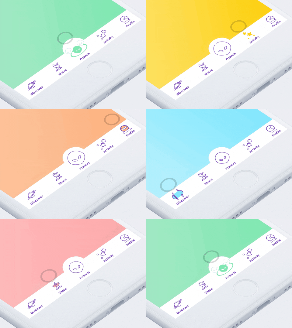
With mobile phones screens getting bigger, these devices are becoming better suited for multitasking. However, bigger screens aren’t always handy when it comes to the natural movement of the thumb. This is why the focus has shifted towards bottom navigation making it an industry standard.
Source: Animated Tab Bar Concept / Cadabra Studio
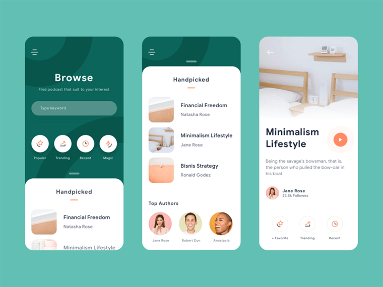
In 2020, the bottom navigation bar is evolving into bottom sheets. You can see them in some mobile apps already. These bottom sheets rely on a swipe-up gesture making more options available.
Source: Podcast App Exploration / Ghani Pradita
Enhanced Personalization
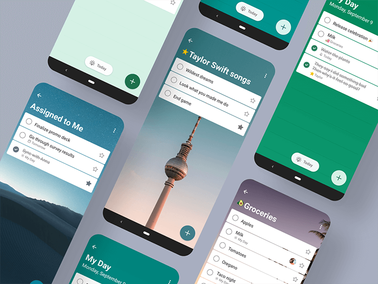
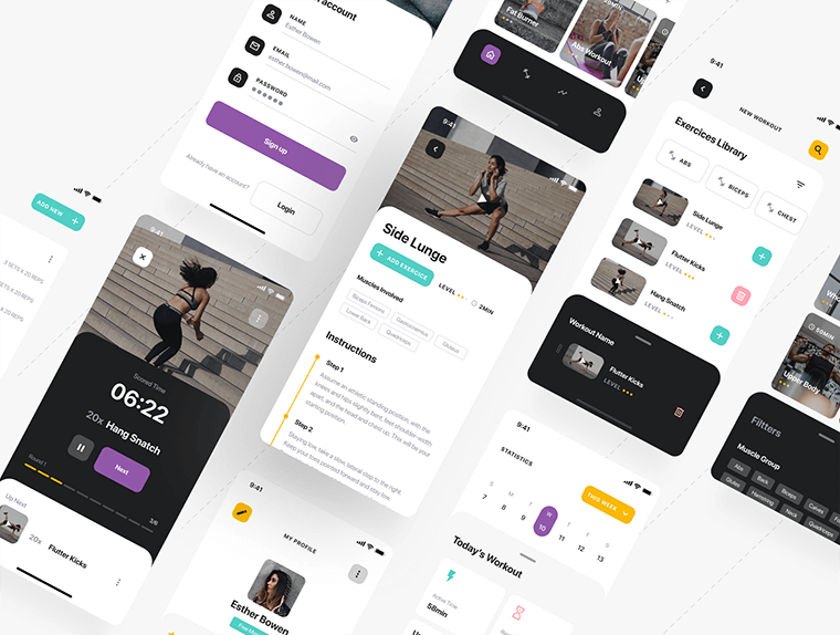
In 2020, mobile app personalization is likely to gain more momentum. A personalized user experience is becoming a “must-have” in mobile development. AI and machine learning are making personalization easier. Take streaming services like SoundCloud or even YouTube where AI analyzes a user’s preferences to provide song suggestions. Also, bucket list and fitness apps provide enhanced personalization to their users.
Source: To Do App / Microsoft Design
Source: Savage iOS UI Kit I / Anton Tkachev for UI8
Round corners
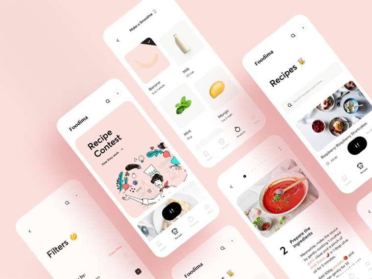
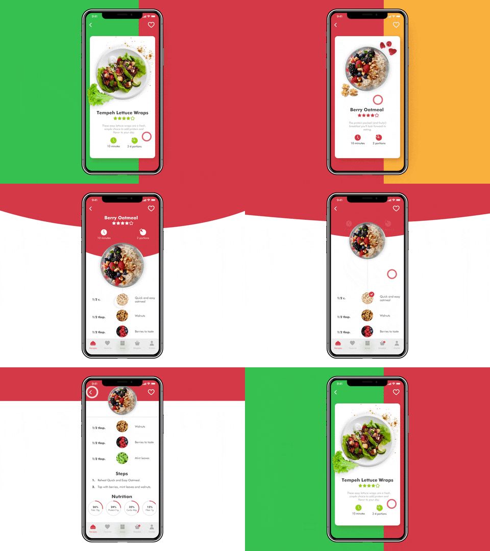
Following changes in the design of mobile devices, apps have acquired round corners as well. Contrary to popular belief, round forms don’t serve the aesthetic purposes only. User experience also improves as information becomes easier to process.
Source: Vacation House UX/UI map / Cuberto
Source: Vegan Recipe App / tubik
Password-less experience
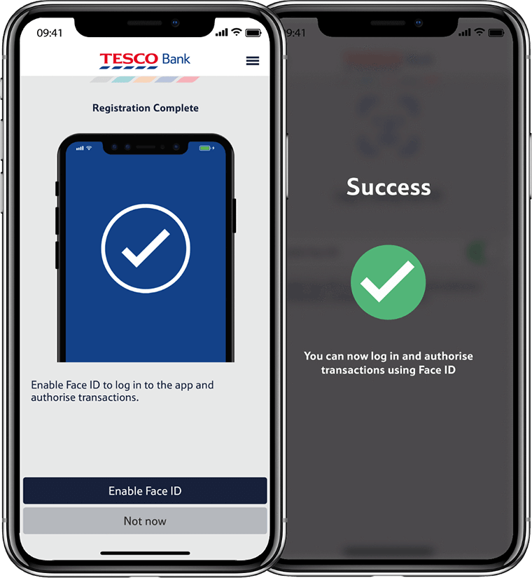
With so many apps used on a daily basis, remembering passwords becomes more challenging. A poll by Intel Security that dates back to 2016, suggests 37% of users forget a password at least once a week. In 2020, password-less login methods are likely to become more popular.
There are a few forms of password-less login already used in mobile apps. For instance, biometric authentication (fingerprint or facial recognition). Also, one-time temporary passwords (Ebay) and sign-ins links (Medium).
Source: Tesco Bank App
Advanced animation
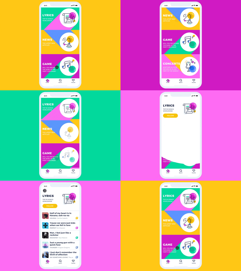
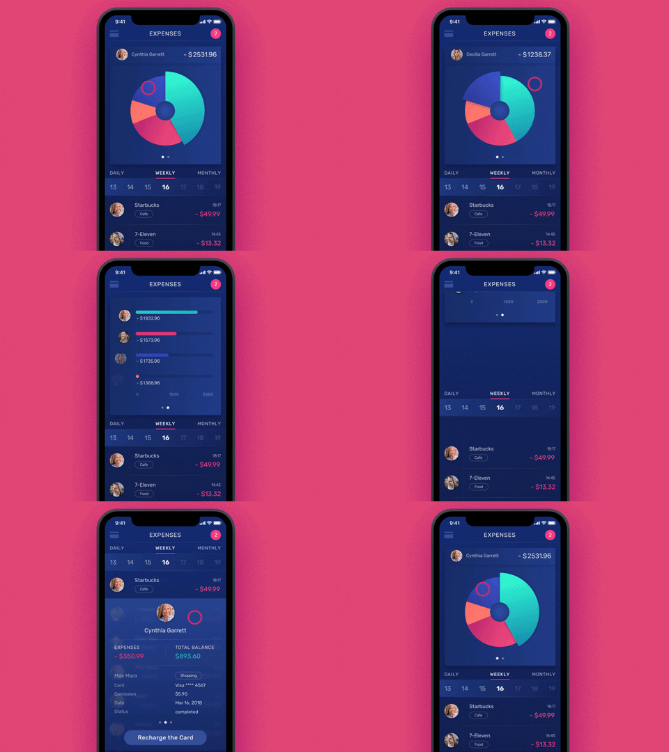
Without a doubt, animation can elevate user experience. Actions confirmation, state changes descriptions, more rhythmical interactions can convey plenty of information. Animation has become the part of storytelling for the brand. Using movie-like scenes helps convey the information and morph it from frame to frame.
Source: Music News App / tubik
Source: Finance App Interactions / tubik
3D and faux-3D design
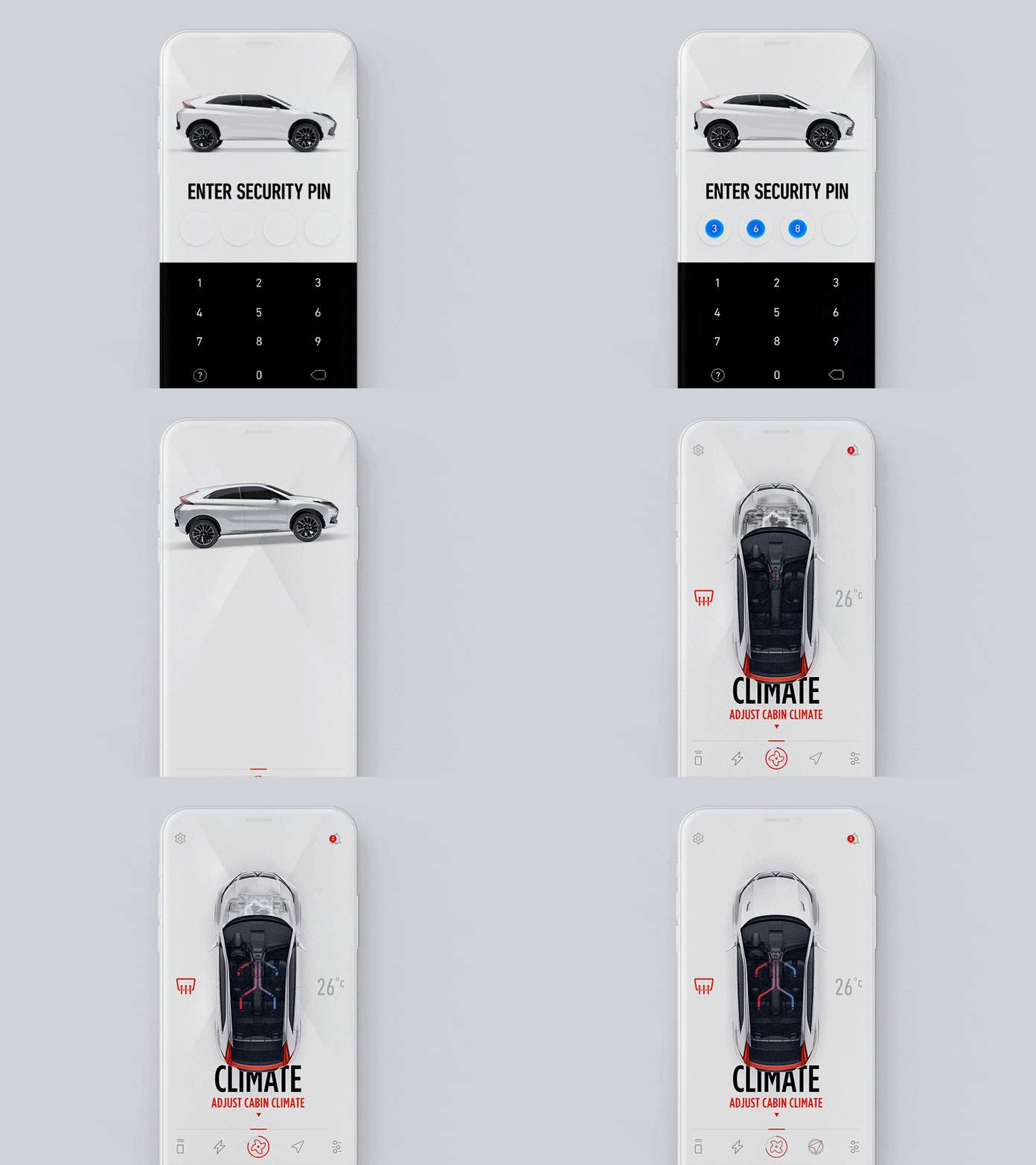
Using 3D objects in mobile apps design is nothing new. With the help of 3D and faux-3D objects in mobile UI, designers make mobile interactions more realistic. Skillfully executed 3D or pseudo-3D can help recreate the feeling you get playing a video game.
Source: Mitsubishi connect iOS / Gleb Kuznetsov
Gradients 2.0
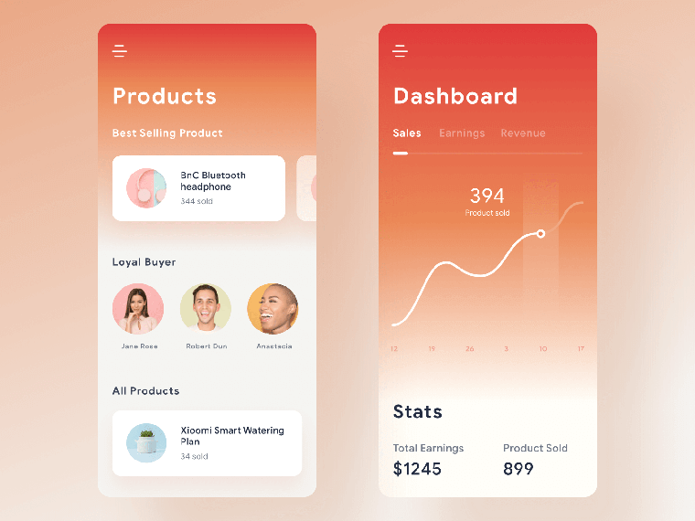
Gradients are getting a new life in 2020. This time, however, gradients are more about vibrant colors used as background. They tend to have a clear light source. Vibrant color palette not only brings depth and dimension to the UI design. It also creates positivity. Also, gradients are shifting towards subtlety and simplicity in terms of styling.
Source: Commerce Dashboard App / Ghani Pradita
Illustrations
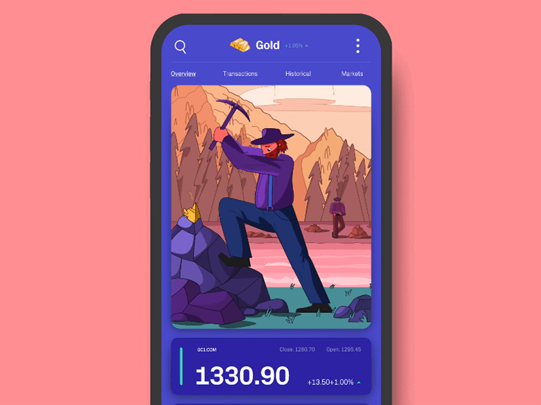
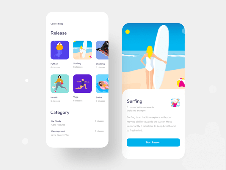
As design is becoming more ‘emotional,’ product designers are leaving ‘neutral’ behind. In 2020, we are likely to see more design experiments aimed to create an emotional impact. Also, designers are eager to experiment with various illustration styles. Their primary goal is to create products that users can relate to on an emotional level.
Source: C M O D / Zak Steele-Eklund for Studio VØR
Source: Course lesson apps exploration / Saikat Kumar for Ofspace
Dark themes
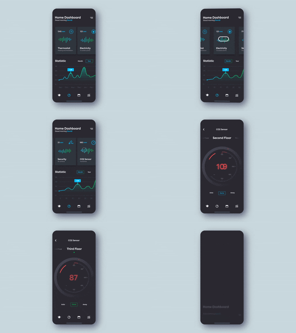
As of late, more apps are switching to the dark themes. Take Instagram, as they introduced the dark theme with an iOS 13 update. Why is there so much hype about it? In a nutshell, dark themes have two advantages in terms of elevating user experience. First of all, they reduce eye strain as they help adjust the brightness of the screen to current lighting. Secondly, they reduce the use of light pixels, which saves up the battery power.
Source: Smart Home Controller / Ramotion in User Interface Design
Device-agnostic experience
People are buying more devices per capita. Statista suggests, there will be around 6.58 network connected devices per person around the globe by 2020. The way people access information is changing. Switching from one device to another becomes natural for a typical user journey.
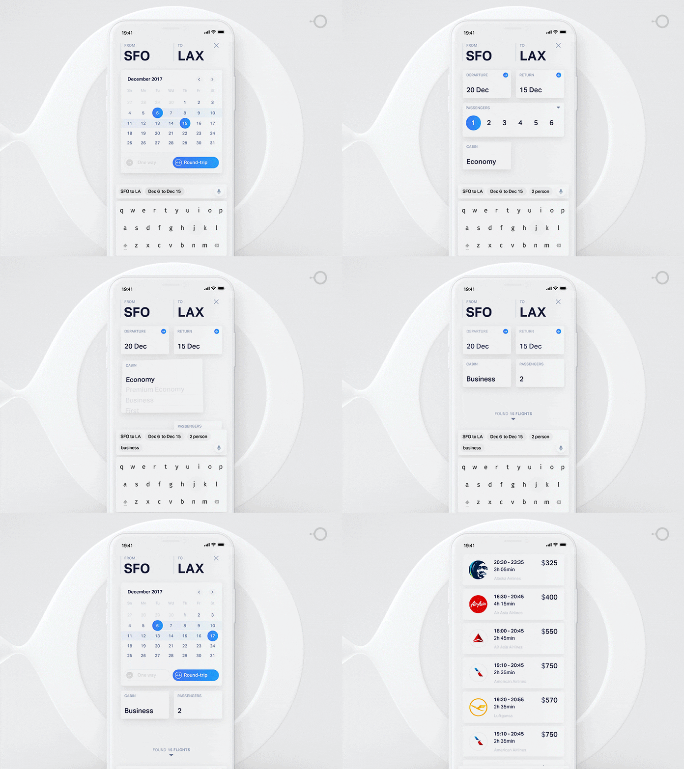
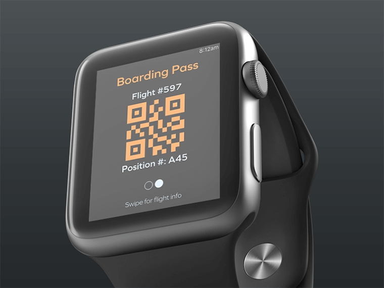
Designers will have to think out of the box as thinking ‘desktop’ and ‘mobile’ categories is not enough anymore. Thinking in terms of the user journey is more beneficial results in developing device-agnostic design. This way, users will have a smooth user experience irrespective of the device. Here’s an example of device-agnostic experience while booking a flight on a mobile and smartwatch:
Source: Booking flight with active interface / Gleb Kuznetsov
Source: Flight Boarding Pass for Apple Watch
Read Also
40+ Breathtaking Apartment Themes: How to Choose a Vacation Rental WordPress Theme That Converts
Web Design Trends in 2020: Are You Ready to Optimize Your Website and Increase Conversions?
65 Web Design Trends of 2020 – Complete Edition
10 Typography Trends to Stick to in 2020
Don’t miss out these all-time favourites
- The best hosting for a WordPress website. Tap our link to get the best price on the market with 82% off. If HostPapa didn’t impress you check out other alternatives.
- Monthly SEO service and On-Page SEO - to increase your website organic traffic.
- Website Installation service - to get your template up and running within just 6 hours without hassle. No minute is wasted and the work is going.
- ONE Membership - to download unlimited number of WordPress themes, plugins, ppt and other products within one license. Since bigger is always better.
Get more to your email
Subscribe to our newsletter and access exclusive content and offers available only to MonsterPost subscribers.

Leave a Reply
You must be logged in to post a comment.