Morning Coffee Website Designs That Will Pick You Up
"Oh, what a day!" if it starts with a cup of black coffee. Its aroma is one of the most pleasant things (so as the first rays of the sun, the kiss of a beloved person) that make morning and the whole day. This post is not a cup of coffee, but has the same arousing effect – it features a compilation of coffee website designs (official sites of well-known brands and tiny coffee houses, number of blogs, etc).
Before you start reading further, make sure you have a cup of nobbishly good coffee in your hand, not to waste your time making it while reading.
Enjoy at First Sip
This post is all about web design with coffee aroma, and of course, about love of this wonderful beverage. While browsing it, you’ll understand the magic of coffee, pleasure of spending time in the local café and sipping hot coffee with friends. It will not be a compilation of top coffee brands websites (like Starbucks, Maxwell House, Carte Noire, etc.), but all sites that deal with coffee, mainly online stores with appealing designs.
Crafty Coffee Web Design
At first let's find out how you imagine a coffee website. Most people will say that such design should please the eye with coffee beans, recognizable textures on the background (paper, wood, textile), natural colors like brown, green... some cups, plates, coffee machines and a number of things that are associated with coffee. Such image of a site is a bit ideal. A lot of websites that present coffee brands, shops, places don't make use of the mentioned above direct pointers at the subject matter. It's not surprising, 'cause just several touches are enough for a good design to communicate the main business idea.
To the Last Drop
All the examples below strike with simplicity and modern look. The interplay between clean approach to design and effective elements create easy on the eye layouts that are interesting to browse through. You can find a lot of signifiers of modern web design trends in them: black & white layout, minimalism, circular design elements, hipster logos, faded colors, large background images, etc. These sites are different, but there is one similarity between them – cozy atmosphere with wonderful coffee fragrance. And it’s time to feel it.
* * *
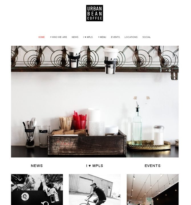
Urban Bean Coffee
Light color scheme is perfectly teamed with black & white photos and effective graphics. The site looks so clean & clear, that I enjoy every minute of browsing all its pages and reading about philosophy of coffee.
* * *
Minimal style is never-dying classics, and this website is a perfect representaion of this style. If you take a look at it, you will find not a single superfluous detail, everything is exactly where it belongs.
* * *
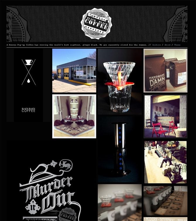
Black Black Coffee
To promote Black Coffee brand, its owners have made use of the same color. This website looks cutting edge with contrasting white graphics and cool hipster elements.
* * *
Grunge style is still out there, being created with a wooden texture and typography (as if written with a felt-tip pen) looks really nice. Over all, the site looks like a big box of coffee.
* * *
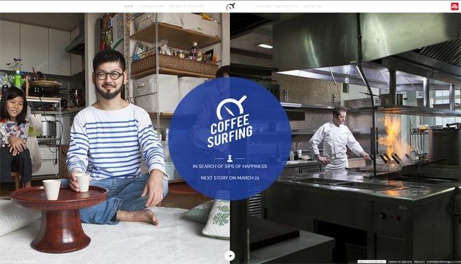
Coffee Surfing Illy
The most interesting thing about this site is its navigation. Click the dots in the left part of the page, don't get lost in the blocks.
* * *
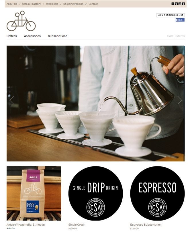
Everything is extremely clear about this design. You choose the product you like, click “buy now” button and get the desired coffee. This website is a good example of how user-oriented online store should look like.
* * *
This website represents a five by five structure. To navigate through the parts of this site you need to use arrows on your keyboard. A schematic map in the left corner of the site shows what page you are at right now.
* * *
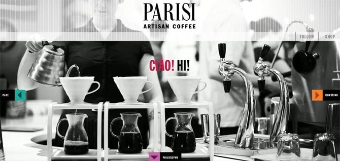
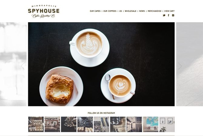
You should see this inspirational website presenting cozy café. Enjoy visual purity of this design, its black and white layout, wonderful photos and easy-to-follow structure.
* * *
Soyuz Coffee Roasting
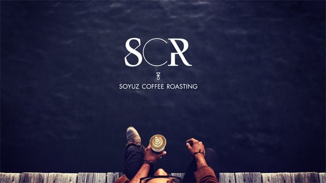
This parallax website with cool graphics and pleasant-to-look-at-color scheme is a perfect choice for coffee roasting company.
* * *
When you hit this website you will see a huge content slider that covers half of the home page. Looks really cool.
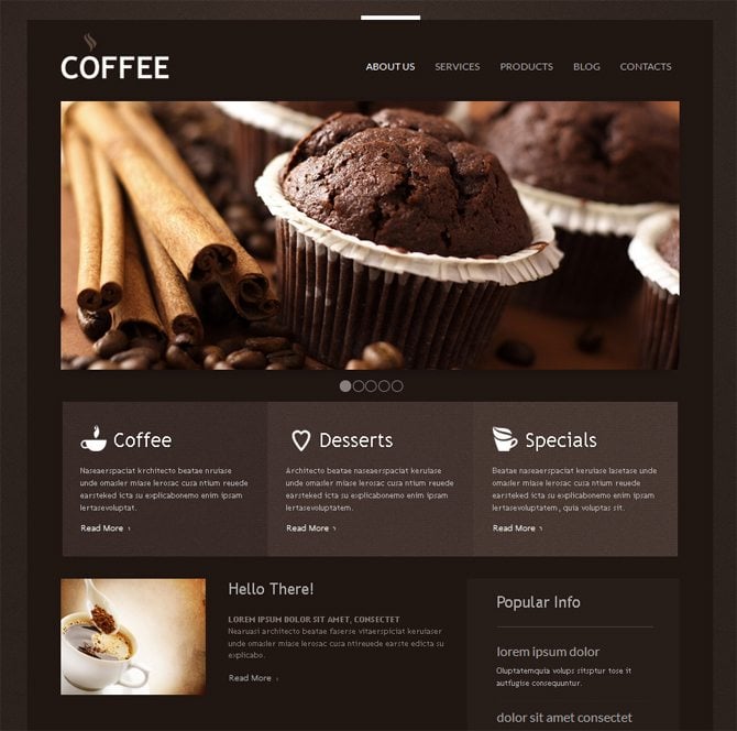
Staring a coffee site, you may need inspiring design ideas that will show you the right direction to follow. Browse through several premium designs created especially to bring coffee website online and make it inviting for visitors.
* * *
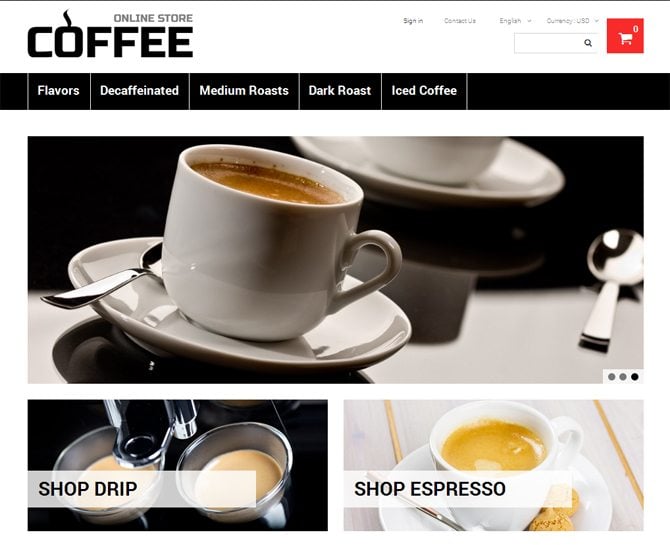
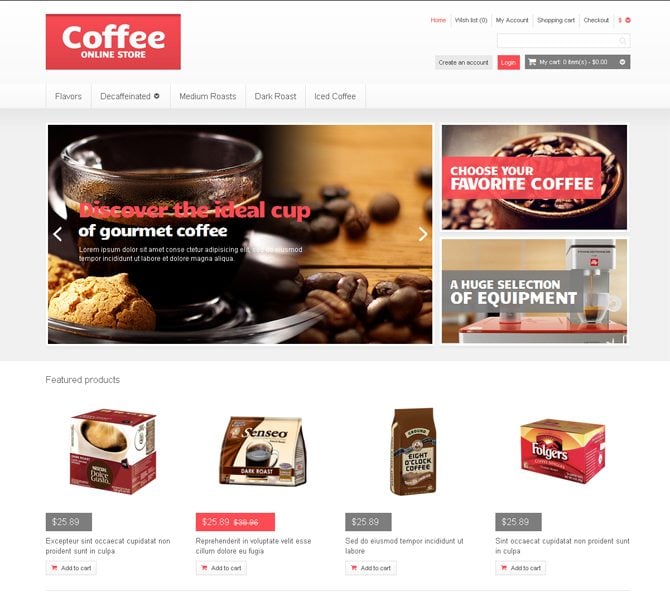
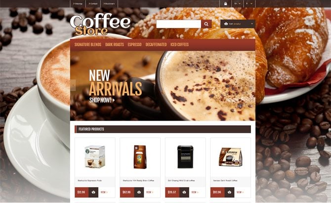
Choose classic black & white design with attention to details for online coffee store. Content wise structure with all products placed in 2 rows (on the home page), featured ones in boxes and top in the slider with images will present all items in the best possible way.
* * *
If you are going to set up a coffee shop that will stand apart its competitors, consider this appealing design in delicate colors. It will easily engage people in with effective JS animation and wonderful images on the gallery page.
* * *
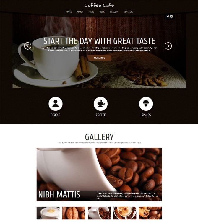
Black theme with contrasting white rounded icons is a perfect start for a site to share your love for coffee. Gallery, slider with images – this theme makes use of visual presentation to drive more people in.
* * *
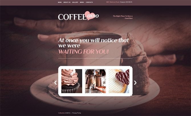
Choco chic – this is how the design you see invites you to try delicious desserts and coffee it presents. Try this Joomla theme to set up a site for café, restaurant, coffee shop or any other place of this kind.
* * *
To draw attention of your site visitors, try this design that will warm their hearts with ever nice coffee visuals.
* * *
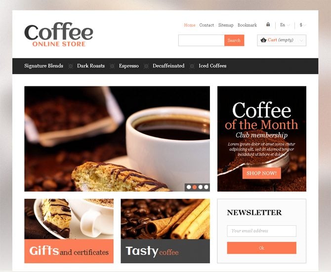
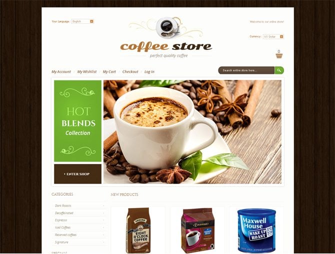
Clean, elegant, with light coral accents – this design is a stylish choice for bringing a coffee store online. Its well-organized content part and user-friendly navigation will make users’ work with your future site really comfortable.
* * *
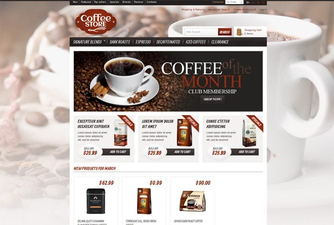
Nice discovery for coffee lovers – visually appealing design with blurred background images and decorative elements for coffee shop. By the way, if you're looking for an opportunity to launch your online business, address to Imcreator.com.
* * *
Tasty look of the next template is achieved with large background image, nice top slider and natural color scheme. To start or redesign online coffee shop, get this professional fully-responsive theme.
* * *
Brown wooden texture and vibrant green are most popular colors used in coffee shop designs. They create easy on the eye look and welcome more visitors in.
* * *
That's all for this time. Have a good day, my dear readers. Sip, savor, enjoy good coffee and your life 🙂
Don’t miss out these all-time favourites
- The best hosting for a WordPress website. Tap our link to get the best price on the market with 82% off. If HostPapa didn’t impress you check out other alternatives.
- Monthly SEO service and On-Page SEO - to increase your website organic traffic.
- Website Installation service - to get your template up and running within just 6 hours without hassle. No minute is wasted and the work is going.
- ONE Membership - to download unlimited number of WordPress themes, plugins, ppt and other products within one license. Since bigger is always better.
Get more to your email
Subscribe to our newsletter and access exclusive content and offers available only to MonsterPost subscribers.


Leave a Reply
You must be logged in to post a comment.