The Post Telling What Motion in Web Design Is
There is no need to explore difficult techniques to make a website attractive. For now it’s quite enough to be a skilled designer that knows his job well, because in this case you should know about such a tricky thing as motion in web design. Don't grasp much? Then, this post is exactly for you.
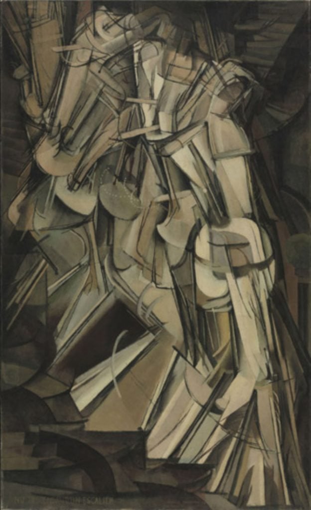
This method appeared in web design long ago, and it’s not really surprising since such expedients were well-known long before the internet and graphical user interface occurred: in classical design and visual art in general. It won't be amiss to outline Étienne-Jules Marey, who’s pioneering in photography revolved around the movement exploring. Of course, lately these experimentations resulted in intensive cinematography development. However, the artists never left the motion in permanent visual depiction – for example below you can watch the interesting painting of Marcel Duchamp, who abstractly showed the man going the stairs (according to the art critics). For me it’s very interesting to watch the evolution of motion and check the result in modern spheres of visual crafts.
So, let’s also become critics a bit – in web design arts - and determine a definition of the subject in this context:
Motion is an artistic mean, which creates the illusion of the depicted object moving.
In real life motion needs at least couple moments to take place. The difference of the subject in design excludes the duration aspect and gives an opportunity to perceive the motion as constant object, apart from the time dimension. The other point - motion in web design is just a 2D simulacrum of 3D reality. But who in our time of the internet virtuality would dare to state the imitation is 100% better than reality?

Inspired by Marey's photos, some artists saw the motion in such way. Marcel Duchamp - Nude Descending a Staircase
The diversity of ways for motion creating is undeniable. First of all, you can take a picture of an object moving. Rather similar way – you can paint it. Also the bunch of appropriate effects exists: shadowing, lighting, blurring, diming, using elliptical impress and contrast colors. Sometimes all the action is composed by Photoshop only.
* * *
Classification always grants with doubts...
...Because measuring needs focusing on certain features while totally ignoring the rest. Nevertheless, the needfulness of classification for novices is indisputable – a cognizant person’s point of view leads to development of the own understanding of a percipient. One important thing to remember: no sample of motion picture fits into any of the types completely. So, here's the classification of motion itself:
Direction

Gravity

Balance

All of aforementioned points can be improved with variety of methods. We shouldn’t forget about typography that's so inherent for web design: motion impression can be strengthened with the text, call-to-action and through imitating the concept on the image. The other great thing is depth effect – it qualitatively defines the object increasing the impression of action for the viewer.
* * *
And it’s not the end of the list. Anyway, the tips for creating motion in web design are not a topic of this post, so I must finish. But don’t worry – I’m going to write the sequel article that will provide with useful tuition and remarks regarding the techniques.
SPEAK UP!
Your commenting would speed up the release.
* * *
Image credits:
Abstract background by Shutterstock
Abstract retro color arrows background by Shutterstock
Abstract Background vector illustration by Shutterstock
Abstract background by Shutterstock
Don’t miss out these all-time favourites
- The best hosting for a WordPress website. Tap our link to get the best price on the market with 82% off. If HostPapa didn’t impress you check out other alternatives.
- Monthly SEO service and On-Page SEO - to increase your website organic traffic.
- Website Installation service - to get your template up and running within just 6 hours without hassle. No minute is wasted and the work is going.
- ONE Membership - to download unlimited number of WordPress themes, plugins, ppt and other products within one license. Since bigger is always better.
Get more to your email
Subscribe to our newsletter and access exclusive content and offers available only to MonsterPost subscribers.

Leave a Reply
You must be logged in to post a comment.