Very few components have a more crucial impact on your site UX than navigation choices. As UX describes the overall experience and satisfaction a user has when interacting with your website, try to make it easy for them to find the information they likely want to know.
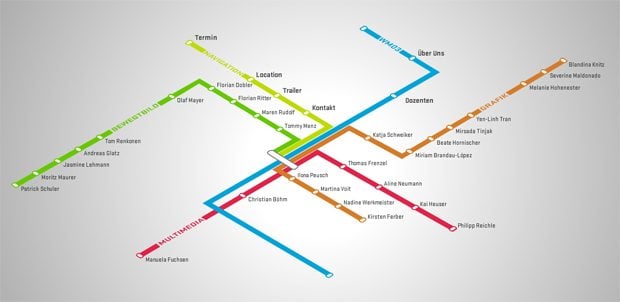
In the process of formulating website navigation system, utilize a navigation type that is most appropriate for your content, that supports users' behavior and enables them to seamlessly get to the key areas of your website. Often, site navigations fail because web designers don't realize they were designing for the wrong navigation type. Luckily, there is a huge number of other navigation approaches that could be more suitable to help people easily browse your site and retrieve information related to the site's topical content. Now we'll look into the usability concerns of the main navigation options.
- When you are working with a complex content, consider setting up a faceted navigation with multiple filters to get the desired and customized information. That is a great value of improving findability as it provides users with visible options for narrowing or refining their broad query to a smaller range of custom results.
* * *
- Sitemap approach can be the most search-engine friendly approach as it lets search engines find all the pages within your website. Resembling a menu tree with bullets in nested levels or organizational charts, this option allows users to link from every page of your site to every other page. You simply list all the sections in one place and this gives users a shorter path to the different areas of your website.
* * *
-
- For websites with large number of pages, you may as well incorporate index navigation approach. Such sorting system with alphabetical listing or chronological layout is being usually displayed a line down to simplify browsing the entire site’s list of topic pages.
- As for the search navigation option, it is very helpful for large websites and can solve the most complex navigation problems. Include search box on every page at the same location to enable visitors easily search within your website.
* * *
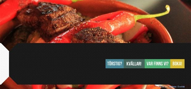
- Top horizontal bar navigation is used to place text/icon links and clearly separate them in one row. This navigation system is widely adopted because most views start out showing the top area, plus such option maximizes the horizontal space and provides simple and effective visual context of the site content structure. When paired with dropdown sub-navigation, the top horizontal bar navigation can hold more links and push essential content vertically downward.
* * *
-
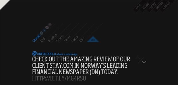
- You can also use vertical bars in text navigations for visual separating unrelated groups of links. Instead of dividing each navigation link, vertical bars put a strong emphasis on the related groupings marking them at the end.
- What about navigation pointer, which is an isosceles triangle that is center aligned with the text link, it is a good practice to use this tool when you need to offer the viewers clear visual feedback in the navigation. In addition, this technique gives an incredible amount of focus to help users see where they are.
* * *
- Provide a list of side-by-side links or wayfinding breadcrumbs that give users facilities for exploring the related areas and show the users where they are in the overall structure of the website. Such trail of small navigational links is useful if the website has a lot of categories and each category is few levels deep, plus it provides a quick way for the user to know what section this web page is in.
* * *
- Tabbed navigation also works well for top menus interface to improve design usability and findability. With active states, highlighted by color contrast, size, and font-weight, tab navigation clearly indicate current locations and prevent users from getting lost in large numbers of categories.
* * *
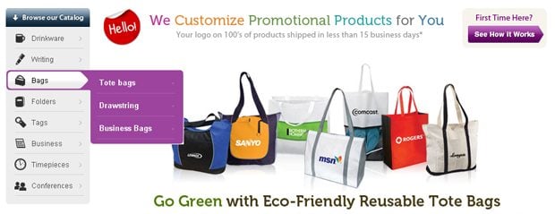
- Additionally, there is an inverted L navigation system, also referring to as L shaped configuration menus. Such approach implies that horizontal and vertical navigation are applied. Frequently, it is a list of main points, usually positioned horizontally at the top of the page, and when user clicks on one of these points the sub-points can be displayed in a vertical column.
* * *
- Another commonly used website main navigation technique is vertical navigation. Arranged in a single column, it is often found in the top-left side preceding the main content area. This option particularly works well with sites having more than a handful of main navigation links. Use this most versatile pattern in case you want to accommodate, visually group or cluster a long list of links.
* * *
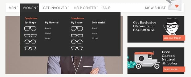
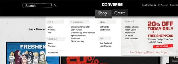
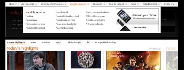
- Good UX navigation options are dropdowns and fly-outs, which is great for sites that have multiple levels of content hierarchy. This solutions work well with pages that do not offer a lot of page space; they trim down long menus that are overwhelming the screen space and get them displayed in a more organized rational fashion.
* * *
* * *
-
- If to decide between hover menus, which are deceptively meant to enhance site navigation and save space, and a menu that opens on click, better give preference to a click menu as it gives the user some navigation control and avoids them to accidentally close the menu or hover on something else while moving the cursor. However, type of trigger generally depends on the abilities of the typical users who interact with the website.
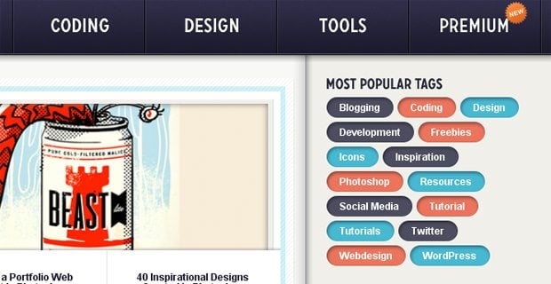
- For content-centered websites you can consider tag navigation with text links having varying sizes when arranged in a tag cloud to denote popularity. This solution is rarely seen as main website navigation, it can however enhance findability and site exploration. SO if you have plenty of topics, tag your content with keywords.
* * *
- Another option to enrich your navigation arsenal is named anchors. Basically, this is the type of links that take you directly to a spot on the current page or on another web page and thus access the information faster. It can be used primarily or as a supportive tool for the main navigation.
* * *
-
- Don’t forget about the skip navigation to help screen reader users and persons who can’t use a mouse to skip long lists of links, such as the primary navigation on a website. Simply make it a link right at the top of the page that if clicked allows the users to jump over the navigation links and position to the content section.
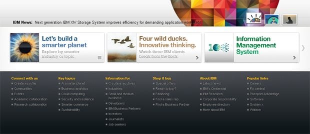
- If you need to have some kind of footer navigation, consider what would be useful to have there – text/icon links, navigation items that don’t fit within the main navigation, simplified site map of links. Placing navigation links in the bottom of the page helps visitors further locate the information on your site and functions as additional booster for main navigation.
* * *
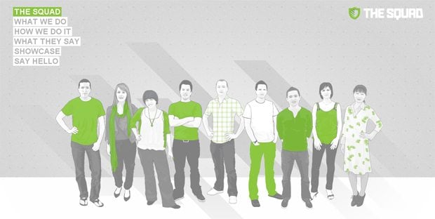
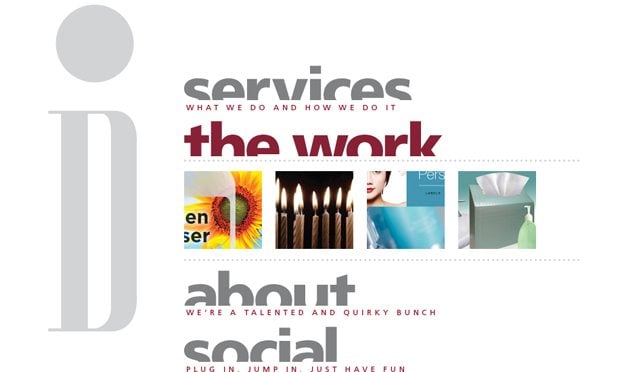
- One more option is minesweeping, when you show graphical elements that upon mouse-over reveal their meaning. In case your website is more visual or theme related, this solution works perfect attracting and stimulating the users to interact more with the site and explore the hidden content.
* * *
- Another variation is an accordion navigation, which can be achieved by using CSS3. With several buttons or labels being stacked upon one another, only one of them can be active and expanded to reveal the content associated with it. This lessens the information overload and, with multiple shortcutted sections in a single list, help users to make choice faster.
* * *
- What about doormat navigation, that is a clean and informative list of the main categories with the elements in the center of the home page. You simply divide your site into very few main sections and place the labels of each main section above a list of typically 4-8 sub-items of that section.
* * *
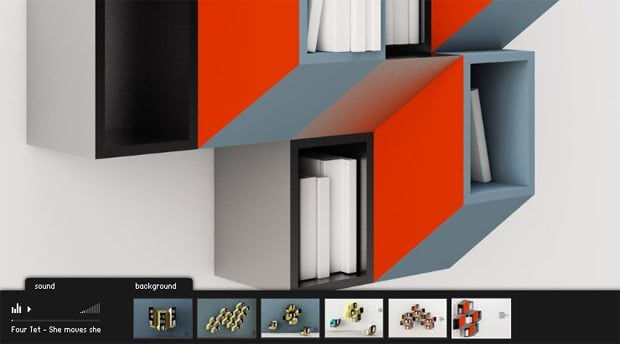
- The last in this list is retricable menu that can be beneficially applied if you want to save screen space and create a menu that can be put aside and easily retrieved again, remaining on the page when activated. This refers to some form of a liquid layout and can fabulously style the overall website content.
* * *
* * *
Whatever navigation style you opt for, remember that you should properly study the behavior of your website users – this is a main factor to define a perfect navigation formula.
Don’t miss out these all-time favourites
- The best hosting for a WordPress website. Tap our link to get the best price on the market with 82% off. If HostPapa didn’t impress you check out other alternatives.
- Monthly SEO service and On-Page SEO - to increase your website organic traffic.
- Website Installation service - to get your template up and running within just 6 hours without hassle. No minute is wasted and the work is going.
- ONE Membership - to download unlimited number of WordPress themes, plugins, ppt and other products within one license. Since bigger is always better.
Get more to your email
Subscribe to our newsletter and access exclusive content and offers available only to MonsterPost subscribers.






Leave a Reply
You must be logged in to post a comment.