Designers often don’t take time they should to learn basic psychological principles that will help them produce websites more usable for the visitors. As a rule they omit some valuable principles considering either unnecessary or to complicated, but in fact they are neither. Generally there are dozens of tricks and techniques to implement, but mostly they are straight-forward and can be applied to any eCommerce website.
Eventually these principles became more complexed what turned into the new trend in web design and marketing called Neuro Web Design.
How to explain web design fundamentals in public effectively? Use best ppt templates
.
This new methodology includes all previously implied concepts but now they are backed by fundamental scientific research provided by psychologists and marketologists and includes following stages: motivation, trust, decision-making, and neuro-marketing. When these methods are applied they create an incredible effect that allows to predict user' preferences on the stage when user, himself haven’t yet made a decision.
Psychology based approach can have a positive effect on your end result. Before you start, take your time and think about what your visitors want and how they want to get it. When you catch the idea you’ll be ready to get on the right track to creating a site that will tap into the psychological drives of your target audience. Considering the visitor psychology you are likely have lots of happier visitors that will perform actions you wanted them to (get in touch with you, buy your product, refer their friends to your resource). Now let’s have a closer look at these stages.
Motivation
There are numerous methods used for user motivation but the most productive are the following:
- Call-to-action buttons – make your visitor do some action, that can be adding a product to the shopping cart, downloading something, requesting information, or just about anything else.

- Good copy – text is the most important part of your resource along with visual presentations. Carefully written texts always help to answer the "whys" and the "hows", when illustrated with corresponding graphics the whole presentation works way more effectively. (Make sure your images fit the text).
- Freebies or low-cost goodies – users are fond of getting some useful things for free or for a hay. Do not forget to notify your users about the pricing.
- Social Medias – the best possible way to motivate your users. Add reviews, comments, testimonials of those who already used your products. Comments of satisfied customers may help change mind sets of those who are still in doubt.
- Sign-up process – long form is what creates user’s frustration, make sure your forms indicate number of steps they are going through, this helps to improve the ease of using the form.
- Color presentation – one of the most complicated approaches to the motivation of user. Unfortunately all people react differently to various color schemes. That is why it can be really hard to choose major colors for your web resource. Make sure the colors you pick reinforce your message and the image you want to portray.
Building Trust

Decision-making Process

- The New Brain is logical and it makes deductions based on facts and data. It shares what it has discovered with other two parts.
- The Middle Brain is an emotional center. It processes intuitions and feelings, and then, it shares its discoveries.
The Reptilian part is an ultimate decision-maker. There are four steps you can use to convince this decision-maker to make a sale.
1. Diagnose the pain – Reptilian part “wants” to avoid pain at all costs, show how your product will help cure its pain and frustrations;
2. Differentiate your claims – you need a hook that shows how your product stands apart from others, create a real contrast to help the Reptilian part see you as special and decide in your favor;
3. Show benefits – show it the gain it will get from choosing your product, you need to demonstrate concrete evidence of your benefits using simple and easy to understand messages;
4. Deliver your message – to complete your effective sales technique, your messages and presentations should be filled with visual stimuli and emotions that grab the attention of the Reptilian part and cause it make a buying decision in your favor.
Neuro-marketing Concepts

Neuro-marketing study provided marketers with a secret weapon that is focused on making websites more engaging. Some of these tips can be familiar to most of us, but when used together, these tips will be your weapon of mass attraction.
1. Too many choices – if people have too many choices they will not choose at all, that is strange but it's the fact, the wider the range of products is - the more time user needs to choose the one (you can try to reduce the amount of similar products);
2. Social validation – reviews and testimonials, users consider reviews of other customers more important than those submitted by the experts, or provided by the website specialists (try to engage your customers in submitting reviews considering the products they've acquired);
3. Scarcity principle – if something is unavailable it is considered to be more valuable;
4. Food, sex and danger – powerful triggers for action (feel free to use but not overuse);
5. Power of faces – fusiform facial area, part of a brain that makes us focus on the faces of people, when using pictures of people make sure they look right;
6. Story – information that is presented in a form of a story is processed better, you can personalize your fact presentation with your own thoughts if it is appropriate (this will be effective when presenting video reviews of the products you offer);
7. Commitment – by asking small commitments you will get more loyal customers after some time, similar to social validation.
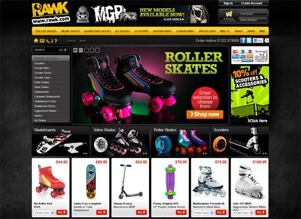
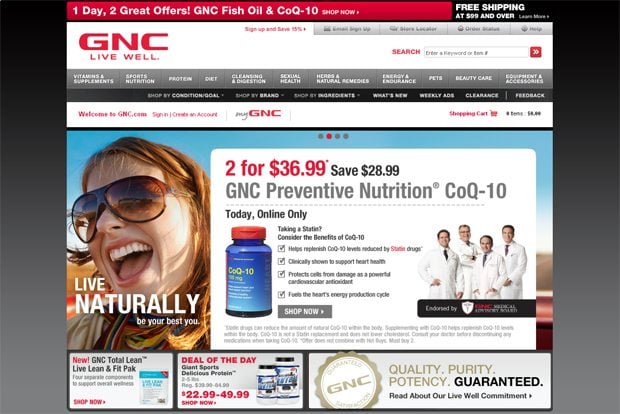
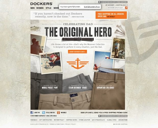
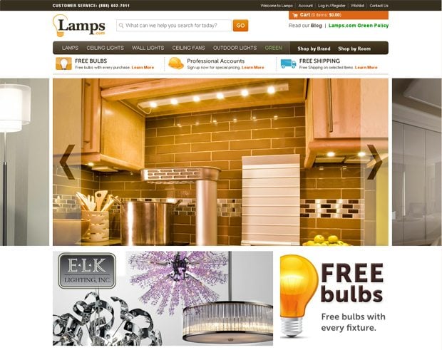
Some examples of eCommerce websites that successfully use tips mentioned above:
***
Rawk.com
***
Gnc.com
***
***
Conclusion
Using the pieces of advice given in this article you’ll be able improve usability of your web resource thus improving user response. If you use the tips reasonable you'l be able to achieve extremely high conversion rate and you’ll get a handle on the best way to present design and content that entices visitors and helps generate business to your company. One thing needs to be pointed out these tips won’t be helpful if you don’t have a solid product or service to begin with, so get that down first. The rest will only serve to deliver it to the consumers successfully.
Don’t miss out these all-time favourites
- The best hosting for a WordPress website. Tap our link to get the best price on the market with 82% off. If HostPapa didn’t impress you check out other alternatives.
- Monthly SEO service and On-Page SEO - to increase your website organic traffic.
- Website Installation service - to get your template up and running within just 6 hours without hassle. No minute is wasted and the work is going.
- ONE Membership - to download unlimited number of WordPress themes, plugins, ppt and other products within one license. Since bigger is always better.
Get more to your email
Subscribe to our newsletter and access exclusive content and offers available only to MonsterPost subscribers.


Leave a Reply
You must be logged in to post a comment.