The Way You Scroll It. One Page Website Designs
What about some casual Friday post, not overloaded with plenty of crossword words and unintelligible terms? Let’s start this day with something inspirational that will make you ready for your great work. What should it be? One Page Website Designs seems to be a good spoon of inspiration that you are welcome to try. What is special about them? This is the wow factor that consists of interactivity and usability in one place.
These sites show a good example of thought-out arrangement of all content in one place, instead of using a number of subpages. The less is better – this is how one page design can be described.
What is the most pleasant about these sites, is the way you interact with them. Here you’ll not find the usual navigation bar, but a variety of options that allow you to move around the site. Everything is intuitive, and it makes the journey around a captivating one. Smooth downward/ upward and left/right scrolling is not everything you can expect from them. Within one page designs you’ll find vibrant parallax scrolling images, hide/show panels, sliding navigation bars, cool hover animation and much more. It was tricky to find the most original examples of One Page Website Design, but at last here they are. This approach to designing sites seems to be the efficient one, don’t you think so?
***
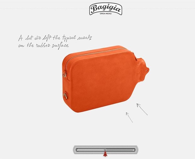
bagigia.com
The zipper at the bottom and the dots at the right sidebar act as the same elements of the slider that help to navigate through the site. The dots are linked to particular elements of site, and you can choose them randomly, while zipper helps to scroll them from A-Z.
***
***
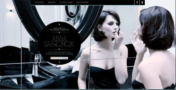
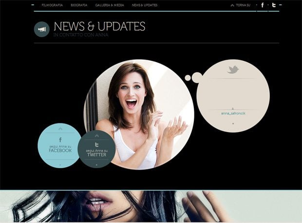
annasafroncik.it
You will certainly like this one page elegant fully responsive website with smooth and effortless scrolling. Browse menu in its header to see cool hover effect. By hovering the mouse over the pictures in the gallery section, there appears a label linked with a certain part of this gallery.
***
***
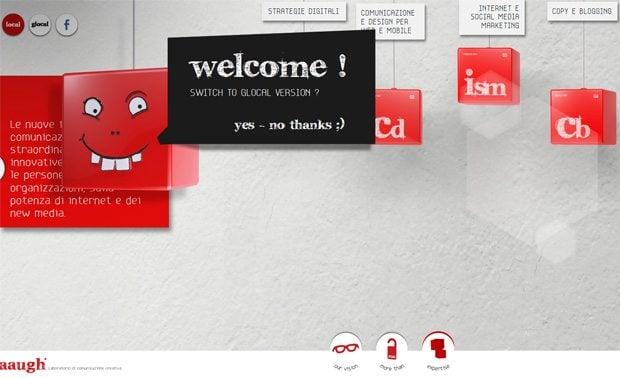
aaugh.it
What interesting can you find here? Horizontal panel scroll is the way you move around the site which is decorated with eye-candy CSS3 animation. In the bottom there are 3 so-called navigation anchors that help to shift to the desired part of the site.
***
***
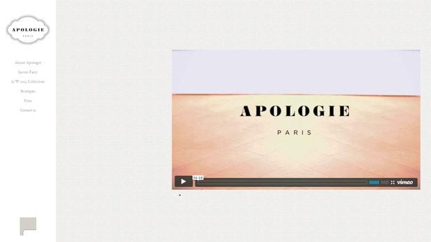
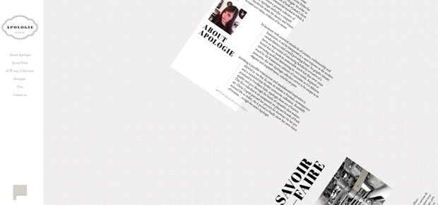
apologie-paris.com
At a first look, it’s easy to eyes site in clear style with the fixed navigation menu in the left sidebar. The wonders start with the smooth scrolling, and you see what happens with the content part. It rolls slowly while you scroll, then comes a fixed block of information and this cool rolling again.
***
***
beetle.com
The intro of this site shows the historical views of the beetle. The second level of is marked with parallax technology that creates the effect of moving car, nevertheless its position is still. Progress bar in the bottom shows the process of the revival of classic model into the new and powerful one. The next level of the site allows to look into interior of this car using the effective slideshow. While scrolling down you learn the latest news about beetle.
***
***
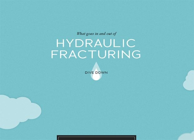
dangersoffracking.com
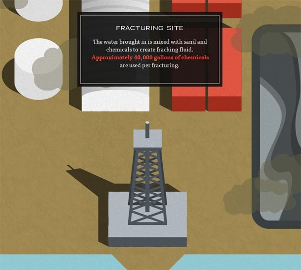
Those of you who are really fond of infographics would find dangersoffracking.com website really amazing. Turn you scroll wheel to see how water drop starts “moving down the page”. The droplet is static, but the scenery moves about it making sort of a movie. Depending upon the scene, there will appear various text blocks that describe things around.
***
***
francescobertelli.com
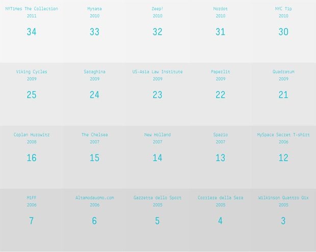
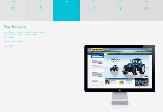
This stylish calendar features grid-based layout with cool hover animation of each item. When you choose the one, its changes its colors into the vibrant blue. To reveal hidden content you should click the item and the information will appear in the drop-down block.
***
***
inception-explained.com
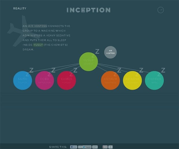
Browse this site to find out the clue to the riddle of the same name movie. The first you see is the fixed header in the top and several colored points below. The navigation is based on vertical scroll (you just click and scroll the colored points), and is spiced with original animation effects, pop-up informational blocks.
***
***
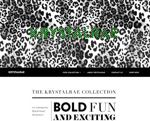
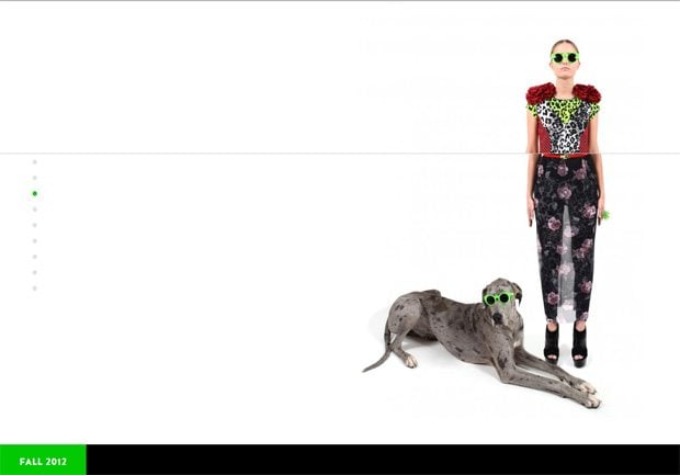
krystalrae.com
To move around the site you just scroll down, and look the way background images fade one into another. The cool element is waiting for you when you have scrolled a half of the site, and it’s the girl that changes her outfits from the latest designer’s collection. You scroll and see what happens to her.
***
***
mandoch.com
What you'll see in the top right corner of this site slightly reminds some figures from the Tetris game. All you need to do is to press separate squares to go to various parts of the page, also you can use your navigation buttons on the keyboard to stroll around mandoch.com.
***
***
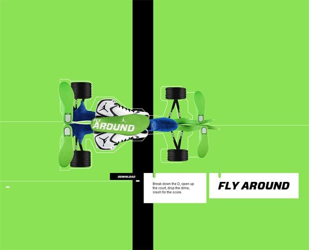
nike.com
Have you seen how parts of snickers turn into jet, or a tank? If no, check out the Nike website. Scrolling down the website you’ll see how various parts of these snickers combine into pure athletic wear masterpiece. By turning your scroll wheel you’ll feel invisible small hands softy turning the boot on your screen. The effect is truly amazing.
***
***
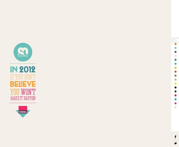
soleilnoir.net
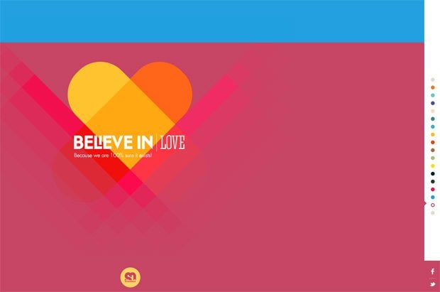
My favorite site from this collection, because I do believe in love, modern technologies and the power and inspiration that they bring into our life. You can use either the navigation panel in its right sidebar, or scroll down to see the sections of the site overlap each other. Each part goes with inspirational slogans and cool interactive elements.
***
Don’t miss out these all-time favourites
- The best hosting for a WordPress website. Tap our link to get the best price on the market with 82% off. If HostPapa didn’t impress you check out other alternatives.
- Monthly SEO service and On-Page SEO - to increase your website organic traffic.
- Website Installation service - to get your template up and running within just 6 hours without hassle. No minute is wasted and the work is going.
- ONE Membership - to download unlimited number of WordPress themes, plugins, ppt and other products within one license. Since bigger is always better.
Get more to your email
Subscribe to our newsletter and access exclusive content and offers available only to MonsterPost subscribers.








Leave a Reply
You must be logged in to post a comment.