Outline Design – Balancing Between Flat & Minimal
Web design is impossible without sketches, drafts, prototypes and outlines. On the stage of development they help the designer imagine and represent the concept before it comes to life, try different styles and approaches, play with shapes of elements and the like.
Each design is born in mind first, then it can be put on paper, and only after that on a computer screen. The order is not rigorous, as you understand, because each professional has unique methods of creating things.
Outline design - the definition
Back to outlines. Did you notice that sometimes authors leave outline elements as they are on live websites? Outline design implies sketches, depicting the outer edges of an object or element without any interior details or shading.
But what effect is aimed to be reached by these schematic elements placed together with the ones carefully drawn to minor details?
For me personally, it's like reading a book with complicated psychological plot. You are led by the author through all those numerous pages and jumble character lines, and when the end seems so close, you understand that there is no expected legible dot on the last page. The author leaves some fascinating mind work to you. You become a kind of co-author of the story as your imagination starts to invent various endings. They may be happy or mournful, depending on the impression, made on you by the book.
Some thoughts on the technique...
In web development, the outline technique is frequently used in logo design. It’s a good solution for brand identity as such logo is easy to memorize, it looks good in different colors and is always clearly readable, if properly drawn, of course.
In this post you will see a collection of live websites and templates, applying the outline design technique to various website elements, not only logos. Viewing them all, you will either agree or disagree with my standpoint on the matter.
The outline elements may help bring some style, singularity and diversity to a website. They work similar to white space, creating a kind of color gap, drawing visitor’s attention to the important content.
Outline design in general is a borderland between minimal and flat design, possessing the best features of both.
Outline designs are airy, clean, unobtrusive, uncluttered and extremely functional. Clear hierarchy and accuracy of lines should also be admitted as well. Outline design can be considered another step moving us away from the outdated skeuomorphism to advanced futuristic next generation interfaces.
Just like those stories with no clear ending, they bring some intrigue and uncertainty you nearly die to find out. Strong users’ interest is always beneficial for the website and outline design elements definitely help to stir it.
* * *
Live websites
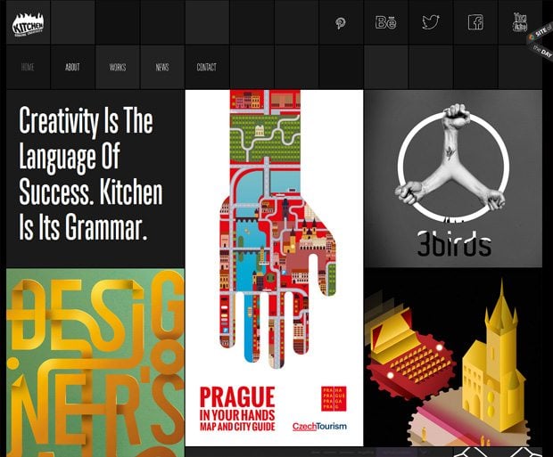
Kitchen
* * *
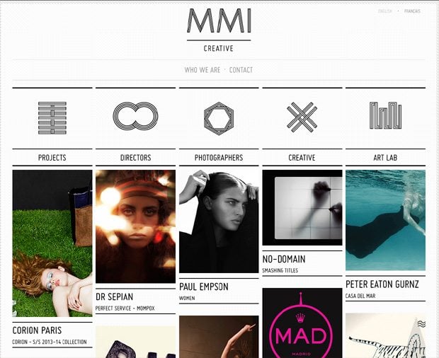
MMI Creative
* * *
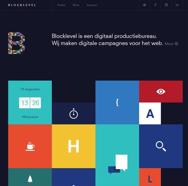
Block Level
* * *
* * *
* * *
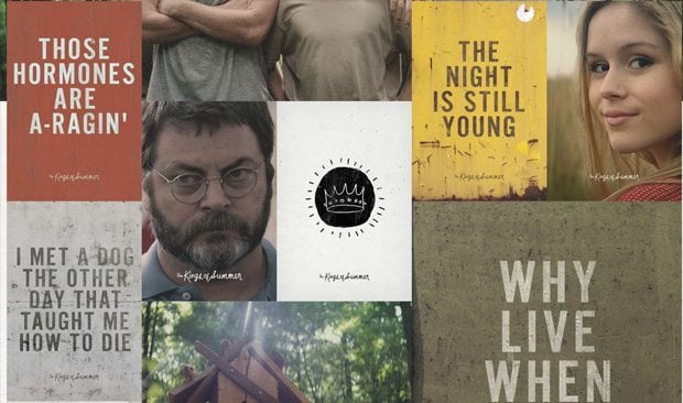
The Kings of Summer
* * *
* * *
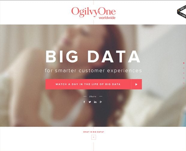
Ogilvy One
* * *
* * *
* * *
* * *
* * *
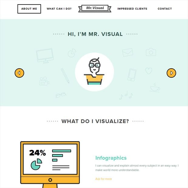
Mr. Visual
* * *
* * *
Website Templates
T-Shirt Responsive Jigoshop Theme
* * *
Photography Responsive WordPress Theme
* * *
Business Co Cherry WordPress Theme
* * *
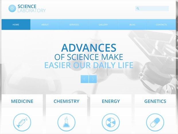
Science Bootstrap Drupal Template
* * *
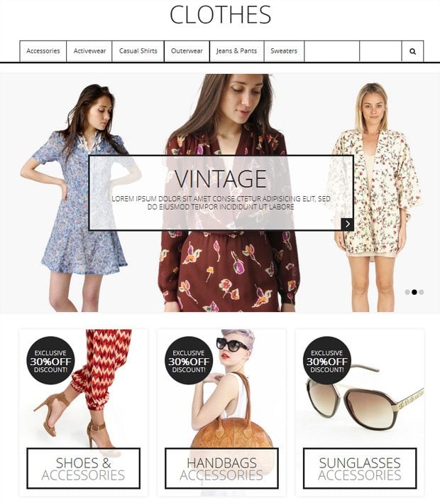
Clothes Responsive Magento Theme
* * *
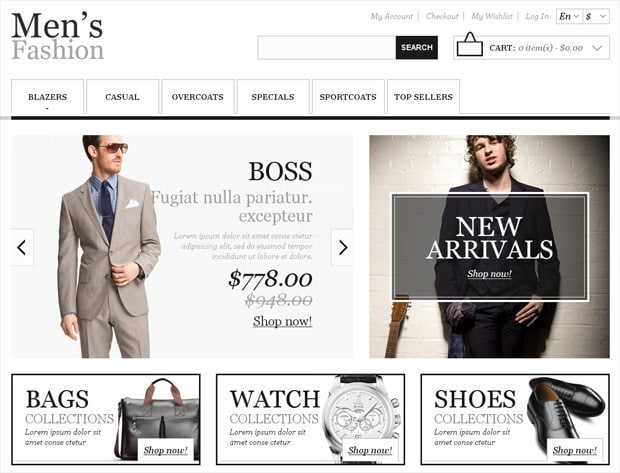
Men's Fashion Responsive Magento Theme
* * *
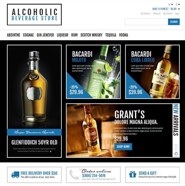
Beverage Store Responsive Magento Theme
* * *
Taxi Services Joomla Template
* * *
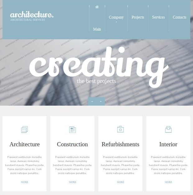
Architecture Responsive Website Template
* * *
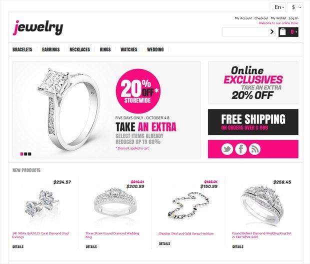
Jewelry Responsive Magento Theme
* * *
Guys, do you apply outline elements in your design practice? What do you think of their purpose? Is there anything beyond the aesthetic ornamental appeal? Can outline design be considered a current trend? Your thoughts are very important for us.
Don’t miss out these all-time favourites
- The best hosting for a WordPress website. Tap our link to get the best price on the market with 82% off. If HostPapa didn’t impress you check out other alternatives.
- Monthly SEO service and On-Page SEO - to increase your website organic traffic.
- Website Installation service - to get your template up and running within just 6 hours without hassle. No minute is wasted and the work is going.
- ONE Membership - to download unlimited number of WordPress themes, plugins, ppt and other products within one license. Since bigger is always better.
Get more to your email
Subscribe to our newsletter and access exclusive content and offers available only to MonsterPost subscribers.



Leave a Reply
You must be logged in to post a comment.