6 Powerful Design Tips To Prevent Shopping Cart Abandonment
No matter how much you’ve spent on marketing to improve your web traffic, without conversion, your website won’t earn enough to survive long term. Conversions are visitors who take a specific action you want when they visit your site. For online retailers, conversions are customers who successfully transacted and bought an item from their store.
When you start looking at conversion rates, it becomes clear where the root of the problem lies. Most e-commerce websites today fail to have high conversion rates because of the prevalence of shopping cart abandonment. There are many causes of abandoned carts including consumer behavior and competition. But what we’re going to focus today is the issue of bad web design.
According to conversion expert, Bryan Eisenberg, there are actually three kinds of design form problems.
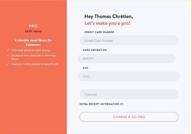
- Design forms that fail to reduce fear. These are forms that ask more information than required and may even ask sensitive information that makes buyers uncomfortable.
- Designs forms that fail to build trust and credibility. These are forms that fail to ensure users that they are in a secure browser environment.
- Design forms that fail to reinforce benefits. These are forms that fail to remind visitors benefit in exchange for information.
With this in mind, here are some tips to help improve your conversion rate and avoid cart abandonment:
Refine Your Registration Process

What makes people abandon shopping carts prematurely? According to experts, sometimes, the problem isn’t the shopping cart itself but the registration process which frustrates customers and compels them to leave.
Many e-commerce sites today don’t pay attention to studying consumer behavior. They fail to see how simple processes like registration impacts their consumers' decisions. Consumers can abandon the purchase because of many reasons. It could be because the registration requires customers to give out too many personal details or because they see unnecessary steps that force them to quit the process early on. Sometimes, customers also abandon cart because they can’t understand where to proceed from the page.
That would explain why they abandon shopping carts before they even get to check out. As a designer, it’s your job to make this step easy for buyers. A good option would be to ask users to register an account after the sale.
Avoid Content-Rich Checkout Pages

When you want your buyers to check out, you don’t want them to get distracted during the process of purchasing. I’ve seen e-commerce sites that crowd the checkout page with advertisements and irrelevant content, and that’s just a big turn-off.
Check out pages should be ridden of almost all kinds of feeds, attention diverting promos or anything that would force consumers to abandon the page. Instead, include a progress indicator on the checkout pages and add striking checkout buttons on the top and bottom of the page. This helps customers understand the checkout process and eliminates all ambiguity for a clearer and faster transaction.
To sum it up, don’t clutter your checkout page with unnecessary content. Keep it simple, clear, and focused on the checkout process. By doing this, you can direct user’s attention towards completing the purchase.
Simplify Navigation

According to a survey by Ripen eCommerce, 24% of shoppers abandon their shopping cart because they felt that the site’s navigation was too complicated. You have to understand that not all customers know their way around your site.
Navigation should be simple so it’s best not to include clutter in between pages. Customers especially, non-techy, beginners may find e-commerce websites hard to navigate. Perhaps they failed to see a “continue shopping button” which forced them to quit the checkout process. Or they encounter multi-page checkouts that are installed with additional forms that are clearly unnecessary. Add this with the lack of proper help options and lack of cart review, potential buyers will feel lost whenever purchasing on your site.
This is where a feature such as “Express Checkout” becomes necessary. With this, buyers can view their cart items and immediately check out to complete the purchase. Designers can also make use of a readily viewable cart that shows items currently on the user’s shopping cart or a simple thumbnail of products throughout the checkout process. This will make it easier for buyers to add or remove items
Allow Cart Saving or Wishlists

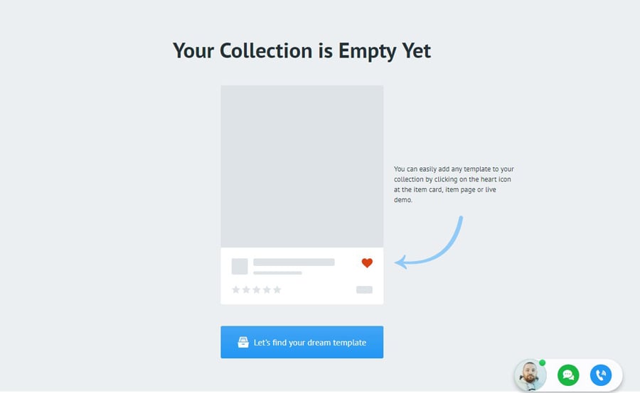
People sometimes use shopping carts as their wish lists. Keep them from doing this by including a save cart option or a wish list for easy browsing. Keep in mind that not everyone who visits e-commerce sites is determined to buy something, encourage users to include items in their wish list if they’re simply window shopping.
Improve Security

Credit card frauds and hacking incidents are not to be taken lightly. Consumers have the right to be worried about sharing personal information online. In fact, concerns about security payment are one of the biggest reasons for cart abandonment. Virus from email and websites can be used by hackers to get into shoppers accounts and computer system.
Give your consumers some peace of mind by showing them that payment made is secure. Aside from implementing SSL encryption for credit card payment processing, you should also display badges, credit card logos, and security seals that will assure buyers they have nothing to worry about.
Offer Multiple Payment Options

It’s also important that you allow an extensive list of payment options. Include a variety of credit cards and online payment services such as PayPal, Skrill or Google Wallet.
Offering lots of payment options helps potential customers finish their purchase without any more hassle. It may be an additional fee on your part but it’s going to be a real help for your consumers. And that’s the key to keep them coming back.
Conclusion
Not every item that goes into the shopping cart is a guaranteed purchase. And sometimes even the best shopping carts can’t help you overcome problems on cart abandonment.
However, when you focus on your site design and create an intuitive layout that works for your consumers, you can prevent shopping cart abandonment and increase sales in the long run.

Get more to your email
Subscribe to our newsletter and access exclusive content and offers available only to MonsterPost subscribers.

Leave a Reply
You must be logged in to post a comment.