Make Every Number Count or Psychology of Numbers in Web Design
How do you feel about the implementation of numbers in web design? Do you have your favorite digit? Does its implementation in your creative projects bring you luck? In this blog post we offer you an opportunity to dig deeper into the psychology of numbers in web design and find out what effect digits can have on your audience.
You don't have to be a mathematician to have a feel for numbers.
John Forbes Nash, Jr.
Numbers are known as the universal form of language. Based on history, the number-letter relationship has been passed down through generations, delivering religious, superstitious, mythical and mathematical significance.
The way we understand numbers at a subconscious level is not as rational as you might think. For many years a human being was considered to be a rational creation who weighed every action. Now, with the development of behavioral economics, we may safely assume that humans rely heavily on emotions and reflex when it comes to decision-making.
[tweet_box]Humans heavily rely on #emotions and #reflex when it comes to decision-making.[/tweet_box]To a great extent, this deals with the psychology of numbers. Web design is a field that the aforementioned notions simply cannot evade. Before we plunge deeper into the mysterious world of psychology, let's start with one simple and popular example.

Is the glass half full or half empty? This is one of the most popular web design techniques, better known as the framing effect. This is all about the way different people see and understand the same things.
For example, take a glass filled with water. An optimist will say that it's half full, whereas a pessimist will insist that it's half empty. How else might the same object be characterized?
Some will say that the amount of water left in the glass makes up 1/20 of the daily norm of water that an adult person should consume. Others will say that it contains 8 ounces, while someone else will claim that its density makes up 999.97 kg/m³. As you see, opinions differ. A similar situation will occur with different elements of web design, and numbers play a significant role in creating an impact on the web audience.
Gendered Numbers
Have you ever thought that numbers can be gender-specific? Though it may sound somewhat funny or even ridiculous, numbers are divided into feminine and masculine. If we dig into the history, we will find out that such differentiation has existed since the times of ancient Sumerians.
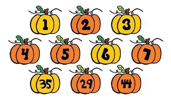
Research shows that this particular group of people invented the numerical system, in which they used words for the number one and two, which equaled a man and a woman respectively. This is the time when odd numbers like 1, 3, 5, 7, etc. started to be associated with masculine qualities, whilst the even numbers, like 2, 4, 6, 8, etc. were meant to reveal feminine characteristics.
As the time passed, scientists decided to dig deeper into an investigation of this aspect of numerology. As part of their experiment, psychologists Galen Bodenhausen and James Wilkie placed odd and even numbers next to ambiguous elements, and asked people to ignore the digits and focus solely on the names and faces of the newborn kids. As a result, people just couldn't avoid the digits and claimed that the faces paired with the odd numbers looked more masculine than the ones placed with the even digits.
Such knowledge can be applied to web design as well. For example, if you want your site to look more powerful and authoritative in the eyes of your site visitors, make use of the odd numbers. At the same time, for a softer and more visually pleasing effect, try to use even digits.
Psychology of numbers: pricing in eCommerce
No matter whether you are a business owner or just an online shopper, knowing some facts and the basic tricks of the psychology of pricing is indispensable in the modern world. In fact, there are four key strategies that are being actively used in eCommerce today. Let's review each of them in detail.
- First comes Charm Pricing. As the name implies, marketers make use of this technique in order to "charm" buyers with lucrative offers. As a rule, such products feature 9s in their price tags. According to the study of MIT and the University of Chicago, items ending with $9 generated 24% more sales. Also, adding $9 to the price tag of new items increased the demand for the latter more than for the items that were previously on offer. And finally, using number 9 when pricing products that people have little to no knowledge about results in a greater demand for "new arrivals".
- Anchor pricing. This is the technique that is being widely used by web marketers during sales and promo campaigns. Just consider the following situation: you are a customer returning to an online shop selling fashion and beauty products. From time to time they initiate promo campaigns offering you opportunities to purchase items that you couldn't afford previously, but at a lower price (e.g. $20 instead of $65). At the same time, they list the discounted price next to the original cost so that you will subconsciously be captivated by the more advantageous offer. Anchor pricing is closely connected to charm pricing, since placing 9s at the end of the discounted price tag has a greater effect on the buyer.
- When implementing the tiered pricing technique, retailers put several products at different price points next to each other, thus making certain items seem like great deals. Apple implemented this trick when they released the $349 Sport watches. At first, the price seemed to be too artificially high and the offer didn't provoke great demand among the targeted audience. However, after the company introduced the $10,000+ Apple Watch Edition, investing several hundred bucks in the former seemed like a lucrative deal, and the sales started to increase.
- Limited time offers. You will hardly ever come across a lifelong discount code. As a rule all offers of this kind have expiration dates. What's the purpose of doing so? Subconsciously, every user understands that if he/she doesn't get to your site within the set time period, chances are that they will miss the opportunity to acquire the item about which they were dreaming for so long, at a more affordable price. Limited time offers create a sense of urgency and motivate online shoppers to make quick purchases.
Mystery of the most popular numbers uncovered
Here comes my favorite part. I guess it's almost possible to find a person on Earth who doesn't have a favorite number that bears some mythical characteristic. That's why I have decided to pick the most popular numbers that are of the greatest importance for millions of people worldwide. But for their superstitious and mythical value, these play a significant role in web design as well.
[tweet_box]Popular numbers #demistified >> #numerology #ilovenumbers
[/tweet_box]Seven. Without any doubt, this is the most popular number in many religions, nations and even ages. This is the number that was named more often than any other as part of Bello's favorite number survey. Three and eight ranked second and third, respectively. Together with "nine", "seven" is a very symbolic and significant number for many religions. God rested on the 7th day after the creation, the Bible names 7 deadly sins, Islam counts 7 heavens, etc. Just remember Agent 007! Isn't the number "seven" significant in this case? 😉
In terms of web design, if you want to add mystery and extra significance to your web project, then using "seven" in any of the elements of its design will be a clever move.
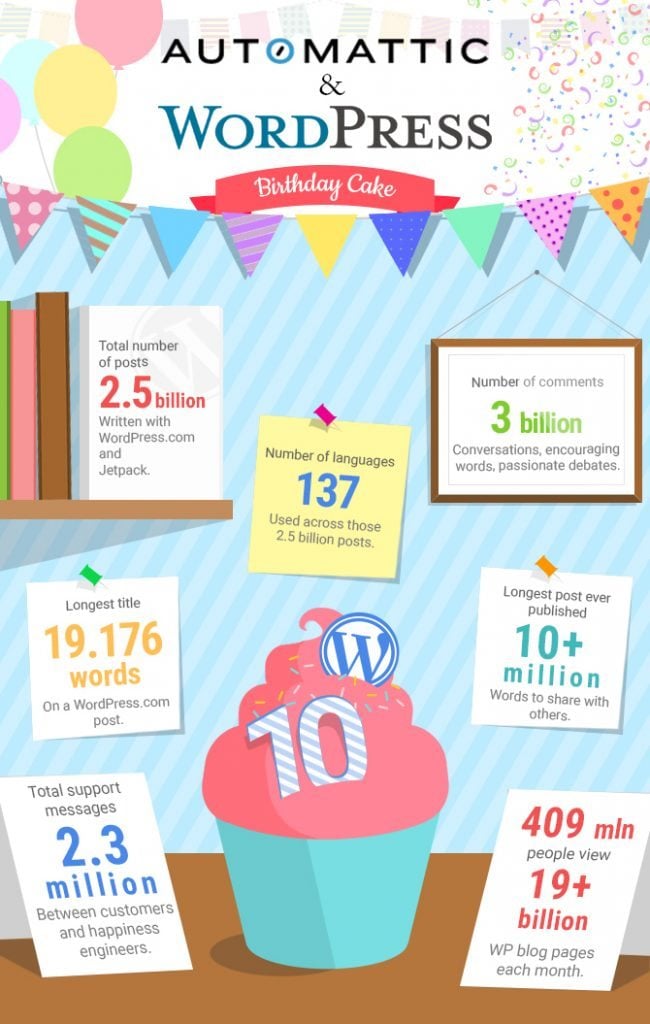
Ten. This is one of the preferred numbers used in charts, compilations, tutorials, etc. Though many think that the number "ten" is somewhat emotionless, it is still rational and well-ordered. So, if you need to achieve an impact with your designs, then go ahead and present data with the digit 10 on the top. For example, have a look at this 10 Years of WordPress Infographic.
Numbers below twenty. If you want to evoke users' curiosity and make them visit your site, read your blog post, etc. then make use of numbers that run from 1 through 20. Everything that starts with 20+ sounds too complicated and time-consuming. As part of the experiment initiated by King and Janiszewski, the respondents who took part in the survey said that they gave preferences to numbers from 1 to 20 (75%) rather than any other variation.
Another interesting discovery - numbers accompanied by images have a stronger appeal to the audience. As part of the recent Cornell research, people reacted to numbers illustrated with charts much better than to the pure texts.
As part of their experiment, they shared a success story of one large pharmacology company about the effectiveness of a medicine intended to boost people's immune system. Only 68% of readers believed that the drug really helped people. Next, when they enhanced the same information with visuals and charts, the number grew up to 97%. In that way, numbers enhanced with visuals have a more persuasive effect on the audience.
Summing up everything that was said above we'd like to conclude that understanding the psychological effect of numbers is one of the indispensable components of your design success. While making use of the framing methods and accompanying numbers with images you will make numerical information look more meaningful and trustworthy to your audience.
***
Have any thoughts on any other techniques of presenting numerical data more effectively? Do you know some other interesting facts about the psychological effect of numbers on web users? As always, we would highly appreciate your sharing your thoughts and experience with us below this post.
Don’t miss out these all-time favourites
- The best hosting for a WordPress website. Tap our link to get the best price on the market with 82% off. If HostPapa didn’t impress you check out other alternatives.
- Monthly SEO service and On-Page SEO - to increase your website organic traffic.
- Website Installation service - to get your template up and running within just 6 hours without hassle. No minute is wasted and the work is going.
- ONE Membership - to download unlimited number of WordPress themes, plugins, ppt and other products within one license. Since bigger is always better.
Get more to your email
Subscribe to our newsletter and access exclusive content and offers available only to MonsterPost subscribers.


Leave a Reply
You must be logged in to post a comment.