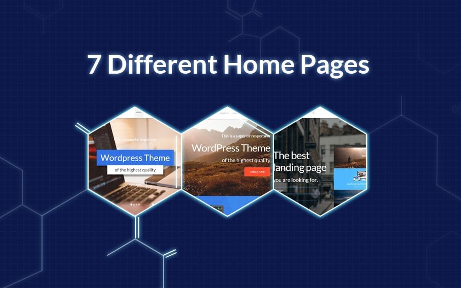
We'd like to start a series of blog posts describing ten reasons why Monstroid WordPress theme is the best option for your website. The first reason we'd like to talk about is the Monstroid's home pages.
As you know Monstroid contains 7 home pages, each of them is styled to fit specific requirements.
The first home page is Home Business.
- This page is tailor made to fit most businesses, there you will find a Moto Slider in the head of the page.
- This slider is being followed by the block with a short about us info. further you can find two blocks where you can display your unique features or UVPs.
- A little bit lower you can find a nicely-styled call-to-action block.
- In case your company has a long history you can showcase your projects in a portfolio that has a number of stylistic options.
- This page has a number of blocks that are looking really awesome like this one with counters.
- To help your client meet your team you can benefit from the Team section.
- Almost in the footer you can find the block with your clients logos and social media section.
See the demo to check out this page.
Next one is a Home Parallax
Most blocks of this page contain parallax effect, it gives an additional depth effect thus highly improves visual presentation of the content.
- Due to amazing photo on the background About Us section was given an extra portion of dramatism.
To experience this amazing parallax effect see the demo.
The third page is Home Video
It's styled to fit those websites where video content is given the primary role.
- The whole header with a looping video, at the bottom of the video there you can find playback controls to start or stop the playback.
- Portfolio section of this page is styled to fit in videos you've created.
Page number four is Home Personal
This page has all the features needed for a personal portfolio or a presentation website.
- The slider in the header may contain the info about site's owner. See how it's presented here.
- Also this page features sections like portfolio, services and offers that will fit personal website of a developer or designer.
Page number five - Home One Page
- The only blocks that make it special are Testimonials + Customer's logos sections.
- At the bottom of the page you can find the Contact Us form.
Page number six - Home Landing
The name of this page speaks for itself. It's designed following the best traditions of landing pages. Here you can find some outstanding sections:
- In the header of this page you can find the sign-up form where your customers can subscribe to the product launch or buy it via pre-order.
- Another great thing is a call-to-action section
- An important thing for every landing page is Our Prices section, see how it's presented here:
And the last page - Home Blog
- The header is covered by the Moto Slider and all the rest page' space is given to the blog posts. Within Monstroid theme you can choose among number of blog layouts to present your posts in the best possible way.
That's it for now. Next time we're going to tell you about the Reason #2. Stay tuned.
