Responsive Email Design: Tutorials + Free Templates
If you are running your business on Internet, for a continuous and sustained success you need to attract customers to your website. These days, much attention is paid to SEO and attempts to gain new visitors, but there is another side: how to get a returning customer.
E-mail newsletter is an excellent opportunity to tell visitors about your reasons why they should return to you. Even if you are not using e-mail newsletters, it’s likely that sooner or later, you will find clients willing to get emails from you.
As you know e-mail is one of the oldest (or anyhow you call it) forms of communication in the Internet. Actually it's one of the few communication means that did not change much, because email had a number of functions it did perfectly thus it did not require additional steps.
Just as most web designers take a design-first approach to their projects, we’re going to uncover the design side of creating mobile-optimized email newsletters. This will help you make informed decisions when planning an email newsletter.
So, here is the list of things we've prepared for you. Click the items in the list to hop on to the most interesting info.
Newsletter Desing Tutorials
These tuts will help you to figure out the essentials of responsive newsletter design.
Responsive Email Newsletter Design
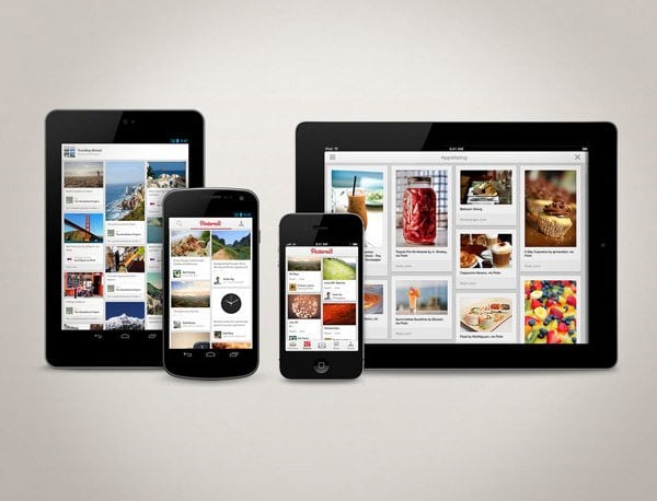
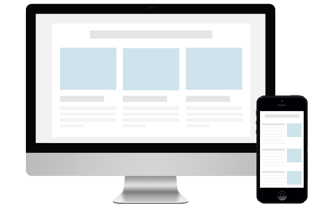
Lots of people read emails from their smartphones – in the car, train or even airplane. Due to our fast pace of living we try to do as many things as possible on the go, so we can enjoy some more free time with ding things we like. Making your newsletter responsive will give your readers a possibility to check on your updates any time and any device they find it appropriate. In this tutorial you will learn how to make your email newsletter cross-device compatible.
If you are just starting to master the email newsletter you need to keep an eye on a number of things. In this article you find 20 things that are dead-important for starters.
Video Tutorials
There is nothing more interactive than a video tutorial. That’s why we’ve gathered some videos where designers and email marketing gurus provide detailed explanation on how to create, code and use newsletters.
This is a "must watch" video for anyone involved in email marketing. A one hour talk by Anna Yeaman will give all the info you need to know about Responsive Email Design (RED). Besides, you will get an explanation of what responsive email design is, how to use it right, and which benefit you'll get from it.
Learn how to incorporate media queries into your designs to switch styles depending on the size of the browser window or screen resolution.
This tutorial shows you how to take a newsletter template and add it into Magento using Zurb's responsive email templates.
Free Newsletter Templates
We've already checked out some tutorials, now it's time to do some practice. Here you will find some resources that provide free newsletter templates. There you can use some predefined templates to create your own, unique newsletter.
Free Responsive Email Template
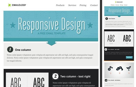
With mobile on the rise and so many of our users inquiring about best practices for developing responsive emails, I bet you need some great responsive and free email templates. Here you can get some.
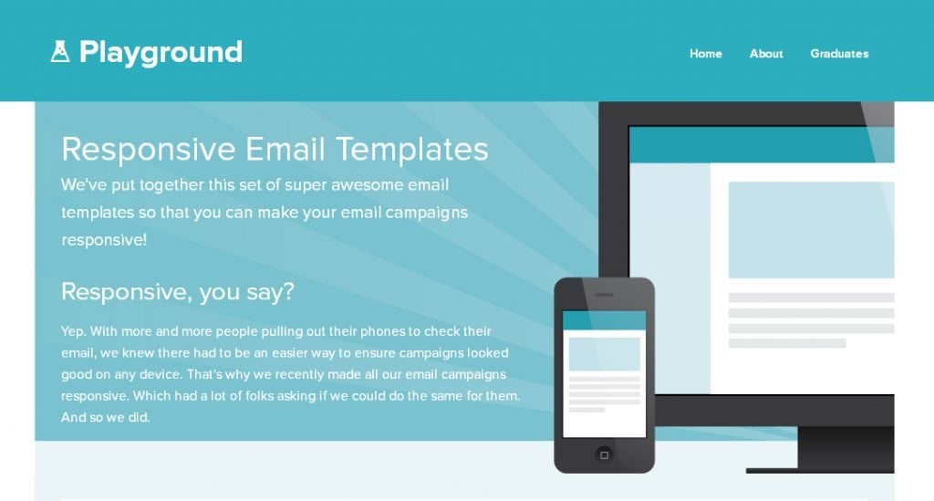
At zurb.com you can find a set of super awesome email templates that will make your email campaigns responsive.
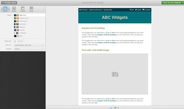
Using this Template Builder you can build an HTML newsletter template in just 60 seconds.
Another great newsletter template builder, with it's help you can easily create the layout using some predefined templates.
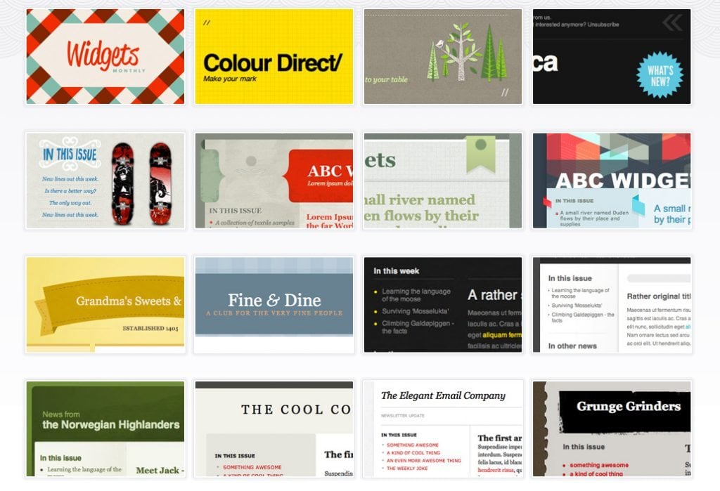
Campaignmonitor have teamed up with some of the world’s finest designers to create a selection of free templates to download and use. If these ready-made designs do not satisfy your needs you can use a free template builder.
Also you can share screen shots or links to your newsletters, everyone will be interested to check it out.
Don’t miss out these all-time favourites
- The best hosting for a WordPress website. Tap our link to get the best price on the market with 82% off. If HostPapa didn’t impress you check out other alternatives.
- Monthly SEO service and On-Page SEO - to increase your website organic traffic.
- Website Installation service - to get your template up and running within just 6 hours without hassle. No minute is wasted and the work is going.
- ONE Membership - to download unlimited number of WordPress themes, plugins, ppt and other products within one license. Since bigger is always better.
Get more to your email
Subscribe to our newsletter and access exclusive content and offers available only to MonsterPost subscribers.

Leave a Reply
You must be logged in to post a comment.