


Mashable has officially declared 2013 to be the year of responsive web design (RWD). But, seeing how the trend is spreading like wildfire throughout the industry, we can safely assume that the enthusiasm for responsive design will spill over into 2014 as well. In fact, as a designer, I strongly feel that RWD is going to stick around for a while and become integral to the way websites will be conceptualized in the coming years.
And why not? Do you remember how websites used to appear all warped on your smartphone or tablet not too long ago, with half the elements distorted beyond recognition or the layout looking horribly cluttered? Or how they would take ages to load, leaving the user fuming impatiently before you lost interest and gave up altogether?
RWD takes care of those glitches by doing exactly what the name suggests: responding to the device the websites are being viewed on and adapting to a screen of any size or resolution, so that the user’s interaction with the site remains pleasant and fruitful at all times.
Simply put, in order for a website to be deemed responsive, it should meet these 3 most basic requirements:
- Fast loading of content, regardless of the screen resolution.
- Proper scaling of the site layout and text size.
- Anticipate the visitor’s need (much before they recognize it themselves) and respond effectively.
As it is with all new trends, RWD also has its fair share of skeptics who are quick to dismiss it as nothing more than a hype. Worse, their doubts manifest in the form of ‘expert opinions’ which are about as much based on fact as the Loch Ness myth. However, these bits of information are quickly picked up and passed around the industry by people who don’t know any better either.
Soon enough you are faced with a huge pile of misinformation that threatens to sweep away sense and sensibility and harm the integrity of this fine design concept. Moreover, it keeps people from discovering the benefits of RWD thanks to the cloud of skepticism hanging over it.
It’s about time someone put an end to this silliness and shoveled away the rubbish to make way for some hard core facts. And, as they say, there is no better time than now to do something good, so let’s get started and discover what responsive web design is all about.
Myth #1: Responsive Website HURTS SEO
I often wonder how this particular myth got started, especially when Google – the Big Boss of all search engines - lists responsive web design as ‘the industry best practice’ - ON ITS WEBSITE! It’s there for the whole world to see, so why one should choose to ignore plain fact and socialize with fiction is a mystery to me.
Just to make things really, really clear to everyone out there, here are some top reasons why Google prefers responsive websites:
- Responsive sites have one URL and they share the same HTML code. This makes it easier for Google bots to crawl the site and index its contents.
- Since responsive sites can be accessed across a wide range of screen sizes and devices, it translates into consistent and positive user experience.
- Responsive sites are easier to link to, share, and interact with. Google recognizes this and gives them higher points for it.


Also, website owners tend to forget that, in terms of SEO, a responsive site is a lot easier to manage. If you have a mobile site, you will need to launch and monitor two separate SEO campaigns, a hassle you’ll be spared with a responsive site.
Myth #2: Responsive Design Is About THE MOBILE
Again, I am really curious to know how this piece of misinformation was born considering the sheer array of gadgets that are on display at every electronic store you walk by. I mean, you could’ve gotten away with this argument a few years ago when smartphone technology had just caught everybody’s fancy and was the only medium for accessing internet on the go.
But today people log on to their favorite sites on personal computers, tablets, smartphones, iPhones, mobile phones, and even the television. To continue believing, and propagating, the notion that RWD is only about mobile phones is the design equivalent of sticking your head in the sand and blatantly ignoring all that is happening around you.
There’s a new wave of consciousness in RWD that encourages designers to look beyond the device and, instead, take into account the context in which a user is browsing the internet. If he’s not at home at his personal computer, where is he? Could he be in line at a movie hall? Or perhaps he’s chilling on the beach with a couple of mojitos? Maybe he’s grabbing a quick lunch in the park with his friends.

The thing is you cannot control the context. It is everywhere and anywhere, and as a designer, you have to prepare for all kinds of eventualities. Therefore, realistically speaking, your site should be able to scale up or down conveniently, regardless of the device the visitor is using or its resolution. And this can only be done if the designer is able to balance the site’s visual layout and performance with the user’s needs.
Myth #3: Responsive Websites SACRIFICE Content
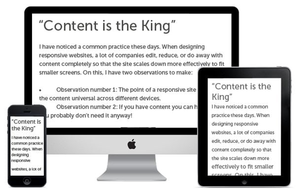
I have noticed a common practice these days. When designing responsive websites, a lot of companies edit, reduce, or do away with content completely so that the site scales down more effectively to fit smaller screens. On this, I have two observations to make:
- Observation number 1: The point of a responsive site is to keep the content universal across different devices.
- Observation number 2: If you have content you can hide, then you probably don’t need it anyway!
I imagine that responsive websites were innovated because someone somewhere came up with the brilliant idea that the size of a device shouldn’t limit one’s access to content. And, here we are wondering if the ideal responsive website isn’t one that skimps on the amount of content being offered to its users! How did we arrive at this stage?
Hiding content from screen readers is never a good practice. It will end up confusing and irritating them. Consider this: How would you feel if you had to spend several minutes scrolling up and down a website on your smartphone hunting for the information that you were able to locate within seconds on your laptop or personal computer? Not good; confused, even cheated, perhaps.
Therefore, I strongly advise against limiting content on a responsive website. If you decide not to pay attention, you will be responsible for the bad experience your visitors will face when accessing your website.
Myth #4: Making a Responsive Site Involves MORE EFFORT
I am not going to deny that building a responsive site will need more time and effort. But, what else do you propose - building separate sites for different devices? Okay, let’s evaluate this alternative shall we?

So far, ‘M-dot’ sites have been able to cater to the needs of handheld users. However, with the introduction of seven-inch tablets, the industry is witnessing a ‘confusion’ of sorts. These gadgets hover ambiguously over the desktop-handheld divide, without fitting into either camp. Furthermore, they don’t conform to a designer’s pre-established notion for layouts either.
So, what do you do now? How do you reach out to people using these gadgets? Invest in a third version – a kind of ‘T-dot’ site? What’s next? A ‘TV-dot’ site, too? How many sites do you want to build and maintain? And will you continue making a mini version of your site each time a new category-breaker is launched in the market? What about the separate SEO campaigns you will have to run for each version? Doesn’t that seem like a lot of effort to you?
And to all those companies who are worried about the extensive coding and testing that goes into building a responsive site here’s what I have to say: Of course you will have to do more coding and testing, but it’s totally worth it.
Your aim is to reach out and serve a diverse audience. And much like it has become standard practice to test websites in different browsers, you will have to anticipate different contexts and create experiences for different devices. If you think that’s a lot of effort, the other alternative is to retire from the race and cheer your competitors on as they become industry leaders.
Myth #5: Responsive Designs Are Meant for SMALL & LIGHT WEBSITES
This myth is used to discourage companies from switching to responsive design. My argument to them? This list of ‘SMALL’ sites using responsive design!


- Barack Obama
- Tommy Hilfiger
- Sony
- Microsoft
- Global News
- Mashable
- TIME
- World Wildlife Fund
- The Official Website for UK
- Starbucks
- Nixon Watches
- British Council, Ukraine
- Town & Country Magazine
- The Guardian
- Mitsubishi Motors, Australia
I rest my case.
You must remember that your website no longer sits on a desktop. Ignoring responsive web design puts you in the unhappy position of trying to keep up (rather unsuccessfully) with an endless array of devices, screen sizes, and resolutions, along with an equally endless number of mini-versions of your website. And, with the inventive tide not ebbing anytime soon, can you imagine what kind of pickle you will be in 5 years from now?
While you think about that, I would like to end with words borrowed from Jeffrey Veen, Vice President of Products for Adobe, “Day by day, the number of devices, platforms, and browsers that need to work with your site grows. Responsive web design represents a fundamental shift in how we’ll build websites for the decade to come.” I find myself agreeing wholeheartedly with him. What about you?