Responsive web design tutorial: questions, myths, problems and real solutions

Jeff Bell
Jeff is a 20 year old Tech Support Operator at TemplateMonster. Helping our clients to edit and customize their sites every day, he knows what they need most and how to make it as easy as possible. More than one satisfied client already promised to call their child after him. Being a semi-professional high jumper in the past Jeff leaves no issue unresolved.

Have you ever noticed responsiveness bugs on a site while surfing it with your phone or tablet? It’s okay when it’s a competitor's website, but what if it’s yours? You won’t be able to relax till it’s fixed, you will think that everyone notices and clicks away from your site at once. That is why I decided to show you how to add responsiveness to your site using the most basic toolkit: your hands, a keyboard and a mouse.
After reading this guide, you won’t need to call your IT guy every time there is an issue with responsiveness any more. You will know how to do it yourself within several minutes.
You’ll learn:
- How responsiveness works on the web
- How to make your page responsive with CSS media queries
- Media queries syntax
- Is creating media queries hard?
- Creating media queries for certain screen dimensions
- How to work less on responsiveness
- Most common responsiveness problems, question and answers to them
- Is responsive design overrated?
- What to do if the images are distorted when the screen gets smaller?
- How to make font sizes responsive?
- How to create Responsive Images with CSS?
- How do I make sure the theme I want to use is responsive?
- How to make an iframe responsive?
- Are “CSS media queries” and “media queries” the same?
- What if a horizontal scroll bar appears on my site on mobile devices?
- Media queries for most popular mobile devices
- Browser specific CSS hacks
1. How responsive websites work
First of all, let’s figure out what forces make elements behave differently on different devices. They are called media queries and hide in the wilderness of your site’s CSS (cascade style sheet) files.If you’re serious about your business online, you need a responsive website. Developers of most website engines claim their platform to be fully mobile-friendly and responsive out of the box. Well, we all wish it was true.
However, in reality the custom content of your site will sometimes require implementation of custom CSS rules to insure it stays responsive. That is why you need to know how to create your own custom media queries (CSS rules that apply only for certain screen sizes).
What do you need to do to tweak responsiveness issues of your site without third-party help? Locate the troubled screen dimensions, create a media query for them and, inside the media query, tell the selected elements to behave differently on certain screen dimensions. Now let’s look at these steps in more detail in this responsive web design tutorial.
2. How to make your page responsive with CSS media queries
You need to learn to use the basic functions of your browser’s developer tools.
If you press Ctrl+f12 on your keyboard, you will most probably see the default developer tools of your browser in the bottom of your screen. It might seem confusing at first, but it’s there to help.
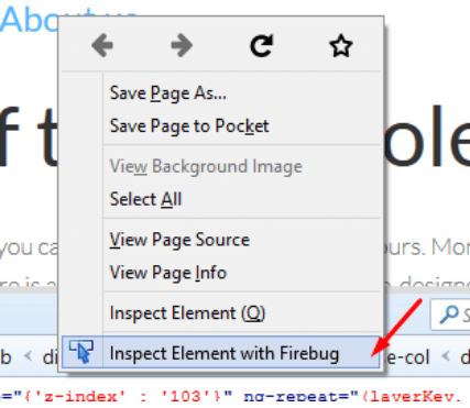
In Chrome it’s the Inspector tool, in Firefox I recommend using the Firebug addon. Safari has one too; you can enable it in Safari > Preferences > Advanced >Show Develop menu in menu bar.
Once you’ve enabled the developer’s tool of choice, you’ll see two main sections: one with HTML of your site and the other one with CSS. They are marked with arrows below.
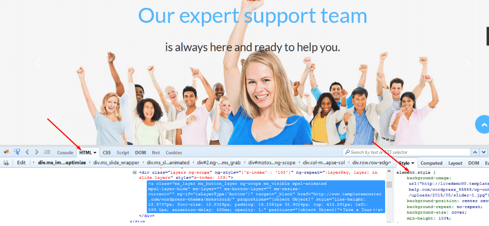
Your site’s front end consists of HTML elements: paragraphs, columns, headings, tables, etc. Without code in your CSS files, your site would look like a plain black-and-white page without any styles (colors, backgrounds, heights and widths, etc.). Each element on your site has its own CSS selector. By adding CSS rules to specific or general CSS selectors, you tell the styles to apply to chosen element or elements.
To create a CSS rule for a particular element, you need to have a very specific selector for it. In order to get it, you should:
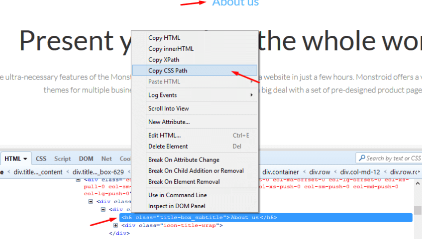
Right click on the element in question and inspect it with your developer’s tool.
Right click on the element in the HTML section and copy it’s CSS path.
In the CSS section on the right, create a new rule and add a selector you’ve just copied there.
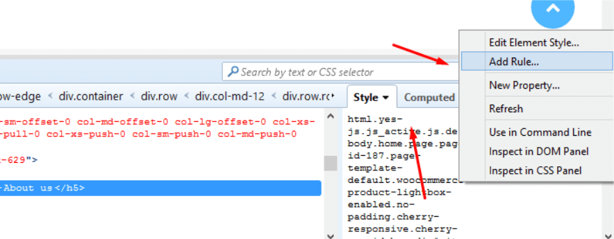
There we have it. Now any CSS style declaration that you come up with and apply to this selector will affect only the required element and not every element of this kind.
3. Media queries syntax

CSS media queries are used for any kind of situation in which you need some styles applied only in certain environments.
For example, styles for a certain browser or a device with specific screen dimensions. A media query is basically a frame for several CSS rules applied at the same time.
Any media query starts and ends with curly braces. Between them, you can add as many CSS rules as you want. Be careful to close the braces though. For example, if we wanted to change the font size of all the paragraphs on a site only for Iphone6 screen dimensions, we’d add the following query to the bottom of our CSS file:
@media only screen
and (min-device-width : 375px)
and (max-device-width : 667px) {
p {
font-size:15px;
}}
The “min-device width” and “max-device width” lines of the query define the screen dimensions in which the rules inside the query will apply to the chosen element. Notice that we have two closing curly braces at the end of the query because we need to close both, the rule declaration and the media query. Otherwise, future rules you add to your CSS file will de facto be inside the unclosed media query and will apply only for Iphone6.
4. Is creating media queries hard?
Creating your own CSS media queries for mobile devices of choice is really easy. All you need to know are the screen dimensions you are generating the media query for.
That brings me to the easiest way to test responsiveness of your site - the good old browser resizing. Of course, it doesn’t always behave like the actual smartphone in terms of animation and such, but it’ll give you a rough idea of what are the screen dimensions of your site you want to work on.
5. Creating media queries for certain screen dimensions
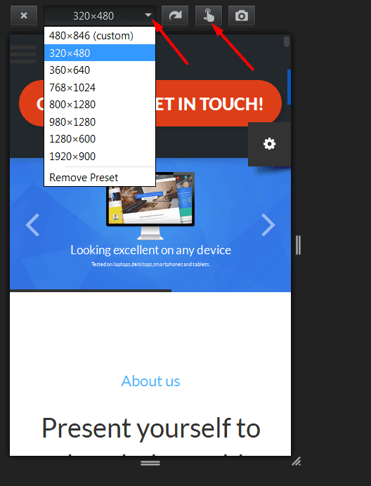
I prefer using Firefox for this task, but you can do with developer tools in Chrome just as well. So you press Ctrl+Shift+M (f12 and telephone icon in Chrome) and select the screen dimensions or the device for which to test your site. The screenshot below features the Firefox interface.
Once you know the screen resolution you need the rule for, set the pixel values as in this example :
@media only screen
 and (min-device-width : 480px) and (max-device-width : 780px) { put your CSS rules here }
Put the minimal pixel value into the “min device width” line and the maximal value in the “max device width” line. And you’re done.
6. How to work less on responsiveness
There is a set of rules to follow to make sure your site’s elements behave the way they should in most screen resolutions:
Set the width and height for elements in percentage, not in pixels. For example, don’t set images to be 357 or 280 pixels wide. To make them adapt to the screen size, be it Iphone or a TV screen, add dimensions style declaration as I did in this rule:
img {
width: 100%;
height: 100%;
}
In this example, we’ve told images to take 100% of the width and height of the html container they are located in.
Text, more than anything else, tends to render messy on mobile devices. How do you overcome this issue? Hide overflow and add breaks for text elements so that they fit the screen.
Also, make sure the fonts resize when viewed on a smaller device. For example, paragraph text on a site has the size “set in stone” somewhere in the CSS file (10 or 12 or 14 px, etc). Add a relative (in %) font size for individual elements, like this:
p {
font-size: 80%;
word-wrap: break-word;
overflow:hidden;
}
In the above example, the 80% means that we set the font size to be 80% of whatever the default value is.
Feel free to check these sources for more detailed info on media queries and CSS tricks for easier responsiveness:
http://www.w3schools.com/css/css3_mediaqueries.asp
http://www.w3schools.com/cssref/css3_pr_mediaquery.asp
7. Most common responsiveness problems, question and answers to them
I’ve gathered the most popular questions about responsiveness on the web and answered them below.

Q: Is responsive design overrated?
A: It is not. It is very important if you are serious about your site. Mobile traffic numbers grow each day. You need your site to be responsive and look good on all devices.
Q: What do I do if the images are distorted when the screen gets smaller?
A: You need to examine the trouble images with developer tools. Prepare a media query for the problem screen dimensions. Check the width, height, max-height and max-width properties. Play with them. Try setting different percentage and pixel values for each and see which work best for the required screen size. When you’ve found the perfect rule, copy it and paste it into the media query. After that, add this new rule to the CSS file.
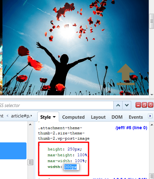
For example:
@media only screen
and (min-device-width : 1170px) {
.your_selector_here {
height: 250px;
max-height: 100%;
max-width: 100%;
width: 300px;
} }
Q: How to make font sizes responsive?
A: Fonts that don’t resize properly on mobile devices are ugly.

Moreover, having to scroll down to finish reading a sentence greatly harms your visitors’ experience. To avoid that, you need to add media queries for your typography elements like paragraphs and headings.
No need to set different font sizes for every device. Create two or three queries for several dimension ranges. For example, 320px to 667px for smartphones, 667px to 1024px for tablets, and 1170px + for desktops. The sample media query below applies to smartphones:
@media only screen
  and (min-device-width: 320px)
  and (max-device-width: 667px) {
  h1 {
      font-size: 15px;
   }
   h2 {
      font-size: 12px;
   }
   p {
       font-size:10px
   } }
Q: How to create Responsive Images with CSS?
A: The “go to” hack to make sure your images resize nicely is to set their height and width in percentage rather than pixels from the very start. For example:
img {
    width:100%;
    height: auto;
    max-width:100%;
    max-height: auto; }
If that doesn’t help, you’ll need to create a media query for the trouble images, specifying their dimensions on different screen resolutions. For example:
@media only screen
  and (min-device-width: 320px)
  and (max-device-width: 667px) {
img {
    width:300px;
    height: auto;
    max-width:300px;
    max-height: auto; }}
Q: How do I make sure the theme I want to use is responsive?
A: You shouldn’t always trust the “Responsive” badge on the web product you are about to purchase. Always test it on different devices or simply by resizing your browser. Check out this guide I wrote on mobile friendliness. Also it’s always a good idea to run the theme through Google’s Mobile Friendly Test.
Q: How to make an iframe responsive?
A: Iframes are used to embed a YouTube video or any other piece of content like Google map or calendar from the web on your site
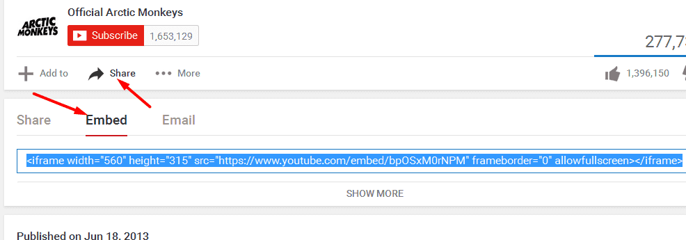
Unfortunately, frames don’t tend to resize well by default and you need to perform some HTML and CSS magic to get them in place. To add a video to a page, you would need to create a div HTML element on your page with any class you want, and then insert the iframe into it. After that add the CSS code to your .css file in which you specify the wished behavior for the video.
You would add a video to a page with HTML like this:
<!-- Div element to contain the iframe in it with any class you want -->

<div class="box_around_video">

<iframe width="560" height="349" src="https://www.youtube.com/embed/bpOSxM0rNPM" frameborder="0" allowfullscreen></iframe>
</div>
Add code like the one made below to your css file:
.box_around_video {
position: relative;
padding-bottom: 56.25%;

padding-top: 25px;
height: 0;
}
.box_around_video iframe {
position: absolute;
top: 0;
left: 0;
width: 100%;
height: 100%;
}
This trick proved effective in my experience, I hope it’ll help you as well. You can read more about it here.
Q: Are “CSS media queries” and “media queries” the same?
A: Yes, these are different names of the same thing. Media queries are filters applied to CSS styles.
Q: What if a horizontal scroll bar appears on my site on mobile devices?
A: You can easily fix this by hiding the overflow. “Overflow-x” property controls the horizontal scroll bar and “overflow-y” - the vertical one. So to hide the horizontal scroll bar, you should add the following rule to the bottom of your CSS file:
body {
overflow-x:hidden; }
8. Media queries for most popular mobile devices
Smartphones:
/* ----------- iPhone 5 and 5S ----------- */

/* Portrait and Landscape */
@media only screen
and (min-device-width: 320px)
and (max-device-width: 568px) {

your styles go here
}

/* ----------- iPhone 6 ----------- */
@media only screen
and (min-device-width: 375px)
and (max-device-width: 667px) {

your styles go here
}

/* ----------- iPhone 6+ ----------- */
@media only screen
and (min-device-width: 414px)
and (max-device-width: 736px) {

your styles go here
}

/* ----------- Galaxy S4 ----------- */
@media screen
and (device-width: 320px)
and (device-height: 640px) {

your styles go here
}

/* ----------- Galaxy S5 ----------- */

@media screen
and (device-width: 360px)
and (device-height: 640px) {

your styles go here
}
Tablets:
/* ----------- iPad mini ----------- */
@media only screen
and (min-device-width: 768px)
and (max-device-width: 1024px)  {

your styles go here
}

/* ----------- iPad 3 and 4 ----------- */
@media only screen
and (min-device-width: 768px)
and (max-device-width: 1024px) {

your styles go here
}
Laptops:
/* ----------- Non-Retina Screens ----------- */
@media screen
and (min-device-width: 1200px)
and (max-device-width: 1600px)
{

your styles go here
}
/* ----------- Retina Screens ----------- */
@media screen
and (min-device-width: 1200px)
and (max-device-width: 1600px)
and (-webkit-min-device-pixel-ratio: 2)
and (min-resolution: 192dpi)   {
your styles go here
}
You can check more media queries for standard screen dimensions here.
9. Browser specific CSS hacks:
Sometimes, you need a CSS rule to apply only in a certain browser. It’s very simple to achieve. Just use the templates I’ve prepared for you:
/* safari+, chrome */
@media screen and (-webkit-min-device-pixel-ratio:0) {
your css here
}

/* IE9, IE10 */
@media screen and (min-width:0\0) {
your css here
}
/* Firefox only. */
#your_selector_here,  x:-moz-any-link {
your css here
}
Now you know how to tweak responsiveness on your site with the tools from this guide. Also, check out all the responsive website templates by TemplateMonster. Share your own experience in our comment section below and I’ll gladly help you!