As it is popularly said that, ‘we can even dream in Colors’. Colors play a very crucial role in our daily life events. Similarly it is an important aspect in the designing community as well. However, the color preference and the combination changes with the passage of time.
So, this year is not an exception too. It can be rightly called a Renaissance year when it comes to color and its revolution. They are as diverse as they are persuasive. This makes the web designer experiment more with colors and refresh them into unique tones and shades.
This is not the end of it. The most interesting part is yet to be shared. These new Colors are compatible with all the User Interface deliberations thus conveying the best style and mood needed. They add dynamism to the clean modish style and help to distinguish important elements in a design. Therefore, let us see how this harmony of colors has reformed the web designing industry and has made a topic of discussion.
Black is back- a little edginess blended with the darker shades:
It is very difficult to read something against a dark background. So typically, dark colors are always reserved as accent colors in web design. However, the scenario is different this year. The designer can no longer disregard the dusky Colors. Colors like dark brown, dark blue or even dark grey are used in the front and in the centre to grab the attention towards the content. Isn’t this a great change? Indeed it is. Not only the darker shades are used to evoke sophistication but also a little edginess is added to them to make it stand out of the crowd. However, designers have to use various techniques to do the needful.
Digimurai
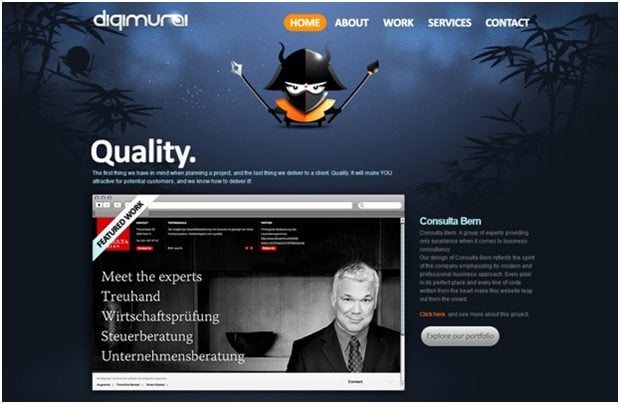


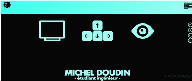
Michel Doudin

Designers simply love the 80’s- they now mix the bright colors with neon:
Wow! That’s quite an interesting combination. The neon’s and the upbeat colors are making a huge comeback. Their amalgamation can be effective to draw the attention of the audiences. They add a retro style to a site to convey a sense of exuberance.


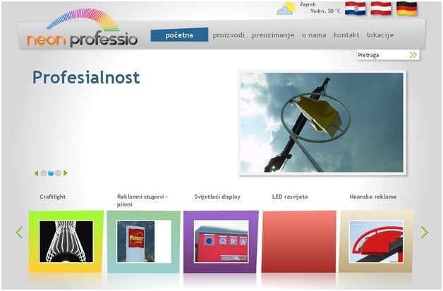
Neon Professio

Set the tone- with monotone color scheme:
Monochromatic tones use various tonal values and hues of a similar color to make your site look exclusive. Monochromatic colors paired with flat design technique are emerging in popularity at a rapid pace. This style relies on a single color either with black or white to give design its distinctiveness.
Another captivating option is the creation of monotone effect using variances in color. For instance, if you start a design with blue color, add a pinch of green to make it look appealing.

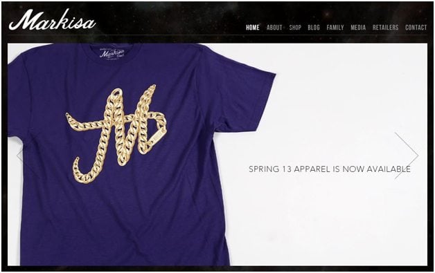
Markisa

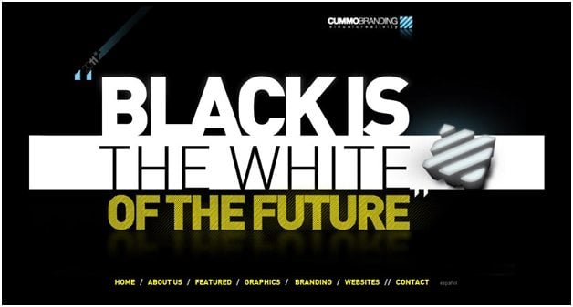
Cummobranding

Add simplicity to a design- with solid color blocking:
The use of bright colored geometric shapes is the most common use of color blocking in web design. Often this block is of single color with no gradients or patterns. However, they contain other vital elements such as illustration, images or text. Color blocking make a design look simple and is easy to build and develop. There lies no confusion for the user as where to look first on the site because of the use of bright and distinct color. Their primary function is to define website functionality and prevent dizzying assortments of color scheme.


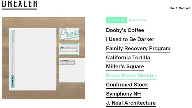

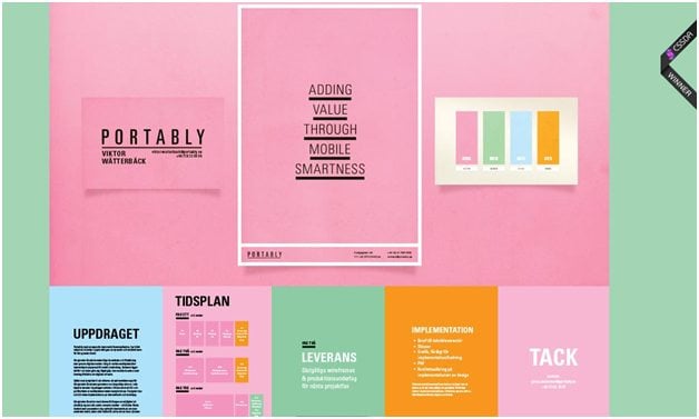
For a warm and friendly tone, hushed pastels are the best:
Pastels are inviting colors and especially when added with hand-lettering can represent a retro or vintage look. They are popular with cartoony vector illustration or organic typefaces. The soft tones of the pastel colors add elusive diversity between topics without being visually overpowering. Moreover, when pastels are given a facelift with basic grey, it can even make your website more interesting. Nothing can beat a practical look when greys are accentuated with bright pastes shades.

Portably

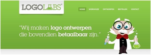
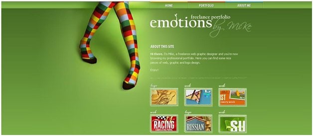
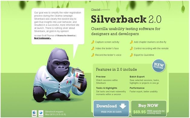
Go green- this year’s rejuvenating color:
A new dimension and liveliness always makes a design supreme and accepted formany years to come. Therefore, with the trend of being more environmentally conscious and going green, it is no surprise that green color is widely accepted in the web designing industry. Green represents growth and renewal and provides your site with a sense of precision. To bring to your notice, the year 2013, Pantone announced Emerald as the color of the year. However, designers are also inspired to use other shades predominant in nature such as earth tones, yellows and blues.


A little tweak in the color trend:
The year has not only given a twist in the usage of colors but also offers a comprehensive set of tools such as color extraction, matching and conversion to create fascinating palattes that are perfectly balanced and safe for the website to boot.
Color Wizard is a similar tool that allows you to submit your chosen base color and automatically match the colors for the one you have selected. It also has a function that generates color scheme that is far beyond your imagination.
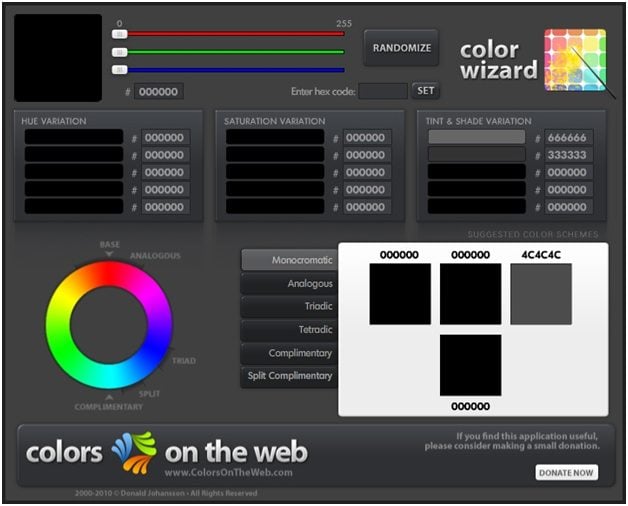

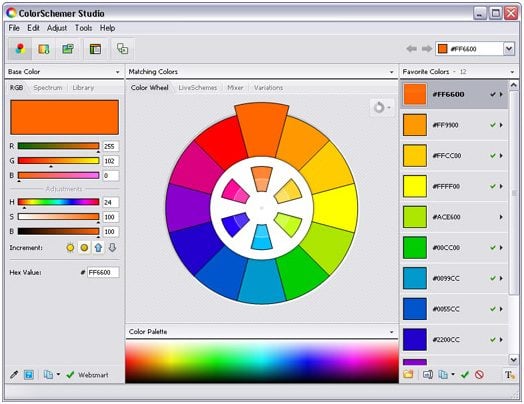
Color schemer Studio 2 is also a professional color matching application that intelligently suggests color schemes whether you are working with visual color wheel or explore harmony relationship.