Seductive Home Page Design – The “How to” Guidelines
When you reach a new website, what’s the first thing you see? The home page of course. Unfortunately, not all website owners pay much attention to the looks and usability of their home pages. That leads to huge bounce rate. And those website owners usually wonder: “Why do people leave my site, I’m having such a great content.”
“The homepage is your company’s face to the world. Increasingly, potential customers will look at your company’s online presence before doing business with you — regardless of whether they plan to close the actual sale online.”
Jacob Neilsen
There is no one near to tell them: “Buddy, your home page looks like it was created by designer who takes $5 for his work.” Even though there are guidelines for every taste, some people still don't use them. This results in appearance of tons of website with frail design of home page. So let’s see some must-have things every home page should have. And we'll...
Start from the Header
Window Title
This is the first piece of content that loads when you open any new page. Window title is important for your home page because it’s all about SEO and bookmarking lists. As for SEO, the title should include the main keyword of your website. As for the lists, don't use last letters of the alphabet since your site will be listed somewhere towards the end.
Say Hello
When you meet someone you’ve never met before, what do you say? “Hello my name is...” The tag line at your website is the analogue of this phrase. With its help you can inform your visitors about what’s going on at your website or which products/services you provide and why they need them. Some websites don’t have this information, making it pretty hard to figure out whether this site is useful for them or not.
Corporate Information/Contacts
How does it feel when you want to call someone but can’t find their phone number? Awful feeling, isn’t it? Same feeling experience your customers when they can’t find your corporate information on the website. The best way out is to place your contact info in the header of the site. An “About Us” section is the best place to share with user more in-depth information about your company.
Help Your Visitors Find What They Need
Selling Points

The Search Box
Search box is extremely important in every website. Not all users prefer running through the categories, they immediately use the search. The reason is quite simple - search saves time.
Examples of Your Content
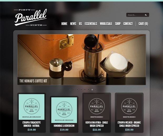
Don't just cram your home page with ads and other things you find interesting. If you own online store share top selling items or new-coming collection of products. See for yourself, these two online stores are using wisely home page space:
This store has a classic layout, slider in the header (with the best products of the store), top selling products under the slider and corporate news. As you can see the whole space of the page was used quite effectively.
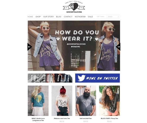
So Worth Loving
The second example is also a 'good to go'. Like the first one, it's also a classic online store layout: slider with most important information, blog and top new items. The layout is clean and easy to scan.
Text Links with Keywords
People don't read...if they say they do, they are lying! I bet you're not reading this right now, you're just looking at these letters...if I'm wrong object me in the comments. So, when you create a text link anchors like click here, find here, follow link, etc. don't actually work. When you create a link with a relevant keyword, it's much easier to differentiate it from other links on the page.
Use Visuals to Enhance Your Design
Don't Over-Format Navigation Areas
Probably you think that important home page items like navigation need to be designed really carefully. You will use more elaborate illustrations, boxes, and colors. But eventually you will turn it into something like a ‘nasty rainbow’. Keep navigation areas clean and straightforward to let your users see where to go, and how to find pages they need.
Use Graphics that is Relevant to the Content
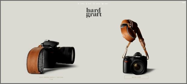
Do not cram your page with images you have borrowed somewhere. Make some collages. For example, it’s always better to show photos of real people actually connected to the topic rather than pictures of some models. Here's what you can find on the web.
Think of your home page as of an analogue of a trade booth. There should be some reason why you stop at some and skip all the others. You need to create the home page answering these questions:
- Why user needs to use your website?
- How difficult is it to use your website?
- The info you presented is clear or quite tangled?
SPEAK UP! As I have already told you, you can object to any statement given in this article. You are free to go.
Don’t miss out these all-time favourites
- The best hosting for a WordPress website. Tap our link to get the best price on the market with 82% off. If HostPapa didn’t impress you check out other alternatives.
- Monthly SEO service and On-Page SEO - to increase your website organic traffic.
- Website Installation service - to get your template up and running within just 6 hours without hassle. No minute is wasted and the work is going.
- ONE Membership - to download unlimited number of WordPress themes, plugins, ppt and other products within one license. Since bigger is always better.
Get more to your email
Subscribe to our newsletter and access exclusive content and offers available only to MonsterPost subscribers.


Leave a Reply
You must be logged in to post a comment.