Seven Tips to Make a Website Template NOT Look Like a Template
Website Design in 1998, 2006, and Now. In case you haven’t noticed, web design has changed a bit since your high school web design class in 1998.
The cost of web design compared to the quality of the final product has transformed even just in the last ten years. I’ve experienced these changes first-hand building websites for almost two decades. Back in 1998, it was not uncommon for web designers to charge $10,000 for a basic HTML site. And it may have been justified because of the hours that went into custom coding the entire site.
Today, anyone can purchase fantastic WordPress templates for under $75 and customize their site to look like a $5,000+ custom design. And when I say $5,000, I’m talking about what you can get TODAY for $5,000!
You can quickly find beautiful themes and templates on sites like TemplateMonster.com. Themes are available for most popular website platforms like WordPress or Joomla as well as up-and-coming e-commerce platforms like Shopify. These pre-designed templates drastically reduce the time and mental energy it takes to go live with a new website. This modern efficiency is welcomed, but too often it’s painfully obvious that a website was created using a template.
So to help template users stand out from the crowd, here are seven ways to customize your theme or template to make it NOT look like a purchased template…
Start With a High-Quality Template or Theme
You may be tempted to grab a free theme or template, and while this may be OK for some websites, I highly recommend making the small investment to purchase a premium template. The elevated level of design quality and functionality common in premium themes justifies the price.
If you’re prudent (and a bit lucky), you may discover a template that incorporates some of the elements I describe below to reduce your time and expense even more! KEY: These tips are great to read BEFORE purchasing a template.
In case you’re wondering how tough it is to download and install a website theme from TemplateMonster and how much does it cost to build a website, watch me purchase and install a Shopify theme in this video.
Customize Typography
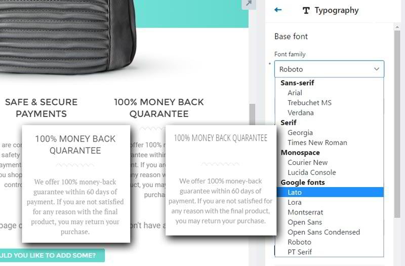
Too often I can spot a particular WordPress theme or website template just from glancing at the top menu and noticing simple typography - either the font typeface, the font color, or both. Many premium themes will default to a basic font that looks perfectly fine and so many people don’t take the time to tinker with it.
My encouragement to you. Spend 10 minutes and tinker!
Seek out a font that adds some creative flare, or find an ultra-clean font that exudes that professionalism you desire to convey. Whatever you’re trying to communicate on your site, the right font can help.
Many premium themes come with Google Web fonts pre-installed which make it painless and even fun to browse fonts for your site. My suggestion would be to find a custom font for your main navigation, headings, and main body text. Don’t go too crazy on the body text, though - readability is usually the goal with the body text. Keep the specialty fonts in the headings and navigation text only.
Use Overlapping Elements
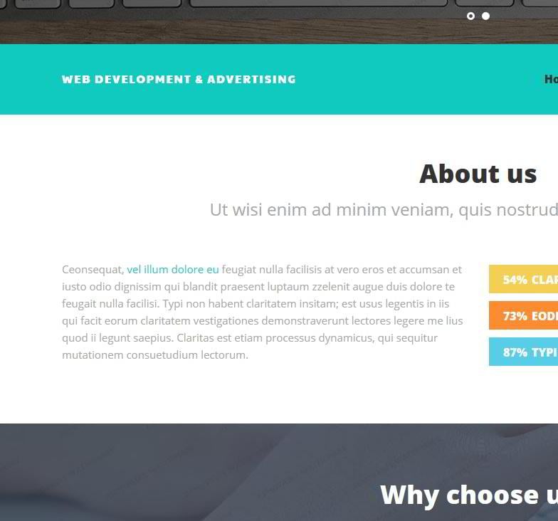
A focus on ease of use and keeping up with the latest web design trends leads most template designers to create templates that are divided into horizontal sections like the design below.
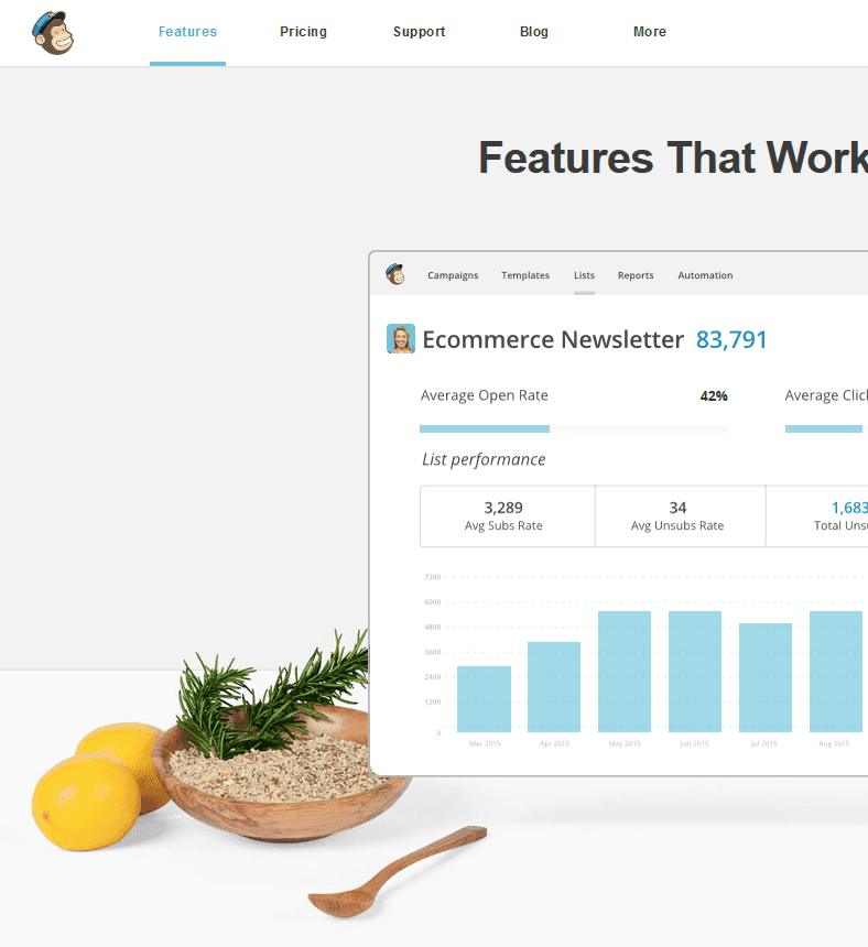
Choosing a theme that has overlapping visual elements will give you a head start in making your website design look totally custom and conceal the fact that it originated from a purchased template. Take a look at this page on Mailchimp.com to see what I mean…
The Mailchimp designers aren’t doing anything super complicated here, but the images overlayed over the background sections portray a professional and custom look to the skilled web designer’s eye and probably to most website visitors too.
So how do you create these overlapping elements? There are a few common ingredients to cook up this look...
- You’ll usually need to start with images that are transparent PNG (a file format like GIF or JPG) images with the background removed. You’ll need minimal Photoshop skills to do this, or you can use a tool like ClippingMagic.com.
- If you’re comfortable delving into the code a bit, you can utilize CSS and negative margins to move elements into the adjacent sections. Watch out, though! - as this can cause problems with the look of your site on different screen sizes (i.e. mobile devices).
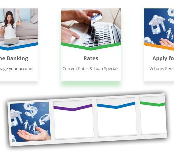
- Use custom background patterns and tile them horizontally to create a sectioned look with overlaid elements. See an example of this below… I created a 1px width background image of the white/blue/gray background and used the CSS background-repeat property to tile it behind the image. (The animation below is just from the Photoshop document where I created the background.)
You may need to hire the web or graphic designer to implement some of these elements for you since they can get pretty technical, but it will be a minuscule investment compared to the cost of designing a full website and should still be enough to give your site a custom appearance. This brings me to my next point...
Invest in Custom Graphic Elements
Even though you’re on a budget and not paying a designer to create a 100% custom web design, you can still hire a graphic designer to create a few unique elements for you.
Maybe your brand, logo or the design template can be accented with some custom graphic elements. Spending $100-200 for a graphic designer to create these will be well worth the price considering the visual value it can add to your site.
Examples of custom elements could be image icons that match your color scheme, photos with overlaid text that match your website font, or something buried deep in your creative mind that has yet to be uncovered! Check out Upwork.com or Fiverr.com to find some graphic designers to complete small projects for you.
Get Beautiful Stock Photos, Videos or Hire a Photographer
I’ve built over 200 websites for small business clients in the last five years, and I’ve received all sorts of personal photos to place on websites. More often than not, the images are out-of-focus, vertically-orientated, poorly composed images that don’t convey professionalism. People often judge a book by its cover, and your website (and even your product/service) WILL be judged by the quality of the images on your site… so choose wisely.
I always encourage clients to find a friend with a nice camera and some photography skills or hire a pro to take some decent pictures for their business website. Making this investment in decent photos can do wonders for your site. Plus it’s one more way to increase the overall quality of your site and make it look custom and not template-based.
If you can’t find or afford a photographer, another option is high-quality stock photos or videos. There are free stock photo sites, but the best and latest images will always be available from the paid sites like istockphoto.com and shutterstock.com. You can watch my quick video comparing the selection of free and paid stock photo sites.
Get a Custom Logo for $99
By far the easiest way to transform a website template into a brand masterpiece is creating your custom logo and tailoring the website color scheme to match.
You may already have a logo that can be implemented into your site. And you may think your logo is awesome, but please take the time to ask trusted advisors with a good eye for design if they believe your logo needs improvement.
If you do need a new logo, it doesn’t cost a fortune to get one. You can use a website like 99designs.com to get a logo for only -you guessed it- $99. It’s one of the ultimate investments you can make in the branding of your business since the logo can show up on your business cards, print materials, on the side of your trucks and more. The investment in a custom logo extends way beyond just your website.
Use Plugins to Enhance Functionality & Design
One of the most common reasons people have websites developed from scratch is the need for custom functionality. But more often than not, you can find a third-party plugin to extend the functionality of your site without having it custom-coded.
If you’re building a WordPress site, you have access to thousands of free and paid plugins in the WordPress Plugin Directory.
There are plugins like Contact Form 7 that allow you to easily create custom forms that visitors fill out on your site; Envira Gallery creates slick photo galleries and Revolution Slider which allows you to build amazing image and video sliders. Some WordPress themes even come pre-packaged with these paid plugins.
In addition to WordPress, many other platforms offer plugins to extend the functionality of your site. Ensure you have all the functionality you need before you dedicate yourself to a particular platform and design theme.
Your Template Site Doesn’t Have To Be Cookie-Cutter
Many people use website templates to save money. But your site doesn’t need to look like a website template from a mile away!
I encourage you to employ some of these techniques, and people will think you spent $5,000+ on your site design!
//
Don’t miss out these all-time favourites
- The best hosting for a WordPress website. Tap our link to get the best price on the market with 82% off. If HostPapa didn’t impress you check out other alternatives.
- Monthly SEO service and On-Page SEO - to increase your website organic traffic.
- Website Installation service - to get your template up and running within just 6 hours without hassle. No minute is wasted and the work is going.
- ONE Membership - to download unlimited number of WordPress themes, plugins, ppt and other products within one license. Since bigger is always better.
Get more to your email
Subscribe to our newsletter and access exclusive content and offers available only to MonsterPost subscribers.




Leave a Reply
You must be logged in to post a comment.