Do You Know What All Valuable Websites Have in Common? Clean Web Design
Websites are a sort of an asset - their value depends on the perception of the market.
Whether you’re currently in the process of selling a website or are thinking about doing it down the road, you need to make sure you’re obeying the current rules of web design as they pertain to simplicity and minimalism.
Clean is Successful
Take a look at lists that rank the best websites of the year and you’ll notice that every site included is simple and clean. Browse a website marketplace like the Shopify Exchange and you’ll see that all of the most valuable websites have simple, minimalistic web design. There’s a reason for this: clean web design conveys value.
Minimalistic design tends to focus on stripping back superfluous and nonessential elements to allow the content and core message of the site to take center stage.
Every element should have a justifiable purpose. Minimalistic design by nature should be highly usable and functional, as there should be no distraction to compete with the information the site is trying to communicate.
Web designer Shaun Cronin
Designing a clean website is easier said than done. It takes some work, particularly for websites that are currently bogged down by busy web design, but if you want your site to deliver the sort of return on investment that it should, clean has to be the priority.
Don’t confuse clean with empty. A clean website needs to be functional in order for it to be effective. The objective is to strip away the elements that don’t matter and zero in on the select few that do.
Whereas your site’s current design may feature four or five distinct calls-to-action, a cleaner version of the site will feature just one call per page. It’s still actionable, but the visitor is clearly being guided in a specific direction instead of allowing them to get distracted by things that don’t matter.
Clean Elements That Matter Most
The process of stripping down a website and making it cleaner can often be intimidating if you’ve never had to do it before. With that being said, here are some of the clean elements that matter most.
White Space
White space is the space that surrounds an object in an image, graphic or text. Line height, spacing, padding, etc. can be considered white space. White space is as effective in a layout as the content itself, and helps to define the boundaries of positive space and brings balance to a layout to enhance the experience.
Designer JoJo Marion
Ironically, white space doesn’t really have to be white in order to qualify. It can also be referred to as “negative space.” The point is that you don’t need to fill up every pixel of a page with busy elements. The majority of any page should contain soft, blank space that focuses the reader’s eyes.
Applying theory to practice
We have a number of templates which comprise all design aspects mentioned here. Since I have already mentioned Shopify Exchange here's a business idea you can use. As you know there's a Shopify Membership at the TemplateMonster marketplace. Here's how you can benefit from it.
At Shopify.com you can create a dropship store based on the Oberlo app. Setting this up is extremely easy just install Oberlo app on your Shopify, import products to your inventory set pricing and the store is ready to accept orders.
So how exactly can Shopify membership help you? When you subscribe you download TemplateMonster's Shopify themes as low as $2 a piece. After that, you can create a bunch of dropshipping stores and sell them as already trading stores at Shopify Exchange.
That's it!
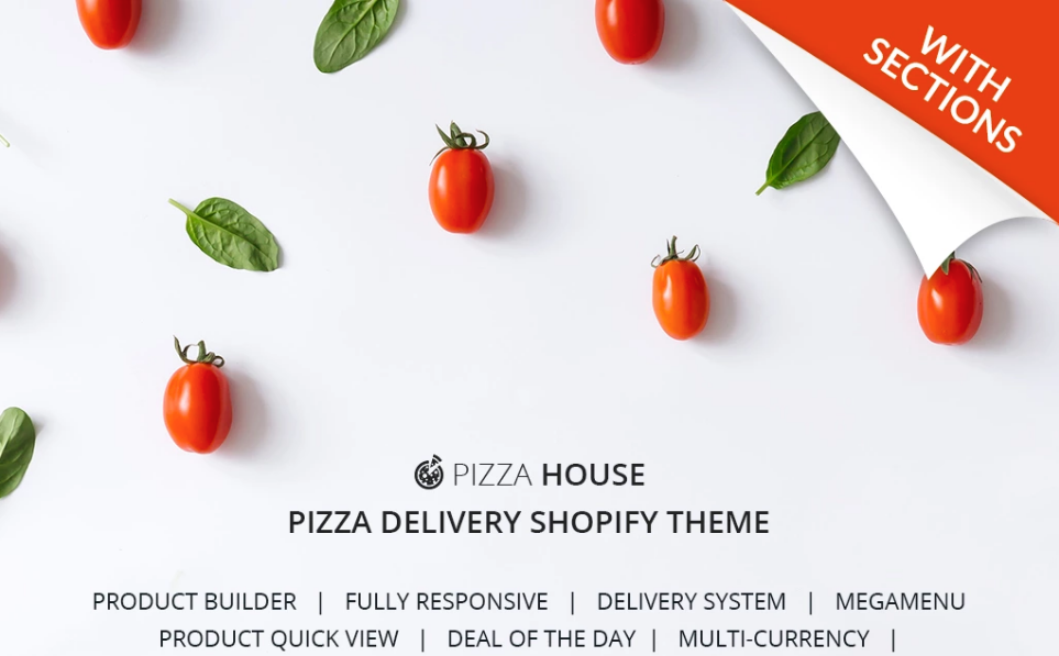
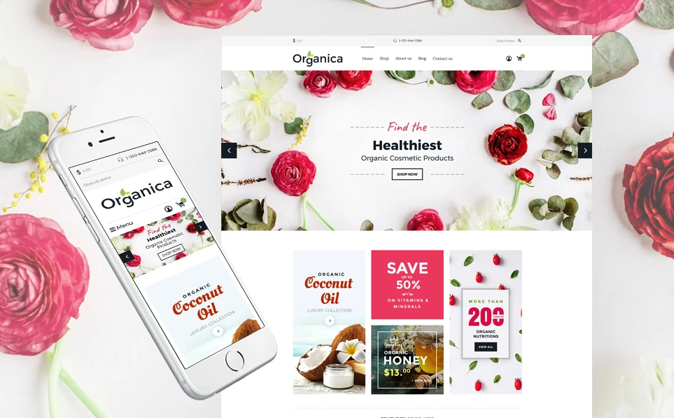
Here are some nice-looking Shopify themes that make good use of the whitespace.
Food Delivery Responsive Shopify Theme
Nutrition Store Responsive Shopify Theme
Typography
Typography is something a lot of web designers think about last – however, you should really make it a priority. Not only is it an effective way of establishing a strong visual hierarchy, but it can also communicate just how important specific elements are without the need for noisy elements like arrows and badges.
In order to create a smooth, seamless visual experience for your users, stick with just one or two typefaces. Any more than this and you risk convoluting your message.
Here are some nice-looking Shopify themes that make use of stylish typography.
Cosmetics Store Responsive Shopify Theme
Gifts Store Responsive Shopify Theme
High-Resolution Images
By now, you’re acutely aware that boring stock photos are a no-no in web design. Hopefully, you’ve already removed the bulk of these images from your site and are using carefully selected, custom visuals. But do you know what else matters? Resolution.
In order to wow visitors and immerse them in your website, you need to invest in high-resolution images that are clear and visually pleasing.
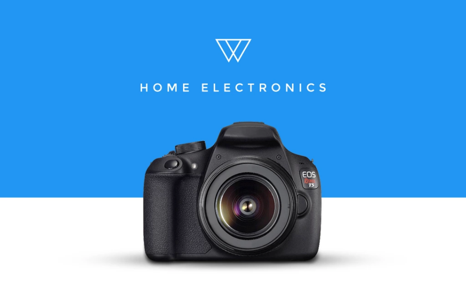
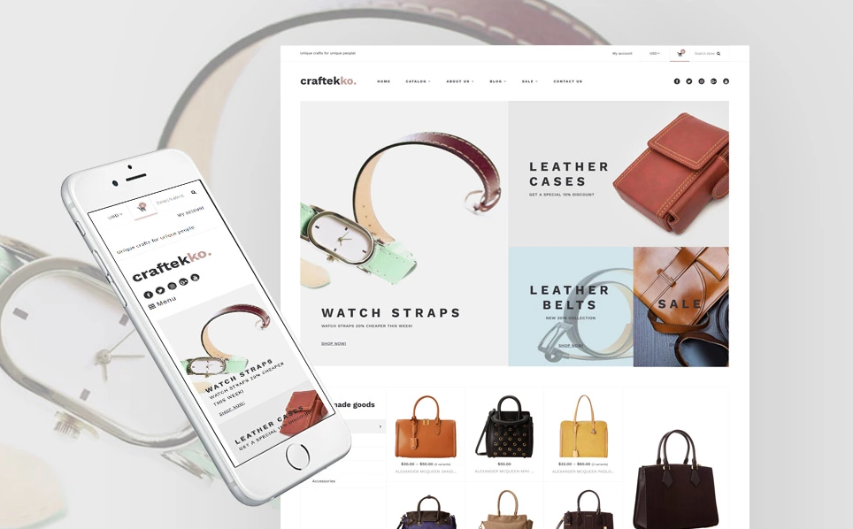
Here are some nice-looking Shopify themes that make use of high-resolution images.
Home Electronics Shopify Theme
Craftekko - Handbag Responsive Shopify Theme
Timelessness
There’s something to be said for trendy web design and taking advantage of hot trends, but chasing fleeting styles does very little for your website in the long run. Clean, successful websites understand that it’s best to establish a timeless look.
Timelessness ensures that your web design connects with visitors, regardless of changes on the market. It also helps you avoid premature redesigns if there’s been a stylistic shift. Consider this as you attempt to find your style.
Here are some nice-looking Shopify themes that are about to be trendy in the next 5 years.
Multifly - Multipurpose Shopify Theme
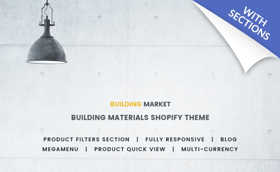
Building Materials Responsive Shopify Theme
Make an Investment in Clean Web Design
Whether you’re selling software to large businesses or toilet paper to consumers, a clean website will help you accomplish the goals you’re striving to achieve. It’s not something that will allow you to cover up other deficiencies in your business model or value offering, but it will allow an already strong business to maximize the value of its website.
Prepare to spend considerable time and energy on a minimalistic redesign, but know that it’ll all be worth it in the end.
Get more to your email
Subscribe to our newsletter and access exclusive content and offers available only to MonsterPost subscribers.



Leave a Reply
You must be logged in to post a comment.