Sign-Up Form Optimization: Usability Tips and Use Cases
Sign up forms are widely used in innumerable websites, being the special bridge between visitors and site owners. They are presented in various designs, shapes, colors and sizes. But before starting to expose peculiarities and functions, first we need to understand the difference between the sign up form and the login form.
Sign up form is the design element or page with several input fields that require to be filled out. And login form can be a web element or page which consists of username/email field and password field, so you fill out this form when you’re already registered at the website.
So the structure of the sign up form should be built on the principle to attract more visitors to a website and make them complete the form but not push away. Such important aspects as title, placement, layout, color scheme and arrangement of additional fields constitute the whole presentation of this form. Majority of people don’t really like to fill out the form as it takes time and requires personal information. That’s why designers try to make the form completion easy and comforting.
Actually, sign up form can be performed in different ways, so we tried to distinguish it into several types:
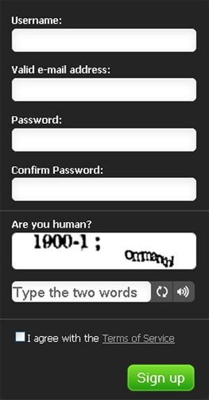
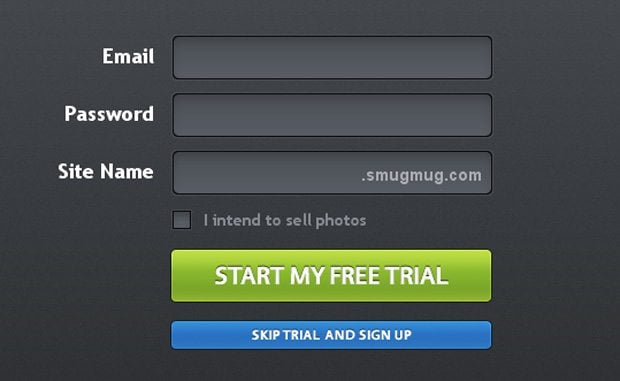
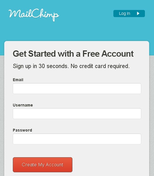
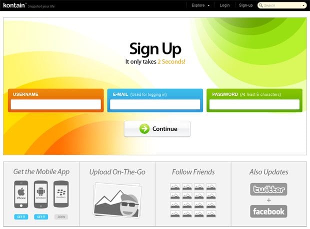
- Sign Up Forms with Simple Design Layout
- Sign Up Forms with Various Design Elements
- Sign Up Forms Integrated into Website Page
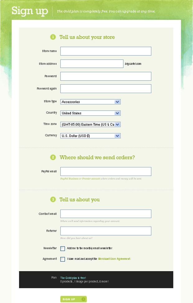
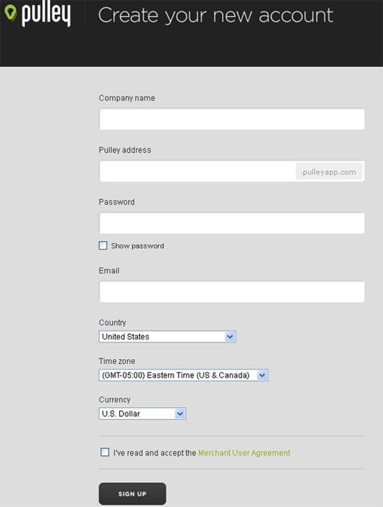
- Sign Up Forms with Multi Fields
We can spot many various examples of the sign up form in different designs and styles. Still what is the best option to create the sign up form? Surely you need to consider the theme of your website design and its specialization, and to simplify your work we prepared some usability tips that can help you build really nice sign up form:
- Try to place the link to the sign up form in the header of your home page, so your visitors can find it right away.
- You can title your form originally “sign up”, “join” or “register” as people are better oriented to the most common names of this form.
- Don’t overload the sign up form with additional layouts or multi colors, it should be effective and without unnecessary details.
- If you want to save your visitors and subscribers - build one-page form that can be quickly and simply fill out.
- Try to avoid mandatory fields in the sign up form, just include necessary input fields with the name, login, password and password confirmation. Other fields are additional and not obligatory.
Hopefully these tips will help you build the sign up form most usable for you and for your customers. Now let's get back to the sign up form types and examine them in detail, with several use cases.
Sign Up Forms with Simple Design Layout
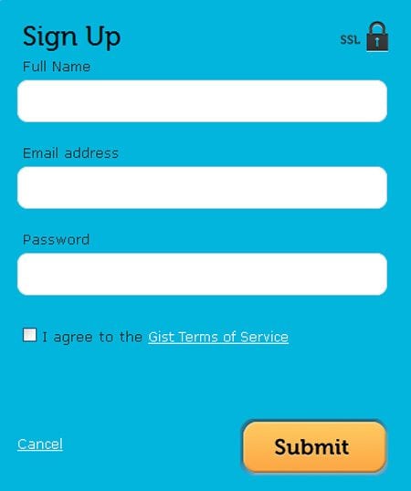
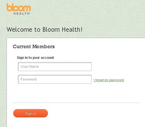
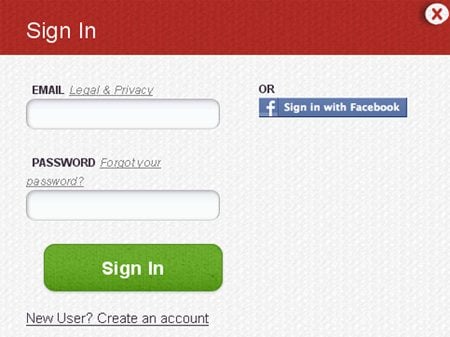
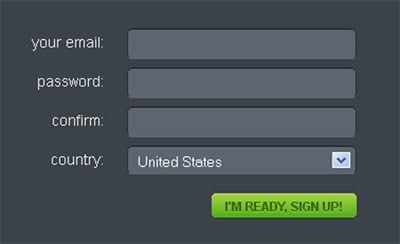
Sign up forms of this type have elegant and simple design with minimal color scheme. The main advantage of this type is effective and at the same time easy structure which gives to your visitors pleasant visual experience.
Gist.com
* * *
* * *
Bloomaccount.com
* * *
* * *
* * *
Soundz.fm
* * *
* * *
* * *
* * *
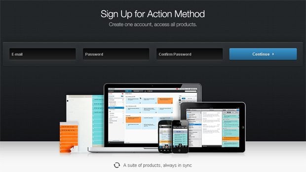
Sign Up Forms with Various Design Elements
Here you'll find effective and really striking sign up forms with various additional layouts, icons, images and other design elements that make them more attractive for visitors.
* * *
Actionmethod.com
* * *
Audio-logic.net
* * *
* * *
* * *
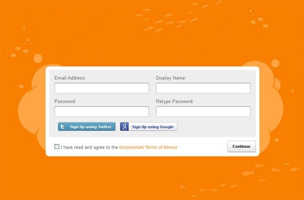
Grooveshark.com
* * *
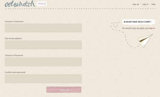
Sketch.odopod.com
* * *
Sign Up Forms Integrated into Website Page
This type presents you sign up forms which build as the integrated elements and introduce here as the parts of the web pages. They can be placed at the homepage of your website, in "the hidden place" or contain additional information and options of your website.
* * *
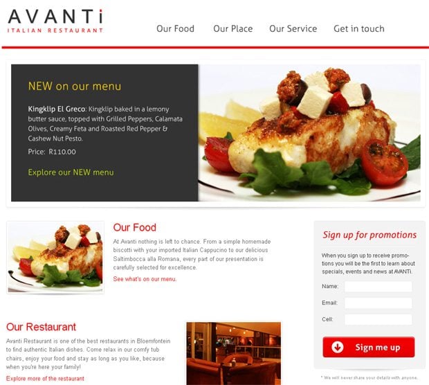
Avantirestaurant.co.za
* * *
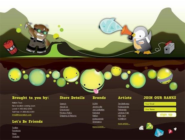
Thisisnation.com
* * *
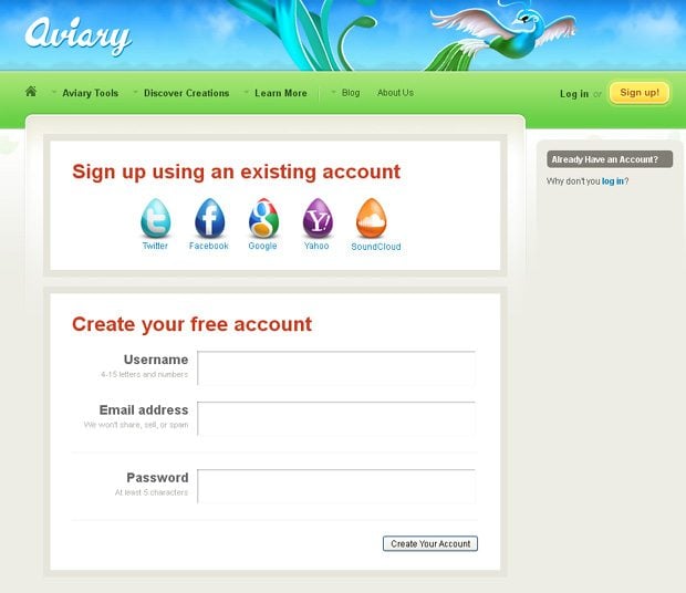
Advanced.aviary.com
* * *
* * *
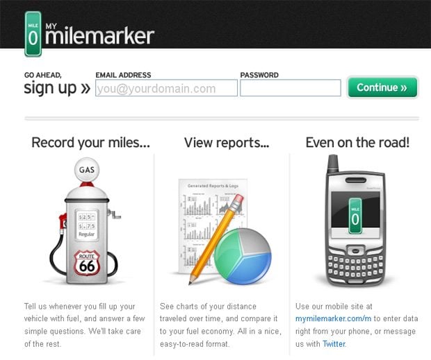
Mymilemarker.com
* * *
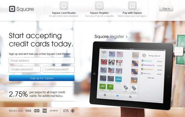
Squareup.com
* * *
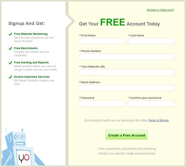
Yottaa.com
* * *
>
* * *
Sign Up Forms with Multi Fields
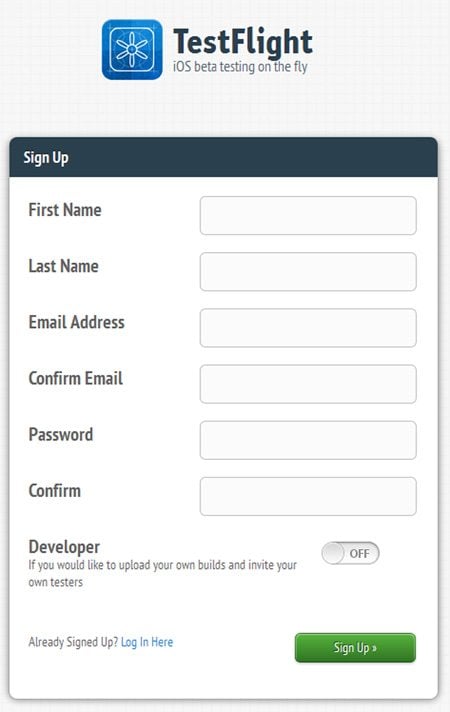
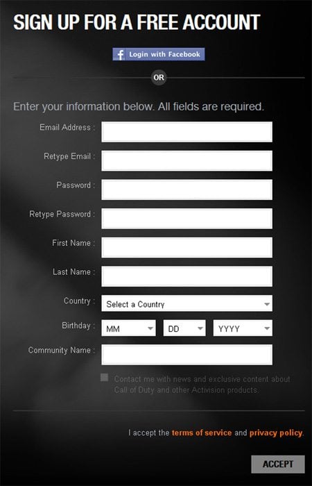
This type represents sign up forms that require to fill out all mandatory fields to complete the registration. But remember, if you need to have more members or subscribers it will be better to have just several fields in your sign up form.
* * *
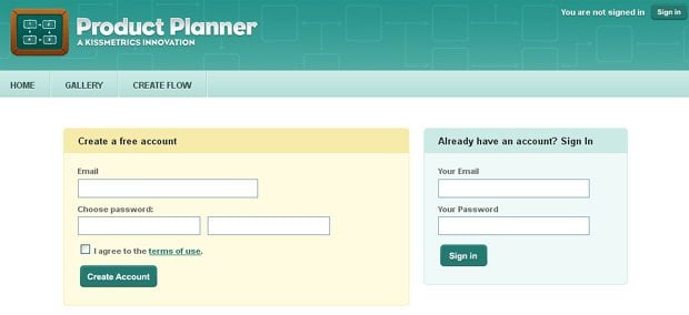
Testflightapp.com
* * *
* * *
* * *
Just follow one important rule: embrace great design and easy structure of the sign up form, as it must be good-looking, quick and simple to understand. Pay attention to the title, placement, input fields and general design, and please try not to overload it with additional mandatory fields or unnecessary design elements.
Don’t miss out these all-time favourites
- The best hosting for a WordPress website. Tap our link to get the best price on the market with 82% off. If HostPapa didn’t impress you check out other alternatives.
- Monthly SEO service and On-Page SEO - to increase your website organic traffic.
- Website Installation service - to get your template up and running within just 6 hours without hassle. No minute is wasted and the work is going.
- ONE Membership - to download unlimited number of WordPress themes, plugins, ppt and other products within one license. Since bigger is always better.
Get more to your email
Subscribe to our newsletter and access exclusive content and offers available only to MonsterPost subscribers.




Leave a Reply
You must be logged in to post a comment.