Three Pillars of a Highly Converting Landing Page
No matter, whether you are a blogger, an online seller, or an owner of a small business, - you do need a landing page. If you are none of the listed above, you need a landing page to become one of them (come on, everyone wants to be a blogger!).
But seriously, there are examples of landing pages with the conversion rate of 11% and higher. Who wouldn’t like to have such an awesome profit maker at hand?
It's not as easy as it may seem. Building a new landing page you should keep an eye on every of its three pillars: design, copy and usability. Remove any of them – and the entire structure will fall. Today we are going to disassemble them to smaller parts, and give you an idea of what to start with.
Pillar Number One: Design
Conversion rate: 100%. Good job, Mr. Shepherd Drone!
Although design alone is not enough, it is the basis, without which everything else is pointless. Designing a landing page is not much simpler than designing a large multipage portal, if at all. It is extremely knowledge-based, as you should not only create a visually appealing layout, but also take into account the psychological peculiarities of your target audience. If this sounds like too much trouble for you, check out the predesigned landing pages from our gallery.
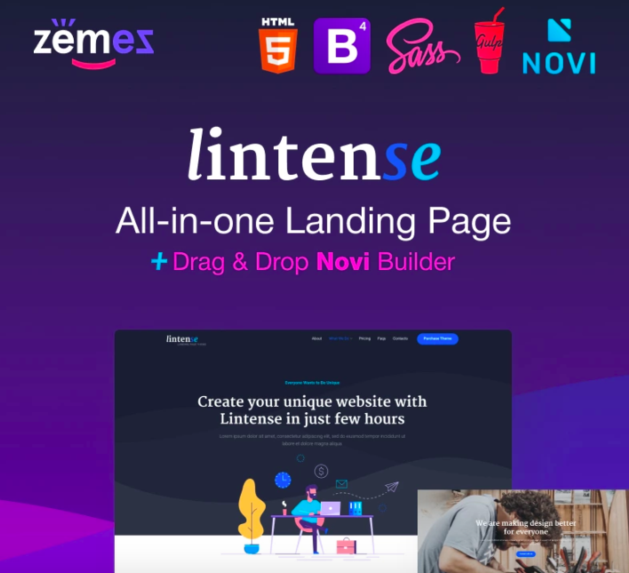
Lintense - All-in-one Landing Page Template

Lintense is an excellent example of a landing page template which meets all the requirements of a highly converting web product. To achieve a good conversion level, you need to understand clearly what you want and be able to answer the questions: who, what, when and how. After, think about the design of your landing page. To be more precise, Zemez developers have already done that for you. There is no need to acquire any coding skills, the template is installed and set up with a few clicks only. Whether you are building a landing page for a corporate project, SEO agency, mobile application, promotion, or digital agency, Lintense will be your perfect choice. 5 stunning pre-designed templates, SEO-optimized code with incredible speed and performance, powerful plugins, and regular updates are not the complete list all the features included.
More features:
- Parallax effect
- Novi Builder
- Easy installation
- 100% responsive design
- Cutting-edge technologies
- Cross-browser compatible
- Bootstrap framework
- Accurate documentation
- 24/7 support
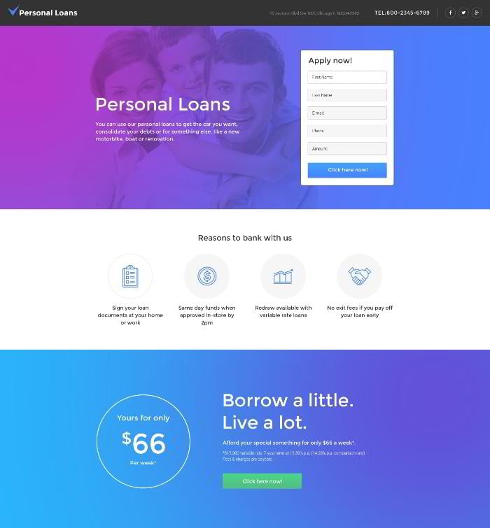
Financial Advisor Responsive Landing Page Template
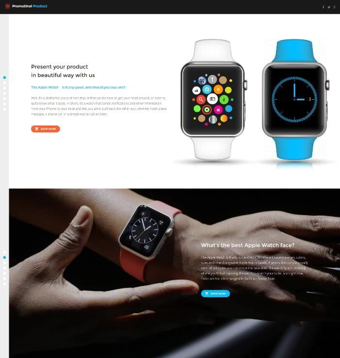
Print Shop Responsive Landing Page Template
Any landing page is single-purpose, which means that it is intended to lead to only one action. If you need to promote several products, create a separate landing for each of them.
Remove any functional debris that can potentially distract your visitors: other offers, banners, information about your company that doesn’t directly work towards your positive image, etc. It is especially important to hide all the navigation in order to prevent your visitors from fleeing to other pages of your website.
Make call-to-action buttons clearly visible
Call-to-action is the crucial element of any landing page. That’s why you should make it as outstanding as possible. First of all, put it in the area, which is visible for your visitors without scrolling down, a.k.a. “above-the-fold” area. Duplicating your call-to-action button in the bottom of the page will be a smart move as well.
Many conversion experts suggest building the entire landing page around the call-to-action, and not just incorporating it into the existing design. Such an approach requires a lot of planning ahead (and designing a custom page from scratch, which is not a cheap option), but it’s worth it.
Highlight important content blocks
It’s not only the call-to-action that needs to stand out. If your page contains such elements as pricing tables, you can bring them to the forefront by just increasing their size. Choose contrasting colors to highlight them even more, and run A/B tests regularly in order to know what variation is the most effective in your case.
Use rich media
It’s so great that today you can use high-definition images and videos. Placing a large expressive image onto your landing page is the fastest way to grab your visitors’ attention. If your product doesn’t allow using photography due to its “flat” nature, feel free to use videos – they are always appropriate.
According to Unbounce, integrated videos are able to increase the conversion rate by a whopping 80%.
Pillar Number Two: Copy
This is exactly the product you are looking for.
If design is the part of your landing page, which keeps and directs your visitors; then copy is the one, which actually sells. It is impossible to overestimate its importance, so better hire a professional copywriter if you are not confident in your persuasive skills. Anyway, you should find the following tips useful – at least, to be able to give a clear task to the copywriter.
Write a killer headline
The headline is the first text thing your visitors will see. That’s why it is vital to make it catchy and intriguing. This element is situated in the so called “upper conversion funnel”, where it is easy as to interest a visitor, so to lose him forever.
Be natural and personal
No one likes talking to a soulless machine, that’s why your copy should be written by humans, and for humans. Throw away your professional vocabulary, and focus on the benefits of your product, and not on its specifications. Your goal is to make your potential customer believe that the page has been created for him personally. Be a friend, a helping hand that is going to solve his problems; and not the guy, who tries to blatantly tout him a vacuum cleaner by phone.
Make your copy easy to follow
This rule was born in the days of PowerPoint presentations. Solid blocks of text written in small print will never convert as good as a well-structured bullet list providing essential information in an unobtrusive manner. As already mentioned, a lot of text information can be replaced with videos, infographics and other easy-to-grasp visual content.
Contribute to trustworthy
Implementing real testimonials is a great way to improve the credibility of your page, allowing you to squeeze the most out of your traffic. Did you notice that the word “real” is shown in bold? That’s because fake testimonials and reviews have diametrically opposite effect, being able to kill your business in its infancy.
Pillar Number Three: Usability
How about a nice big cup of connection timeout?
Now you should make a difference between “click” and “action” conversion rates. You, probably, want your visitors not only to click the call-to-action button (unless you are a monkey trainer, and that’s what your experiment is about), but to perform some action: make a purchase, subscribe to your newsletter, or sign up for your online courses. And here is where many well-thought-out landing pages spring a leak.
Maximize the loading speed…
… Not the loading time. Loading speed is among the most influential factors that can negate all your efforts to build a perfect landing page. After all, it does not matter how mesmerizing your copy is if your visitors close the page before it even gets a chance to load.
A 1 second delay in page response can result in a 7% reduction in conversions, according to Kissmetrics. Two seconds will reduce it by 14%, 4 seconds – by 25%. Do you really want to lose a quarter of your income because of such a trivial issue as poor website optimization?
Ensure smooth action process
After your potential customer clicks the desired button, fills in the registration form, or enters his email, he still has to perform another action or two. Most of the abandonments happen on this very stage, because webmasters often don’t pay enough attention to the technical side of their website. Make sure that this aspect of your landing page is polished and well-tested.
Don’t frustrate your customers
Be honest and transparent with your visitors if you want to see them among your customers. Forewarn them about any additional expenses they may encounter during the checkout, and they will repay you with loyalty and trust.
Conclusion:
You haven’t abandoned the idea of supplying your website with a landing page yet, have you? Great, welcome to the ranks of successful businessmen then.
21 Signs of a Perfect Landing Page Design [Free eBook]
Don’t miss out these all-time favourites
- The best hosting for a WordPress website. Tap our link to get the best price on the market with 82% off. If HostPapa didn’t impress you check out other alternatives.
- Monthly SEO service and On-Page SEO - to increase your website organic traffic.
- Website Installation service - to get your template up and running within just 6 hours without hassle. No minute is wasted and the work is going.
- ONE Membership - to download unlimited number of WordPress themes, plugins, ppt and other products within one license. Since bigger is always better.
Get more to your email
Subscribe to our newsletter and access exclusive content and offers available only to MonsterPost subscribers.


Leave a Reply
You must be logged in to post a comment.