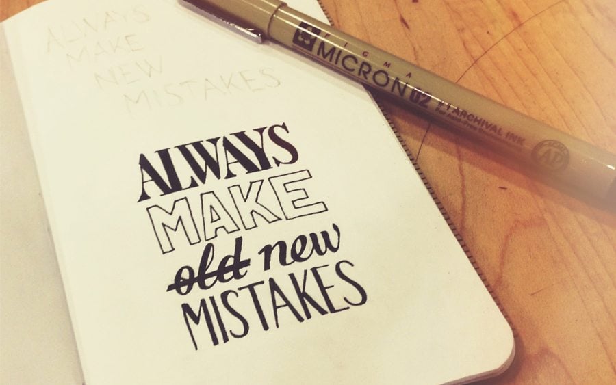
Web design is a transforming process. It is moving on every year. And each year, new trends are emerging. These web design trends help to make the website worth visiting for a number of people browsing the internet. Despite that, quite a few web design mistakes are also committed by the designers.
And at times they are grave enough to make your whole website disinteresting for the visitors. The result: the number of visitors will decrease and so will be the revenues. Hence, it is extremely important that you identify the mistakes you are committing in the web designing front and get rid of them to maximize your return from the business.
Not Giving Enough Importance to Hyperlinks
Are you treating the links properly? The hyperlinks are among the most important parts of your web design. They offer you the most valuable traffic. In fact, if you hyperlink the other pages of your website from one page, then you will be able to hold back the visitor to your website for a longer time. This will surely reduce the bounce rate and thus, have a positive impact on your site’s search engine ranking. So, as a designer, you need to treat them separately, as hyperlinks are extremely important. You should either highlight them or present them in a separate color. This will ensure that the readers are able to view the hyperlinks easily and hence, are likely to visit the linked pages.
Using Multiple Large and Heavy Images
A picture speaks a thousand words – this old adage remains true to this day. And this has found its use in web design as well. Hence, a large number of websites are using large images to communicate with their target audience. Many are using a number of such images to enhance the appearance of the website. This surely is a great way to make the site attractive as well. But there’s more to it. And you might need to face a few disadvantages as well.
One of the major problems faced by websites using numerous images is the long page load time. Images usually result in heavy pages. Hence, the time for the website to load increases significantly. This can have a negative effect from the SEO aspect, as it is likely to increase the bounce rate of the website.
Using Images that are Non-responsive
The images that are used in the website are usually not suitable for responsive web design. Hence, it is a major issue with a lot of websites. For example, many of the images in different websites do not fit in properly when viewed from different types of internet-friendly devices, such as mobile phones, tablets, and so on. This hinders user experience and hence, has a negative impact on the website’s performance.
Fixing the Length and Breadth of a Website
These days, people do not view the websites just in a personal computer. Instead, they surf the websites from multiple internet-friendly devices, such as mobile phones, tablets, and so on. Hence, it is important that a website can appear perfectly on all these devices. And this is what you need to do as a web designer. But in many cases, the designers fix the length and the breadth of different websites. This can be a major issue with many of the websites, as they won’t appear perfectly in the mobile devices. Or, you might need separate mobile versions for each of the websites.
Many designers also think that the web pages they are designing might fit all devices. While it’s true for some of the designs, they are not enough. These designs appear in the right way in some of the devices, but not all. Hence, it is important to go for a responsive design for your website’s design.
Not Making the Navigation User Friendly
Have you focused properly on the navigation of your website? A visitor might reach a landing page of your website and spend a bit of time there. But to keep him glued to your website for some more time, you will need to ensure that the visitor moves to other pages of the website as well. And for that, your website will require an excellent navigation. If you are not focusing enough on creating a user-friendly navigation, it is sure to have a negative impact on your site’s search engine ranking.
Continuing the Use of Flash Introductions
Are you still planning to integrate Flash introduction in your web design endeavors? But why? Flash introduction is almost a thing of the past now. They surely make the site look pretty. It is actually a great way to attract the attention of the users. But Flash introductions usually take a long time to load. Hence, it increases the bounce rate of the website. So, you need to do away with these Flash introductions to enhance user experience of your website.
As a process, web designing is a dynamic one. It changes every other day. So, it is important for you, as a web designer, to remain abreast about the new trends. It will help your site remain relevant and earn maximum return on investment.
