The Power of Imagery in Web Design. Trick Photography Mystery Uncovered
It’s a known fact that imagery helps making a web page brighter and more appealing. While there are thousands of great sites with stunning images available on the web, it may seem to be difficult to resist competition. However, everything is better than it seems. Adorning your site with trick photography you will not only make it remarkable but also boost sales, engage more viewers in, and achieve plenty of other goals effortlessly. Keep reading and discover the trick photography mystery.
Designing a content-heavy site, many web developers make use of photography. And that isn’t unfounded since imagery has a great effect in web design. Pictures are used to deliver various messages in any media, reinforce a news story, arouse desire to buy the promoted stuff, indicate the position of objects, etc. What is more, imagery significantly helps in building brand awareness and making your site more enjoyable. However, you should not overuse it. Too many photos can lose the page focus. Your site visitors can simply find it difficult to work out what is important and what serves as decoration. To put it right, here are several basic tips to consider:
***
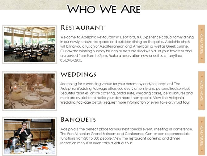
1. Keep images close to the accompanied text.
***
2. Smaller images help in faster page loads.
***
3. Images should guide users towards key messages on your page.
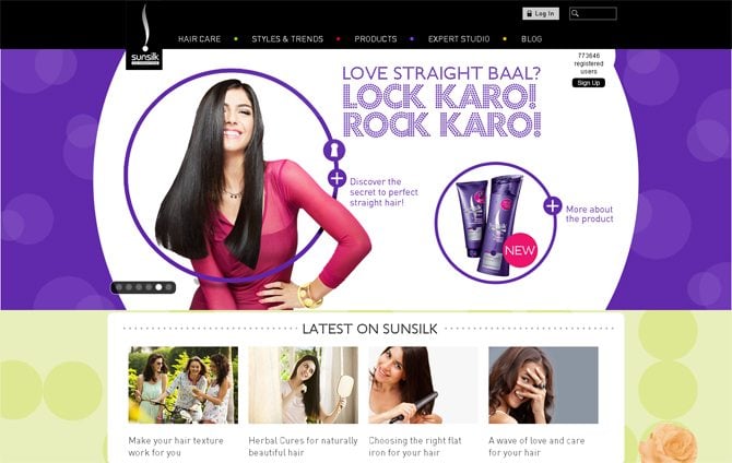
This tip would be of special use to those of you working in the ecommerce field. Advertizing different beauty products many of us are making a severe mistake – we put emphasis on a model rather than the stuff on sale. Try to draw the viewers’ attention to the advertized product primarily.
Sunsilk
***
4. Full-size background images
can create a stunning visual effect, especially for high-res monitors.
A Bit of History
Using background photos isn’t a new notion in the modern web design. However, do you know how and when it appeared? The roots of refreshing web design with imagery go back to the year 2003, when WordPress started spreading over the web. Initially, its interface looked rather simple and functional, but it didn’t feature anything to help webmasters stand out of the crowd. As the content managing system evolved, it started boasting of a bigger number of features and possibilities that helped using images in a new, unique way. Now web developers could express their creativity by adding photo sliders, image galleries, and more.
WordPress has always been a powerful and versatile platform that can be equally enjoyed by webmasters and visitors. However, it still lacked the strong visual engagement. That was the time when people began to look for something more appealing and interesting. Since then the web started consisting of the two competitive types of websites – functional but somewhat dry WordPress and catchy but slightly clunky sites built with Flash.
With the development of social media platforms like Facebook, Twitter and Instagram, people completely changed the way they used and perceived imagery. Photos become a more convenient way to express emotions, deliver messages to others, etc. In a word, people started communicating in images more often than in word. The same ‘hysteria’ touched upon web design, where photography became the ‘center of the universe.’
Imagery Effects in Web Design
Adding imagery to your website, just like any other element, should be done with careful thought and consideration. Though some web developers underestimate the role of photography in their online projects, many others preach the importance of refreshing layout with some tricky, catchy stuff.
A web page without any photos looks dull and boring. Would you stay on such a resource for long? I really doubt that. Unless it features some valuable written data, statistics and other information that is rarely accompanied by pictures, there would hardly be anything to make you come back. That’s an entirely different matter when we are talking about entertainment or business projects. Here imagery is often used with purpose. Whether your primary goal is increasing conversions, promoting your brand, improving visual appeal or simply enhancing the user experience, you may always achieve the desired results with the use of pictures.
Imagery talks better than words. We can hear, feel and smell something, but we will hardly be able to build the right concept of some notions unless we see them. A photo can refresh your web design and make it great. Picking the right picture you will make your web project look complete and well though over. So, what are other cool effects of photography in web design? What’s the purpose of adding imagery to your page? Answers to these and a number of other questions can be found below.
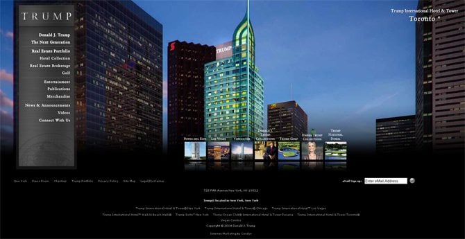
- Large background images have a bigger impact on viewers. The concept stems from portfolio design – grab users’ attention once they come up with your site and then guide them to additional information. Though many thingkthat this technique should be primarily applied to such photo-rich sites as designer and photographer studio, it can be also used in business projects. Have a look at the TRUMP official site. They make use of animated background photos to engage more clients in.
- Photos are great attention grabbers. As a rule, every article posted online comes accompanies by several images that help to reveal the message of written data. When people reach long posts, in most cases they skim over them. If they find the imagery you’ve shared intriguing, they will stop and pay attention to your data.
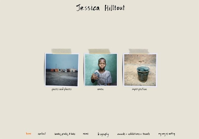
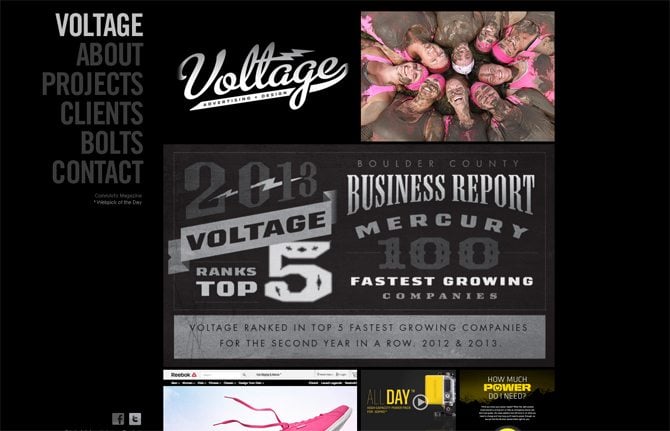
- One of the recent web design trends that is gaining popularity at a fast pace is using imagery for navigation. Similar to such popular social media platforms as Facebook and Pinterest that have taught users to click on miniature images to proceed to the next page, many websites are also using this technique, replacing the more common text navigation and adding on-hover effects to images. See how VOLTAGE makes use of this.
Keep in mind that less is more. No matter how professional and amazing your images are, cluttering your page will lead to the opposite results. Even if pro photography services are not in your budget, you may also use stock images that do not lag behind in quality and can still be highly effective.
Be very selective about the images you choose. Opt for those ones that would help you better communicate your business ideas and fit your brand. The properly chosen imagery will enhance your website content and perfectly fit all other element on the page.
Trick Photography Techniques
To put it simple, trick photography is the genre the makes use of special effects that make you wonder “How did they do that?” This is not a simply photoshopped image. Trick photography is the product of a highly skilled pro who knows how to use his/her camera right and capture the right moment. No matter what make and model of the DSLR camera one is using, the better you know the functionality of your gear, the better results you will get.
Illusion is an alteration of your mind. This is the way our brain perceives and interprets a captured or drawn object. What we may claim for sure is that web users adore trick photography.
Sharing compilations of this online they draw more attention to this art (yes, you got it right!). So, can you just imagine how many viewers your site would draw once you update it with such images or simply share a post with a compilation of these?
To a master of trick photography, one of the best compliments that can be paid is the belief that their photo was photoshopped before showing it in public. Have a look at some of the greatest examples of trick photos on the web and try to figure out how these shots were taken.
***
Forced perspective is one of the most widely-used techniques by trick photographers. Here the main idea is to make an object look closer or further, smaller or larger than it really is.
Blowing in the wind by Jeppe Olsen
[mfc_lightbox]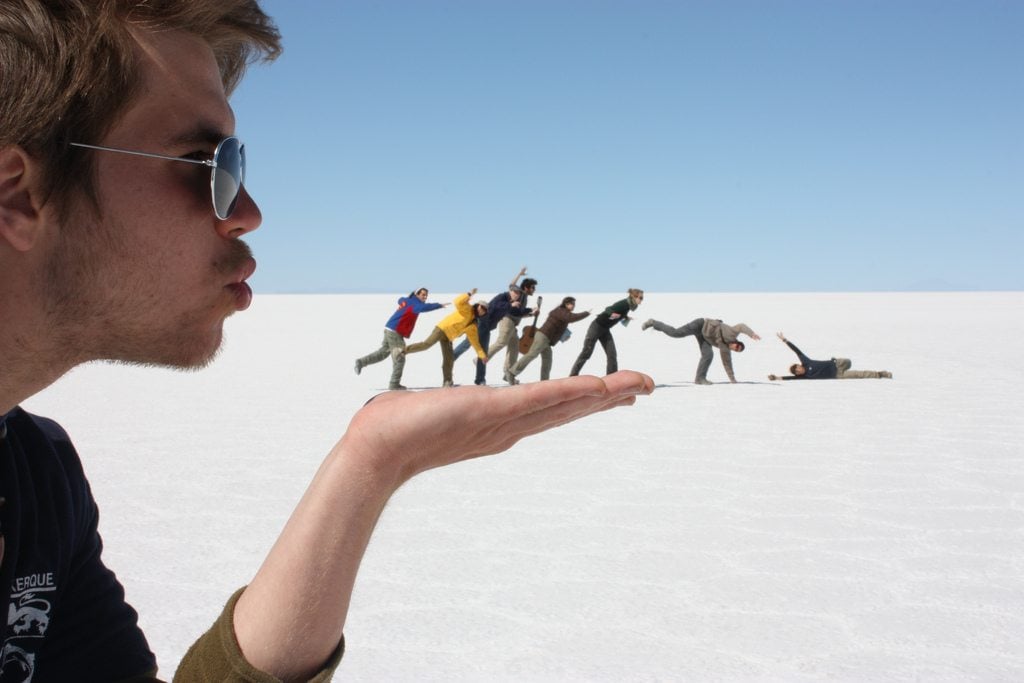 [/mfc_lightbox]
***
Levitation photography is a trick that shows people or objects that seem to be defying gravity. Using this special effect you can make people look as though they are flying, climbing the wall, standing on a ceiling, etc.
Magic trick by Jonathan Longstaff
[mfc_lightbox]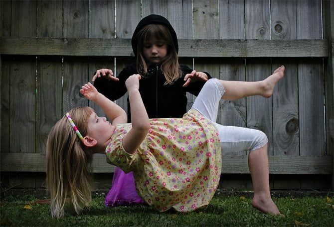 [/mfc_lightbox]
***
Long exposure is one of those trick photography examples developed in modern times. The idea is to hold onto the light for a little longer to create the ‘moving’ effect on a photo.
Tressa - Kakaako Photoshoot by Kyle Nishioka
[mfc_lightbox]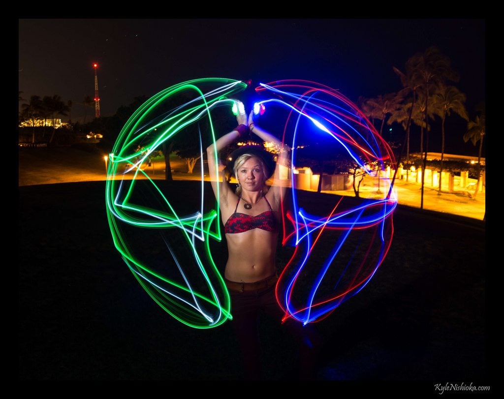 [/mfc_lightbox]
***
Multiplicity is another popular photography trick where you take several photos of a scene (say, three photos), and between each photo you move the subject.
Hear see speak no evil by Josh Wendler
[mfc_lightbox]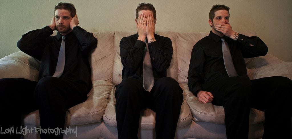 [/mfc_lightbox]
***
Add some chaos to your photo using Curtain Flash Sync effect. The primary goal of this method is to fade the background and put focus on the moving objects.
Rear Curtain Sync photography by Neil Patrick
[mfc_lightbox]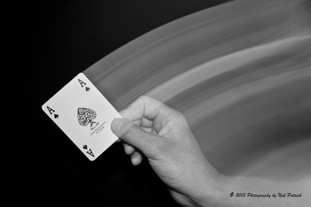 [/mfc_lightbox]
***
To sum it up, you may use images not only for the sake of making your web page more visually appealing. A properly selected photo will be a great way to express your thoughts, deliver your business ideas, and enhance the user experience on your web resource. Every element of your website should benefit your company and trick photos are no exception.
Don’t miss out these all-time favourites
- The best hosting for a WordPress website. Tap our link to get the best price on the market with 82% off. If HostPapa didn’t impress you check out other alternatives.
- Monthly SEO service and On-Page SEO - to increase your website organic traffic.
- Website Installation service - to get your template up and running within just 6 hours without hassle. No minute is wasted and the work is going.
- ONE Membership - to download unlimited number of WordPress themes, plugins, ppt and other products within one license. Since bigger is always better.
Get more to your email
Subscribe to our newsletter and access exclusive content and offers available only to MonsterPost subscribers.

Leave a Reply
You must be logged in to post a comment.