12 Natural Science and UX Laws that Impel Web Design
Universal UX laws may not always be the measure of all things, but they can help to achieve success in different areas, including communications, manufacturing, services, technology, art, and environmental design.

Throughout the ages people have been arranging important knowledge, which form the basis of rules in design. This is the knowledge of the general positive reactions of the human being. David Hume called this the nature of "constant and universal principles of human nature."
Only the product that is created using these rules gets the highest demand of the consumer. Main principles of these rules can be applied in art, architecture, photography, interior design, communication technologies including advertising and website design. Original purpose of design is the aesthetic appeal of the product. For competitive realization of design ideas one need to understand the processes that affect human perception.
How to explain web design fundamentals in public effectively? Download ppt templates
Occam's Razor
Occam's razor (the law of minimum assumptions) - formulated in the 14th century by Father of Church William of Ockham, the law which was ahead of its time. This law is not indisputable, scientific progress can do without it, but, however, it shows that the most appropriate solution is the simplest one. In other words, the most preferable is the simplest explanation of theory that becomes the only correct explanation/solution.
Leonardo da Vinci pointed out: "Simplicity - is the most ultimate sophistication." When applied to design, Occam's Razor warns that unnecessary complexity should be avoided in presentation of information.
To understand this law better here are examples from TemplateMonster's collection:
Fibonacci Sequence
The Fibonacci sequence is named after Leonardo of Pisa, who was also known as Fibonacci. The sequence was revived in early 13th century, but was seen previously in works of old Indian mathematicians. The sequence continues by summing the last two numbers. It starts with 0, 1, 1, 2, 3, 5, 8, 13, 21, 34, 55, 89, 144, etc.
Interesting! This sequence can be seen in nature (branching of the tree, the petals and leaves of most plants, as well as in the behavior of the bees).
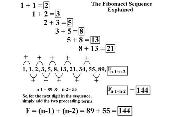
Most people find such designs as the most aesthetic ones. In fact, many of us consider this sequence as the most important model in mathematics, as well as in web design. It can be successfully used to create drawings and geometric and organic ornaments, and visual images, and even for individual tracks.
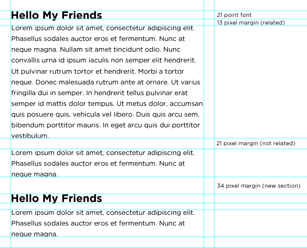
If you look at the Fibonacci sequence and consider them as possible section, margin and font sizing it should be clear that it can structure your entire design. The smaller range of the sequence (8, 13, 21, 34, 55) is perfect to decide margins, line heights and font sizes. The higher range of the sequence (144, 233, 377, 610, 987) can easily decide column widths and other section dimensions.
The Golden Ratio
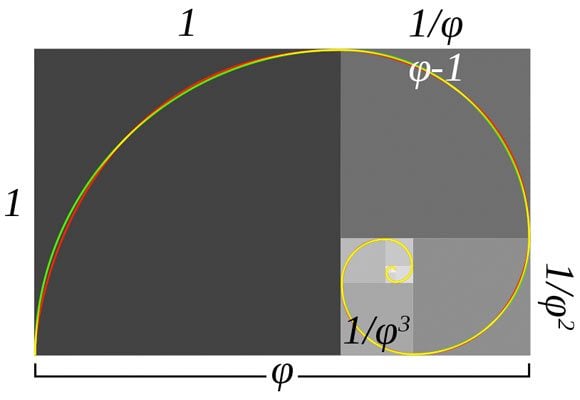
The Golden Ratio - in fact, this is mathematical variation of the Fibonacci sequence. Golden ratio - is a constant equal to 1.6180339887. This law was realized more than 2,000 years ago, but for the first time Euclid defined it. Golden ratio justifies the choice of proportions of shapes of the design so that it will look more attractive.
"Geometry has two treasures: one of them - the theorem of Pythagoras, and the other - division of lines of the golden ratio. First is the precious metal of geometry, and the second is it's jewel"- Johannes Kepler.
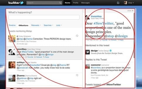
The idea of the golden ratio is following: a larger part of one segment is referred to its lesser part as the whole segment refers to its greater part. This ratio describes the relationship between the long and short sides of the rectangle...
Here are the examples of practical application of Golden Ratio into TemplateMonster's templates:
The Rule of Thirds
The rule of thirds may resemble the golden section, but, in fact, it's not the same thing. This law has been ascertained for the first time in 1797 in the book of John Thomas Smith, "Notes on the background of the rural landscape." Smith saw his discovery as a generalized rule, not as an absolute law. However, in reality it turns out that if designers do not neglect this law, the results would be the most attractive for most users.
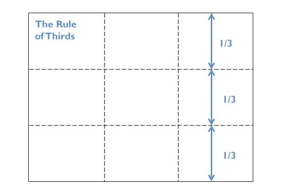
If we divide any image by imaginary horizontal and vertical squares into nine blocks, the line and the intersection of the lines will be the most important. The division of space on the image divided in to two parts only one of them is the sky and the other one is the earth, or the sky and the water on one of the three horizontal lines is also preferable to division into two similar parts. Such disproportionate division concentrates energy and attracts more interest. For artists and designers the understanding of the rule of thirds can lead to an increase in audience interest towards their works.
This is how this rule works in TemplateMonster's themes:
Pareto Law
The essence of the Pareto law or the 80/20 rule is well known to team leaders, those who run meetings. Pareto's law states that no matter how many events occurred, 20% of the results are caused by 80% of the efforts.
Joseph M. Juran in 1906, called this phenomenon after Wilfredo Pareto, who proved that 80% of land in Italy belongs to 20% of population of Italy. This law was explaining why 20% of criminals commit 80% of all crimes, and why 20% of all users of the health system use 80% of its services. And in general, why 80% of all results come from 20% of all actions.
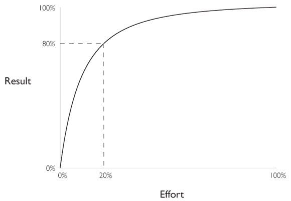
For practical use in the website, the statement should be the following: if 80% of users use only 20% of the information provided, columns, buttons, etc., than everything that is not in use should be reduced or replaced with something more efficient (or even avoided). This solution is supported by Occam's Razor - an irrational approach to simplicity of use.
Signal-to-Noise Ratio
Signal-to-Noise ratio determines the true balance between message and background noise, which may limit or reduce the value of the message. If the proposed ratio is 1:1, it means that the background noise is almost equal to the power of posts. In this case, the results will be lower than expected.

Correction may be in the selection of the main element, which can be both audible and visual. This may also include the removal and reduction or distracting sounds or visual disturbances.
If you let important and useful information to take the main place and reduce unnecessary and useless information, it will definitely bring good results.
The Law of Perception
The law of perception practically speaks for itself. If the information or instructions are not presented in an accessible form, this information will be ineffective, and it will not have a positive effect. In most cases, the best guidance is the shortest and the simplest. Equal use of audio and video formats, including graphics and text, may make guidance more informative and at the same time easy-to-read.
Using a variety of following elements will work for you, they include: important instructions, directions and information keys.
Zeigarnik Effect
“People remember uncompleted or interrupted tasks better than completed tasks.”
A Soviet psychologist and psychiatrist, Bluma Zeigarnik, conducted a research on memory in the 1920s. She was comparing memory in relation to incomplete and complete tasks and found that incomplete tasks are easier to remember than successful ones.
Another psychologist - Kurt Lewin, the creator of Field theory, explored how the Zeigarnik effect works in real life. He observed how a waiter worked with his orders. The waiter remembered the “still unpaid” orders much better than those that people had paid for.
How to use Zeigarnik Effect in UX design?
In design one of these UX laws works to create deeper user engagement:
- Using gamification UX laws
It’s a common practice to motivate users to go deeper into any process of your product using reward and credit systems.
- Feeding user’s ego with challenges and goals
Starting challenges, setting goals and encouraging users to publicise their achievements have always created better user engagement. Feeding user’s ego is the reason behind the success of many apps on the market. This works for fitness apps and social media apps (Instagram, Tik Tok).

- Progress bars & completeness meters
Using progress bars for complex tasks increases the likelihood of them being completed. Completeness meters have been a part of various social media and job portals where candidate or personal information is required in order to connect or validate the level of genuineness or simply for collecting information.

Fitts’ Law
“The time to acquire a target is a function of the distance to and size of the target.”
While examining the human motor system, psychologist Paul Fitts showed that the time needed to move to a target depends on the distance to it, yet relates inversely to its size. Fast movements and small targets result in greater error rates. Fitts law greatly influenced the commencement of large buttons (especially on finger-operated mobile devices):
- Touch targets should be large enough for users to both discern what it is and to accurately select them.
- Touch targets should have ample spacing between each other.
- Touch targets should be placed in areas of an interface that allows them to be easily acquired.

Hick’s Law (Hick–Hyman Law)
“The time it takes to make a decision increases with the number and complexity of choices.”
Psychologists William Edmund Hick and Ray Hyman have established that “increasing the number of choices will increase the decision time logarithmically.”
How to apply it as one of design UX laws?
- Simplify choices for the user by breaking down complex tasks into smaller steps.
- Avoid overwhelming users by highlighting recommended options.
- Use progressive on-boarding to minimize cognitive load for new users.
Keep in mind that users browse your website with a specific goal. Minimize the distractions by removing unnecessary links, images, text and buttons from pages to allow users find what they need asap.
Shorten long lists and reduce the amount of options where possible. In cases where long lists are inevitable, limit the number of options the user can view at a single time to make scanning easier and faster.
Pavlovian Conditioning
“When we are getting used to performing a certain action or reaction based on a memorized pattern, we would perform the same action or reaction if the pattern shows up yet again.”
Pavlovian Conditioning is a behavioral principle discovered by a physiologist Ivan Pavlov. He researched how stimulus and reaction works. Pavlov research was based on measuring dog salivation rates increase whenever he performed actions (opened the door, turned on the lights) indicating they’d be fed.
Pavlov’s principle can be applied as one of UX laws to help enhance navigation. It can help choose the right color for the buttons and sections that need more attention. When designing a CTA button, this principle can point at the right choice.
For example, if a user sees a CTA button painted red, they will be more determined to press it. By creating a red CTA button you send a call to action, and you get the desired reaction.
Good example:

Bad example:

Serial Position Effect
“Users tend to remember the first and last items in a series best of all.”
German psychologist Hermann Ebbinghaus researched how the position of an item in a sequence affects recall accuracy.
- Placing the most important information first, and last. Placing the least important information in the middle can be a highly effective way to get users' attention.
- Placing the least important items in the middle of lists can be helpful because these items tend to be stored less frequently in long-term and working memory.


How to apply serial position effect in UX design?
1. Provide users with tools to help them achieve their goal and be more efficient.
For instance, apps like Keynote, Photoshop etc. provide users with page number information, rulers, and grids to help the user create better work and be faster at it.
2. Provide users with cues to help them identify something they’ve done/learned before. For this use sounds, visuals, etc.
3. Limit the amount of recall.
Due to the limited attention span, designers should ensure users are only faced with less than five items at any one time within the dialogue. Many online retailers know that it’s important to keep the user informed as they move through the user flow of product purchasing.
4. Emphasize the important things at the beginning and the end.
If a website sells clothes or other items, UX laws designers study the traffic to each of these items with the help of the marketing team. The items that sell the best, go in the beginning and at the end of the line, while items with less traffic go in the middle.
That's it for today! If want more videos about UX laws and design psychology, subscribe to TemplateMonster's YouTube channel!
Conclusion
You may want to consider other principles and laws, such as equal use of nearby objects and the law of physical force, etc. There are many cases in which these laws can have an important role, as part of the design process. If you find theme theme really interesting and useful feel free to express you opinion in the comments section and we will consider posting the continuation of this article.
Understanding that "there is one common consciousness of each individual" (R. Emerson) means that the better you understand human nature and what drives our perception, the better your design will be.
In a few words: all spheres of human activity are interconnected, if we make an intense brainstorming we will find links with some absolutely unexpected things like the influence of Large Hadron Collider on web design, or how movement of subatomic particles affects image sliders.
P.S. If you know other rules aimed at making designs better spread the word in the comments section.
Don’t miss out these all-time favourites
- The best hosting for a WordPress website. Tap our link to get the best price on the market with 82% off. If HostPapa didn’t impress you check out other alternatives.
- Monthly SEO service and On-Page SEO - to increase your website organic traffic.
- Website Installation service - to get your template up and running within just 6 hours without hassle. No minute is wasted and the work is going.
- ONE Membership - to download unlimited number of WordPress themes, plugins, ppt and other products within one license. Since bigger is always better.
Get more to your email
Subscribe to our newsletter and access exclusive content and offers available only to MonsterPost subscribers.




Leave a Reply
You must be logged in to post a comment.