Captivating Web Design Trend That Will Make You Stuck: Bubbles, Circular Elements, and Droplets
The more tempted users are, the more difficult it is to engage them. UX/UI web designers use psychological tricks of visual perception to catch users’ emotions and desires.
Speaking of elements that help to create a website with a good conversion, let’s talk about those that we subconsciously perceive in a positive way or elements that are mostly liked by users today.
According to UX specialists, there are some more or less tenacious trends in web design, i.e. round shapes. Since 2016 till the end of 2018, this trend has been transformed from clear geometry in 2016 to streamlined shape at the beginning of 2018. And now it is animation and interaction of natural or round shapes.
Let’s see the most eye-catching websites that use bubbles, circular elements, and droplets in combination with some animation and interactive. It’s a 2019 trend and a sip of inspiration for your business, so take it!
Geometric And Techno Circular Elements
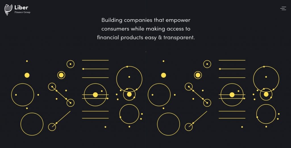
Liber Finance Group
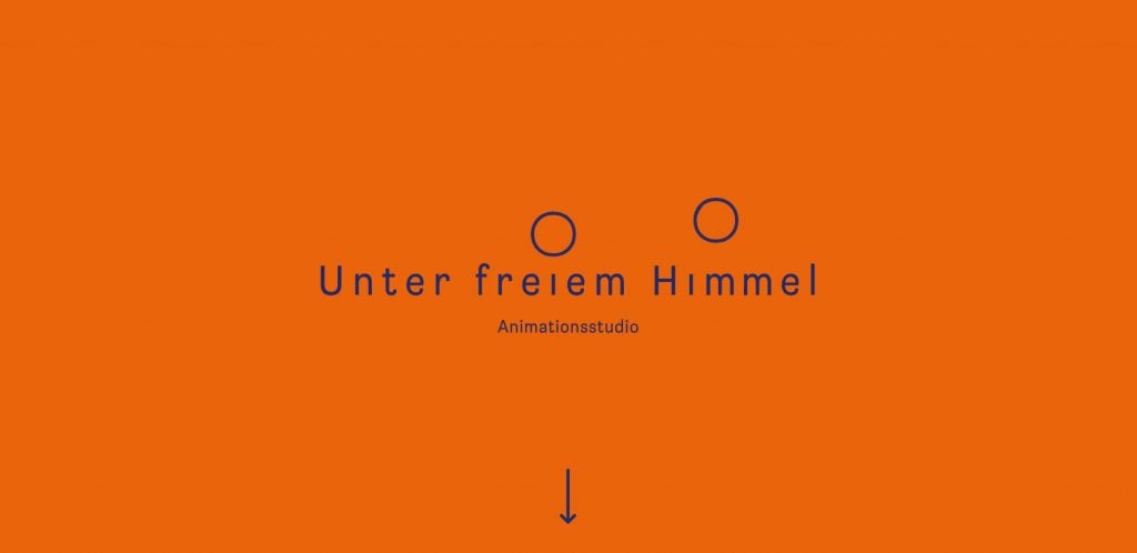
Unter Freiem Himmel
Wealthsimple
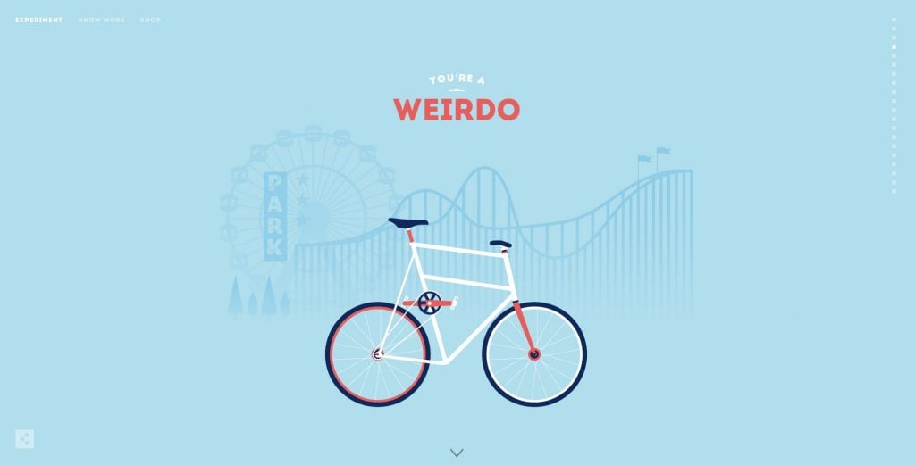
Cyclemon
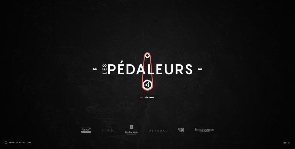
Les Pédaleurs
Natural Shapes
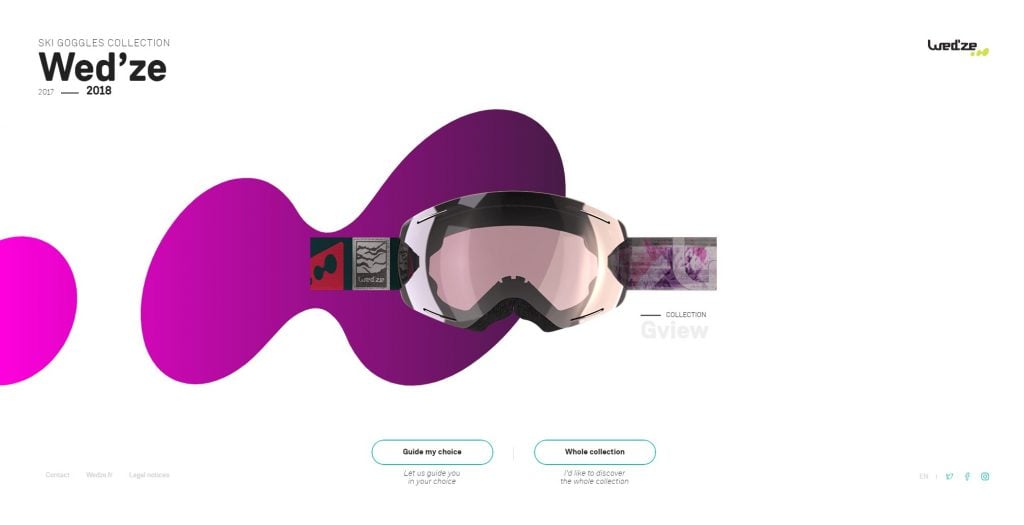
Wed’ze
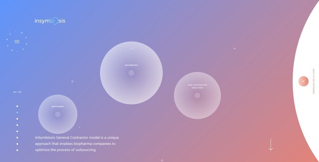
InSymbiosis
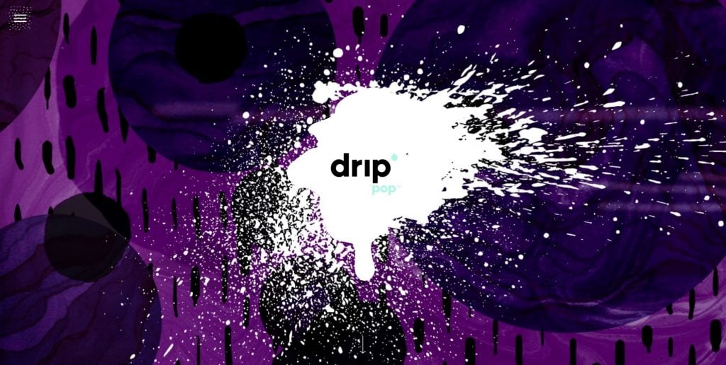
Drip Pop
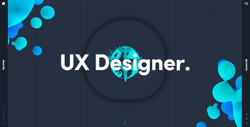
Andy Patrick
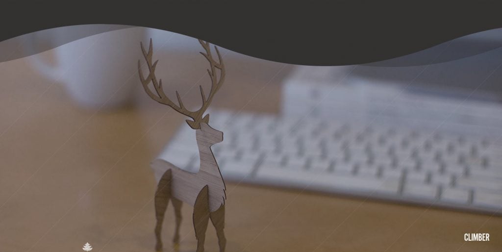
Climber
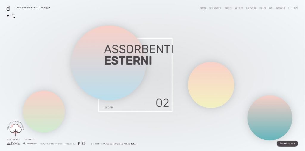
DOT
Bubbles And Circular Elements in Website Templates
If you are inspired by an idea to use such elements in your project, take a look at website templates with this kind of mood and elements.
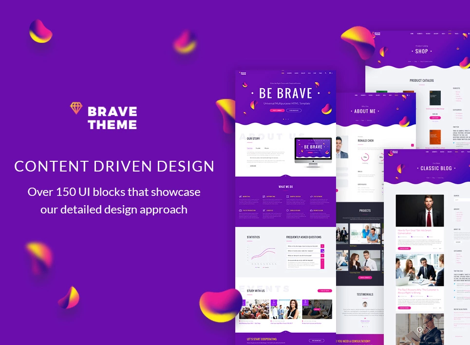
Brave Theme - multipurpose responsive HTML template with an optional Visual Page Editor – Novi abord
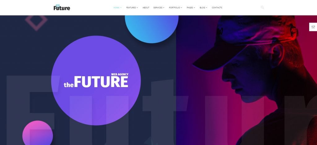
The Future - multipurpose HTML template
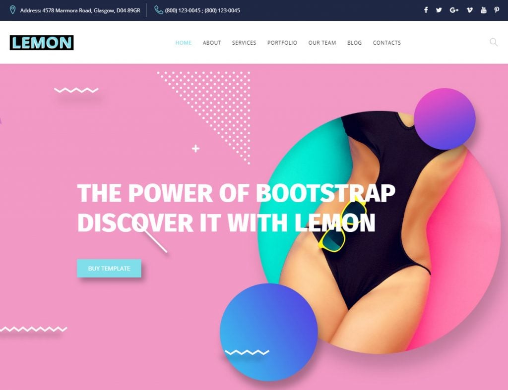
Lemon - Design Company Responsive HTML Website Template
At TemplateMonster marketplace, you can find a lot more templates, themes and options to build a stunning website. If you have any other brilliant examples of websites using trendy design elements, share it in the comments below.
Read Also
Ecommerce Web Design Trends 2019
[Web Design Mauvais Ton] 10+ Techniques to Avoid in 2018
10 Typography Trends to Stick to in 2018
Top 9 UI Design Trends for Mobile Apps in 2018
Latest Design Trends for Online Photo Galleries
Web Design Essentials For Non-Designers [Free Ebook]
By clicking the button you agree to the Privacy Policy and Terms and Conditions.
Get more to your email
Subscribe to our newsletter and access exclusive content and offers available only to MonsterPost subscribers.


Leave a Reply
You must be logged in to post a comment.