The Weblog Usability: Points of Concern [Starter’s Guide]
All around the web we can hear how usability is important. But most blog users neglect the simplest usability rules. As a rule this happens because of lack of knowledge in usability, or simply because blog owner does not really care about these "low desires".
In this article we'd like to point out the simplest and the most important usability rules of every blog. Following these you'll be able to improve your weblog, gain more readers and make more money with your online publishing.
How can the blog owners discover whether their resource is usable...or not?
How to find and fix possible issues?
These questions are extremely important. Ever since search engines pay more attention to behavioral factors. In here we'd like to point out most important factors of usability, each point is backed with some examples of relevant tools.
Three Pillars of Usability
- Average load time
If your blog loads way too long, you need to optimize it as soon as possible. Probably you’ve heard about the "two second rule": average visitor doesn’t want to wait more than two seconds for a site to load. “If I have 20Mb Internet speed why should I wait 10 seconds till your blog loads.” There is a bunch of techniques you can implement to improve load speed. If you have tons of images – lazy load plugin is a must have for you.
- Obvious presentation of information
In this case, obvious means clarity of information and good looks. Semantic clarity means straightforward titles of articles, columns, pages. If you can create a puzzle that all users will be interested to solve - go for it. Make it simple and clear, in though an Internet newbie will get it where to find info about new types of tires, or where to subscribe for the blog updates.
- Less movements – better feedback
The law of conservation of energy is so versatile to be legit everywhere. Internet users can be compared with those types of energy that transfers from one condition to another. Here comes another rule that should not be neglected - "the rule of three clicks". That is how much action average reader is ready to make.
Seven Points of Weblog Usability
1. Hi-quality Graphics
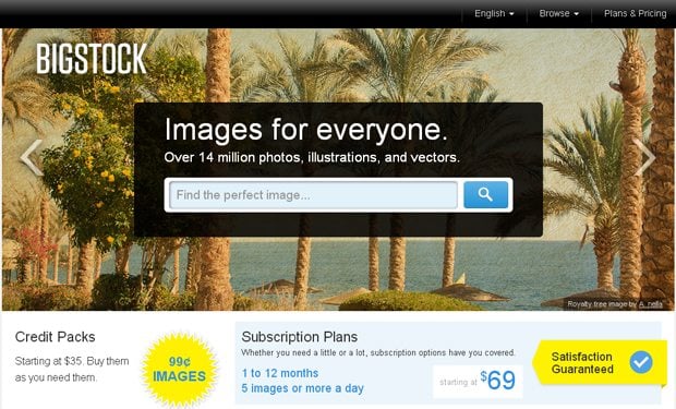
All images you’re using on your blog should be done professionally. They shouldn't be blurred or differ when used in various parts of your blog. Using the resources given below, you can buy hi-resolution images for your blog.
BigStock Photo
***
***
2. Forget about Unnecessary Elements
You shouldn't use widgets like calendars, watches traffic sources, or whichever else that will drive your users away from your blog. But don’t overload your pages with ads banners. (We’re not talking about banner/content rotators they’ve proved to be really useful and helpful to grasp attention of visitors).
3. Choose Your Fonts Wisely
Fonts play the most important role on the blog. They should not be too small and at the same time not too large. Also, you must not change your fonts all around the blog post, trying to highlight this or that paragraph, these attempts of yours will only scare away your visitors.
Source: NY Times
4. The Color Scheme
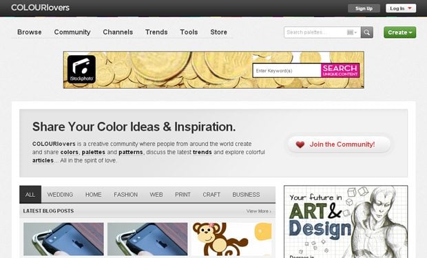
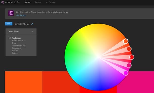
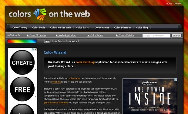
You should use calming colors within your blog. If you’re not aware of color psychology read some articles where symbolism of color is depicted. Colors on the blog shouldn't irritate your visitors, or burn their eyes out.
Colorlovers
***
***
5. Advertise on Your Blog
No need to cram your blog with ads. Choose 3, max 4 places all around your resource where you can place the ads. Here is a list of articles about ads placement:
- Best practices for ads placement
- Best places to put ads on your site
6. Modal Windows
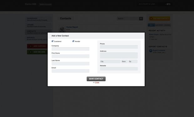
Forget about modal windows once and for ever. This is the first reason your visitor leave your blog. Imagine you were advised to visit some interesting blog, you click the url and what do you see? Blacked out background and a modal window in center asking you to subscribe for the blog. If you want to get subscribers, better add the form on a home to gather their emails.
7. Cross Browser Compatibility
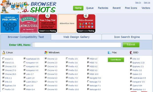
Be sure that you blog is displayed in all browsers adequately. To check whether it’s compatible with major browsers, you can use some special tools. Like:
BrowserShot
***
Having that said that, the best way to learn about UX design principles and practices is to read special literature and to experiment with your own weblog. In case you're not really about your progress, you can always hire a designer and professional for a piece of advice. We'd like to share with you four ebooks about interface design. They contain much information that will help you create awesome designs:
- Human Computer Interaction Lecture Notes by Dr. Keith Andrews (2011)
- UX Storytellers – Connecting the dots by 42 UX masterminds
- Free Web Design Ebook
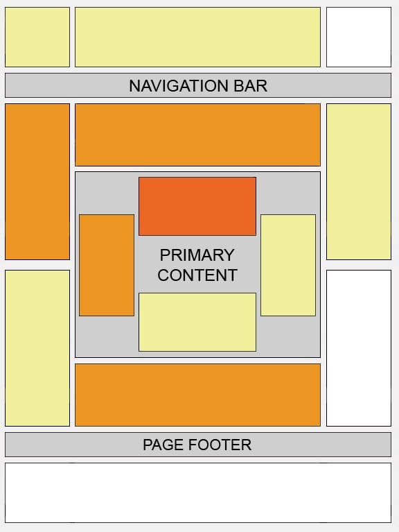
- “Mosaic Layouts”: How and Why to Avoid Creating Puzzle-Looking Websites
***
SPEAK UP!
If you have any question, you're free to ask those in the comments section below. We'll gladly give all the answers.
Don’t miss out these all-time favourites
- The best hosting for a WordPress website. Tap our link to get the best price on the market with 82% off. If HostPapa didn’t impress you check out other alternatives.
- Monthly SEO service and On-Page SEO - to increase your website organic traffic.
- Website Installation service - to get your template up and running within just 6 hours without hassle. No minute is wasted and the work is going.
- ONE Membership - to download unlimited number of WordPress themes, plugins, ppt and other products within one license. Since bigger is always better.
Get more to your email
Subscribe to our newsletter and access exclusive content and offers available only to MonsterPost subscribers.




Leave a Reply
You must be logged in to post a comment.