

This is actually a common situation when a user visits a specific website, finds something interesting, but can’t find that thing while revisiting the site once again. This happens because a website owner or a designer created a navigation that is quite tangled. Trying to find the right information, people as a rule do several attempts, but often they almost immediately leave the artful maze. When it comes to designing site and its navigation, for some reason it is assumed that the new visitor starts journey around the site from a home page. But it's a mistake, the search results can bring the user to any part of the website. That's why making navigation easy to comprehend is dead essential.
* * *
Navigation Planning Scheme
The scheme below shows a classic navigation structure of any modern website. You can use it when creating your website navigation or as a proof for your client that navigation has to be like this, but not as they want (unless they are website usability genius). 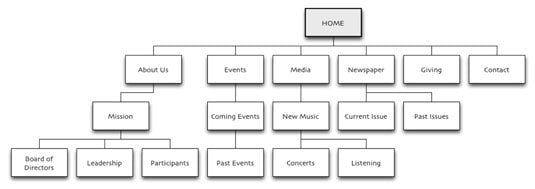

* * *
What is a User-Friendly Website Navigation?
Links in text should be visible, they need to be distinguished by some different color, and probably underscored. Once hovered over, the pointer near the active link should become a hand. For all users this is a hint that this piece of text is a hyperlink. In terms of usability, navigation throughout the website must respond to three main questions:
- Where is the visitor?
- What pages did they visit?
- What other pages are available for them?
There's one rule. Links to pages that user have already seen should be in a different color from those which haven’t yet been clicked. Upon its functions the navigation is divided into several types:
- Language navigation - stands for the language interface and displays content on a user-selected language.
- Basic navigation - these are the most important sections of the site, as a rule the menu.
- Global navigation - these are the links that should be visible from any page of the site, for example link to the home page.
- Advertising navigation - these are the links that should attract visitors to the advertising pages where goods and services are located.
- Thematic navigation - this is a navigation throughout one specific topic (column) on the site.
- Text navigation - this is a text of a hyperlink on the page. From a usability standpoint, they need to direct user to the material referred in the text. From the point of view of optimization, it is a robust cross-linking in the site.
- The guiding navigation - otherwise, reference. The hyperlink indicates where exactly is the visitor on the website right now.
- Geographical navigation - used on sites where one can find sections devoted to different countries.
* * *
Bad Piece of Advice
We've been always sharing with you some good pieces of advice, but this time we decided to make something opposite. Below you will find bad pieces of advice with good explanation.
- Use only JavaScript for the navigation
Imagine that your visitor turned off Java in their browser (for safety reasons), how will they navigate on website? Right, they'll go to the home page or click some sidewide links that can be found on any page.
- For navigation, use only images
Search engines can't read images, they can only read text. So if you are using pictures to navigate, search engines can't index your page. If you insist on using pictures, do not forget to place "alt" and "title" attributes. If you are using text navigation, use the links with relevant words and phrases that describe the content of the pages hiding behind them. This will greatly facilitate the users orientation on the site.
- Use drop down navigation
Have you ever visited sites with a drop down multilevel menu which folds you barely miss the item? You will have to get closer to the screen and squeeze mouse harder trying to click the needed menu item. This really drives users mad!
- Don't use keywords in links
People don't read texts, they scan. That's why including keyword into the link is important.
- Don't show people where they are
People need to be shown the page or category they are in right now. With the help of breadcrumbs people can easily understand where they are.
* * *
Navigation and Usability Checklists
Why do people love checklists? These lists ease the work process, with their help we can make everything we planned without remembering postfactum that we missed something. In web designing checklists are also very helpful especially on primary stages of development. Creating navigation that will work for the favor of your website is not that difficult. One can easily find best practices guides on the web, but we've decided to share some with you. Below you will find some navigation checklist that will be really useful for any kind of sites. Essential Navigation Checklists for Web Design 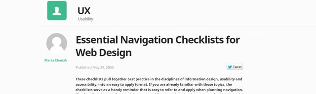

* * *
25-point Website Usability Checklist 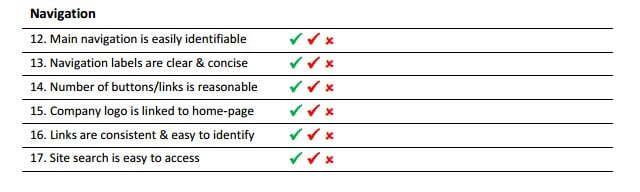
* * *
57-Point Checklist for Maximum Usability 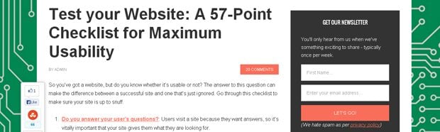
* * *
Navigation Checklist PDF 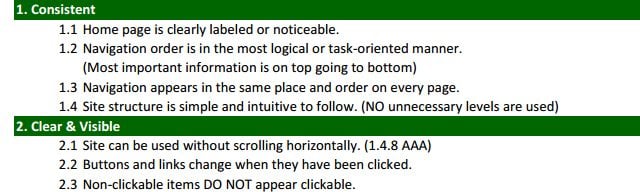
* * *
Navigation Tutorials
Everyone needs a perfectly fine and usable navigation. Here we've got a bunch of navigation tutorials that will help you improve yours. How to Make a Responsive Slide-Down Navigation There are plenty of CSS3-based responsive navigation menus which are great for general content websites. The only problem is that not all browsers support native CSS3 transition effects. Using JavaScript as an alternative helps when applying the sliding animation effect onto responsive layouts.


Live Demo - Download Source Code
* * *
Drop Down Menu Tutorials in HTML5, jQuery, and CSS3 Here you will find a compilation of 20 drop down menu tutorials that will teach you how to create menu design elements with HTML, CSS, and jQuery. You’re more than welcome to bookmark this post and use these tuts for your future projects. 

* * *
How to Code a Header Navigation with Centered Logo In this tutorial you will learn how to build a centered logo header design with HTML and CSS. The webpage body is fairly bland since the focus is on the core header. But definitely check out the live demo example to get an idea of what is being built. The best solution is to incorporate transparent PNG images for your logo design, which will have no background and sit directly in the middle of the navigation menu.
![]()
Live Demo - Download Source Code
* * *
As we were speaking about the checklists, the conclusion will also look like a checklist: Introduction - Done Classic navigation scheme - Done What's a user-friendly navigation - Done Some "Bad" pieces of advice - Done Navigation checklists - Done Navigation tutorials - Done
* * *
SPEAK UP! The "Leave a message..." square at the bottom is for you now 🙂 Spread some light on navigation issues or just share your favorite joke.