Banner blindness
Banner blindness (a.k.a. ad blindness) is a pretty interesting, but oftentimes disappointing phenomenon of banner ignorance by website guests. Users tend to ignore banner-like information on the website as they perceive it as irrelevant and obtrusive.
Website usability tests
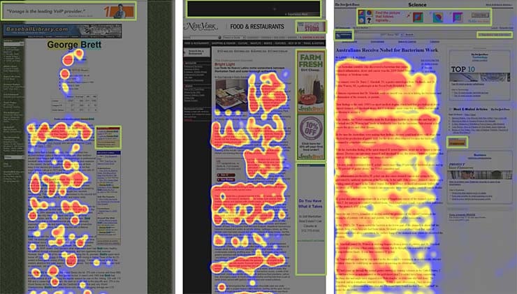
Banner blindness was proven by a number of website usability tests that involve eye-tracking. A user gets a task either to browse a web page or to search for some specific information. While the user is searching, their eye movements are registered. As a result, it becomes obvious, which information receives user’s attention and which is ignored.
This picture shows the results of eye-tracking studies. Banner ads receive the minimum amount of attention, which is pretty disappointing for website owners, who want to get revenues from their websites. Moreover, users tend to focus merely on the main content. They not only avoid ad banners but also avoid banner-like navigational and informative blocks.
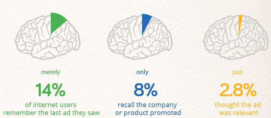
It’s reported that 86% of users suffer from banner blindness. Just 14% percent of Internet users remember the last ad they say, and just 2.8% find this ad relevant.
How to combat banner blindness?
There are several ways to make users mind your banners.
Banner placement. Users scan the page from top left to bottom right. These are the areas that receive the biggest amount of attention. Place your banner there, and it'll be less ignored.
Native appearance. Screaming, animated banners are quickly identified by users as noise and, consequently, ignored. Your banner should look as a part of the website and fit its color scheme and design. It’s even better when the banner not only goes in line with the website design but compliments the layout and design of the page it’s used on. Learn more on how to make a compelling banner design or how to make use of free advertising plugins.
Mixing banners and content. Making your banners appear as a part of the content is a very effective strategy. If the banner is masked as content, users may not notice it and start paying to it the same amount of attention as to the content they are interested in.
Relevant adds. Use relevant ads that appeal to the specific needs of your website users. This is a fair and effective strategy. You don’t have to trick site guests into paying attention to the ad, the ad itself attracts them as its offer is viable.
Consider banners beforehand. Mind banner placement at early stages of website creation. If you want to build your website with a template, opt for one that brings you multiple layout options. Among such templates, you can pay attention to modern WordPress themes by TemplateMonster.
Related terms: banner, ad, web page, sidebar, website usability.
References and further reading:
- Banner Blindness– Wikipedia.
- Banner Blindness. Definition and basic information.
- Your Ads are Getting Ignored: 5 Smart Strategies to Overcome Banner Blindness. A detailed illustrated article on banner blindness and addressing it.
- Banner Blindness: Old and New Findings. Banner Blindness Findings.

