Baseline
A baseline grid is an underlying structure, which allows guiding the vertical spacing of web designs. As a rule, it is used to draw web design elements and their positioning within a page. By means of baseline grid, you can bring consistency into web layouts, organizing texts and graphics at regular vertical intervals and outlining content side-by-side nicely. The baseline grid is also used in traditional publishing while using it for consistent leading and fiddling including any exceptions that may arise.
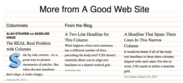
In a website using 3 article summaries placed side-by-side within one page, headlines and body texts varying in the font size and types, different types of data may not line up with one another. In an example given below, the heading and the body text use exactly the same line height, which makes headlines appear a little too ugly. So, it's better to specify larger line height for larger texts.
Baseline grid in print
As mentioned earlier, baseline grids are used not only in web design specifically. Many print designers have been using grid alongside with their own design suits since forever 🙂 By means of the grid, they manage to bring all elements of print designs into a friendly conjunction. This deals with type characters, color, drawing, photography, etc. Thus, by means of a grid system, they bring order to their works.
The benefits of rows
The best thing about using rows as guides within the working area of your web design is that you get visual guides telling you how to line different pieces of content within a web page the right way. So, simply turn on the guidelines and check if there are no extra/missing pixels in the design. All rows from the baseline grid are translated into pixels. So, it's easier to come up with the right standards based on the grid.
How to create baseline grid
As you get to work, define a line-heights for the baseline grid. To do this, decide on the font size for your text. For example, if you choose a 12px text size, the line ratio would be 18px (using 1:1.5 ratio). 150% is a nice amount that will make your text readable. For a more effective UI, keep stick to line height varying from 130% to 160%.
CSS line height
As you work on the baseline grid, you need to understand clearly what exactly CSS line height property means. This is not the text you put line after line. In addition to the text, this is the padding above and below the text space.
Related terms: CSS, HTML, page title, font.
References and further reading:
- CSS Baseline: The Good, The Bad And The Ugly.
- 4 Simple Steps to Vertical Rhythm.
- Setting Web Type to a Baseline Grid.
- How to Set Up a Baseline Grid.
- Web typography is broken. Here’s how we can fix it.
- Aligning type to baseline the right way.
- Baseline Grids for the Web.
