Fixed width
Fixed width is the width of a website element that does not change depending on the size of the used viewport and specifics of the used browser.
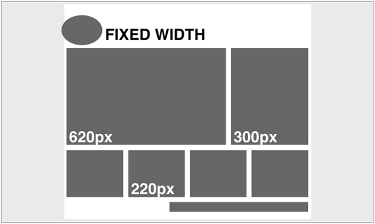
What is fixed width?
If a website element has a fixed width, this width will change under no circumstances. Fixed width does not change depending on:
- The screen resolution of the device that is used to view the website;
- The browser used to view the website;
- Whether browser window is maximized or not;
- Whether there are extra toolbars, such as History or Bookmarks, open in the browser;
- Operating system and hardware used by the user.

Fixed vs. Fluid website layout
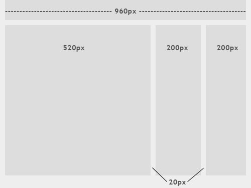
Website layout, where every element has fixed width is referred to as fixed website layout. If the website layout is fixed, the container that holds website content has a fixed width (e.g. 960 px). The elements inside the container may have widths set in pixels/percent. The most important point is that a website container is set not to move and will move under no circumstances.
Let’s see an example: A website has a background image on top of which you see the main content area with the fixed width of 960px. The website is designed for 1024x768 screen resolution, at which the content area is centered and has left and right margins that equal 32px.
Now let’s think of how this website will look on smaller and larger screen resolutions. On a screen with a smaller resolution, a user will see a 32px margin on the left, but the whole 960px container won’t fit. Only a part of it will be visible. On the bottom of the window, you’ll see a horizontal scroll bar that allows seeing the part of the website that is not visible. This is pretty much what you’ll see:

On a screen with a larger resolution than 1024x768px, the left margin will be 32px, but the right margin will be much wider, making the content area shift to the left.
There are certain pros and cons of using fixed width for website elements. Let’s briefly review them:
PROS
- Fixed layouts are much simpler for designers in terms of creation and management as they are strongly based on Bootstrap Grid system that is simple in utilization.
- Widths are the same for every browser, so creating a website requires less cross-browser testing.
- Designers do not need to use min-width and max-width properties, that have limited browser support.
CONS
- Fixed-width layouts shift to the left on screens with large resolutions, thus creating excessive empty space on the right.
- For smaller resolutions, users will have to use the scrollbar to see all the content of the website.
- Fixed websites score significantly lower in terms of usability, which should be one of your main concerns as a website owner.
Related terms: Fluid website layout, responsive website layout, viewport, usability, Bootstrap grid.
References and further reading:
- Fixed vs. Fluid vs. Elastic Layout: What’s The Right One For You?. How fixed width websites appear on different screens.
- What’s the Difference Between Fixed, Fluid, Adaptive, and Responsive Web Design? Fixed width web design explained.
- How to make a div have a fixed size?