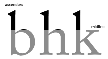
Midline
Midline (also referred to as a Mean Line) is the imaginary line at which all non-ascending letters stop.
Midline is one of the basic typography terms. It’s called a ‘midline’ as this line is the middle of the distance between the baseline (the line at which all the letters without descenders are situated) and caps (the top parts) of the uppercase letters.
The distance between the baseline and the midline is referred to as x-height (as this is the height of letter x, which has no ascenders). In some fonts rounded top parts (shoulders) of the lowercase letters may go a bit above the midline, which makes the font more visually appealing. You can learn more about the impact of typography upon website guests here.
There are two types of font elements that go above the midline. First of all, it’s the upper part of capital letters. In this case, the midline points the middle of the capital letter height. Secondly, these are ascenders, the parts of the lowercase letters that exceed the midline. The English letters with ascenders are b, d, f, h, i, k, l, t. Ascenders, as well as descenders boost recognition and readability of the word.
Related terms: font, baseline, drop-shadow.
References and further reading:
- Mean line - Wikipedia.
- 16 Vital Typography Terms To Learn To Start Enhancing Your Designs "Invisibly".
- Typeface vs Midline - What's the difference?.
- Inconspicuous Vertical Metrics. An article on 5 basic font metrics: descender, baseline, midline, caps-height, and ascender.

