White Space in Web Design – Boost Your Website’s Usability
Content outline:
- Intro to White Space in Web Design
- Review of the 10 Most Inspiring WordPress themes with White Space Design
- Conclusion
Intro to White Space in Web Design
Today’s website visitors can be called content scanners: they quickly scroll pages, skip posts, and try to do a couple of things at the same time. The key point to attract viewers’ attention to your website is simplicity, and it starts with the efficient use of white space.White space in web design is a negative space or blank space on the page that is found between the elements of the composition. These days, white space is considered to be one of the fundamental elements of good design and one of the web design trends for 2019.
Make sure you are giving the audience little visual "pauses" in the progression of mentally processing web content. This can be done by minimize distractions and facilitating the focus on key things. By allowing the elements of your site to "breathe" you make it easier for your visitors to perceive your content. Free space allows you to create a "design flow” and helps to achieve a balance in the design and increase readability. Do not try to fill all the space on the page. Do not try to put everything on one page. Leave free space between design elements and highlight the elements you want the user to notice, such as headings, CTA, contact forms, etc.
A blank area on a web page is crucial not only from an aesthetic point of view but also from the point of view of conversion optimization. Proper implementation of empty space makes the site easier to navigate, visually clear, and convenient but also encourages an increase in conversion rate.
As an example, check out Google’s homepage which allows users to focus on the main task – searching the internet without being distracted by what they do not need.

Ok, let’s summarize the main advantages of the white space in web design:
- increased content readability
- increased content legibility
- balance
- highlighting CTAs
- more interaction
- impressive website
If you ever need a WordPress theme or a website template, visit TemplateMonster Marketplace to see the richest choices available.

Review of the 10 Most Inspiring WordPress themes with White Space Design
Dog
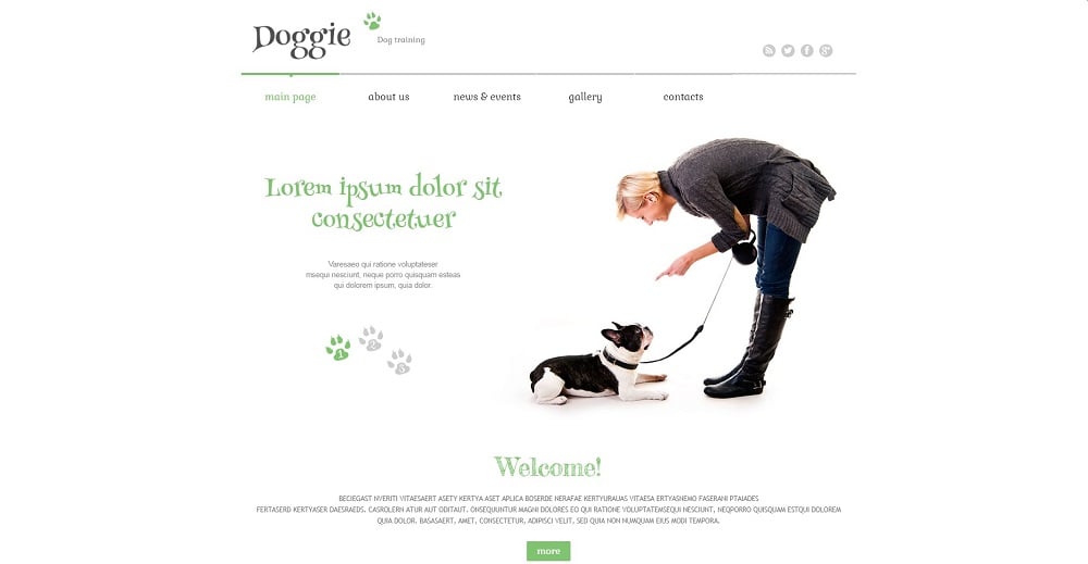
Take a look at this adaptive and minimalistic theme which is a perfect solution for any animal-related web resource. Effective use of white space is a great addition to the overall aesthetics of the theme. It offers a simple and concise look and customizable layouts to create a professional website with a good design. Your content is in focus. You will be able to edit the appearance of the site, create new sections, elements, change the menu, etc.
BeClinic

BeClinic is a multipurpose medical WordPress theme. It belongs to the category of Business & Services WordPress themes. Here you can see how the white space adds elegance and sophistication to your website. The template is extremely easy to use and customize. It comes with a beautiful and ultra-responsive design and cross-browser compatibility. To get the most from the template, you will have access to detailed online documentation and 24/7 professional support.
Roomswear
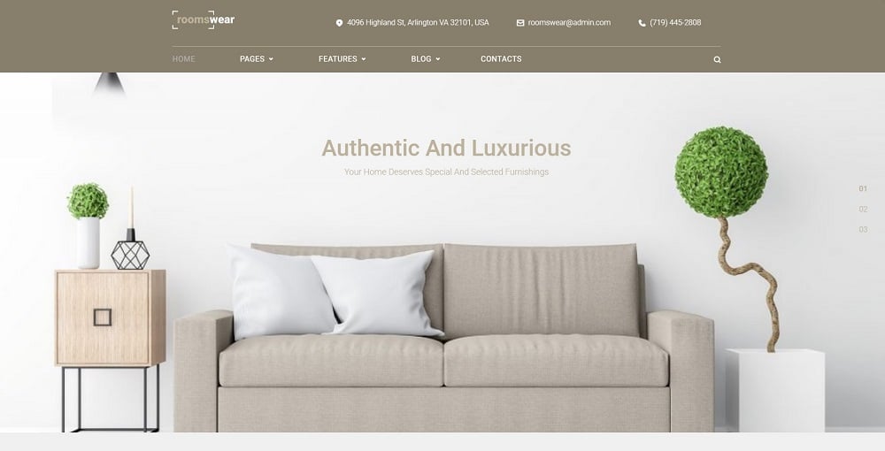
If you are running a furniture salon or interior store, you should definitely try this authentic and luxurious theme to build a successful website. Choosing an empty space theme should not mean a complete absence of colors or images. Place the elements strategically, without complicating the design and confusing your visitors. This theme is cross-browser compatible, SEO-friendly, and fully customizable to create the perfect web store and advertise your products and services in the most efficient way.
PartyMaker
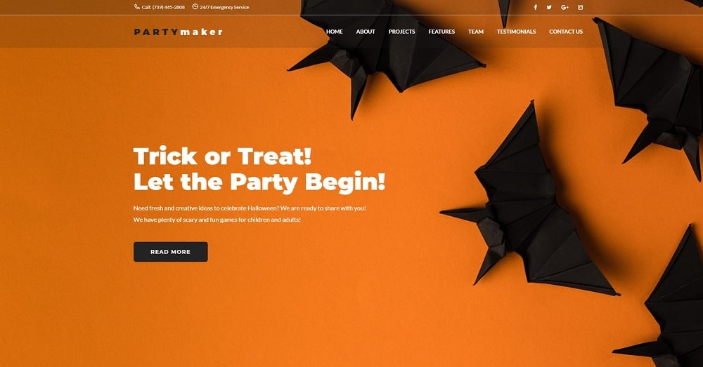
This is a Halloween party WordPress theme powered by Elementor.
Take a look at this great example of using white space in web design. Notice the clean, impressive, and inspiring design. It is a wonderful choice for content-oriented websites such as event blogs, parties, and holidays. The PartyMaker is simple, responsive, and stylish. As a result, it makes your content attractive and unique. You do not need to be knowledgeable in any coding modules with the drag-and-drop Elementor page builder.
Pristine

Here is a great choice for successful people whose business is related to plastic surgery or medicine in general. This simple, intentionally minimalistic page uses negative space to encourage users to continue scrolling. You will get a variety of useful tools and features to customize your website to your preferences. Due to its responsive design and cross-browser compatibility, your web page will be browsed properly from any device. Everyone can easily work with the template as no profound tech skills are necessary.
North Center

Regardless of its name, whitespace on your page does not have to be white.
Fill it with any color or background image. As an example, notice this North Centre - Private Airline WordPress theme. It is supplied with a clean look and highly functional feel. Thanks to a huge choice of pre-built customization tools, you will be able to become the designer of your perfect web resource. Documentation is included to guide you through the installation process. In case you have any further questions or concerns, a friendly technical support team is ready to help you 24/7.
Monstroid2

You will definitely be impressed with Monstroid2, the multipurpose Elementor WordPress theme. The text, signs, and placeholders are accurately located to make sure that your eyes are not growing bored of the content. Extend your customization opportunities with the world’s most popular Elementor page builder. Be assured you will get lifetime updates and round-the-clock support. Dreaming about an online store? Not a problem with WooCommerce module implemented into the theme. Check out the live demo to evaluate all the features and benefits.
Invenio
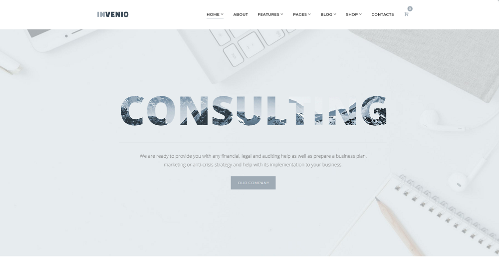
An ideal business template should be simple, clean and utilize white space correctly. Such a unique use of empty space not only looks elegant but also encourages visitors to interact with the site. In addition, you will have numerous customization options to create a web resource to fit your branding needs. Additionally, the satisfied clients are happy with a 24/7 friendly and reliable customer support and detailed technical documentation.
Meltony
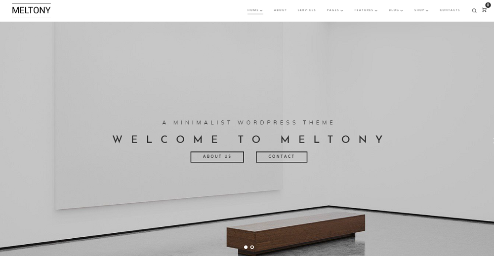
What do you think of this minimal and sophisticated design? You see only the elements that intrigue, attract attention, and impress users. Do you agree? Its layout includes a lot of empty space, and the design looks perfect. The theme offers many useful support options and simple design tools. Beginners and advanced developers can successfully enjoy the ease of the theme and its flexibility. Check out the live demo to see all the advantages of the template.
Aromacafe
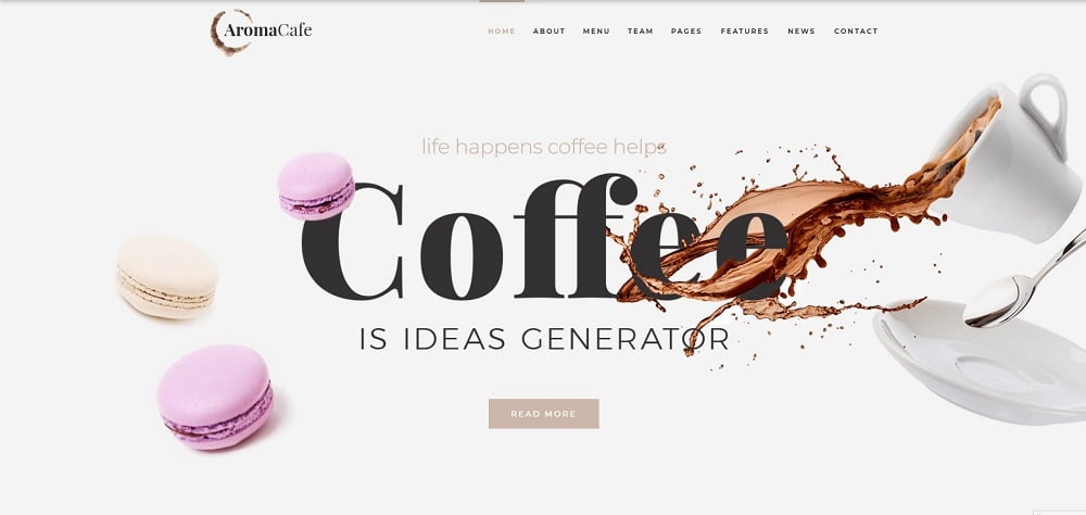
Aromacafe is a coffee shop Elementor WordPress theme to create an elegant top-notch coffee website. You will be gently guided through the content and receive all the necessary information step by step. This type of a design creates harmony and balance, and you have a lot of freedom to customize it to your needs. In addition, the theme is optimized for SEO and mobile platforms, which will help you increase site traffic. The Aromacafe theme is a commendable theme to try because of its simplicity, easy customization, and nice appearance.
Conclusion
The term ‘white space' is often used with such terms as negative space and empty space. But its essence remains the same. All those terms refer to the space between elements of a web page layout. An appropriate use of the white space can benefit almost any layout and become its key element. It allows you to highlight content, improve readability and clarity, and make light colors stand out. Do you still have any doubts about its powerful effect?! Share your feedback below the post and let us know what other techniques besides white space contribute to good website design.
TOP 10 WordPress themes with White Space Design
| Name | Provider | Category | Price |
| Dog Responsive WordPress Theme | WT | Dog Templates | $75 |
| BeClinic - Multipurpose Medical WordPress Theme | ZEMEZjet | Psychologist Templates | $81 |
| Roomswear - Furniture Elementor WordPress Theme | RockThemes | Furniture Templates | $75 |
| PartyMaker - Halloween Party WordPress Theme | ZEMEZ | Christmas Templates | $45 |
| Pristine - Plastic Surgery WordPress Theme | ZEMEZ | Plastic Surgery Templates | $75 |
| North Centre - Private Airline WordPress Theme | ZEMEZ | Airline Tickets Templates | $75 |
| Monstroid2 - Multipurpose Modular Elementor WordPress Theme | ZEMEZjet | Construction Company Templates | $81 |
| Invenio - Classy Financial Advisor WordPress Theme | ZEMEZ | Financial Advisor Templates | $75 |
| Meltony - Minimal Multipurpose Elementor WordPress Theme | RockThemes | Business & Services | $68 |
| Aromacafe - Coffee Shop Elementor WordPress Theme | ZEMEZ | Coffee Shop Templates | $75 |
Read Also
Ecommerce Web Design Trends 2019
Captivating Web Design Trend That Will Make You Stuck: Bubbles, Circular Elements, and Droplets
Top WordPress Themes for Businesses and Startups
Why You Need White Space In Your Designs
Don’t miss out these all-time favourites
- The best hosting for a WordPress website. Tap our link to get the best price on the market with 82% off. If HostPapa didn’t impress you check out other alternatives.
- Monthly SEO service and On-Page SEO - to increase your website organic traffic.
- Website Installation service - to get your template up and running within just 6 hours without hassle. No minute is wasted and the work is going.
- ONE Membership - to download unlimited number of WordPress themes, plugins, ppt and other products within one license. Since bigger is always better.
Get more to your email
Subscribe to our newsletter and access exclusive content and offers available only to MonsterPost subscribers.

Leave a Reply
You must be logged in to post a comment.