

The design is not only about organizing your content but also about an understanding of how to use the free space correctly.
Mastering the art of using the white space in your projects properly will definitely bring the quality of your projects to the whole new level. And don’t get me wrong, not only the minimalist design is in need of the white space. It is needed everywhere, but the question is: how convenient you want to make your website usage experience for the customers or random website visitors?
Time to point fingers and judge someone on the internet
While trying to show you what’s cool and what’s lame, I will use my favorite form of art: pointing fingers at someone’s screwed up design and grumbling about how badly I don’t like it.
In order to understand how white space affects the design and content readability, I will show you two examples. These should help you to distinguish right and wrong. I will take two different news website I read and you’ll see what I am saying.

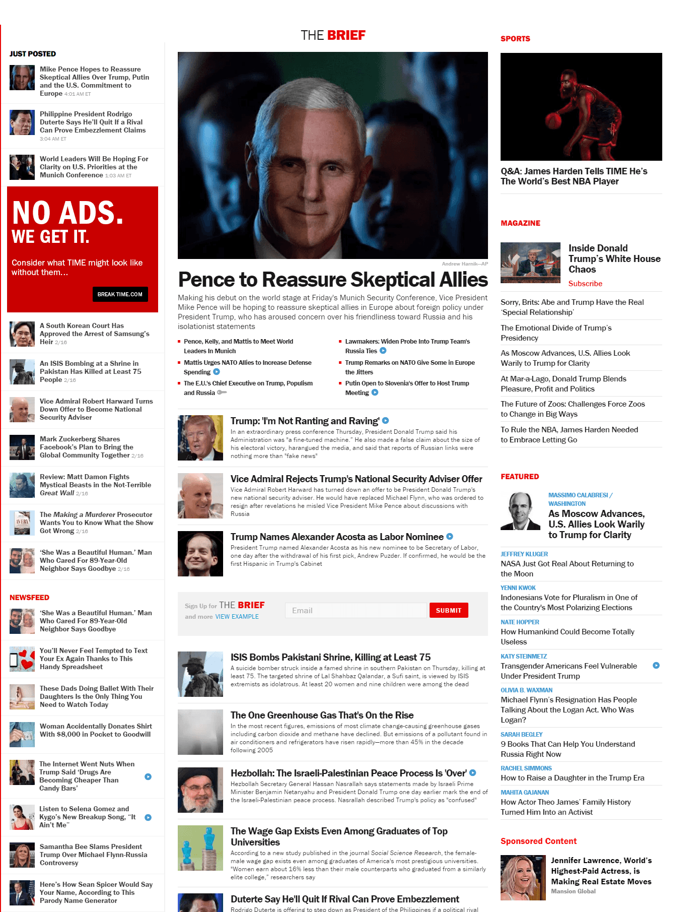
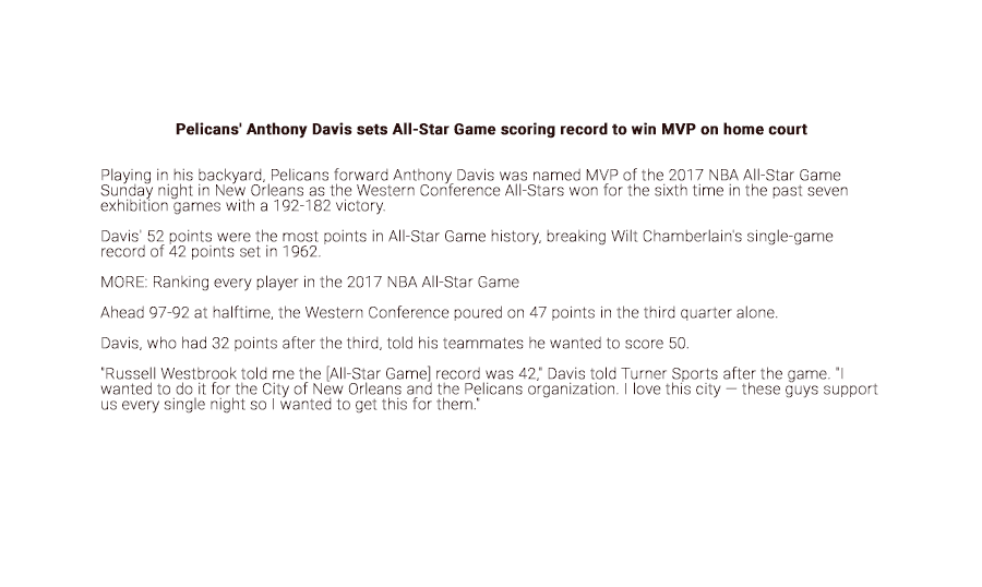
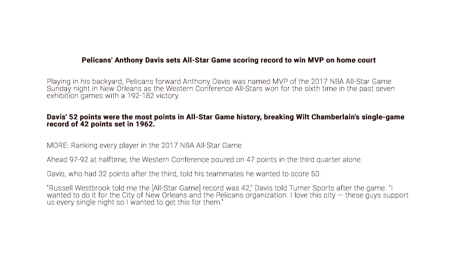
As you can see on the first picture, wrongly used white space can affect the readability of the text and ruin the overall user experience. I mean, no offense, I admire the Times magazine, this is a big publisher with a big history. However, It’s like I am feeling the physical pain while reading it. Are you trying to make it harder for everyone to consume information? What the hell, guys, I’m really getting pissed every time I open your home page.
So basically what is a white space? This is a metaphorical glue that holds the design elements together and helps your designs not to look like a total mess and chaos. It also represents the space between the readable characters and other typography.
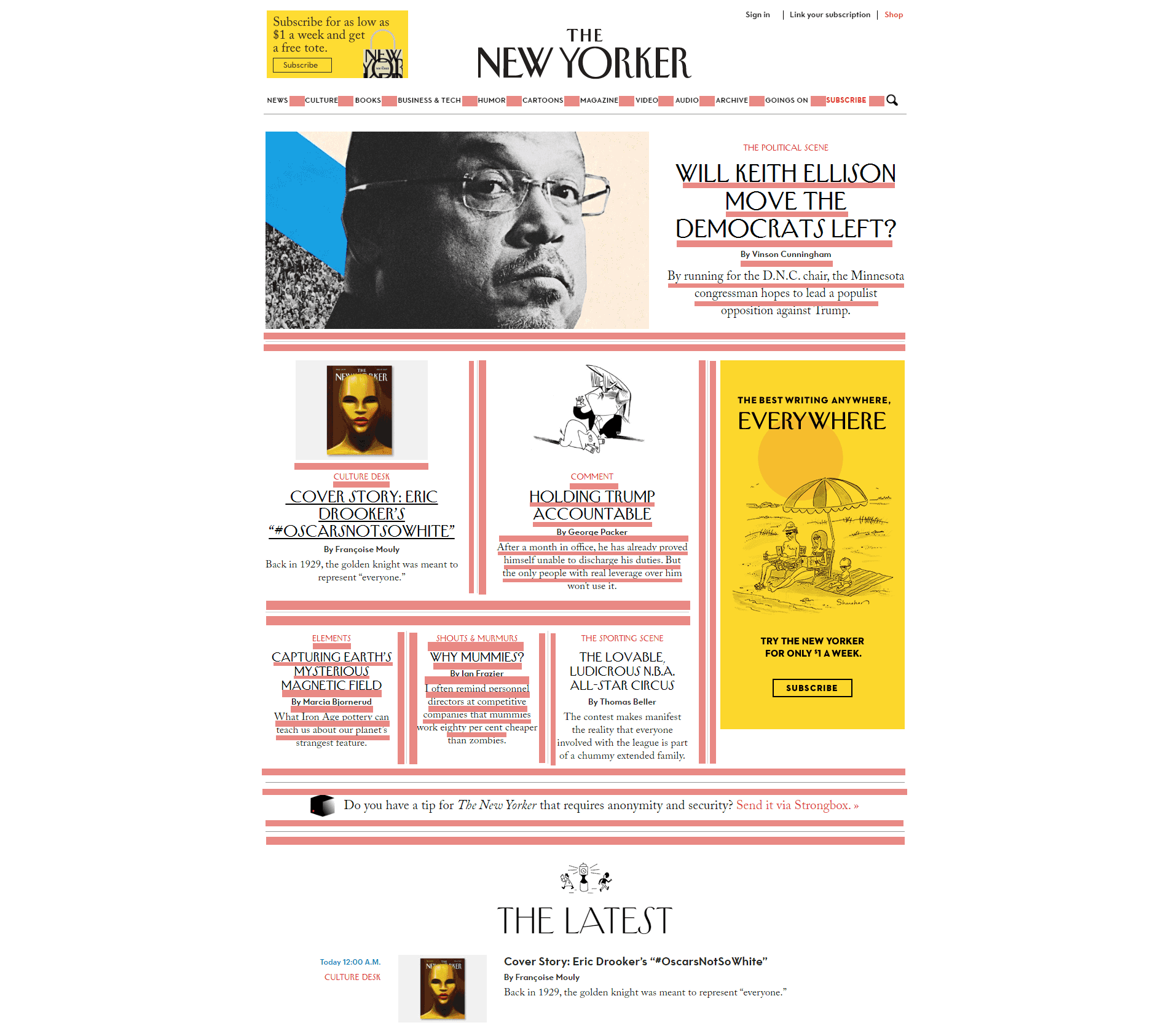
Let’s see a better example of the news magazine I actually enjoy reading.
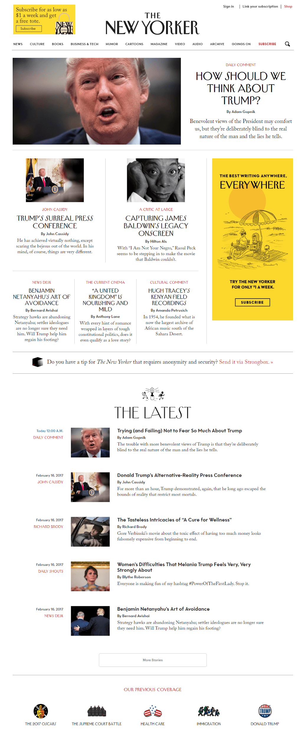

The reason why I chose The New Yorker as an example is the fact that the online magazines should always bust their ass to use the white space in the most efficient way. I read lots of news websites with articles and stuff, but for me, The New Yorker is the one with the most pleasant readability and design. I just like being on this website, scrolling around and reading their stories.
Did I sound like these guys paid me to tell this? Unfortunately, no. But hey, guys from The New Yorker, I will not decline a free unlimited subscription to the printed version of your magazine...
White Space has always been a very debatable topic among the designers and their clients. The main problem here is that clients consider the empty space as wasted space and try to fit something in there. But they are not getting the main point.
You can use all the space on the webpage, but it will not help you land more clients, this is not the recipe for success. I would say that it’s a complete opposite of the approach needed for a good and successful website design.
Types of white space
I would suggest breaking down the White Space into two sizes/types: the Micro and the Macro. Let’s dig a little bit deeper and see what type of white space you need and where.

Macro white space
Macro white space is the free space between the large design elements. You may also find it on the right and left side on major part of the boxed websites on the internet. I will continue using The New Yorker as an example, so I will highlight the zones of the macro white space for you below.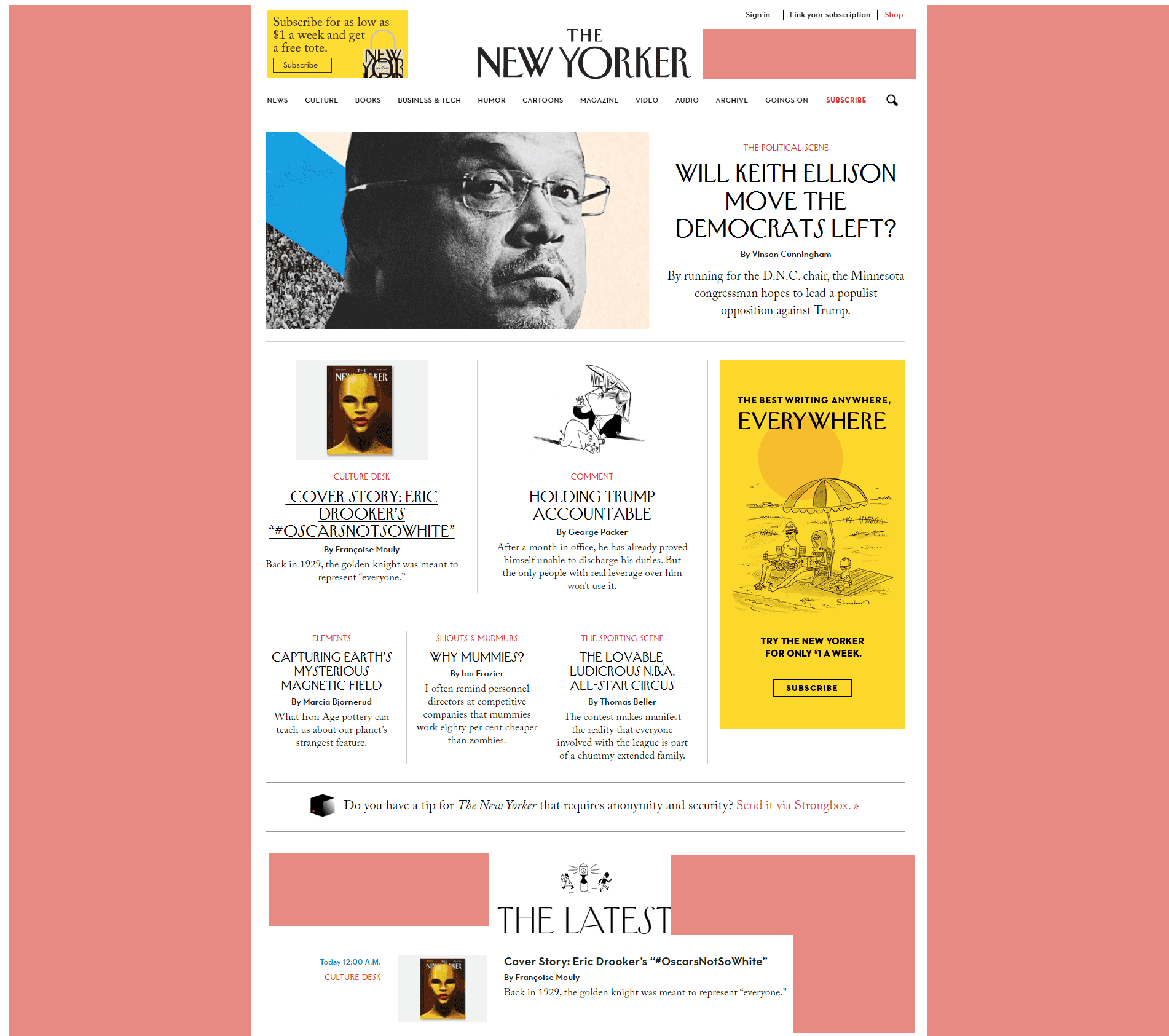

‘Big picture’ - that’s how you can call it. You will not miss the macro white space, it’s very easy to notice.
Micro white space
This is the white space that we see between the small elements. This type of the free space can be found between the lines, paragraphs, sections and menu elements.
Using marginal white space in your posts and post previews directly affects on the readability of your text. If you use it right, your client will not only be pleased with the simplicity but will also read it much faster without any problems.
How to determine what type of the white space to use?
There are a lot of factors that affect the white space type selection process. Above all there are:
Content
If you want to present a lot of information to your website user, the amount of the macro white space will not be high. It means that your design will depend more on the micro white space areas.

The bad news is that you will have to find the solution how you can shorten the content amount on your website and increase the macro white space. Otherwise, your website will look like a badly designed newspaper with nothing but text. It doesn’t seem to be a very good user experience, right?
Design


So you may stick to one of the white spaces types while it doesn’t affect the actual user experience.
Target Audience
You have to know your user and make the needed research. Sometimes you may decide on the macro vs micro white space ratio just by looking at your audience and understanding their needs.

For example, if your users prefer mobile devices, keep it in mind while thinking about adding macro white space areas. You will have to work with the micro white space much more attentively in this situation.
Is there any other way to approach the white spacing?
White space can also be Active and Passive. The difference is very simple and I’ll show it to you using the examples, so you could see it yourself.
Passive white space includes such things as margins, type family and weight, leading (or line-height, as it’s known in CSS). All these general options of the text are considered as passive white space.
On the other hand, the active white space helps us to highlight some specific element in the whole story and draw the user’s attention to it. Active white space is the space that is used to enhance the reading experience and guide the reader through the content in the most efficient way.
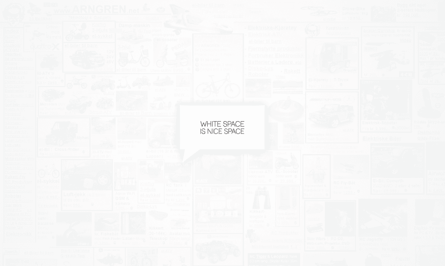
As you can see, I highlighted the most important part of my article to catch the user’s eye and tell him: ‘Dude, this is important!’.
Master the white space
White Space is not something you master by reading one article. This is the topic that should be studied attentively and patiently. But trust me, it’s worth it since the white space will bring your design to the whole new level and help you make the content in your layouts much more attractive.
I’d like to recommend you checking out the book by Rebecca Hagen and Kim Golombisky on this topic.

White Space Is Not Your Enemy by Rebecca Hagen and Kim Golombisky
Good examples of the white space usage
I think it’s always good to get some inspiration from the great pieces of design. That is why I’ve compiled a small list of works that, in my opinion, use the white space in a great way.
Since we have discussed the news magazines in the beginning of my article, the first one will be the ‘KingNews - Magazine News Portal & Blog WordPress Theme’.
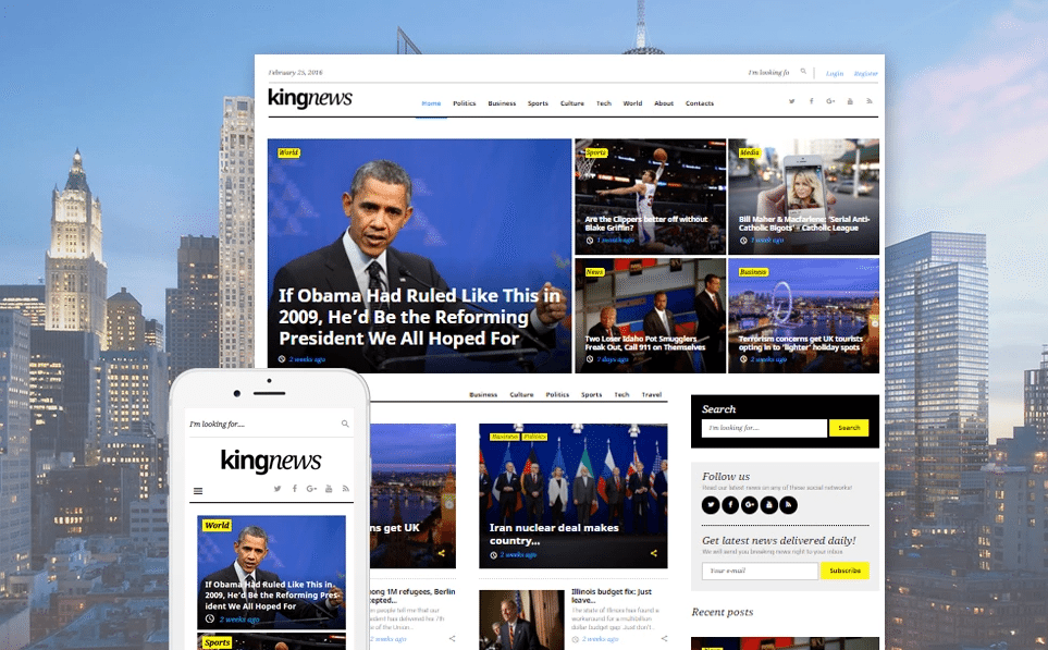

The news is carefully spread on the page and the spacing is good enough to make your morning routine of the news check as pleasant as possible.
Monstroid2 - Multipurpose WordPress Theme
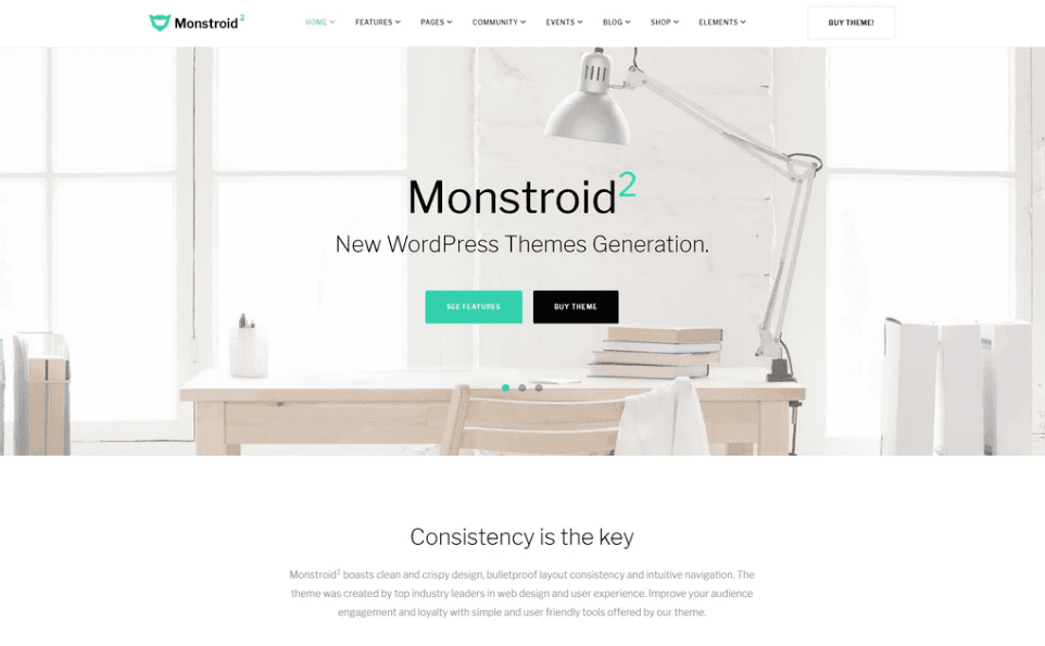
You will be gently guided through the content and receive all the needed information step by step. The text, signs, and placeholders are accurately positioned to make sure that your eyes are not getting tired of the content.
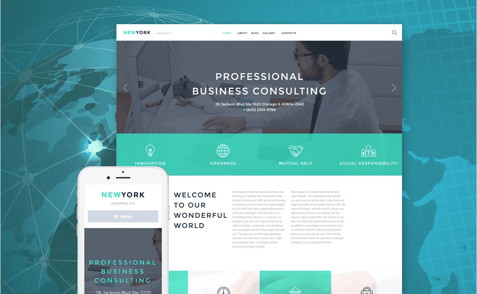
Business Responsive WordPress Theme
An ideal business template should be clean and utilize the white space correctly. That’s was our main purpose when we created this template.

Conclusion
Once you master how to utilize the white space in your layouts, you will be able to create clean and simple templates. In order to get to learn how to handle the free space in your designs, you’ll have to practice a lot. Always remember that experience is everything, the theory is secondary.
If you do not have any time to experiment with your designs, feel free to check out our premium website themes, you will definitely find something you like!