10 Popular Fonts You Should Absolutely Avoid Using In Presentations
Powerpoint fonts. The fonts that you use in your presentation designs play a significant role in making them successful. The wrong typefaces can completely ruin your intentions to establish an effective communications channel with your audience. Using the popular typefaces you face the risk to deliver the wrong impact on the readers.
With the intention to help you achieve the desired effect with the help of your presentation, we have made a compilation of the top 10 popular typefaces that are not the best PowerPoint fonts.
By the way, recently we have launched a new subscription service which name is MonsterONE. ONE Subscription can offer you endless downloads of any product from ONE package just for $19 within a month! For making all the presentation you create more remembering, just subscribe for ONE and check out what Presentation Templates are available within the pack. You can download as many templates as you want to and see which one suits you best. While downloading you have no restrictions. Moreover, if you are a reader of MonsterPost, you can get an awesome chance to save even more money. The blog readers have an opportunity to catch a 5% discount with the promo code BecomeThe1.
10 Popular Fonts to Avoid in Presentations
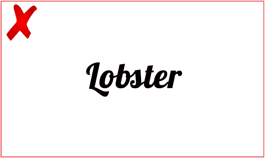
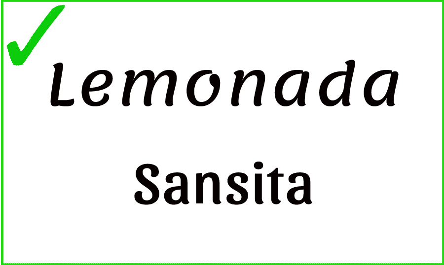
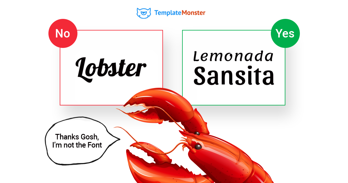
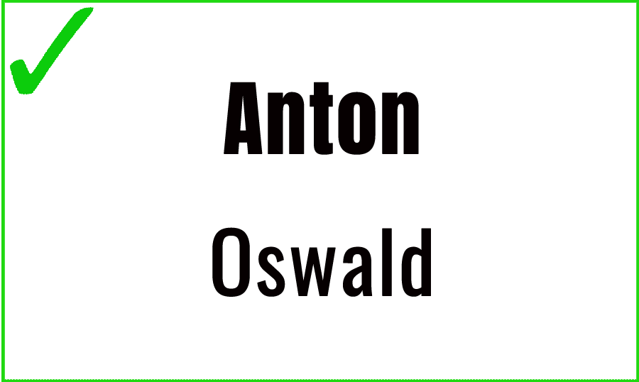
#1 Lobster
Lobster font became popular only several years ago, but it has already managed to gain its position among other overused typefaces. It features the cursive form that doesn't sacrifice readability. The tragedy of the font is that it is one of the most designer-centric solutions. It will be the optimal choice for logo designs and article headings. The pillowy curves will be hardy the best solution for the serious copies.
Good alternatives:
How to Mix Various Types? [Free Checklist]
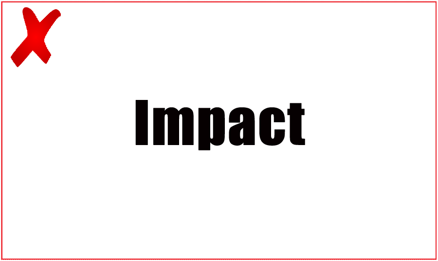
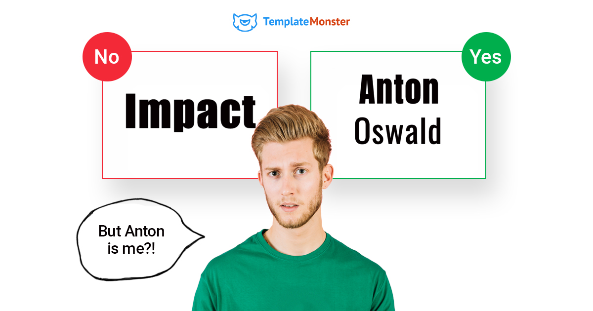
#2 Impact
Impact is one of the most popular header fonts. It is easy to head. One of its biggest advantages is the use of the bold characters that are easy-to-notice. The problem is that the font has been misused far too often, making the designers to opt for other high-visibility fonts. The typeface is too thin and overly-focused. This is the optimal solution for the office handouts and amateur emails. It's better to avoid using the font for professional logos, public documents, and presentations. Impact has become synonymous to cheap marketing. So, if you want to add more value to your presentation, you should better opt for less frequently used typeface.
Good alternatives:
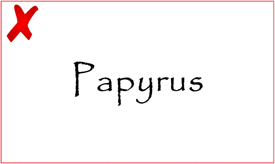
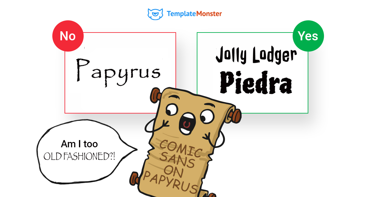
#3 Papyrus
Do you remember the Avatar poster? Papyrus is the typeface that was used for the headline. Looking a bit childish and kitschy, this font found its way into film posters and logos. If you want your presentation to be taken seriously, you should better avoid using this typeface. Unlike other fonts on this list, Papyrus isn't recommended because it is overused. It looks too cheap and vile, which is not the best choice for presentations.
Good alternatives
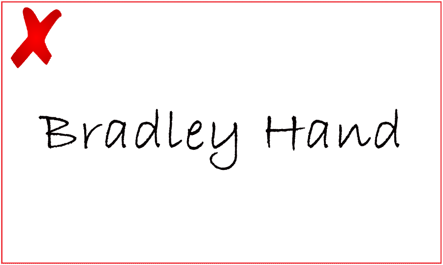
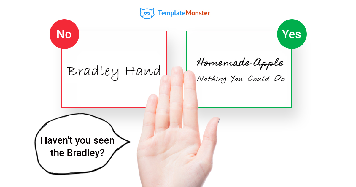
#4 Bradley Hand
Bradley Hand is one of those handwritten fonts that are used to convey personality. Writing the copy for your presentation using this font you will make the audience think about your taste rather than the message that you want to deliver the content. Bradley Hand is a cheap non-official font that was often used in invitations and personal greetings.
Good alternatives
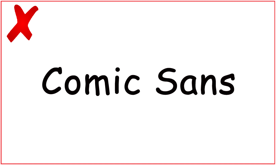
#5 Comic Sans
Do you remember how many times you used Comic Sans when you wrote a new copy? Pretty much often! To be honest, that's my favorite typeface also. Microsoft released it in 1995. Ever since then, it has become a staple of Mac OS X and Windows. The font was literally designed for children. So, it won't look serious in the professional or corporate texts.
Good alternatives
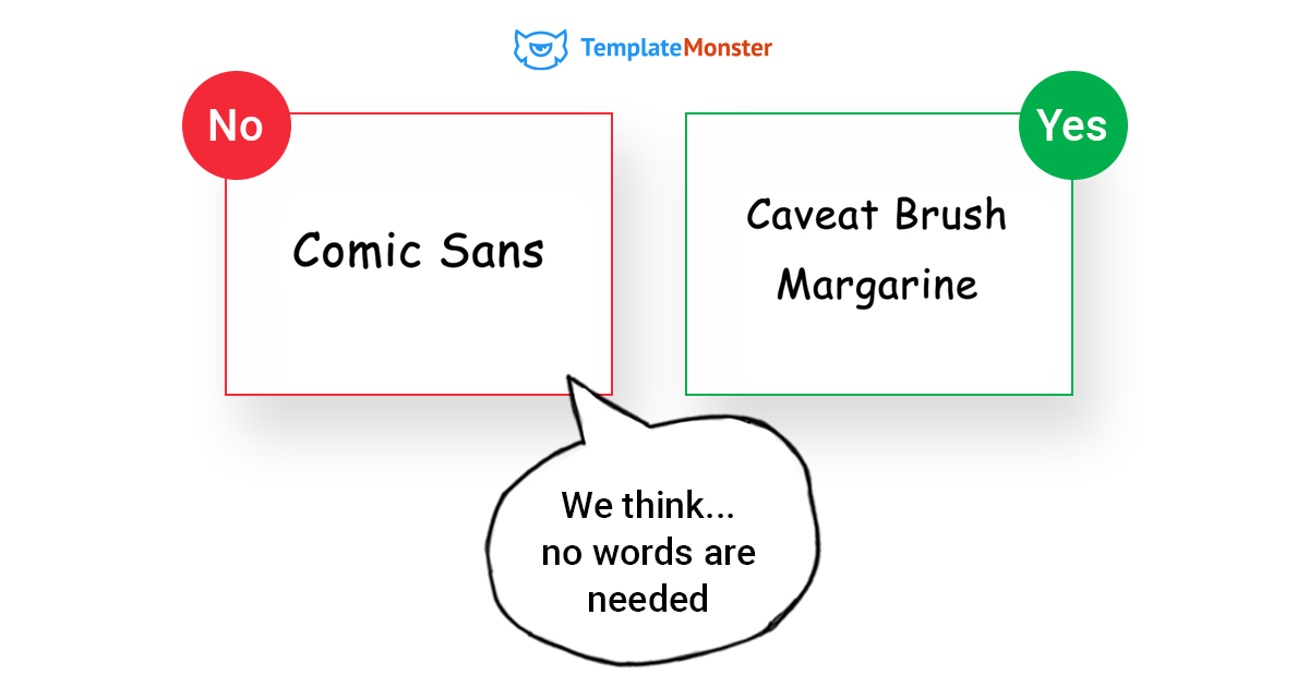
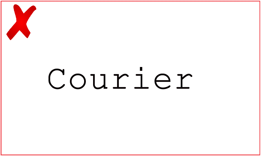
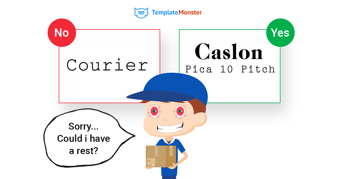
#6 Courier
Courier font is the perfect choice for screenplays, code, and plain text documents. However, its typewriter aesthetic makes it unsuitable for web designers. The typeface will be the ideal choice for the copies for which readability is of the paramount importance. When it comes to the web design and presentations, the audience is likely to be looking for something more appealing.
Good alternatives
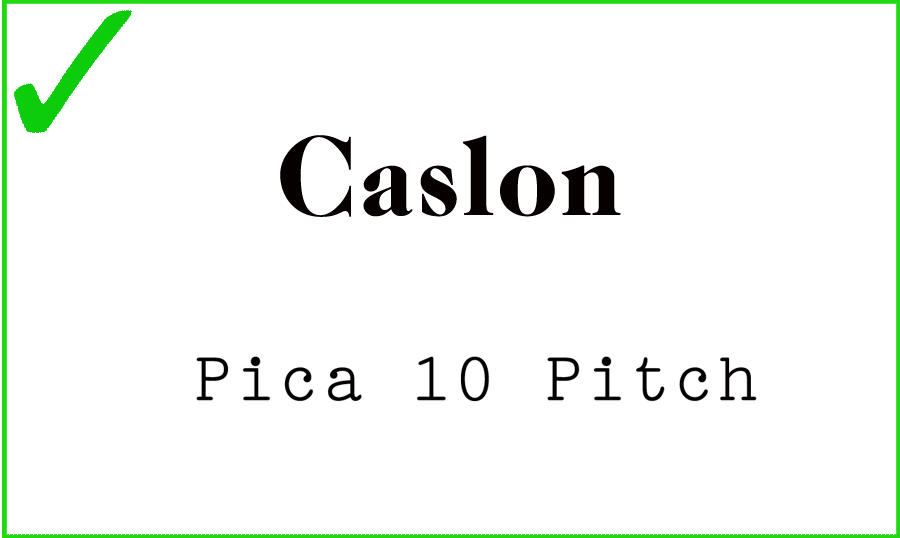
- Caslon
- Pica 10 Pitch
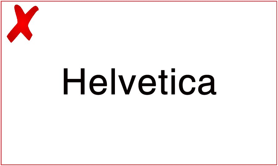
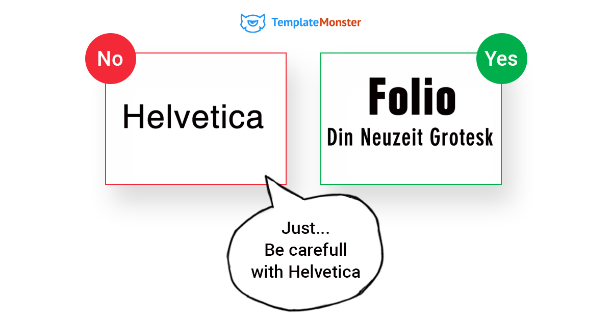
#7 Helvetica
Helvetica was designed in 1957. Without any doubt, this is one of the oldest fonts on this list. The typeface was proudly used by some of the most widely known companies in the world, including Apple, Nasa, and BMW. Helvetica is one of the most frequently used sans-serif fonts in print and advertising. For many years, designers preferred the typeface because of its versatility. That's the reason why we included the font on the chart. We've already seen too much of it. Using the typeface in your presentation won't bring any extra value.
Good alternatives

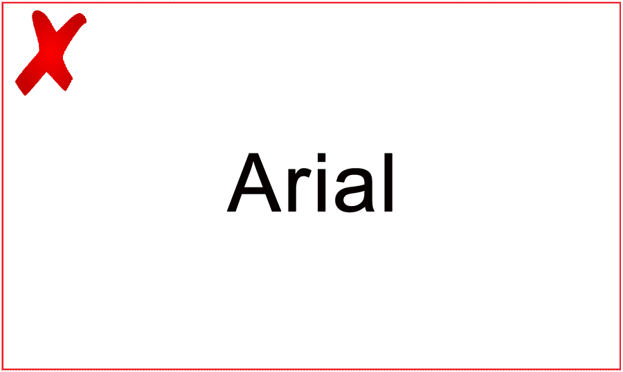
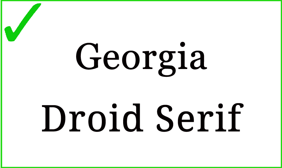
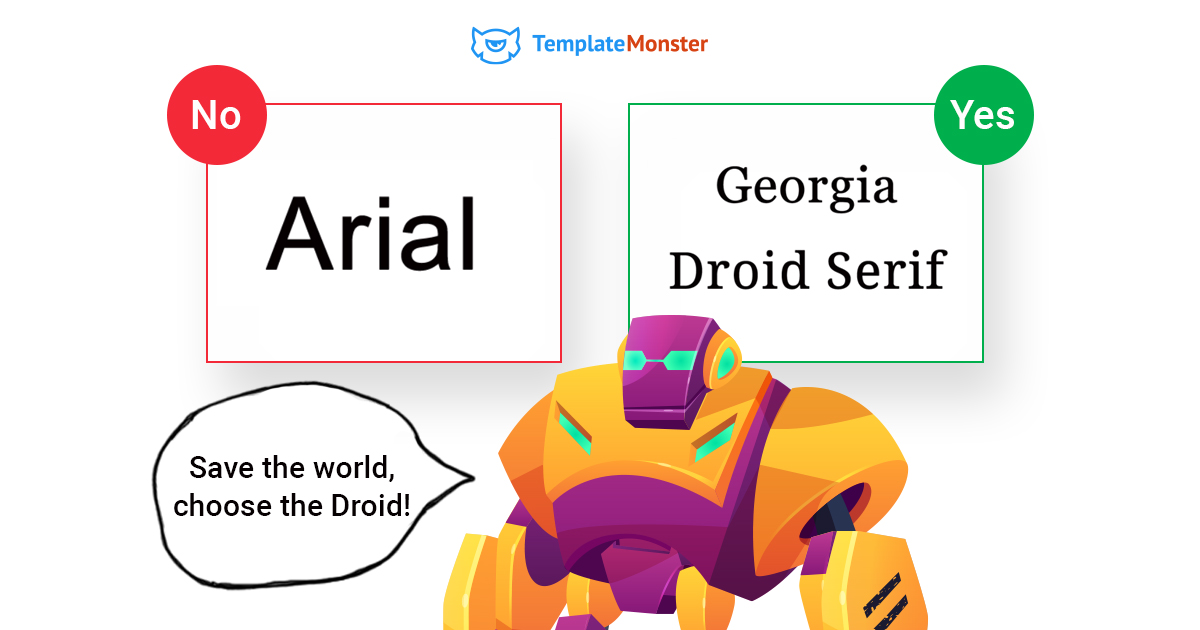
#8 Arial
Arial is one of the most popular tried-and-true fonts that has been the standard choice for a number of Microsoft apps for quite a while. Luckily it was replaced with Calibri as the default font in Office 2007. For quite a long time, Arial was used as the go-to font for amateurs and thoughtless designers. Microsoft chose Arial to skirt licensing issues with the more popular typeface - Helvetica. In such a way, they avoided the licensing fees and got a font similar to Helvetica, with only slight variations.
Good alternatives:
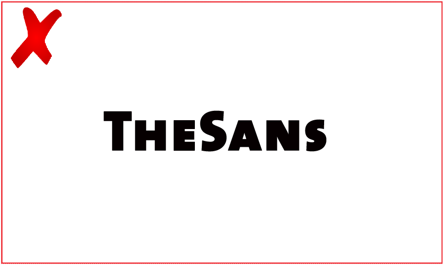
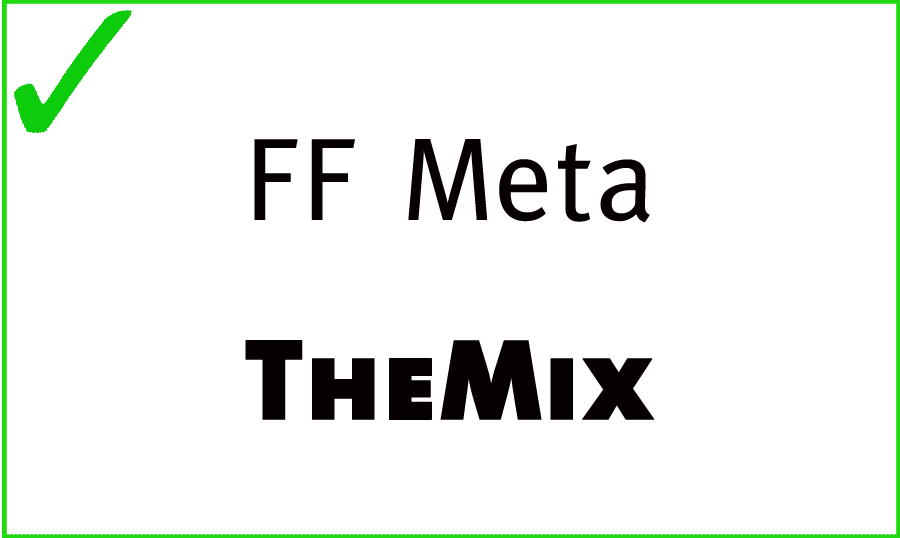
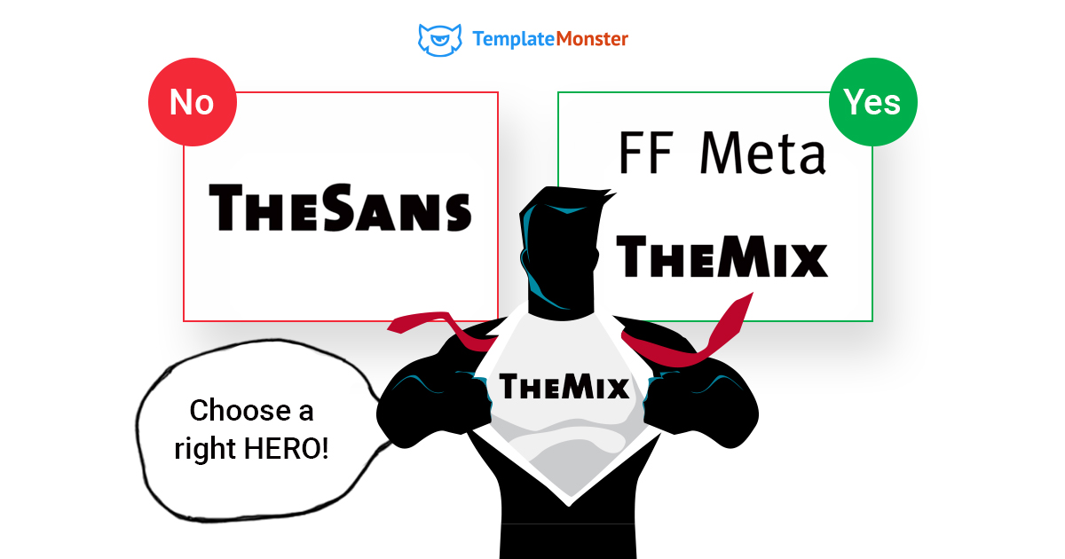
#9 TheSans
TheSans is one of the most widely preferred typefaces that are considered to be fairly standard. The font is being widely used on the Internet (on the media portals). You will also find it in the short snappy copied. However, the uppercase “Q” doesn't match the widely usable style of the typeface. Using it in your presentation, you can make the readers feel confused. Although the rest of the characters are just fine, using the uppercase “Q” in the copy you can kill your presentation with one shot.
Good alternatives:
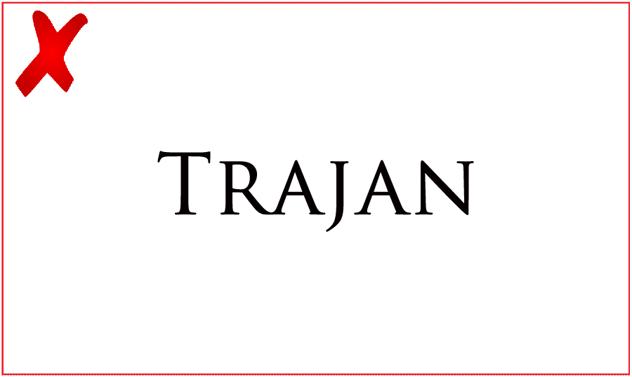
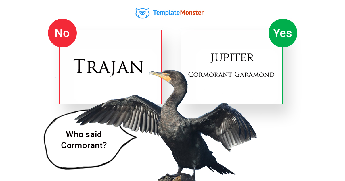
#10 Trajan
Trajan was overused the movie marketing materials. It was used frequently in the posters of fantasy and indie films. Trajan is one of those fonts that were shipped with almost every release of Adobe's Creative Suite. So, it became one of the most frequently used fonts available to any design. Trajan is generally considered to be the best typeface for occasional titles, entertainment pieces, and epics. If you want to deliver a more meaningful message in your presentation, then you should better consider more business-oriented alternatives.
Good alternatives:
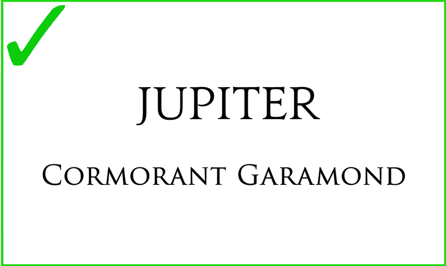
- Jupiter
- Cormorant Garamond
5 Working Tips to Combine Fonts like a Pro
It's not a rocket science to select fonts for a new copy that you write and want to share with your readers. However, there are certain rules and tips that you need to keep in mind in order to choose the right combinations of fonts.
#1 Create Contrast
With the help of the contrasting fonts, you can make it clearer for your audience which texts are the copy body and which ones are the headings. As a rule, we pay attention to the title of the text before moving straight to the body. That is why using bold fonts in the headlines and smaller script fonts in the sub-heading will be a nice attention-grabbing move.
Source: Canva Learn
#2 Create Visual Hierarchy
It's important to establish the visual hierarchy in the presentation design. Similar to the web design, in presentations, the visual hierarchy can be achieved with the help of different font sizes, weight, texture, orientation, space, as well as the combination of all these tools. The print media is the great example of the visual hierarchy done right. What they do is combining fonts in the way that separates different textual elements visually. In such a way, a reader can differentiate the headlines, body copy, and captions effortlessly.
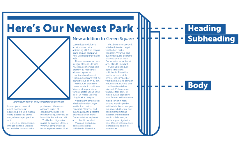
Source: DesignCrowd
#3 Combine Serif and Sans-serif Fonts
This is one of the most popular tricks to use fonts effectively in one copy. This is a classic combination that cannot go wrong. Serif fonts have small numbs at the ends of different strokes of the letters. Sans serif fonts do not have these. The key point that you need to remember when pairing serifs with sans serifs is keeping the text readable. Sans serifs are considered to be better for PP presentation since they are easier to scan. So, it will be a clever move to use sans serifs in the copy body.
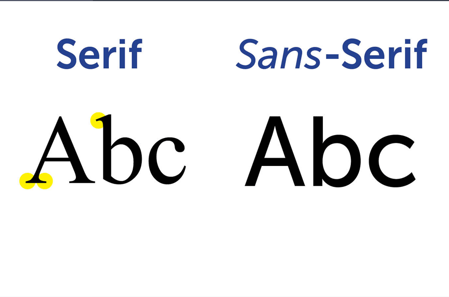
Source: Pinterest
#4 Do not Pair Similar Fonts
Choosing fonts that look identical you will hardly manage to establish the necessary hierarchy in your text. When you experiment with different font types while looking for the most optimal solution for your presentation, choose one typeface with a strong personality, and combine it with something more neutral and reserved.
Source: Pizel77
#5 Use the Maximum of 3 Fonts in One Copy
Use two or three fonts for better readability of your texts. There is no rule that says that you cannot use more. However, always keep consistency in mind. This is the essential part of every PowerPoint presentation.
10 Best Font for Powerpoint 2020
MAQN Font - Best Font for Powerpoint
This font definitely stands out from the variety of font collections, but is suitable for all presentation design options, because it has many positive qualities. This best font for Powerpoint is loved by professional designers for the clarity and sharpness of the lines.
This is a modern sans-serif font family. It is created in a slightly elongated form, which helps to focus attention well. The font has pronounced sharp corners.
The font itself is really stylish and can be used for any modern-looking headers and footers. This font also consists of a slight vintage look which is clearly caused by the fact that the letters and numbers are made out of multiple lines in order to form the full shape of the symbol - a technology used by the vintage past.
Cream alphabet - best font for powerpoint
The last year of the decade is ending, and we can confidently say that a new and bold era is coming in the design of digital pages. While some designers use innovative font technology, others use experience to resurrect and remake trends in the modern world. This interaction between past and future creates a certain contrast and many exciting trends.
Lettering, handwritten calligraphy, sloppy or sweeping Powerpoint fonts on the web are used for self-expression. “Not perfect” handwritten text does not seem to be a generated bot.
The font is consisting of really nice, creamy letters which represent candies. The dripping on them makes them look as a fresh candy who had just been made. This font is really suitable to be used for topics related to candies, sugar and other sweetness products. By using this font, you’ll know that you are one of the only people that have access to it. This ends up with making your label or sign a very impressive piece of your work thanks to its uniqueness.
Inside the BOX Font & Patterns Font - best font for powerpoint
This is an absolutely unique font that combines geometric and soft shapes. At first glance, it has square shapes. But looking at their rounding, it begins to seem that the letters are like a circle. Fonts should be suitable for the application situation. Remember that each of them has its own graphic rhythm, and it must coincide in nature with the document for which the text is created.
The font mentioned here looks absolutely stunning combined with the right color group — as shown on the images that showcase it. That’s why we have combined here the Best Powerpoint fonts for your ease. You can use this font to create a very good looking image, that can be suitable for a nightclub, bar or another venue that operates in the darker hours of the day.
Golden Brush Font
This is a cool lettering style and one of the best Powerpoint fonts. It can be used for any project where it is necessary to show expressiveness and emotionality. It consists of letters of a unique shape, written in a beautiful handwritten style.
The gold effect adds in to the luxurious look of this font, making it suitable for a wide range of logo creation and text effects. There are two font effects which can be combined in order to make a really nice, simple gold effect. The usage can be any — signs, labels, stickers and even images on napkins to bring that really luxurious look to any item you can think of!
You can show all these products in the presentation using 2 files each: OTF and WOFF. In addition, you will receive PSD and AI Samples with applied golden effect and Vector EPS file with all characters.
Sweet Rum Font
Try to decorate a non-complex font with a cutout, bold shades or extraordinary design ideas. Changing the fonts, the main image or the vigorous design of the heading can refresh the site without major redesign.
The same font can vary greatly within the same headset. For example, if you use different styles — bold with thin, or just create an accent the size of the letters, then this will work as a combination of different fonts. This technique is used by Apple on the pages of its website.
Over the past few years, handwritten fonts have been very popular. New rustic fonts are often found in branding for breweries, farms, bakeries and other traditional industries.
The font is greatly used in label and sign making. The font package also includes three fonts, two-high resolution bottle images and an editable label that will definitely be enough to get you started in using this font, which is why this has been added to the list of one of the best Powerpoint fonts.
Lovebus font + graphics Font
When choosing a font for a presentation, think in advance about the conditions under which the audience will read it. If this is a presentation for the projector — choose large fonts and high contrast of the background and text. This will make it easier for viewers to see slides from the far rows. This font was created specifically for this.
All characters are represented in vector EPS v.10, and fonts are OTF, TTF, WOFF files. The font introduces a strong hippie style character to the text, billboard or sign that you’re about to create. The edges of the letters are very smooth and that shape is continued on to all the letters in this font package. This font definitely grabs the eye and makes a really positive, unique impression to viewers.
BIG City Light font Font
This font is absolutely unique and definitely one of the best Powerpoint fonts. It consists of unique vintage-shapen letters that contain really nice light bulbs. It resembles an old street vintage light. The whole font is made in amazing detail and simply zooming into the letters can bring up a lot of unseen detail in the first glance.
Massive iron letters are placed inside 26 PSD & PNG files. In addition, you will additionally receive extra graphics (wires, switchers, texture).
The usage for this font is amazingly vast. Starting off from interesting billboards, to all sorts of other advertisement usages or even signs. This font is one of those that will make every person who looks at it impressed.
Sadist Font
Over time, all designers get a sense of taste for the fonts, which they develop due to being seen on their and other people’s work. If you want to develop the same inner sensation, choose The Sadist Font.
Although sans-serif fonts may look a little childish, they convey simplicity and straightforwardness. It is ideal for a business that wants to arouse a sense of trust and positivity.
The Sadist Font is a really unique handwritten-style font. The letters here bring a really nice, relaxed and positive mood to the reader. It can be combined with many other fonts in order to create a very easy-reading, relaxing environment for the reader, so they can be left to read the whole article in peace.
Wolf Rubeus Font
Straight lines in the font create contrast, and the subtlety of the font shows its elegance.
The font is really simple and sleek looking. It is often used for labels, headers, footers, background text, introductions, advertisements and many other uses. It can be used on almost all famous editing and creation software without any additional applications, which makes this font be able to be used easily without needing to have any special knowledge!
OTP and TTF and WOFF — the format in which the letters are drawn. It looks like a neon lamp. Often such inscriptions can be seen on the sign of a bar, restaurant, fitness club and other public places.
ROCARI Font - best font for powerpoint
Typography is reminiscent of a boyish rebellion in the style of punk rock — the age of provocative antics and exciting statements. Grunge in typography does not imply aggressiveness, the concept is easier — the font is created by brush strokes. The promise of handwritten grunge aesthetics: authenticity, vibrant activity and passion.
The trend is focused on sites with a young audience and ambitious brands. Grunge is suitable for musicians and art resources. Need a result and long-term? Hot Trending Headlines — Advertising for any business.
Great idea — to draw attention with a stylish inscription. This contour best font for Powerpoint comes in handy for this purpose.
When you make out, pay attention to the readability of the contour labels, they are easily absorbed by background images and video. It is solved by the arrangement of letters, the selection of colors and contrasts. Only without fanaticism — an outline emphasizes the idea, and not the entire message.
Rely on the Pro Fonts Choice with PowerPoint Themes
If you do have time to bother your head about the selection of the most optimal font for your presentation, then TemplateMonster has a solution that you will enjoy. What kind of the presentation do you want to create? Does it cover business, financial, marketing, medical, design, fashion, entertainment, food, sports or any other topic? In the collection of the professionally designed PowerPoint templates, you will find the best foundation for your effective presentation. All of them include the optimal combinations of fonts that are suited for every particular niche. Just take a look at several of the top-trending themes.
Entorum - Business PowerPoint template with customizable infographics
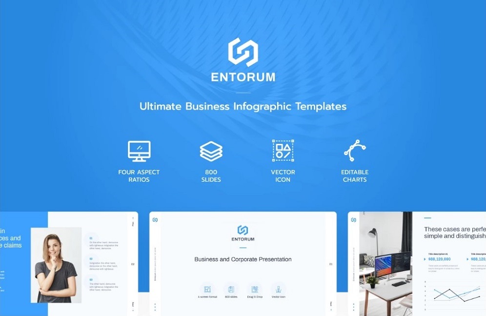
More features:
- 10+ presentation slides
- 28+ analysis infographics
- 15+ service slides
- No coding skills required
- Accurate documentation
- Friendly support
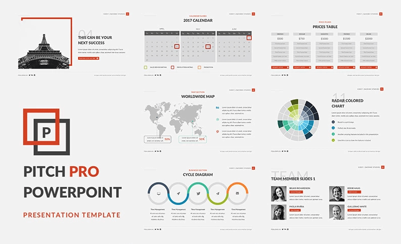
2019 Pitch Deck PowerPoint Template

Start Up PowerPoint Template

Pitch Pro PowerPoint Template
Have you already decided what fonts will be best solutions for your own presentation? Do you prefer more playful or serious typefaces? Do you have any cool examples of the effective presentations with the smart font choices? Feel free to share via comments.
PowerPoint Fonts FAQ
How to add fonts to PowerPoint presentations?
PowerPoint lets you add non-standard and custom fonts as. To add a new font, head to File and choose Options. Click Save and check the box for "Embed fonts in this file."
Using a style font, you can customize the way your texts appear in a PowerPoint document. PowerPoint lets you manage fonts on all slides in bulk or particular slides using the slide master.
The five classic presentation fonts that are used in PowerPoint and Keynote presentations include Helvetica, Garamond, Futura, Gill Sans, and Rockwell.
Graphic designers are welcome to become authors in the TemplateMonster marketplace and start selling typeface fonts and font icons along with ready-made themes compatible with all types of CMS and eCommerce platforms.
Read Also
How to Write Company Annual Report: 15 Tips With Compelling Examples
PowerPoint vs Keynote: Presentation Tools Compared
6 Rules of a Compelling PowerPoint Presentation
The Best Annual Report Presentation Templates For Your Boss’ Admiration

Get more to your email
Subscribe to our newsletter and access exclusive content and offers available only to MonsterPost subscribers.

Leave a Reply
You must be logged in to post a comment.