10 Things to Consider when Designing an eCommerce Website
Designing an eCommerce website can be complicated. There are lots of things to consider, from site performance to user engagement. It’s one thing to design a simple website, but designing an eCommerce site comes with its own challenges.
First of all, eCommerce sites are built not only to inform and to showcase your brand online, they are also built for consumers to shop. Because of this, designers have to make sure that the site is intuitive and easy to use in order to make sales. Without sales, the whole website loses its purpose.
If you’ve ever wondered what are the guidelines and website design ideas for designing an eCommerce website, then you’re in the right place. In this post, I’m going to show you some of the most important things an eCommerce site should have:
By the way, recently, we have started a new subscription service under the name of ONE. This subscription allows you to get any templates, themes, or plugins for only $19 a single month! Can you imagine how great it is? You just join the subscription and have access to any item from ONE package. Check out what eCommerce templates are available in the pack to know which ones you can download. Moreover, you get access to unlimited downloads, that means you can download the products with no restrictions and limits. If you are a blog reader, you can get a 5% discount within the subscription. Simply use the following promo code BecomeThe1.
1. Match Your Design with Your Products
Consistency is key to making your eCommerce website work. Keeping your design coherent with what you’re selling completes the overall feel and look of your site. When designing, make sure that everything from images, color schemes, to text, perfectly defines your website. For example, If your website is selling toys for children, your design should look fun and colorful. And if your website is selling gadgets, the theme of your design should look techy and modern.For example, this e-commerce website which buys and sells Star Wars toys uses a design that matches their merchandise perfectly.
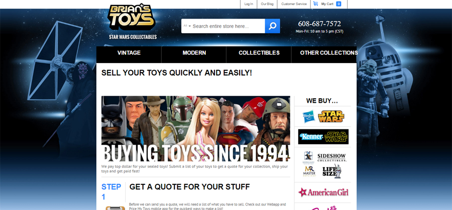
Image Source: brianstoys.com
2. Proper Product Showcase and Descriptions
The purpose of your e-commerce site is to sell products, therefore it is only right that you should highlight your products on your website. When showcasing items, make sure that you’re using high-quality images that will get the user’s attention. The larger the images, the better. By showing quality pictures, your customers can see how well the product looks in real.
For better usability, choose a layout that emphasizes your product in every page. Don’t give them a hard time finding the page for “Accessories” or “Shoes” if they’ve already searched or clicked on a similar item. Lack of information can make customers leave and reach to other websites.
Misinformation is even worse. When you put in a wrong size, or colour, you risk getting a bad impression and losing valuable customers. Describe your products correctly and in detail. Unlike shopping in brick-and-mortar stores, your customers can’t touch and see their items in every angle. You need to devise ways so you can give your consumers all the information they need to picture your item in their heads. This includes the type, colour, size, weight, thickness, cut and fit (for clothes), and all the necessary instructions they need to know before purchasing the item.
3. Shipping Rates
Some of the best eCommerce sites I love are those that offer low or free shipping. When shopping online, customers are always torn with the question “Is this a good deal?” And usually, they decide once they see the shipping rate. High shipping means “I could have just bought this item on a regular store and I wouldn’t pay as much for shipping” while low shipping means that “I can spend a few bucks for shipping just to stay at home and wait for my item to arrive”.4. Shopping Cart Design
Too many designers don’t pay attention to shopping carts, but it actually is one of the most incredibly important parts of your website. A good shopping cart can enable users to add multiple items, revise order, or remove products as easily as possible. When designing a shopping cart, make sure that you include functional product images, reviews, and a convenient search bar.
Here’s an example of a good shopping cart design. This shopping cart from Sephora features a simple but very intuitive design. It includes all the necessary features like the order summary, product recommendations, and a “continue shopping” option for those who want to add/replace items.
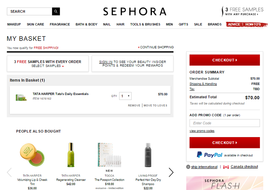
Image Source: sephora.com
5. Guest Checkout
Many eCommerce sites today require users to register and create an account first before they make a purchase. Although this is extremely helpful since it allows you to communicate, follow-up, and track your customers, it isn’t really something customers want to do. Customers want to make every transaction as quick and anonymous as possible.
They don’t want to feel forced when you ask them to register. They don’t want long forms. All they want is to buy stuff from you. With guest check outs, customers don’t need to fill out pages of personal details before making the purchase. Experts believe that guest checkouts help boost conversion rates as it removes the barrier (which is the signing up/registering) so that more people can order from you.
6. Easy Checkout Proces
What’s the ideal checkout page? Aside from allowing transactions to be quick and anonymous, as mentioned above with the use of the guest checkout option, an eCommerce site should also make it as easy as possible for consumers to check out their items. The easier this process, the more motivation your customers will have to repeat purchase. So don’t make too many pages for checkout. Try as much as possible to make it a single-page process while not being too overwhelming for consumers. If you know the basics on how to make a website, designing the checkout page aren't so hard.
7. Payment Options
I’ve seen lots of eCommerce sites that don’t allow users to pay with Paypal or with other kinds of payment aside from Visa or Master card. When designing an eCommerce site, make sure that you provide lots of payment solutions so you can cater a wide range of shoppers. By considering your consumer’s payment preference, you can increase their motivation to shop thereby boosting your sales in the long run.
8. Contact Information and Support
Let your customers know that you’re simply a call, text, email, and live chat away! The best way to earn loyal customers and to instil more confidence is to show how passionate you are in helping them. When they encounter a problem, make sure that there is always someone who can attend to help. If your site hides any contact information and other means of communication, customers see this as a red flag, and they’re less likely to do business with you.
Here’s an example of an eCommerce website that provides complete contact information along with a brief history background, community affairs, and contact services of the company:
8. Contact Information and Support
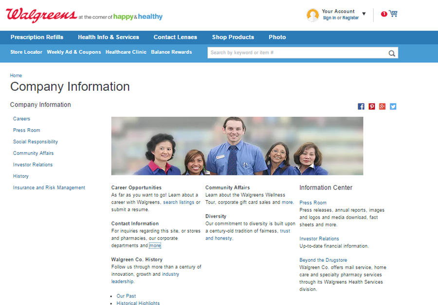
Image Source: walgreens.com
9. Keep Your Store Secure
Brick-and-mortar stores keep secure by installing cameras around their perimeters, appointing bodyguards, and necessary tools to keep customers safe while they’re shopping. How to build Shopify stores? In a recent survey conducted by Ponemon Research, 90% of respondents said their computers had been breached at least once over the past year.
All eCommerce sites are a target for hackers and the need to keep your store secure is becoming increasingly important. Still, the best way to make your site secure is to support SSL to encrypt information. With an SSL certificate, you can protect your customer’s valuable information including address, e-mails, phone number, and credit cards.
10. Social Proof
Without evidence that someone purchased successfully or liked your site no one will ever put their confidence in you. If you’re struggling for good reviews, make it so that your customers are able to review you easily. You can do this by bringing this option on the product page or right after they have successfully completed an order.
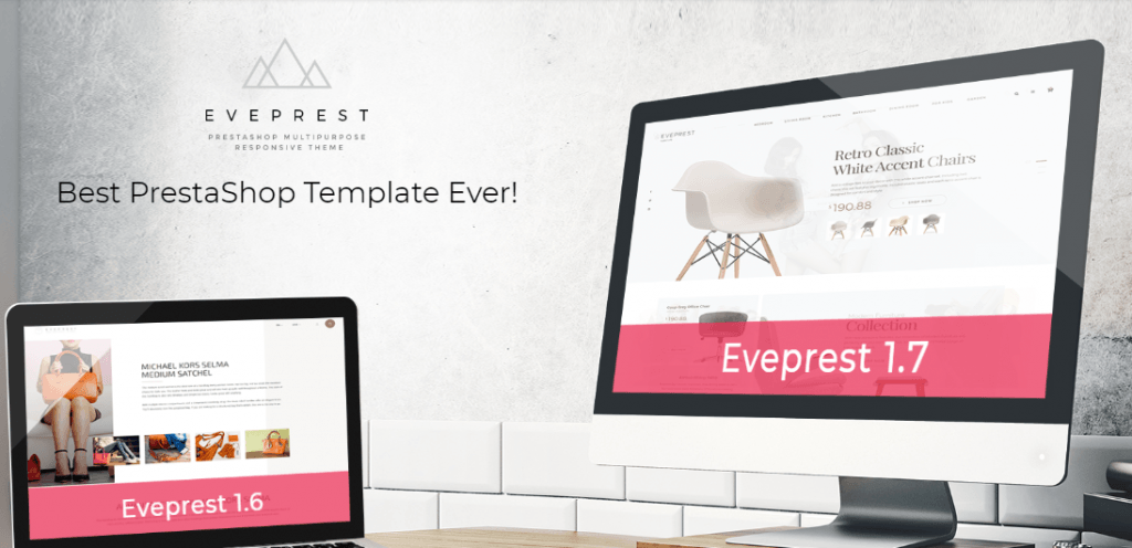
Eveprest - Multipurpose PrestaShop Theme
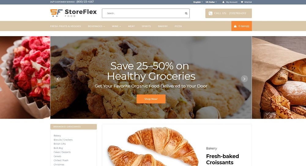
StoreFlex - Food Responsive OpenCart Template
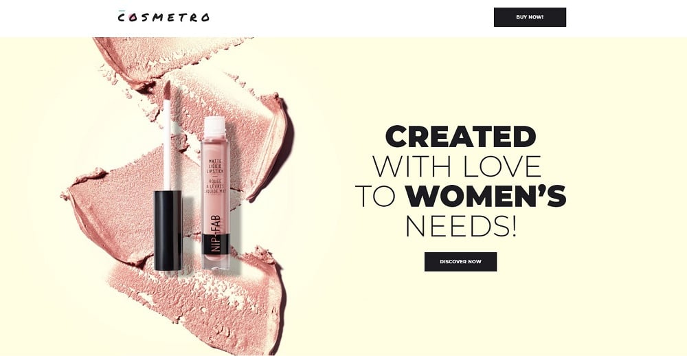
Cosmetro - Cosmetics Store Elementor WooCommerce Theme
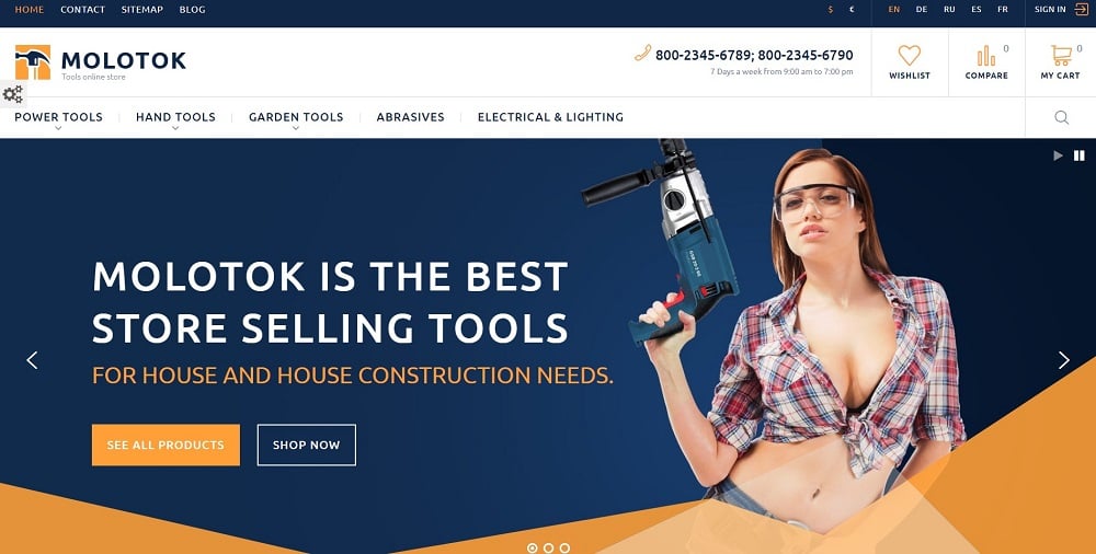
Molotok PrestaShop Theme
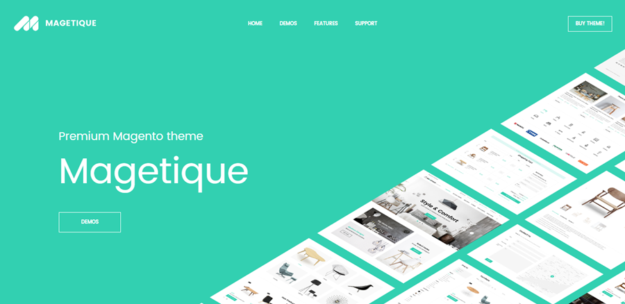
Magetique - AMP-Ready Multipurpose Magento 2 Theme
Web Design Essentials for Non-Designers: Free Ebook
Choosing the Best eCommerce Platform [Free eBook]
Get more to your email
Subscribe to our newsletter and access exclusive content and offers available only to MonsterPost subscribers.

Leave a Reply
You must be logged in to post a comment.