10 Typography Trends to Stick to in 2020
- Top typography design trends in 2020
- hand-Drawn Fonts Have never been so Popular
- Color Fonts Start their Glorious March
- Variable is the new Responsive: Resizable Fonts
- Cool Fonts Always come with Alternative Characters and Ligatures
- Vintage Fonts are Popular as Always
- Everybody Loves Extra Glyphs
- Font Pairings Become a Trend
- Really Large and Really Small Types Match Perfectly
- Two-in-One Mixed Fonts
- Text Over Images
- Image over text
- Extraordinary Type Layouts will Unleash Your Creativity
- Custom Typefaces
- Minimalism is ok, but photos are more Expressive
- Geometric Typefaces
- Watercolor Fonts
- Bold and Eye-catching
- Experimental Display of Typography
- Checklist-Typography Pdf [Free Ebook]
- Oh, come on, and how am I supposed to choose the font?
- Why is it important to know what’s on-trend right now?
- A handful of inspiration
- How to Mix various Types? [FREE CHECKLIST]
- TOP Fonts 2020
- A quick wrap-up
Trendy fonts. Trends are those guides that will keep you within the bounds of common sense. They are commercially oriented and mainstream – just what the market needs. Whether you are designing a t-shirt, a website template, or a logotype, a harmonious combination of all the elements is always of a higher priority than sheer creativity.
This review of the most important typography trends of 2020 will allow you to improve your design workflow, expand your expertise and find new clients. Fasten up!
Top typography design trends in 2020
Hand-drawn fonts have never been so popular
Hundreds of them are being released every month. Brush fonts with bold lines and grungy edges are especially demanded, as they can be easily overlaid with foil and watercolor textures, and are irreplaceable for feminine designs, which are extremely popular on Fiverr, Etsy, and online design marketplaces.
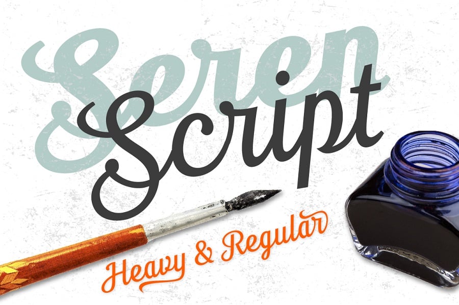
Seren script font by TypeFaithFonts
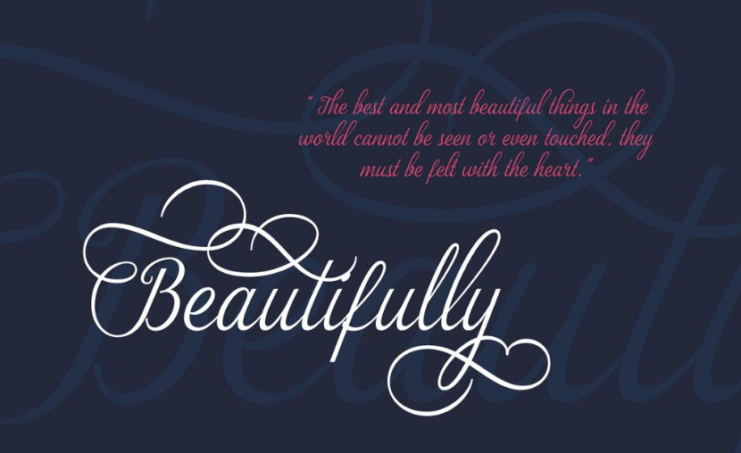
Although you don’t need to be as precise comparing to classic sans and sans serif typefaces, it’s not easy at all to create a font from your own handwriting. You will need to take care of all the connecting strokes and provide a perfect handwritten text flow, which is much more difficult than simply adjusting kerning pairs.
Handwritten typefaces allow you to create truly stylish layouts. It is no surprise that trendy calligraphy will be the icing on the cake for Instagram posts, websites, personal blog or even printed material. By using hand-drawn elements you can evoke different feelings. For example, for a beauty blog, you can use tender and curly lettering. It will create a warm and welcoming atmosphere. The one you see on the picture below is Zelda font from TemplateMonster.
Color Fonts start their glorious march
Color/chromatic fonts are basically SVG data stored in OpenType fonts. Thanks to the extensive OpenType features, raster and vector images can be included. They lack flexibility comparing to regular monochromatic fonts (as the latter can be recolored) but allow them to store pre-bundled with gradients, textures, and other complex graphic effects.
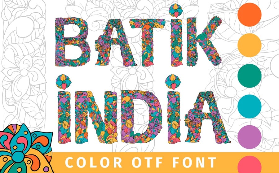
Batik India Color OTF Font by ilonitta
As stated above, color fonts can be a vector (scalable) and raster (non-scalable) depending on the type of SVG data they are based on.
Currently, the most commonly used tool for the creation of color fonts is FontSelf for Photoshop, whose creators actively promote the new trend.
Variable is the new responsive: Resizable Fonts
The big four – Adobe, Google, Apple and Microsoft have partnered to create a brand new type technology introduced in the version 1.8 of the OpenType font format. It is called “variable fonts” and it will blow your mind (if you care at all about design or courseJ). Unlike regular fonts where each weight is static, variable fonts provide smooth, non-discrete transition between weights, continuous variation along width axis and other transformations.
That’s how it works in the example by Erik van Blockland:
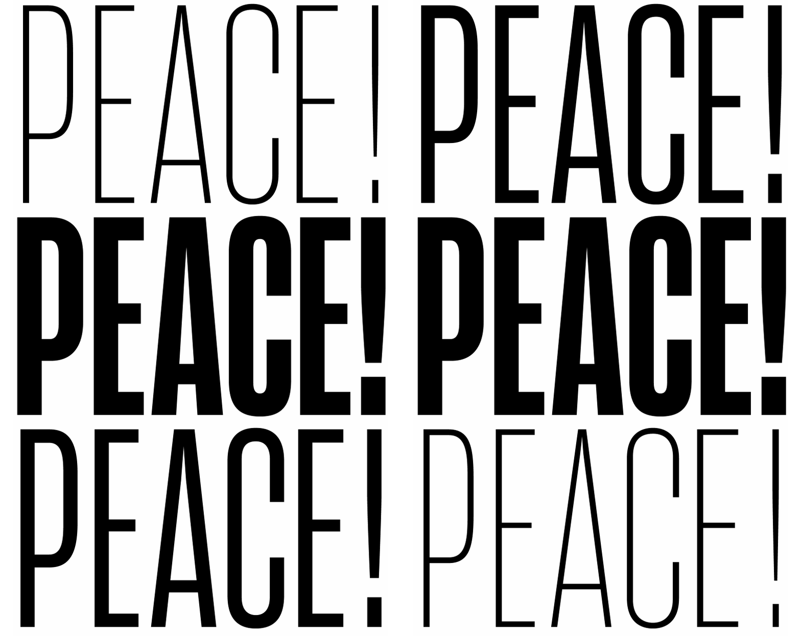
You will be able to receive exactly the appearance you need without installing additional font files or adding an outline to your type.

Customizing the Buffalo Gal font
Variable fonts are not yet supported by most graphic software, but it has a bright future and is totally worthy of your close attention. Thanks to the OpenType 1.8 release, new opportunities have appeared. Imagine that a single font can be viewed in multiple ways. Well, with the Variable one, everything is possible. It allows you to adjust the letter size, according to your needs. Customize the width axis or the weight axis, shorten the descenders. In addition, it prevents the file size from increasing. So consider using them if you want to try out their real flexibility.
Cool fonts always come with alternative characters and ligatures
It is not enough for a good typeface to contain only one set of characters anymore. Typefaces with alternative character shapes and ligatures become more and more common. Stylistic alternatives allow you to make your designs more diverse and add a feel of a custom-drawn artwork to them.
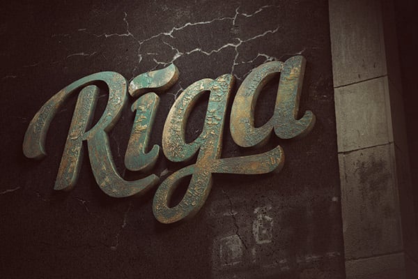
Ligatures and alternatives as presented in the Nautilus Pompilius font.
Vintage Fonts are popular as always
Vintage is among the most popular design styles nowadays, so no wonder that retro fonts are on the top of their popularity.
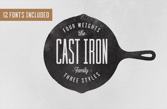
Cast Iron Family Font by FontHustle Supply Co.
Such fonts as Gutenberg and Nexa Rust Slab Black Shadow are also used mainly because they are textured out of the box – you don’t have to spend extra time and effort to add a printed look to your typography.
Everybody loves extra glyphs
Some typefaces are supplied with extra symbols and other non-alphanumeric characters such as icons, dividers, dingbats and flourishes, and even entire icon collections. For example, the premium edition of Nexa Rust comes with 5 icon fonts with over a hundred glyphs.
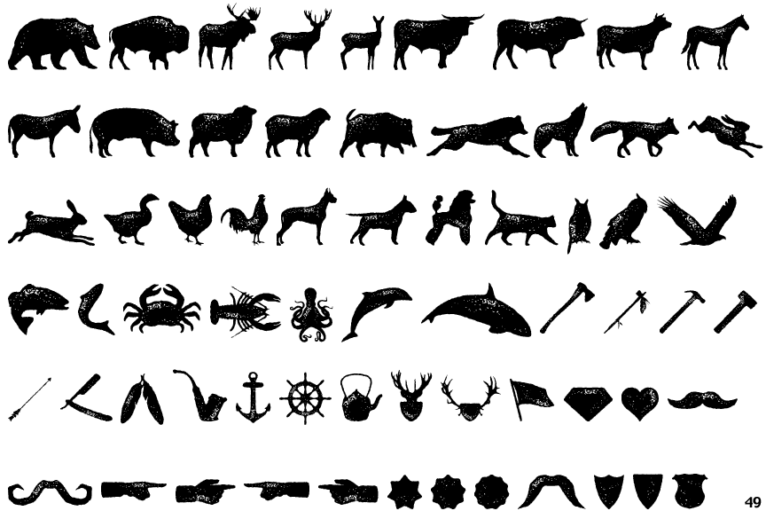
Thanks to the OpenType standard, it is easy to add virtually any number of extra characters to a font.
Font pairings become a trend
If you are familiar with the basics of logo design you know that one will need to combine two or more completely different types of fonts in order to create a professional typography basis for your logo: slab serif + sans, sans + script, condensed sans + serif, etc. But there are so many possible combinations, and not all of them are apposite.
By exploring some of the most popular designs from TemplateMonster you can define the most widely used pairings, and build your designs based on the experience of more proficient colleagues.
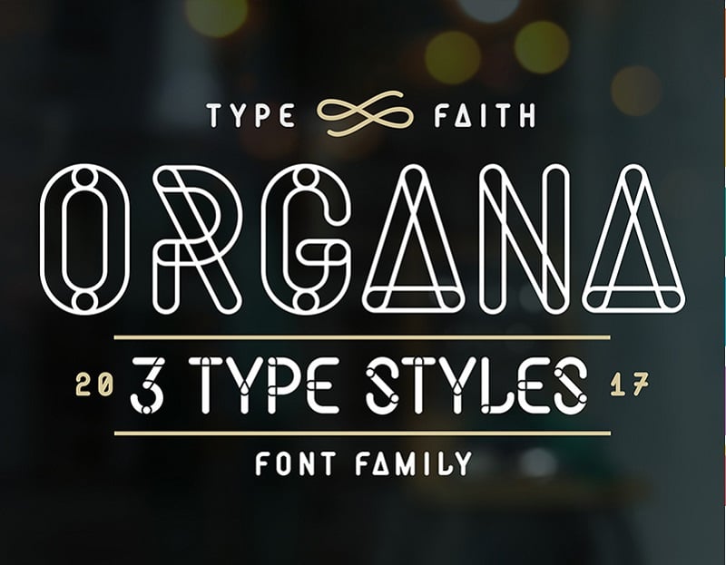
Organa Font by TypeFaithFonts
You can also find cool, web-friendly font combinations on fonts.greatsimple.io.
Really large and really small types match perfectly
Contrasting things look great when put together.
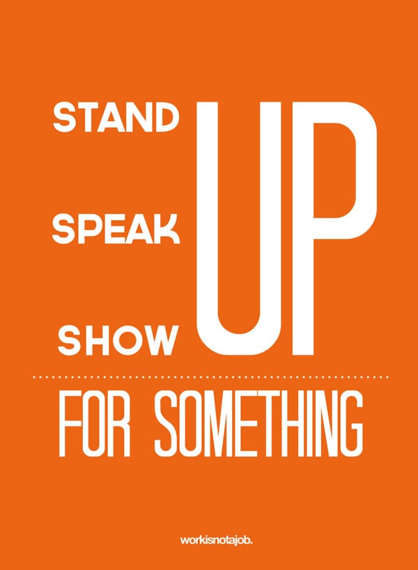
Out next trend is about creating typographic combinations using REALLY LARGE and pretty small text. It is inspired by expensive glossy magazines and gives your designs a bold poster-like appearance.
REALLY LARGE elements are commonly done with bold, heavy sans serif fonts such as Futura Black and Bebas Neue Bold, while for smaller ones narrow fonts are used.
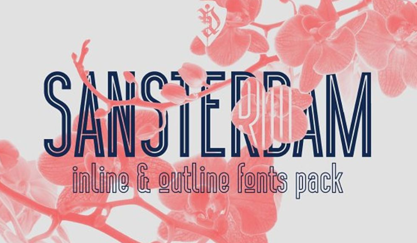
Two-in-One Mixed Trendy fonts
Using a single font for your website is normal. It is a choice of those who love minimalist layouts. But if you are a creative person, the following approach may sound boring to you, so we suggest you break the rules and mix different fonts. The combination of several typefaces is a powerful eye-catching tool. The following trend lets you create a stunning visual representation of your brand, like the Sansterdam font group.
Text Over Images
The text over image concept may sound pretty simple. You choose the photo and then overlay your text on it. Sure, you can just use a black background and put a white slogan on it, that’s classic. But combining the photo and text can increase the effectiveness of your message. The type over image allows you to create contrasting designs. Just make sure that you pick the right color scheme for your printing. For example, use dark nature photos, as we used for Arbour font.
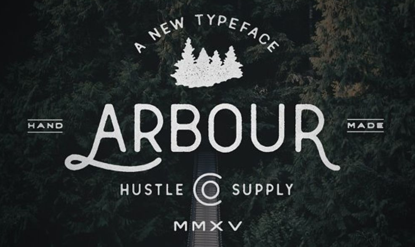
Image Over Text
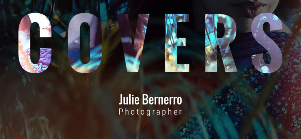
The image over text is popular among graphic designers, photographers and web design companies. This visual effect is created by adding a double exposure. A novel approach like this allows you to showcase an image right in your text. Using the image over text trend can make your content memorable. It will be one of those fonts that play an important role in the overall project perception.
Extraordinary type layouts will unleash your creativity
Your type doesn’t have to be strictly horizontal. Use numerous text warp effectsto the design and make it look outstanding.
You can also use the free transform tool to shape your type more precisely.
The result can be really stunning, as shown in this tutorial by Chris Spooner:
Custom Typefaces & Trendy fonts
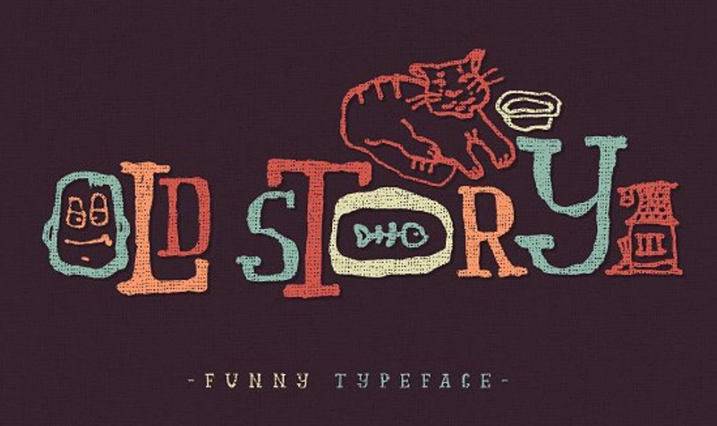
Custom typography provides you with incredible flexibility. Certainly, creating one requires time and money. But the result is worth it. By using a custom type you can underline the personality of your brand. If you want to highlight specific features of your business or niche, you can incorporate all these ideas in the typeface. Show your individuality through the font, for example, Old Story typeface.
Minimalism is OK, but photos are more expressive
There are two major ways of combining text and photography in one design. Let’s call them “text-over-image” and “image-over-text”.
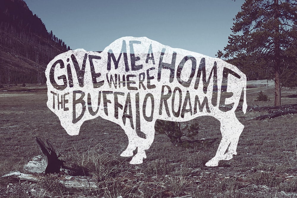
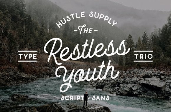
The “text-over-image” way is simple: you just put your type on the photo. In this case, it is extremely important to choose the palette properly.
Have a look at the example:
The Restless Youth Bundle Font by Hustle Supply Co.
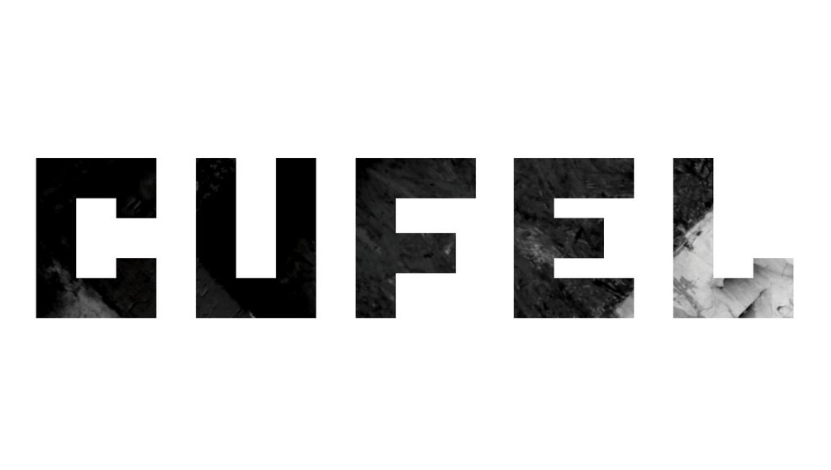
The “image-over-text” is mostly about using clipping masks in Photoshop. You also add extra charm to your design by creating a double exposure effect as explained in this video tutorial.
As a result, you will get something like this:
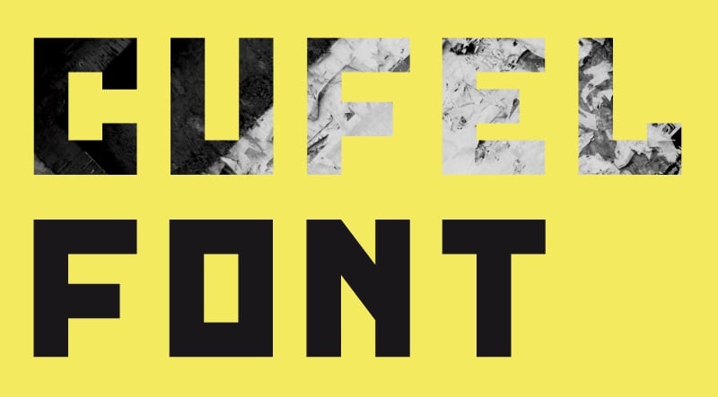
Cufel Font by Fontshpere
Geometric Typefaces
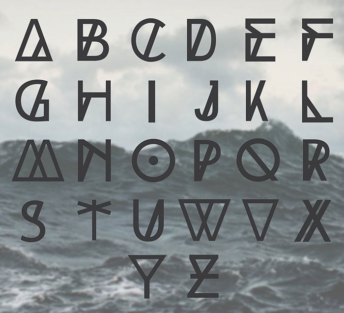
Geometric typefaces have been in great demand during the last couple of years. Such typefaces are created using straight lines and perfectly round forms. The geometric letterforms are completely without serifs or filigrees. As a rule, these are being used for science, tech, and engineering projects. These are the perfect choice to bring a futuristic vibe to your content yet keeping it impressively readable and quick-to-scan. Their clarity makes them well-suited for branding and logo design creation.
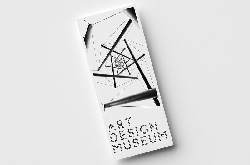
The following trend has remained relevant over the past few years. A geometric inscription is a great option not only for websites and Instagram posts. It would also be a fit for album covers and movie posters. The geometric shapes of the letters remind us of both the runic alphabets and futuristic designs at the same time. So if you want to add some intrigue to your layout, use a font like The High Tide.
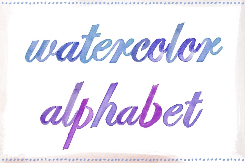
Watercolor Trendy fonts
The popularity of watercolor designs moves hand in hand with handwritten fonts. The two complement one another ideally. The typeface gained the wide popularity in 2018. 2020 is expected to make it even more popular. A watercolor typeface looks as if it was created with a brush using watercolors. Such fonts can add a feminine and refined style to the works where they are being used.
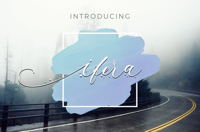
The watercolor design is a rather creative tool for those who want to stand out from the crowd. Beautiful typography, like this one, invokes comfortable and friendly feelings and increases trustworthiness. It is a great option for creating Instagram posts, a logo, or a website design. Moreover, watercolor calligraphy would be a perfect fit for greetings cards. Add a personal touch to your layouts by using this trendy feature. Just look how beautiful Watercolor Alphabet by Angiemakes is.
Bold and Eye-catching Trendy fonts
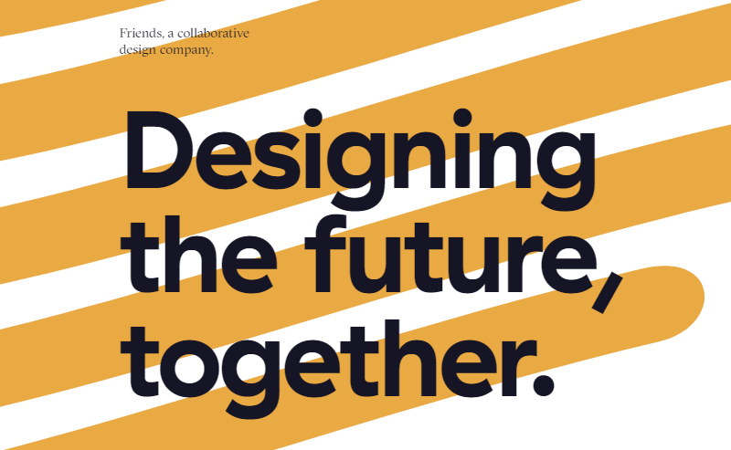
Bold lettering is a great option to underline the necessary text elements. If you want to transmit a clear and powerful message, make it bigger. The big and bold text is a great example of an attention-grabbing element. But remember that balance is a must. It is essential to leave sufficient blank space near such oversize content blocks. Here is how Friends design agency used this trick for their homepage:
Experimental Display of Typography
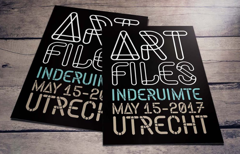
One more trend that’s expected to get a boost in 2020 is creative experimental display of typography. Some fonts are not supposed to be used in long paragraphs of text. They are better suited for custom designs, posters, advertising data, etc. So, using letters as part of images or design projects can entice any passerby to stop and take a closer look.
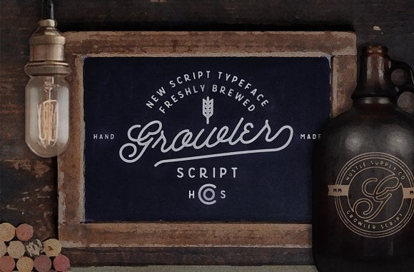
Beautifully written text is an object of art almost from the moment of the alphabet invention. In the Middle Ages the number of people who could read and write was very limited, so the process of handwriting was a kind of sacred ritual. Even in the 15th century, when the printing was invented in Europe, a beautiful text was still in need. And of course, its importance didn’t fade by now. I mean, you see it everywhere and the type of the font can tell you a lot about the essence of the text even before you start reading it. The font is one of the most illustrative parts of any design and their affection on viewer can’t be underestimated.
There even are scientists, who study the psychology of typography. Every day you see hundreds of modern websites, Instagram or Facebook posts, personal or corporate blogs, online magazines, etc., and don't even realize what work stands behind every letter. If chosen wisely, the lettering can improve readability, increase the number of clicks and even drive more conversions to your website. So every time you choose a Times New Roman font for your homepage design, stop right there and think about it once more. Are you sure it is the best choice?
Oh, come on, and how am I supposed to choose the font?
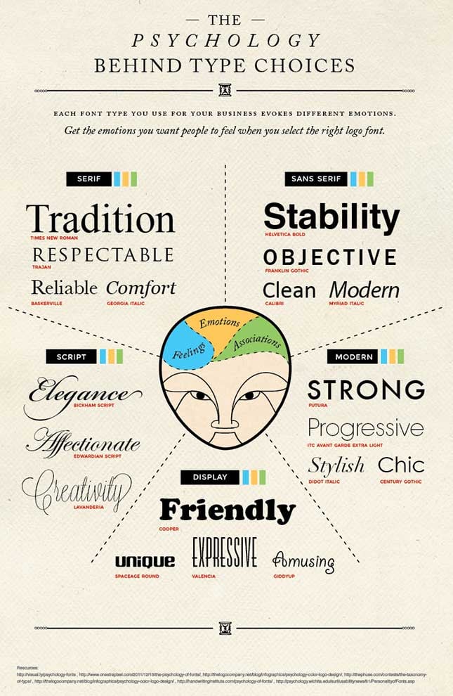
Keep calm, it is not a rocket science. Most of the researches are done long before you. Different style and size make the viewer resonate with a different emotion. Think about the mood you want the user to read the text? Should he feel comfortable? Or adventurous? Or maybe you want him to realise how creative you are? When you define the emotions you want to call to - all the rest is easy. Take a look at this infographics - it will help you to make a decision.
The next question will be - where do I get those fonts you are talking about, author? Oh, my delicious friend, there is a bunch of ways to collect a few fonts and some of them are even free:
- Buy the one you like from the marketplace. TemplateMonster has a wide selection of professionally drawn fonts
- Download some free fonts, that are available on the internet. For example, 1001 Free Fonts website has a big bunch of them
- Use Google Fonts. This website provides you with the code to embed the specific font right to your WordPress dashboard
- Try to draw your own one. Not the fastest variant, but in the end, you will get the font that fits your taste and needs perfectly
- Find a designer to create a custom font for you. If you are not really confident about drawing, a professional will come to the rescue
As you can see, there are tonnes of useful resources where you can find the dream font. However, there are still some pitfalls. Thus your taste is the determining factor of the final design, you also should pay attention to the trends. Nobody wants his banner or website look out of fashion, so check what is on top before making the final decision.
Why is it important to know what’s on trend right now?
Here's a funny story that will explain everything to you. Do you remember the ‘Avatar’ movie? Blue natives on the Pandora planet, brave marine, flying lizards and between-body consciousness shifting? And for the logo of that film, that cost $237 million, 20th Century Fox company used a ‘Papyrus’ font. Yeah, the one every Microsoft Word user has on his computer.
Fans and haters were furious. The meme went so viral, that a brilliant skit from an episode of Saturday Night Live appeared:
The moral is - you have to learn on the mistakes of other people. It’s time to forget about the hackneyed Arial, Comic Sans and Papyrus typefaces (especially the last one). Be trendy, it is in your best interest.
A handful of inspirational Trendy fonts
There are situations when you just can't decide what is best for you. You just sit and try to figure out what do you want to show to the viewer and can't start the work. And all the tips and pieces of advice I gave you previously can't help, because you just have no inspiration. The simplest and the most pleasurable way to overcome such kind of procrastination is to take a look at some inspiring examples. So, here are the freshest, trendiest and the most popular fonts from the TemplateMonster marketplace.
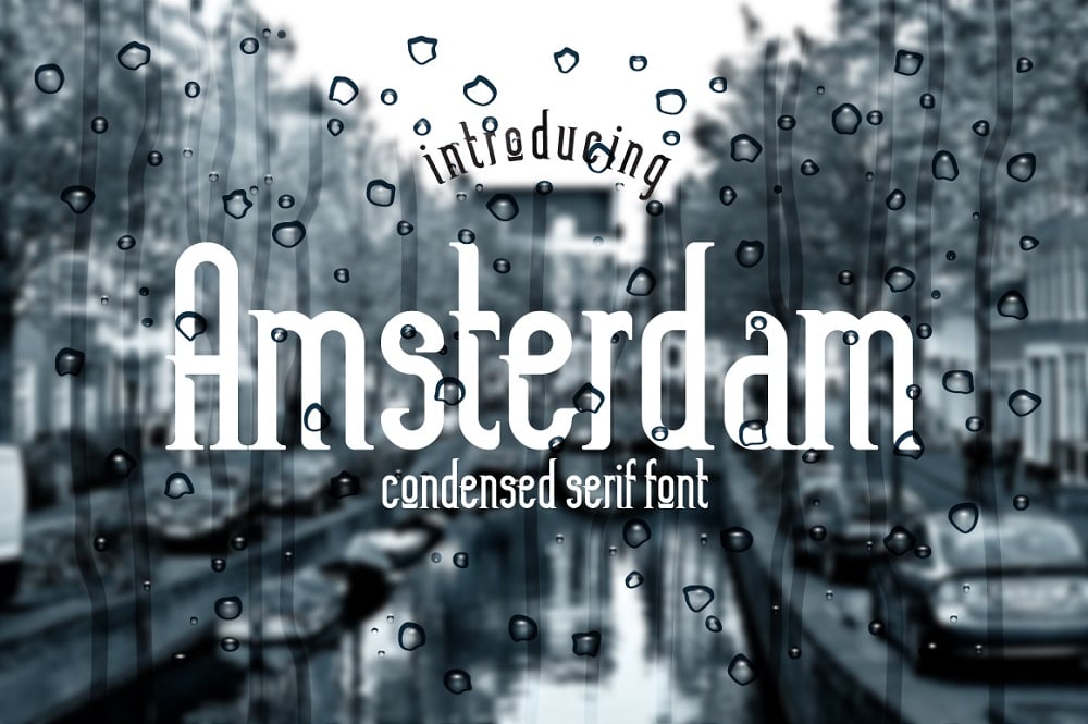
Amsterdam Font
The gorgeous vintage font for logos and headers, isn’t it? Just imagine the logo, created with it – it will definitely attract attention! It will also be a perfect and very accurate decoration of a card or invitation. For example, a wedding website and all the other paper stuff like albums and postcards will look amazing with it. And if you have a fashion brand website – this fancy font could add a witty raisin to the design. On the demo picture it was placed on the “watered surface”, and it indeed looks very romantic in such a way, but the solid-color background could also make it shine.
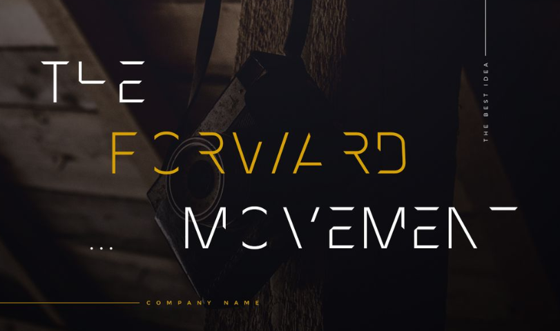
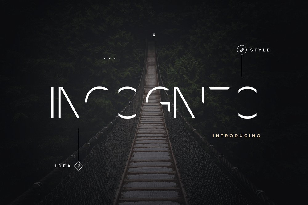
Incognito Font Pack Font
I guess this font is my favorite from all presented on the TemplateMonster marketplace. It is a rather specific solution, but if you have an IT website or gadgets store – it will be a perfect fit. It reminds me of cyberpunk style – this font is really futuristic and stylish. Urban clothes and male accessories will also look great if you will use this font to create a logo, slogan or decorative elements for it. This font is provided in the most common format – the TTF and includes all used keyboard characters, both letters, and symbols. There are about 100 elements in this set and it will be more than enough to create, literally, any text.
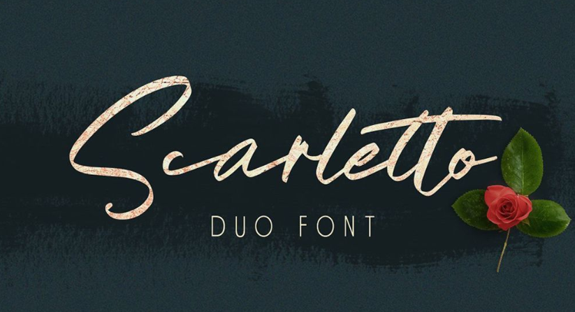
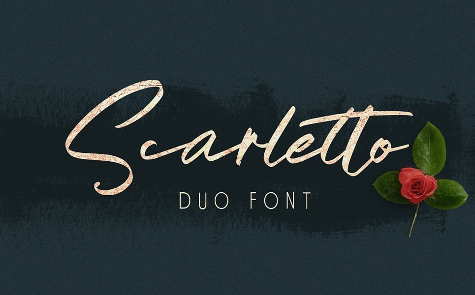
Scarletto Signature Duo Font
Not every font has to be unique and look like a piece of art. This handwritten font is pretty versatile and could fit to a great lots of different projects. Logos, headings, menu options, business cards, invitations – you can use this font almost in every niche and for any part of the design. You can place it over the image or create a catchy ad with it or use it for poster – as I said, it is quite versatile. It includes all the letters and characters you can find on the keyboard.
Abermad - Brush Font
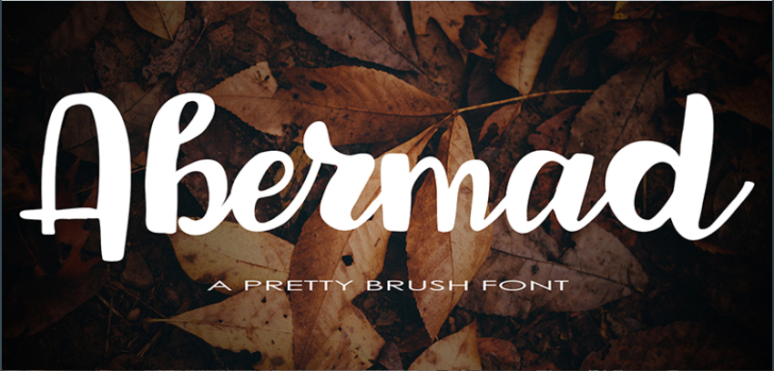
You probably have seen those cool pictures of nature or romantic places with motivating quotes over it in the social media? Well, this font is just perfect for such kind of design. It is created as a hand-written font, painted with a brush and almost every letter has alternative ligatures. This font also supports several additional languages besides English, so you can use it for websites with a Multilanguage block. The letters are rounded, so the font looks cute and is also quite versatile, but I guess it won’t fir for some insurance company or law agency. Take a look at the little video we shot for it:
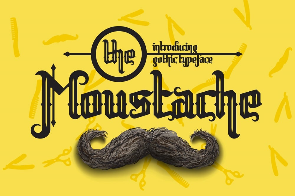
Moustache Font
Oh, I can almost see the signboard of a barbershop or basement-placed pub written with this gorgeous font! A real vintage gothic style – clear and eye-catching. If using it for some kind of a brand logo – it will fit a male-oriented firms (come on, look at those spears that pierce the letters, they definitely remind the old-style weather vanes and good-old knights and castles times). The letter sets go in two variants – ornate and simple one (the second doesn’t have all those spears).
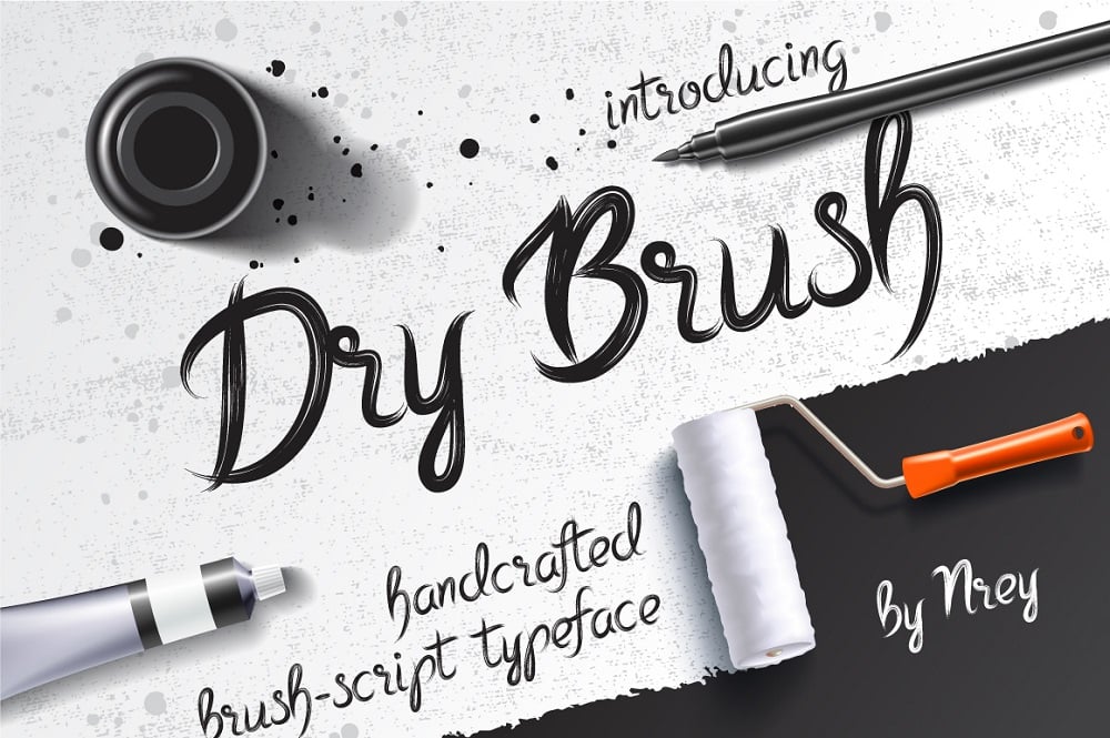
Dry Brush Font
Another versatile font that looks like it was drawn by a skilled in calligraphy artist with a little dry brush. It will look brilliant for different art websites, handmade stuff stores, learning portals and creative agencies landing pages. You can also use it to create a design for cups, t-shirts, posters and advertisements. This font looks perfectly not only for large letters, but far small description texts too. It was created on the base of DieCunst typeface and is perfectly compatible with it. When I look at this font I think that it will look amazing on the Christmas or Valentine’s Day greeting cards.
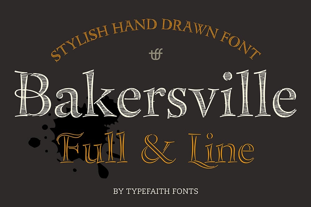
Bakersville - Font
In fact, this is not a single typeface, but a package of two fonts. They are both hand-written, but one of them is empty and drawn only in lines and the second one is shaded. For me they look like some nice appeals that are usually written on the blackboards and put in front of stores and pubs. That’s why this font will look just on the right place on different food packages and in menus. You can also use it for organic food online stores and restaurant websites. We created a little video for it, so check it out to see how we recommend to use this typeface.
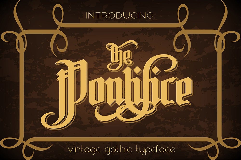
Pontifice Font
This font is created for large writing only; small texts won’t look good with it. The typeface is very pompous, real gothic style, with lots of additional details and a little hard to read. However, it looks really solid and serious, like a text in an old Bible or medieval manuscript. It will look fabulous for a logo or a heading and also will decorate any design or poster. With it you won’t even need to add an icon or picture - this font is beautiful and complicated enough to be a separate decoration of some part of the project.
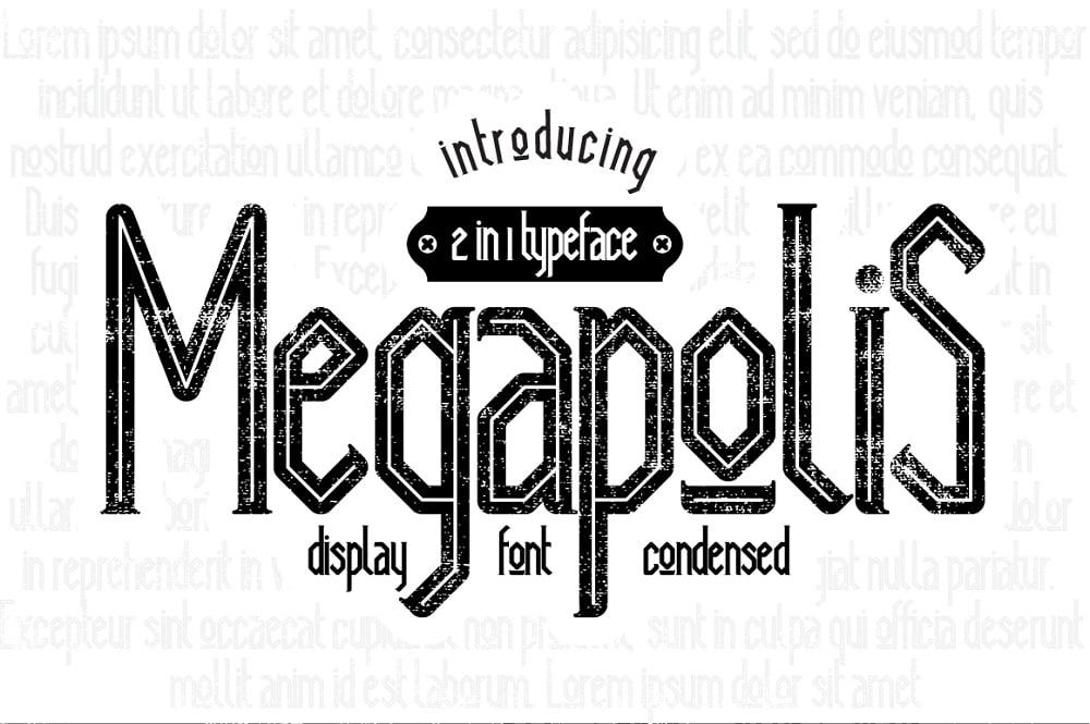
Megapolis Font
This font is created for large writing only; small texts won’t look good with it. The typeface is very pompous, real gothic style, with lots of additional details and a little hard to read. However, it looks really solid and serious, like a text in an old Bible or medieval manuscript. It will look fabulous for a logo or a heading and also will decorate any design or poster. With it you won’t even need to add an icon or picture - this font is beautiful and complicated enough to be a separate decoration of some part of the project.
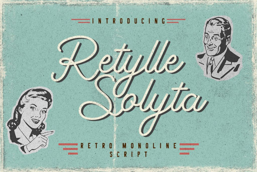
Retylle Solyta
Download Trendy fonts
Retro style is becoming popular again and is used for marketing purposes more and more often. This accurate monoline script font could be used for various purposes, including wedding invitations, watermarks, logos, packaging, and labels. The typeface package includes three file formats – OTF, TTF, and WOFF. It doesn’t need any special drawing software to be used and works smoothly with Adobe Illustrator, Adobe Photoshop, Adobe InDesign, and Microsoft Word. It also supports multiple languages and has all the necessary symbols and characters for them.
TOP Trendy fonts 2020
| Template Name | Provider | Price |
| Amsterdam Font | NREY | $20 |
| Incognito Font Pack Font | ZaremBladeford | $17 |
| Scarletto Signature Duo Font | Bloomxxvi | $17 |
| Abermad - Brush Font | astartejulia | $17 |
| Moustache Font | NREY | $22 |
| Dry Brush Font | NREY | $20 |
| Bakersville - Font | TypeFaithFonts | $17 |
| Pontifice Font | NREY | $22 |
| Megapolis Font | NREY | $20 |
| Retylle Solyta Monoline Font | CratypeStudio | $17 |
Showcase of the Trendy Fonts
Originality is overrated for graphic design. You have to create what the people want – and people often want something trendy. Unless you are going to set your own trend you will have to stick to existing ones.
Some of these typography trends are yet to demonstrate their full potential, so it’s high time for you to at least research them and get ready to implement them in your designs when they become popular.
If you don’t have time to create your favorite fonts you can always get some in the graphics section of the TemplateMonster marketplace.
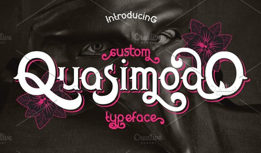
Quasimodo
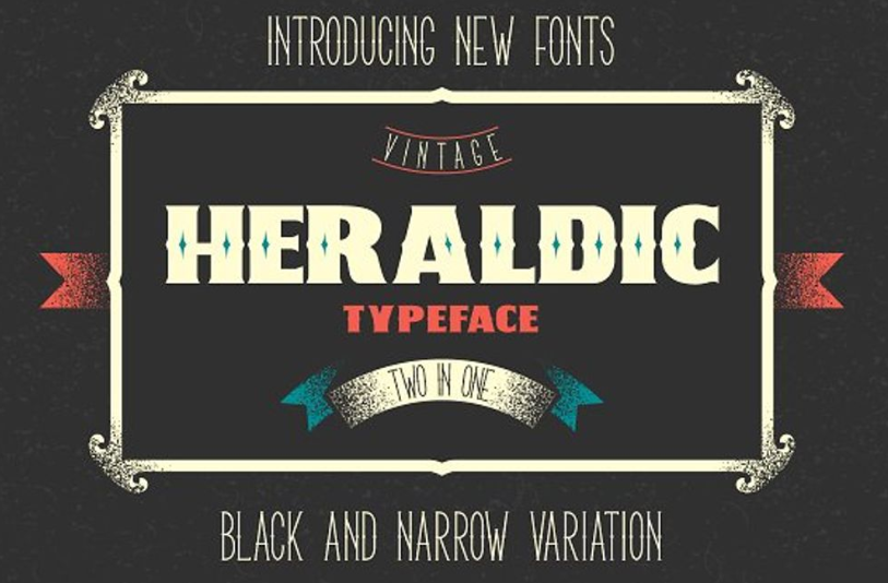
Two Heraldic
Organa
CUFEL
Incognito
Scarletto
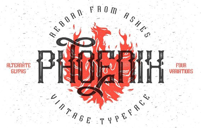
Phoenix
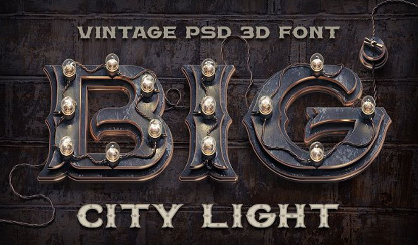
Big City Light
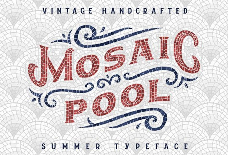
Mosaic Pool
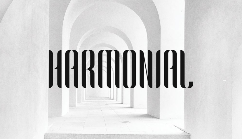
Harmonial Trendy fonts
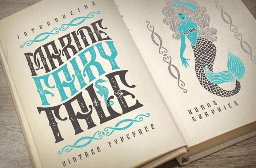
Marine Fairytale Trendy fonts
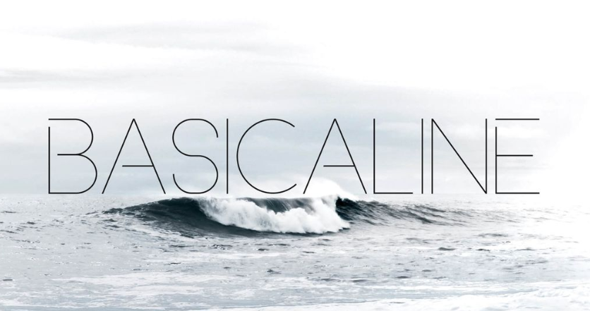
Basicaline Trendy fonts
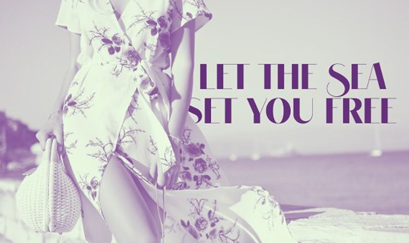
VOGUER Trendy fonts
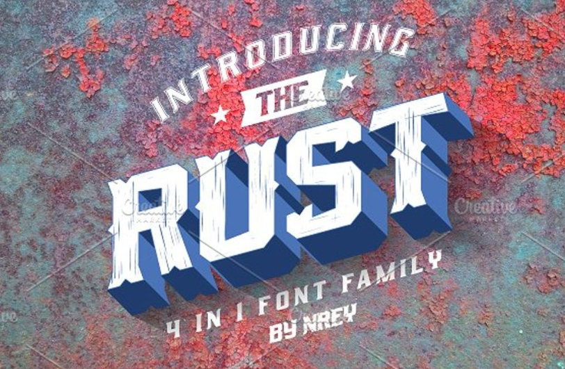
Rust Trendy fonts
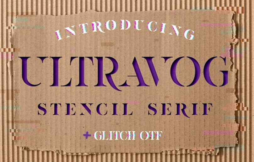
ULTRAVOG
A quick wrap-up
You always have a choice between timeless classic and modern features. You can follow the popular proven methods or become a trendsetter, it’s up to you. Everything depends on your taste and business goals. Which typography trends do you think will stay relevant in 2020? You are welcome to share your opinion in the comment section below. By the way, there is a pack of beautiful font trends solutions on our website, so you can take a look at them and choose the one that suits your needs.
Typography Trends 2020 FAQ
Typography could be a work of art by itself. It could not only add some specific tone to your design but, actually, be a design by itself.
In fact – as many as you want. However, not to make the general look messy it will be nice not to use more than two on the same page.
Handwritten typefaces are on top this year. Vintage ones are also very popular.
Typography is the art of typing printed text according to the rules of certain language using the process of typing and layout.
There are actually four classifications of typefaces: Grotesque (like Venus, Monotype Grotesque, and News Gothic), Neo-Grotesque (like Helvetica, San Francisco, and Roboto), Humanist (like Tahoma, Verdana, Calibri, and Trebuchet), Geometric (like Gotham, Avenir, and ITC Avant Garde).
In the 2010s the most usable font was Times New Roman. Now it’s surely Calibri. Trendy fonts!
Check out the Premium and Free Font Packs page by TemplateMonster or the Fonts page by MasterBundles. Here you can find a lot of fonts for different tastes.
Sans serif fonts are a category of fonts that do not use serifs, small lines at the ends of characters. Popular sans serif fonts include Helvetica, Avant Garde, Arial, and Geneva. Serif fonts include Times Roman, Courier, New Century Schoolbook, and Palatino. According to most studies, sans serif fonts are more difficult to read.
It totally depends on your needs. If you need to experiment with fonts, use bundles. If you have one definite purpose and know which font to use, you can download just one separate font.
Related Also: Trendy fonts
Get more to your email
Subscribe to our newsletter and access exclusive content and offers available only to MonsterPost subscribers.

Leave a Reply
You must be logged in to post a comment.