100 Real Color Palettes Inspired by Best-Selling Digital Products
The product presentation is the uppermost part of your sales funnel, and it can’t be overlooked. The better your featured image is the more people will click on it, the more will buy the product. For me, the hardest part in the design process is to come up with a good color combination for the presentation. Sometimes the colors I choose are too dark or too light; sometimes they just don’t fit. And I’m not always sure what exactly to change, which makes the task even more difficult.
If you are looking for a website template designed in a specific palette, you can go to any category on TemplateMonster.com - e.g. to the showcase of WordPress themes - and filter the results by color. But if you need to create the design from scratch you are on your own.
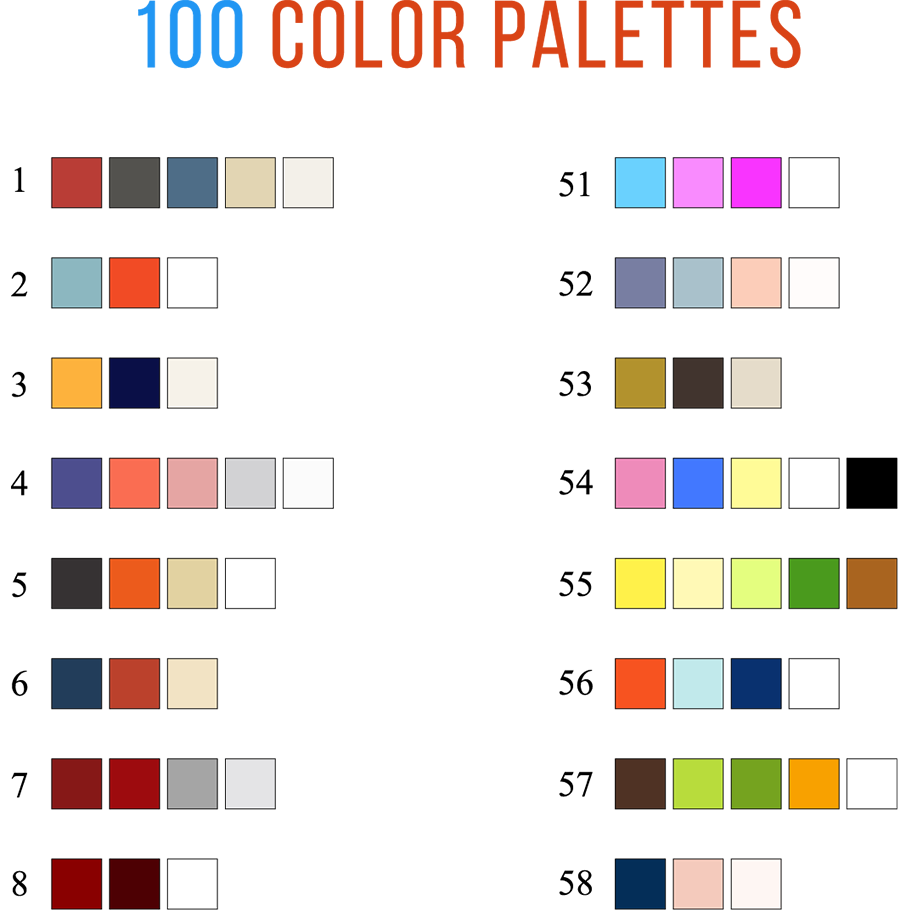
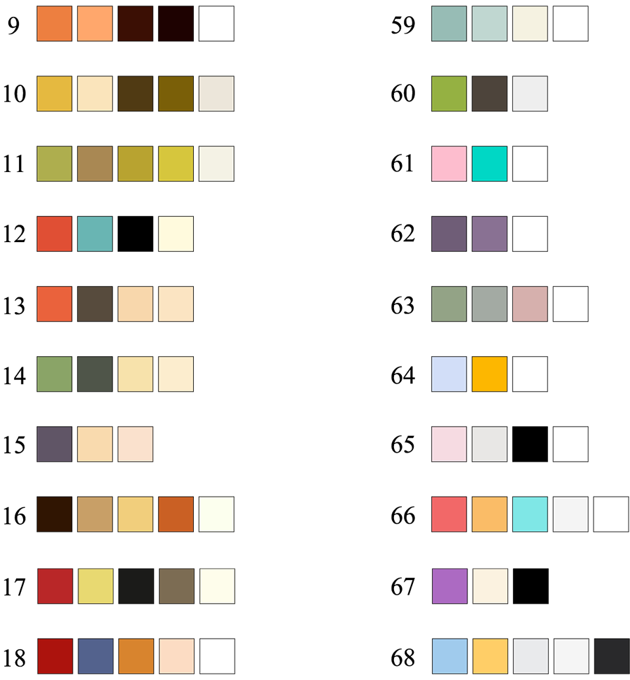
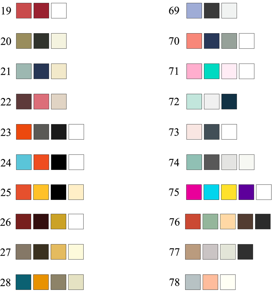
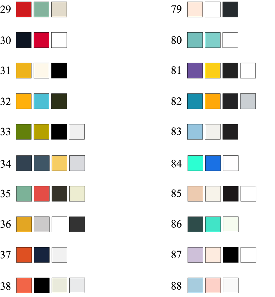
It can take hours to refine a palette, so I’ve decided to create a shortcut. I want to give away these 100 ready-to-use color combinations I’ve created for myself using real life digital products from the first pages of CreativeMarket search results.
What is this color palette collection?
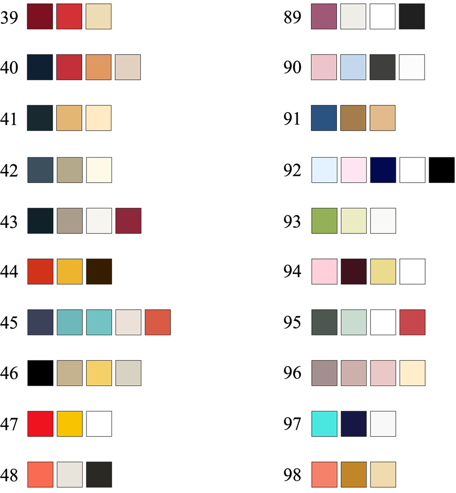
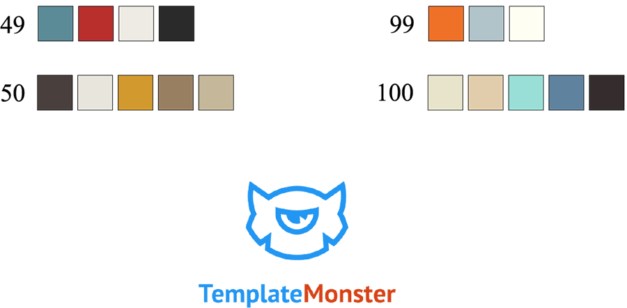
I have chosen 100 of the best-selling products from Creative Market, downloaded the preview images, picked the main colors using the eyedropper tool in Photoshop and transferred the results to Illustrator. Each palette includes 3 to 5 colors.
They might not look as fancy as those randomly generated by online tools, but they work. These palettes are time-tested and their effectiveness is proven by hundreds of sales.
The collection covers a whole array of design styles. The palettes 1-50 were taken from vintage products and include either muted or emphasized bright “retro-comic” colors, while the palettes 51-100 represent colors from modern products. Overall, they are mutually interchangeable.
This palette cheat sheet comes in 3 formats:
- AI – a vector file to be used with Adobe Illustrator CS2+;
- EPS – a file for other vector editing software (CorelDraw, Inkscape, etc.);
- PNG – a transparent lossless raster image, 995*1815 pixels. Compatible with all graphic editors and is best suited for use with Adobe Photoshop.
How you can use them
This cheat sheet works as a real painting palette. It contains 100 grouped color combinations, which you can copy to your document and using the eyedropper tool to pick a specific color. The two most contrasting colors typically stand for the background and for the title.
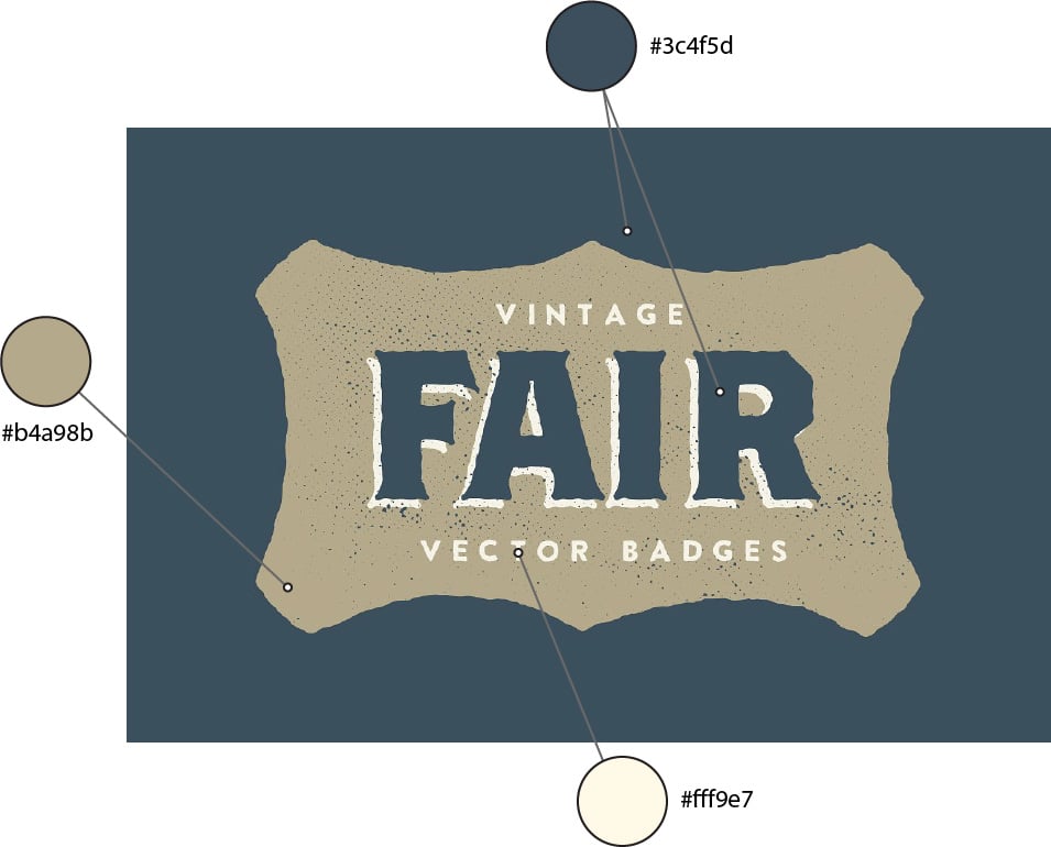
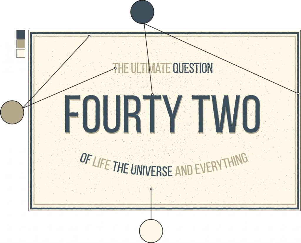
As an example, let’s examine the palette #42. Why this one? Because “42” is the answer to the ultimate question of life, the universe and everything, of course. This color combination belongs to the 15 Vintage Fair Badges by GhostlyPixels.
It includes the following colors:
#3c4f5d
#b4a98b
#fff9e7
Here is the cover image of the original product:
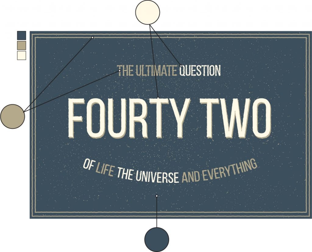
Here is how I used the palette #42 to create a completely new design:
The workflow:
- Find the palette that matches your choice of colors for the project.
- Pick the lightest color (if you want your presentation to be light), or the darkest one (if you want it to be dark) and fill the background with it (#3c4f5d).
- Pick the most contrasting color and make the title with it (#fff9e7). For this example I used Bebas Neue.
- Add some extra elements, borders, illustrations, additional text, and paint them with the rest of the colors from the chosen palette (#b4a98b).
- Apply some graphic effects. I used “Roughen” to add a vintage look to the text and the borders.
- Add subtle textures to liven up your design and make it look more “designy”. I used the pack of grainy textures created by Chris Spooner.
And here is the alternative color scheme for this design:
Get them now!
Feel free to download the palettes by clicking on the button below.
We would also like to hear from you. What tricks do you use to simplify the creative process? Please share your experience with the community.Get more to your email
Subscribe to our newsletter and access exclusive content and offers available only to MonsterPost subscribers.

Leave a Reply
You must be logged in to post a comment.