Excited with Trendy Color of 2014. Showcase of Purple Websites
Expressive, creative, embracing – it’s all about Radiant Orchid, color of the year 2014. Pantone Color Institute announced it as the most popular due to its creative and original look, that is of the previous importance in the modern society. Named after a wonderful flower, it has the same charming nature that draws viewers in.
Previous week we’ve published the freebie colored in this enigmatic purple color, and now we want to share with you a bunch of inspirational designs - purple websites. These captivating purple designs are examples of recently created sites that will be hyper trendy this year. Check them out to see how purple color works in these designs, what other colors match it the best way, and decide on how it can work for your business.
Color Psychology
Radiant Orchid is a harmonious unity of fuchsia, purple and pink undertones, an artificial color that is associated with the following notions:
- Royalty
- Nobility
- Fantasy
- Spirituality
- Mystery
- Dignity
- Luxury
If you want your website communicate points mentioned above, choose purple color scheme for the design. It also has a calming effect and encourages creativity, the latter one makes it a perfect fit for presenting a variety of design portfolios.
What Sites Choose it?
It's known as a contrasting color that is good for attracting attention to the key points of your site. This color as any other has a number of variations. Blue-purple, for example, is visually cool, a red-purple is a bit more warm. Deep purple looks so calming that is widely used in religious sites. The cheerful tone of the brightest shades of purple make it ideal for kids websites.
It’s a wrong assumption that purple is a color only for women websites like spa salons, fashion stores and everything that deals with beauty industry. It goes without saying that purple color in design of women fashion stores uplifts their conversion, but a number of business web presences also make use of it. It’s vibrant, strong and easily attracts attention. You can also find it in a variety of logos that became more eye-catching with this particular choice of color.
Now it’s time to see how purple behaves in website designs. Check out the sites below to see how they make use of this brandish color.
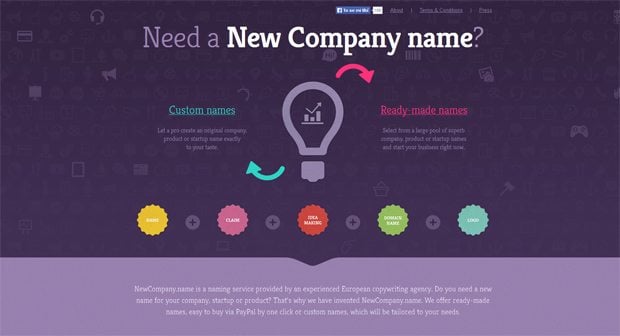
* * *New Company Name
Bold color palette where purple plays the key role and other colors are used as bright accents easily attracts attention of the audience.
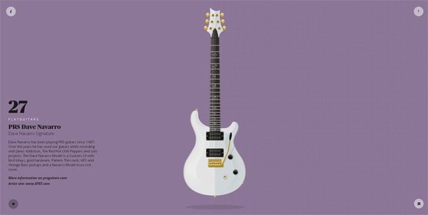
* * *FlatGuitars
Light purple like on the image below is widely used in flat website designs, bringing them a cool look.
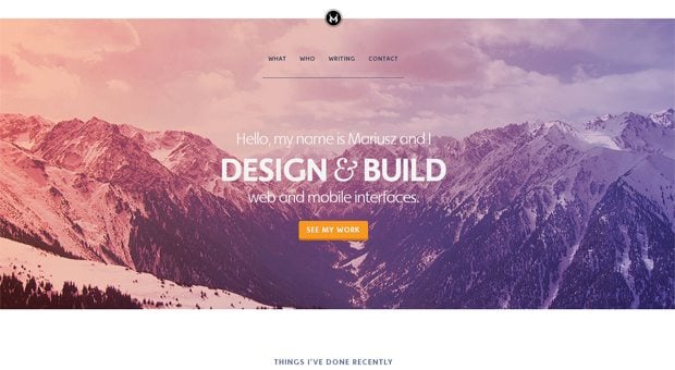
* * *Web & Mobile UX-UI Design
Purple design doesn’t mean that the whole layout is colored in it. Red-purple gradient applied to the full-size picture in the top creates the same effect of nice coloration.
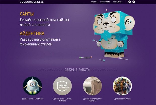
* * *Voodoo Monkeys
This example illustrates how purple encourages creativity. Its bright hue works great for setting the effective tone and pushing the content placed against it in the focus of attention.
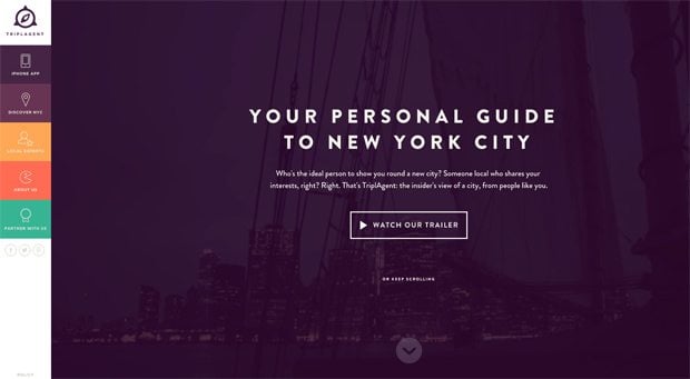
* * *TriplAgent
Purple behaves harmoniously with other colors of this website. Though, it plays a dominant role here.
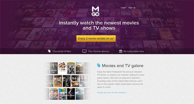
* * *M-Go
If you need to choose the best accompanying color for purple, have a look at this website. There you will find best color combinations where purple plays the main role.
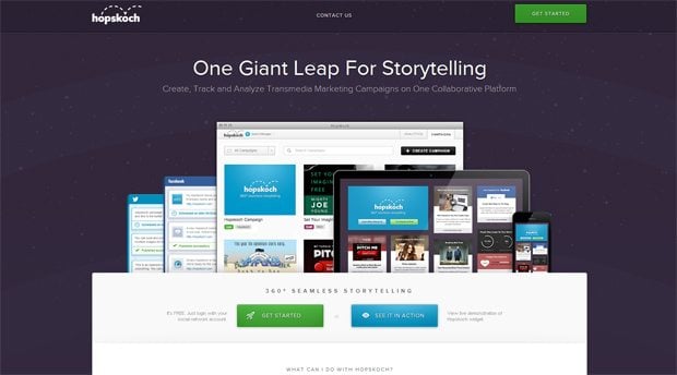
* * *Hopskoch
If someone says that purple is not a good choice for a website - don't believe in it. Hopskoch website is professionally tailored giving an ideal housing for the subj color. Number of illustrations are implemented into this design making it look really amazing.
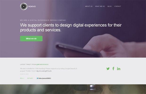
* * *Rokivo
Paired with natural green, purple creates a stunning visual effect. The following design looks clean and clear, thus appealing to the audience.
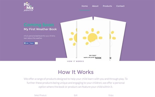
* * *Pic & Mix Pictures
Color palette of this site is a contrasting one with light purple, white and bright green that is applied on key points to accentuate them.
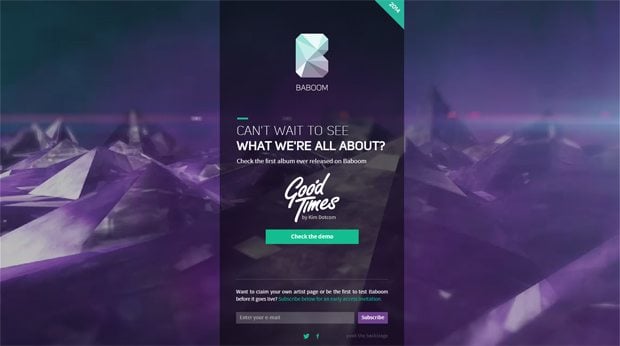
* * *Baboom
Video intro in purple color adds a vibe to the look of this site which design becomes eye-catching.
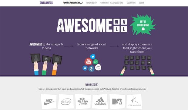
* * *Awesomewall
If you're fond of illustrations, you will find this website quite amazing. Lots of animation mixed with illustrations make a welcoming effect on any visitor. As for the colors used, you'll find couple dozens here.
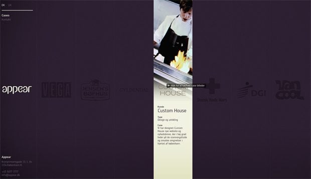
* * *Appear
Some web design bloggers define vertical division of content (like it's created in this website) into a separate trend. Click the screenshot to see what this site can offer.
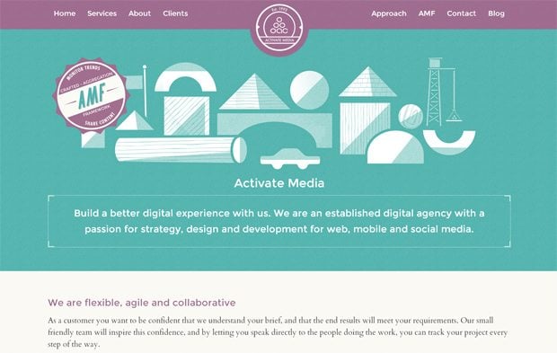
* * *Activate Media
Purple always draws attention, that’s why its choice for the fixed header is a wise one. As you see, such header will always be in the focus of attention.
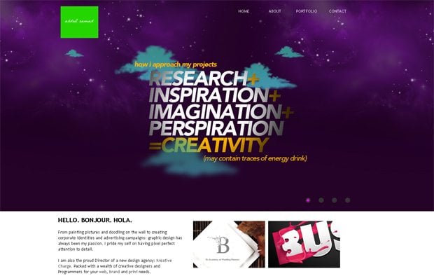
* * *Abdul Samad
Awwwards nominates this website not without a reason. Heavily animated cite looks really amazing combined with a purple color in the header.
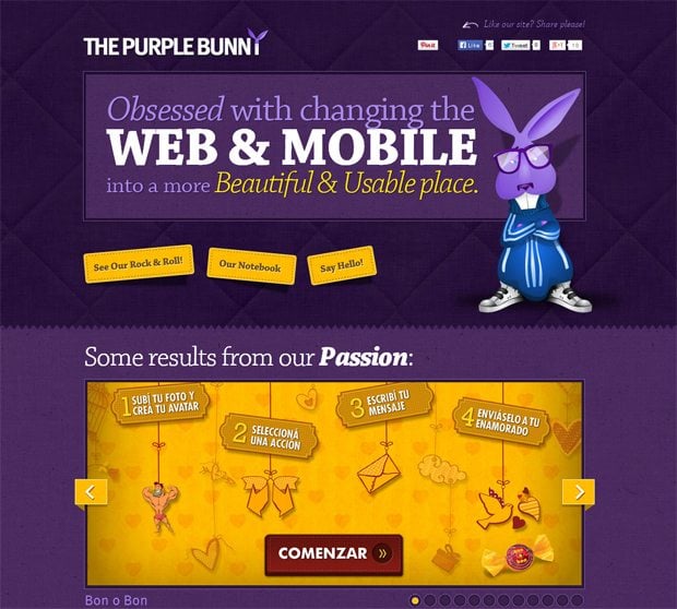
* * *The Purple Bunny
If I were Alisa, I would definitely follow this purple bunny. If you look at something else besides this fluffy guy, you will notice a cloth texture at the background that reminds a blanket. As for me, this makes quite a warming effect.
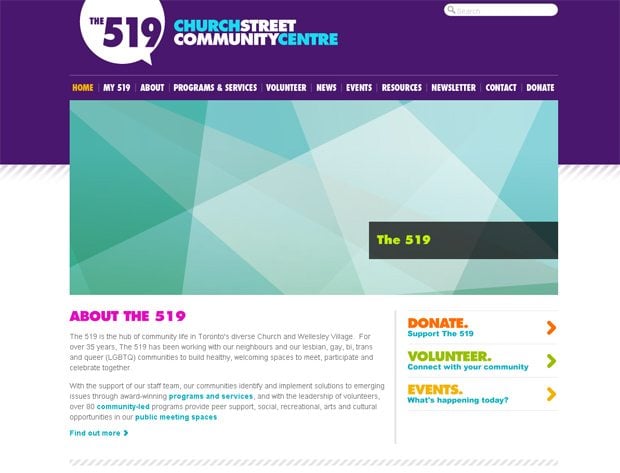
* * *The 519 Church Street Community Center
Generally this design is quite simple from the view point of a trend hunter, yet it's in this round up. Having such a great number of colors used it looks really awesome.
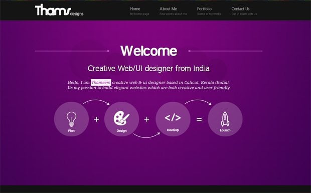
* * *Thameem
Vibrant purple is extremely good for layout of web design studio. It matches the creative mood of such a web presence.
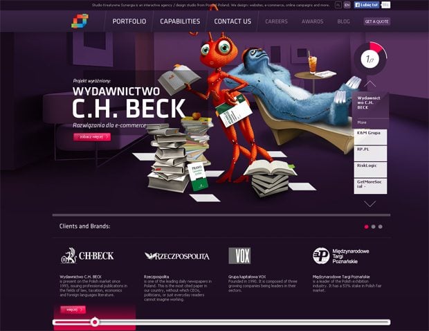
* * *Synergia Agencja
Creative ideas require creative presentation like in this example. Bright purple plus cool cartoon characters make this design distinct and effective.
* * *As you see, purple adds a creative, joyful, royal and beautiful touch to designs, it looks undoubtedly effective and appealing to the viewers. No wonder, it was announced as the color of the year. And are you ready to color your designs in elegant purple?
Don’t miss out these all-time favourites
- The best hosting for a WordPress website. Tap our link to get the best price on the market with 82% off. If HostPapa didn’t impress you check out other alternatives.
- Monthly SEO service and On-Page SEO - to increase your website organic traffic.
- Website Installation service - to get your template up and running within just 6 hours without hassle. No minute is wasted and the work is going.
- ONE Membership - to download unlimited number of WordPress themes, plugins, ppt and other products within one license. Since bigger is always better.
Get more to your email
Subscribe to our newsletter and access exclusive content and offers available only to MonsterPost subscribers.

Leave a Reply
You must be logged in to post a comment.