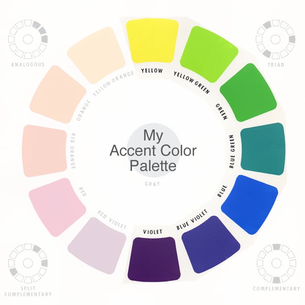
Accent Colors
Definition: Accent colors are the colors that are used sparingly on the website to emphasize and highlight the most important points.
Content is the most important element of the website. However, you should always mind structuring your website content in a proper way. This is the point, at which accent colors come in handy. They play a number of important functions in web design, such as:
- emphasize the most important points;
- contrast with all the other content;
- the foster visual rhythm of the page;
- aid in page eye-scanning and finding the needed information;
- have a certain psychological effect that depends on color choice;
- compliment overall website design and corporal identity.
What are the website elements that require accent colors?
Accent colors emphasize certain most important website elements. Let's see what these elements are.
First of all, call to action buttons should be mentioned. These are the buttons that invite site guests to take the desired action. Clicking a call to action button results in a conversion, which is the most desired action for you, as a website owner. That's why it's important to make sure that CTA buttons are one of the most eye-catching elements of every website page. Use your accent color for such buttons and head toward higher conversion rate. Let's see how it works:

In this example by TemplateMonster, it's pretty hard to oversee the bright-colored CTA button, which invites to subscribe to your newsletter.
Website navigation is the site element that jumps on visitors right at website openings. Accent colors make this exposure brighter and visually mark the starting point of the page. Using a primary color for the navigation will make it blend with the main body of the page, so accent color comes in handy to make it stand out.

Surfing your website in search of your phone number is not a thing that you want your website guests to do. Contact info is an important trust signal that should be carried out in an accent color to be easily distinguishable. Moreover, it's wise to use bold or bigger font for it to stand out even more.

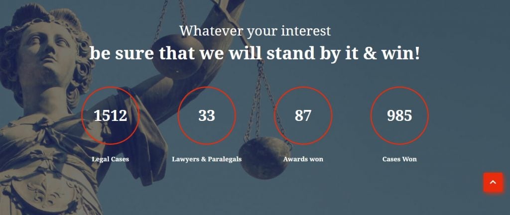
Scroll and back-to-top buttons are the elements that add bulk to your website's usability. On the other side, you can't make them half-page. So, using accent color is a pretty smart way to make these elements stand out. In this way, these pretty standard website elements will be easily accessible for every website user.
To conclude, it must be said that accent color is a pretty important design element that makes the most important website elements stand out. Choose bright colors for your CTAs, navigation, contact info, and website scrolling and your website’s usability will always please your site guests.
Related terms: color scheme, primary color, secondary color.
References and further reading:
- Color scheme – Wikipedia.
- What Are Accent Colors?. Accent colors in the design.
- Accent Colors and Their Role in Web Design. Usage, tips, and examples.
- Color. Examples of color schemes and accent colors.