The Secret of a Call-to-Action Button: How To Create a CTA Button Which Is Irresistible to Click
How do you capture a customer’s attention with a couple of words and push them towards a conversion? How do you create a CTA button which is irresistible to click? Is it possible to find web design templates where CTA-buttons would meet the requirements? In this blog post we’ll figure out the anatomy of the CTA buttons and reveal the Secret of a Proper CTA button. But in order to know how to use these buttons well, we need to look at the process in reverse. Is having a CTA button mandatory?
Is Having a CTA Button Mandatory After All?
It’s notmandatory, but strongly recommended. Theoretically, there would be 3 instances when you wouldn’t need this button. Marketers rarely take chances with their website conversions and usually incorporate the button in the design.- Your brand is so recognizable, that it’s not you pursuing a visitor but a visitor pursuing you. That happens somewhat rare.
- The products which you offer are so clearly depicted on a website, that you don’t even have to explain exactly what it is that you offer. (This is relevant for modern websites with minimalistic design). This happens a little more frequently.
- Your design is minimalistic and it looks so much better without a CTA button that you are ready to take a risk. (This usually goes with the second example. Besides, if you are not ready to include them, this issue may be solved employing ghost buttons or call-to-actions without any frames).
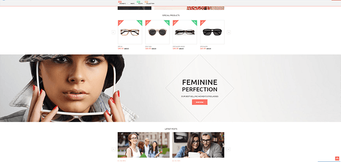
The first example about it being unnecessary to have a CTA button is clear, but what about the second and the third examples? As already mentioned, marketers rarely use a No-CTA-Button policy. Recall all the websites you’ve seen lately, and you may not even remember a website without a CTA button. However, they exist. Here’s an example.
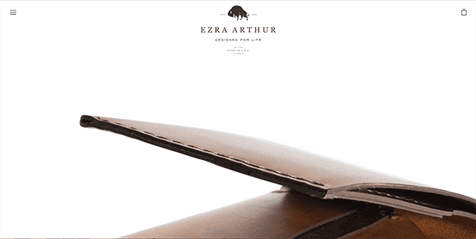
This website has a clearly depicted product in its design [see point 2] and a minimalistic design [see point 3].
When on this website, you don’t get side-tracked by a large number of items. Thus, you may choose not to use a CTA-button if you have a small online store. Furthermore, the hierarchy of the content blocks is calibrated so that every block is taken as a separate almost-call-to-action. See? A big image on a negative space, attracting a viewer’s attention.
An interesting fact:
A human’s perception, when seeing a CTA button, devolves back to an instinctual basis, when men were tribal and in order to survive, they needed a leader. Instinctively, obeying meant surviving in life’s harsh surroundings. We’ve developed enough to think before obeying (and deciding if we should listen to the order at all), but not enough to eliminate it completely from our nature.
A Frame in a CTA Button. Is It Necessary?
It is much more visible on a screen when it is framed. This is the best solution when you need to instigate a desired action.Can CTA-buttons Be Boundaryless?
Yes.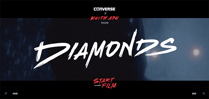
Visit Website
In this example you won’t see frames, just Call-to-actions. ‘Start Film’. ‘Share’, ‘Shop’ - these words have amazing hover effects, which seem to hypnotize you. If you are looking for an unusual design, you may check out themes for art gallery website, they often offer something remarkable.
This design is one of the most airy I have seen lately. Pay attention to the Call-to-action, it is placed on a semi-transparent banner. On one hand, it has some boundaries, which, on the other hand, are not exactly traditional boundaries, and they are not noticed by a viewer.
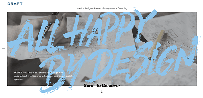
Even without visiting the website, you see a sharp dark text ‘Scroll to Discover’ before you read the big letters “ALL HAPPY BY DESIGN”. Is the call-to-action effective? We’ve just proved this ourselves by reading ‘Scroll to Discover’.
Visit Website
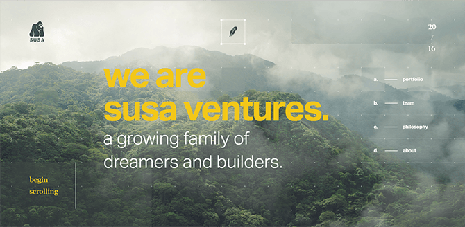
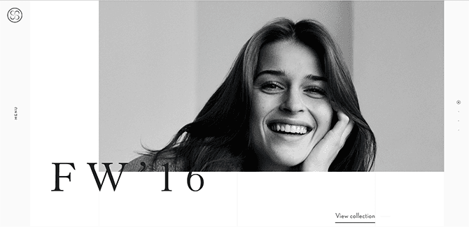
This website is incredibly rich for motion, it seems to be constantly moving, regardless of whether or not you move your cursor. This is an interesting case, because here the call-to-action has only one line under it, and the ‘button’ is, by far, not the first thing you would notice in the design. This underlining is like a part of the button, which nevertheless attracts attention, after the smiling lady (1) and big “FW’16” letters (2).
Where Can You Place it and How Many of Them Can You Use in Design?
Judging by my experience, most websites and web design website templates have up to 5 CTA buttons (or no-button call-to-actions) in a website design. You don’t want your viewer’s attention to get distracted, but you still need him or her to take more than one action. This is when multiple call-to-actions come into play.Don’t forget that pop-ups need to have neat and clear call-to-action.
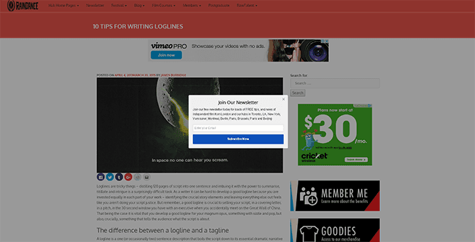
View Resource
By nature, a pop-up is an extra attention-driving design detail, and adding a proper call-to-action here is vital. I bet that most of us, even after all these years on the Web, are still caught off-guard when a pop-up appears on the screen. Good for web designers, they never put the same time interval for a pop-up. I, personally, sometimes get so taken aback that I even subscribe to the newsletter.
So, What Are the Main Requirements Which Help You Create a Perfect CTA Button?
- It should complement the design.
- It should look natural. It depends on many factors, including shape, color, general color palette, size, placement etc.
There’s an unspoken battle of red and green CTA buttons, but as AB-testing cases show, each of them may perform better in specific circumstances. The buttons may be flat design, gradient color, with or without hover effects, but the only thing you should maintain is the integrity of style. The button should look distinctive, but still relate to a specific style.
Here are some examples of buttons which look natural in their design.
Visit Website
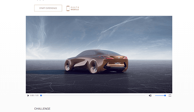
A golden ghost button with text “Start Experience” looks natural and incredibly elegant in this design.
Ice Funky
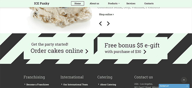
This is another great example of how a design of CTA-buttons may be performed. No visible boundaries, although a button looks well-cut.
Hunting

Use contrasting colors for your background. The button will catch the eye by itself.
Glassonic
If you can’t decide on the color which you need, choosing between the colors green and red, you may consider an idea of a two-colored button. Hover effects provide the magic.
The Text Inside the Button
Don’t forget that in a ‘CTA button’ a Call-to-Action is the key phrase. Which is why you need to pay attention to the text which is placed on it. What can it be related to? Buttons which suggest you share on social media, check out the product, sign up for a class, see the latest photos etc.Always look deep - a CTA button incorporates the essence of what you need from a person. According to statistics, verbs in a text work better. That means, that if you write “See More Products” instead of “More Products”, the conversion (or the number of clicks on a CTA button) will be higher.
The main rules are:
- Start your call-to-action with a verb
- Put the whole message of what you need them to do in as few words as possible
- Don’t be general, make a specific action-oriented text (like, share, invite, subscribe etc.)
How Far Can Your Creative Mind Go When Composing a Text for a CTA-Button?
Not far, so don’t get carried away. If you are a business owner and not a designer who’s trying to beat his competitor with an unusual design, it’s better to stick to something middle-of-the-road.Does the shape of a button influence a conversion?
Ergonomics. By nature, people tend to like softened angles. Of course, sharp angles convert well, too, but this issue is worth a separate blog post. If you’d rather learn more about this now, you may read further details about softened angles in this document and in this brilliant blog post.
Any dazzling buttons?
Well… That probably depends on the style of your project. They definitely could have some psychedelic look, and if that is what you need in the end - you might use this feature.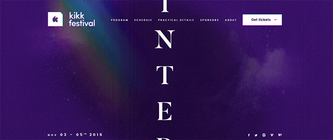
Visit the Website
Advantages of a Proper CTA Button (or a CTA)
For you:- You clearly state what a visitor should pay attention to when looking at the content module
- You clearly state what is needed from a visitor
- You implant the first seed in his or her decision-making process
- You have more chances that a visitor will convert
For your visitor:
- He or she doesn’t have to waste time figuring out exactly what it is that you offer
- He or she has a flawless experience following the tips on the website
- He or she may find his perfect service or business provider (which is your business) sooner.
We are all customers of various businesses, and most of us, if not all, appreciate a good web design. With a flawless customer experience we may find our perfect product, and our service provider will find its customer. That is a win-win situation,right? Besides, rarely do visitors spend more than several seconds on a less than clear website which vaguely explains what it offers. It could be either a scam, or a poorly established business - and neither of those evokes trust in us.
Conclusion
There is no recipe for a perfect CTA button, but, knowing the features to which you should pay attention, creating a perfect CTA button shouldn’t be a problem.
I like putting things in order and sorting stuff to make it easier to find something useful. That's why I like creating template listings. Besides that, I do researches on different interesting topics on web design and seek topics that could inspire readers. LinkedIn
Get more to your email
Subscribe to our newsletter and access exclusive content and offers available only to MonsterPost subscribers.

Leave a Reply
You must be logged in to post a comment.