Animated Website Logo Effect using CSS3 Keyframes
There are a number of basic tutorials online going over how to create CSS3 keyframes. But I wanted to put together a working demo for a very simple layout, so that designers can see how these keyframes animate in real-time. The process may seem a bit complex at first. However once you understand the syntax then CSS3 keyframes will be much clearer.
You can check out a live demo of my tutorial or download a copy from the links below. Ideally this should be a beginners guide into setting up a CSS3 keyframe animation. Another introductory article on Smashing Magazine can introduce more of the specifics. Once you can build even rudimentary animations then you are well on your way to mastering the new CSS keyframes.
Live Demo - Download Source Code
Getting Started
First we need to put together the document resources and layout for the animation. I am only including a custom CSS stylesheet which contains the rules for both layout positioning and keyframe animations.
<!doctype html>
<html lang="en-US">
<head>
<meta charset="utf-8">
<meta http-equiv="Content-Type" content="text/html">
<title>Animated CSS3 Keyframes - Live Demo</title>
<meta name="author" content="Jake Rocheleau">
<link rel="shortcut icon" href="https://secure.templatemonster.com/favicon.ico">
<link rel="icon" href="https://secure.templatemonster.com/favicon.ico">
<link rel="stylesheet" type="text/css" media="all" href="styles.css">
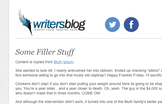
</head> The document looks a lot bigger with the extra filler content. But really this positioning should be very simple to understand. The goal of the animation is to have our logo come in from the top and bounce slightly before resting in place. Then right afterwards a new div containing social media icons will animate from the top into a similar position.
We can leave the CSS positions open because it will automatically update once we apply the keyframe. Syntax is very spotty because we need to support a myriad of additional browser types. Thankfully the degradation is very smooth where visitors will not notice animations are missing.
Styling the Layout
I have included a number of basic CSS resets for these typical page styles. The main content is centered on the page using a width of 850px. There are also some unique box shadow effects which make good use of capabilities within CSS3.
 html, body, div, span, applet, object, iframe, h1, h2, h3, h4, h5, h6, p, blockquote, pre, a, abbr, acronym, address, big, cite, code, del, dfn, em, img, ins, kbd, q, s, samp, small, strike, strong, sub, sup, tt, var, b, u, i, center, dl, dt, dd, ol, ul, li, fieldset, form, label, legend, table, caption, tbody, tfoot, thead, tr, th, td, article, aside, canvas, details, embed, figure, figcaption, footer, header, hgroup, menu, nav, output, ruby, section, summary, time, mark, audio, video {
  margin: 0;
  padding: 0;
  border: 0;
  font-size: 100%;
  font: inherit;
  vertical-align: baseline;
  outline: none;
  -webkit-font-smoothing: antialiased;
  -webkit-text-size-adjust: 100%;
  -ms-text-size-adjust: 100%;
  -webkit-box-sizing: border-box;
  -moz-box-sizing: border-box;
  box-sizing: border-box;
}
html { overflow-y: scroll; }
body {
  background: #f0efee url('images/witewall_3.png'); /* http://subtlepatterns.com/white-wall-3-2/ */
  font-family: 'Helvetica Neue', Helvetica, Arial, sans-serif;
  font-size: 62.5%;
  color: #545454;
  line-height: 1;
}

br { display: block; line-height: 2.2em; }

article, aside, details, figcaption, figure, footer, header, hgroup, menu, nav, section { display: block; }
ol, ul { list-style: none; }

input, textarea {
  -webkit-font-smoothing: antialiased;
  -webkit-text-size-adjust: 100%;
  -ms-text-size-adjust: 100%;
  -webkit-box-sizing: border-box;
  -moz-box-sizing: border-box;
  box-sizing: border-box;
  outline: none;
}

blockquote, q { quotes: none; }
blockquote:before, blockquote:after, q:before, q:after { content: ''; content: none; }
strong { font-weight: bold; }

table { border-collapse: collapse; border-spacing: 0; }
img { border: 0; max-width: 100%; }
Now the internal page elements themselves also need to be setup in the right way. I have the containing div elements set as inline displays, along with relative positioning. This means we can have them resting side-by-side and the elements can be manipulated with direct properties such as top, right, left, and bottom.

/* page content */
#w {
  display: block;
  width: 850px;
  margin: 0 auto;
  padding: 0 25px;
  background: #fff;
  -webkit-box-shadow: 0 1px 2px rgba(0,0,0,0.55);
  -moz-box-shadow: 0 1px 2px rgba(0,0,0,0.55);
  box-shadow: 0 1px 2px rgba(0,0,0,0.55);
  -webkit-border-radius: 4px;
  -moz-border-radius: 4px;
  border-radius: 4px;
}

#w header {
  padding-top: 30px;
  padding-bottom: 5px;
  margin-bottom: 10px;
  border-bottom: 1px solid #bcbcbc;
}

#logo {
  position: relative;
  display: inline;
  width: 280px;
  height: 120px;
}
#socialbuttons {
  position: relative;
  display: inline;
  width: 170px;
  height: 100px;
  left: 60px;
  top: -180px;
}
#socialbuttons span { margin-right: 5px; }

#content {
  display: block;
  padding-top: 22px;
  padding-bottom: 30px;
}
Writing CSS3 Keyframes
Writing syntax for keyframe properties does come off as confusing at first. There are two main components which define the animation - first is the keyframe action itself, and second is the element which is being animated. Let's first take a peek at the CSS3 @keyframe syntax and how you should write the animation properties.
/* keyframes */
@-webkit-keyframes logomovement {
  0%   { top: -150px; }
  80%  { top: 15px; }
  100% { top: 0; }
}
@-moz-keyframes logomovement {
  0%   { top: -150px; }
  80%  { top: 15px; }
  100% { top: 0; }
}
@-o-keyframes logomovement {
  0%   { top: -150px; }
  80%  { top: 15px; }
  100% { top: 0; }
}
@keyframes logomovement {
  0%   { top: -150px; }
  80%  { top: 15px; }
  100% { top: 0; }
}


@-webkit-keyframes socialicons {
  0%   { top: -180px; }
  80%  { top: 10px; }
  100% { top: -15px; }
}
@-moz-keyframes socialicons {
  0%   { top: -180px; }
  80%  { top: 10px; }
  100% { top: -15px; }
}
@-o-keyframes socialicons {
  0%   { top: -180px; }
  80%  { top: 10px; }
  100% { top: -15px; }
}
@keyframes socialicons {
  0%   { top: -180px; }
  80%  { top: 10px; }
  100% { top: -15px; }
}
The first four properties are targeting the logo while the latter four are written for the social icons. Notice that we have a proprietary setting @keyframes along with the vendor prefixes @-webkit-keyframes, @-moz-keyframes, and @-o-keyframes. The syntax should be written as @keyframes nameofkeyframe because we need to include the name when animating each specific page element.
Inside the keyframe brackets you will write code which should happen during your animation. Using the animation property we can then setup a duration, delay, easing, and other typical properties. My example splits the tasks into 0%, 80%, and then 100% at the resting position. You can write anything for these percentages as long as you end up at 100%.
How to Animate
Finally the last piece to our puzzle will be using the CSS3 animation property. You can read more about this property in W3Schools which does have a great resource table. The syntax is longer than your keyframes but we do not need to include everything. Here is my sample code from the styles.css document.
#logo {
  -webkit-animation: logomovement 1s 1 forwards ease-in;
  -moz-animation:    logomovement 1s 1 forwards ease-in;
  -o-animation:      logomovement 1s 1 forwards ease-in;
  animation:         logomovement 1s 1 forwards ease-in;
}

#socialbuttons {
  -webkit-animation: socialicons 0.8s 1s 1 forwards ease-in;
  -moz-animation:    socialicons 0.8s 1s 1 forwards ease-in;
  -o-animation:      socialicons 0.8s 1s 1 forwards ease-in;
  animation:         socialicons 0.8s 1s 1 forwards ease-in;
}
Again we have a number of vendor prefixes written to specifically handle alternative rendering engines. But the most interesting part of our syntax is within the value clause where you find multiple items split up. Here is the generic syntax copied over from W3 Schools.
animation: name duration delay timing-function iteration-count direction;So you can see the very first item should be the name of your keyframe animation. Then we need to specify how long the animation should run and a potential delay amount(if any). Now the timing function is how we write a custom easing into the animation. Typically this will be set to linear but you can use other common examples like ease-in or ease-out.
The iteration count specifies the number of times your animation should run. Typically this is set to 1 cycle, but you could set this to any numeric value or write the keyword infinite to loop forever. Likewise direction will perform as you might expect by reversing the direction of the animation. It is a much more complicated property that you probably don't need to worry about. However if you are interested try reading up on the property page to learn a bit more.
Live Demo - Download Source Code
Final Thoughts
It is obviously nice to be working right from within CSS as opposed to jQuery or other JavaScript libraries. Although the newer CSS3 properties are not fully supported by older browsers, there are a number of people upgrading to more current versions each day. Ideally CSS3 keyframes will offer a method for direct page animation without requiring any scripting at all! Be sure to download a copy of my demo codes and see what else you can build with CSS animation techniques.
Create a Logo!
Need an attractive logotype for your website, but have no way out? Professional web designers from MotoCMS will help you.
Our team will come up with the best solution for your brand according to your personal requirements. If the logo doesn't sit with your requests, we will redesign it up to 3 times.

Logo Creation Offer from Moto CMS

Need an attractive logotype for your website, but have no way out? Professional web designers from MotoCMS will help you.
Your unique handmade logo will cost you $199 (if you get it together with a template) or $249 (if you purchase this offer as a standalone option.)

First it was design, then writing, and now affiliate marketing. Over a period of 6-7 years he wrote a lot of content for many websites. You can reach Jake on Twitter.
Get more to your email
Subscribe to our newsletter and access exclusive content and offers available only to MonsterPost subscribers.

Leave a Reply
You must be logged in to post a comment.