Blog Posts Design: Important Styling Aspects
So you pump quality blog content, but do you inject some creativity into your blog posts and articles? Well, don’t overlook the importance of post design as it plays a highly supportive role to engage people’s attention when they visit your site.
We’re putting this list to show how you can style your blog content to encourage readers to spend more time on your blog and come for more. Though being quite generic in style, these web designs do break the mold of the blogosphere with a creative approach towards blog post styling, being themed specifically to the content. The question comes then, what can you do to make your blog more attractive?
What keeps hooked on the blog post content is a clever design arrangement of posts – readers can spot grid-style layouts with posts being placed throughout, neat column styles, scattered designs, themed post styles, or ones that have the latest post being prominently shown whereas previous posts are being visually shortened.
As for the lead images, they often go with borders or shadowing (that helps the image stand out from the page) and are placed at the top of the post content to break up text-heavy pages and provide visual relief. Left Sidebar layout with the text framing the image or just going side by side with it is also popular when the task is to enhance the appeal of a blog. Thus, the image doesn’t fight with the post for attention but reinforces the message.
When it comes to the post titles, to make them stand out from the standard post content blog owners use larger fonts, often with some unique font styles being applied to them. Plus, we can see post images with overlapping titles, often done to communicate more than a plain title could do on its own. In this case, the post title and image work together with the goal of enticing the visitor to read the first line of the post. Sometimes blog posts can even come equipped with a drop cap style when the first letter of the paragraph is being dropped cap to immediately draw readers’ attention to the start of the post.
Right after the post title usually goes some metadata – date & time, author attribution (to establish a human connection), and a comment count, which are worked into the design so they don’t stick out. However, the layout solution for a date might be truly creative. Overlapping the post image, showing from behind of the content area, being distinguished with colors, unusual light/shadow effects, textures, or forms, they do their best to attract attention. Besides, a nicely designed comments count can as well go a long way towards encouraging the visitor to proceed with a post-reading and even leave a comment, so it also needs serious consideration.
At the end of each blog post, many blogs are including things like buttons and links for social media voting and promotion, categories and tags, and clickable calls-to-actions (often a prominent 'read more' or 'continue reading' permalink at the end of the excerpt – short text snippets of posts on the blog’s home page) that will encourage readers to go and read the post entry. By the way, the text snippet length and formatting should be carefully calculated not to overload the page.
So break free of the usual blog posts design mindset, still, try implementing these aspects as they can definitely increase and retain traffic on your blog.
TemplateMonster's WordPress Templates with Creative Blog Post Styling
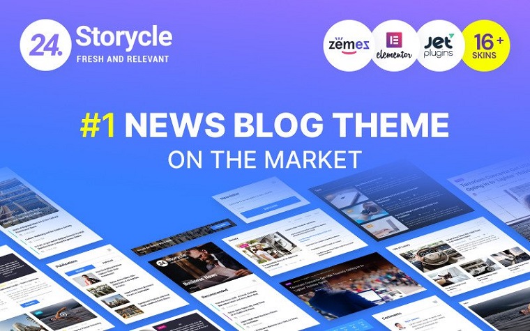
24.Storycle - Multipurpose News Portal Elementor WordPress Theme
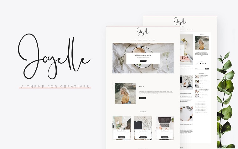
Joyelle - Creative Artist WordPress Theme
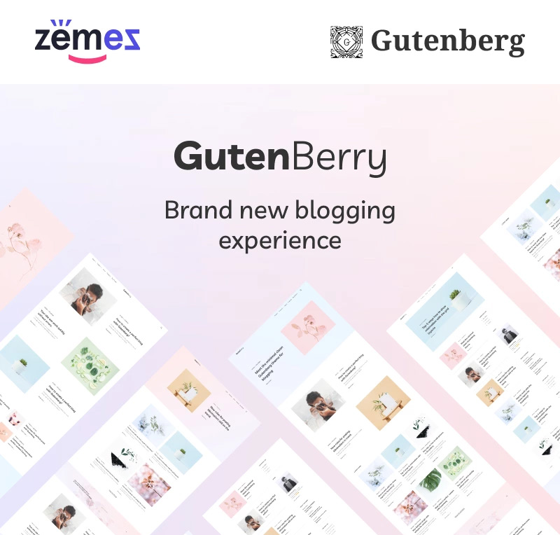
Gutenberry - Clean Blog WordPress Theme for Gutenberg editor
WorldMap - Travel Photo Blog Elementor WordPress Theme

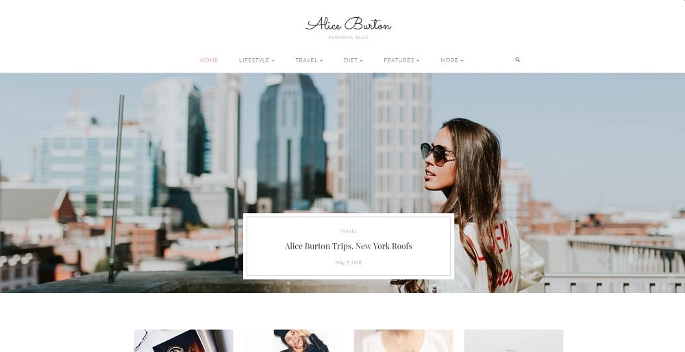
AliceBurton - Personal Blog Elementor WordPress Theme
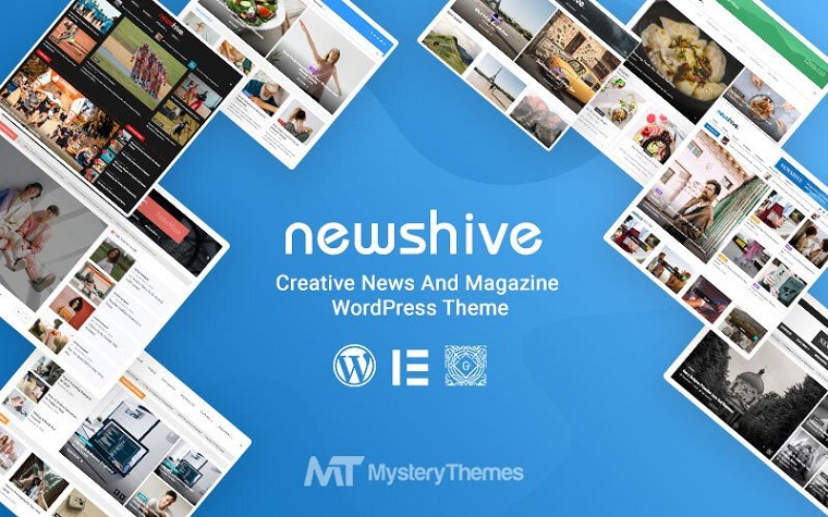
Newshive - Creative, Flexible Magazine, News Portal & Blog WordPress Theme
Chantalle - Multipurpose Woman Fashion Elementor WordPress Theme

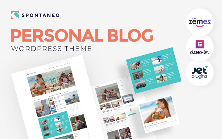
Spontaneo - Personal Travel Blog WordPress Theme
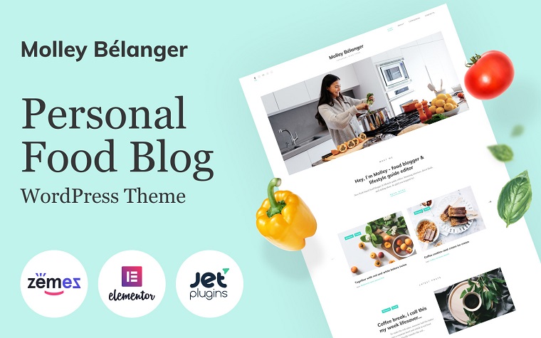
Molley Belanger - Food blog WordPress theme for storytelling WordPress Theme
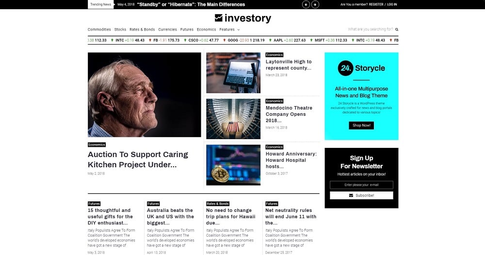
Investory - Corporate Blog Elementor WordPress Theme
Read Also
How to Customize Your Blog Design?
How to Set Up Elementor Blog Post Lists with Elementor Page Builder
100 Best Free & Premium WordPress Blog Themes
Top-30 Personal Blog WordPress Themes
Don’t miss out these all-time favourites
- The best hosting for a WordPress website. Tap our link to get the best price on the market with 82% off. If HostPapa didn’t impress you check out other alternatives.
- Monthly SEO service and On-Page SEO - to increase your website organic traffic.
- Website Installation service - to get your template up and running within just 6 hours without hassle. No minute is wasted and the work is going.
- ONE Membership - to download unlimited number of WordPress themes, plugins, ppt and other products within one license. Since bigger is always better.
Get more to your email
Subscribe to our newsletter and access exclusive content and offers available only to MonsterPost subscribers.

Leave a Reply
You must be logged in to post a comment.