How to Build a Site within 24h with TemplateMonster’s Themes [Freelancer Case Study]
We are back with the new episode in the series of TemplateMonster customer success stories. This time we are happy to share our interview with a successful freelancer from the US who once started as an employee of a web design company, and now works as a serial entrepreneur building sites offering services to the public.
Every new case study that we post on our blog is an avid example that impossible is nothing for a person who follows a dream. Here, at templatemonster.com, we only kickstart your new big achievements. A ready-made theme is a sure-fire way to get started with a web project within a day. How? Read a brand-new TemplateMonster Case Study.

Occupation: Serial entrepreneur.
Location: United States.
Audience: Websites offering services to the public.
Site: 32nddegree.com
I have built my first website in the summer of 1997. In 2008, I quit my full-time job as a web developer/programmer to work full-time on my website products. I'm a serial entrepreneur who builds websites that offer services to the public. I don't build websites for other people. Currently, I list 12 websites on my business website at 32nddegree.com.
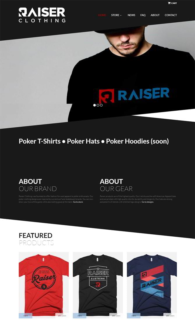
Raiser Clothing
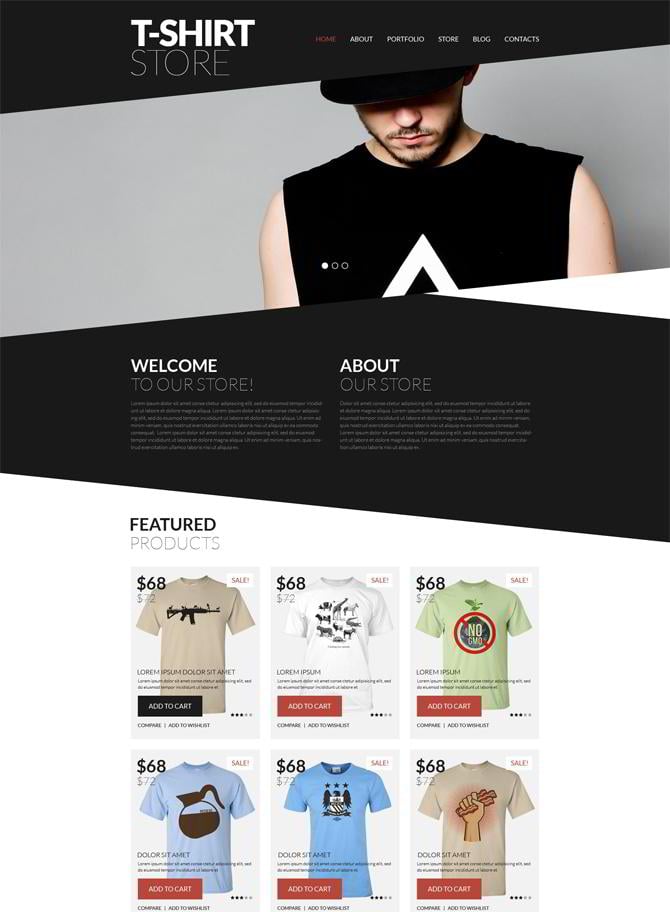
Trendy T-Shirts WooCommerce Theme
There are a few things I wish were customizable that are not. I cannot easily hide the side widget that shows the product categories. I would prefer to have my product listings to go across the screen instead of 3/4 of the way on the website. But, I've used this area to provide a filter for searching for products in the various available colors. So I made it work.
I recommend for users to select a template that is as close to what they want their website to look like as possible. Although you can often alter parts of a template, you never know which part of a template is easy to edit and which parts are impossible to change. Don't just find a template of which you like the overall layout, find one where you like almost everything and think you will tweak very little. For example, my template is designed to have a black background in various parts. The text is intended to be white over this black background. Had I wished to have a white background and black text instead I'm not sure that I'd be able to do this.
Do you have your story that should be told to MonsterPost readers? Then feel free to contact [email protected]. We will get back to you shortly for an interview.
The web community should know its heroes in person!
Don’t miss out these all-time favourites
- The best hosting for a WordPress website. Tap our link to get the best price on the market with 82% off. If HostPapa didn’t impress you check out other alternatives.
- Monthly SEO service and On-Page SEO - to increase your website organic traffic.
- Website Installation service - to get your template up and running within just 6 hours without hassle. No minute is wasted and the work is going.
- ONE Membership - to download unlimited number of WordPress themes, plugins, ppt and other products within one license. Since bigger is always better.
Get more to your email
Subscribe to our newsletter and access exclusive content and offers available only to MonsterPost subscribers.


