21 Amazing Code-Free Parallax Scrolling Sites
Parallax scrolling is an enthusiastically discussed topic in the world of web design. Champions of the trend see it as a revolutionary way to engage and endear visitors to an assortment of web offerings. And while parallax does have its detractors, the overwhelming majority of designers, users, and site owners can’t get enough of the awesome animated effects.
There is, however, a problem with parallax, or at least a perceived problem. As anyone who’s spent time in frontend development can tell you, it’s not so easy to implement. Fortunately, this is a problem with an easy solution.
Most of the design-oriented artistic types who want their websites decked out with this advanced functionality don’t have the development experience (re: coding knowledge) to put their ideas into action. Seeing as the trend has gained so much steam over the last two years, however, every web builder worth its salt has been scrambling to put an easy implementation solution into effect.
Today, we’ll take a look at artistically designed websites that each have Parallax scrolling implemented that didn’t require any coding whatsoever. Believe it or not, using a high-performance website builder is more than enough to create an eye-catching resource without touching a line of code.
Professional Design Software Suites Webydo and Adobe Muse
Our first set of immersive examples comes from the two heavyweights in the design world: Webydo and Adobe Muse.
Webydo

Webydo’s sophisticated cloud based SaaS allows professional web designers complete creative control of their designs--down to the individual pixel. This comprehensive aesthetic oversight is obviously a very attractive feature and it’s played no small part in the cultivation of the Webydo community—one which boasts more than 100,000 professional graphic and web designers.Scrolling Animator
Webydo has recently unveiled the world’s first code-free Parallax Scrolling Animator. This unique feature allows professional designers to imply depth, define scroll events, and determine motion paths in their designs.
The animator comes as a direct result of an extensive, unorthodox, and egalitarian development process open to Webydo users through a popular vote. The idea behind the vote is to provide Webydo’s community of professional designers an avenue of providing direct feedback, as well as a sense of ownership of the platform itself. Webydo users suggest features within their forums, vote for the best ones, and the winners of the votes serve as the roadmap for development. Once the votes are counted up, the ideas are developed, and included within the platform.
Needless to say the results of giving designers more control and a powerful parallax animator have been very impressive.
Death-is-coming.info
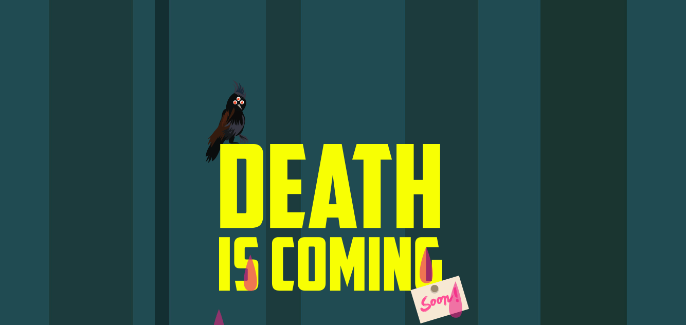
The Death is coming site somehow manages to make a flat design feel three dimensional. This gory iteration of a choose-your-own-adventure story rotates trees around a flat-designed White Walker holding an adorably doomed infant. Giving depth to something that by definition, should be superficial. This is a paradoxically cool use of parallax scrolling.
* * *
oz-studio.ca
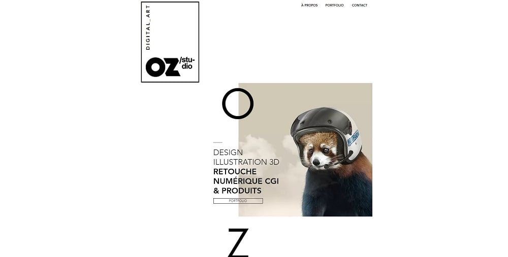
The website of the OzStudio is an example of the wisely chosen typography, high-quality visual effects, and parallax scrolling that supplements a sophisticated look of the website. Additionally, it proves that a minimalistic classy white space can be a stylish attention-grabbing trick in the era of the complicated grid layouts.
* * *
The graphic and web design agency knows how to draw the attention of potential clients with a clever combination of the parallax scrolling, modern illustrations, awesome typography, and bold colors.
The value proposition is wisely highlighted with the help of the parallax scrolling with rationally placed CTAs. Smoothly appearing texts and visuals create dynamics that looks super stylish.
* * *
webycan.com.au
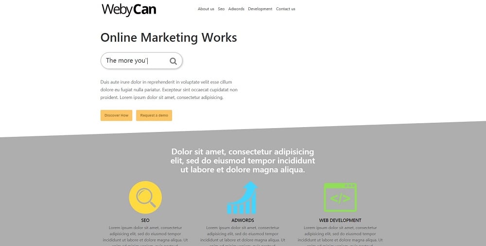
Another sample of the smart parallax scrolling shows how different ways of presenting information (both static and dynamic) can be combined on the one page.
Content comes out unobtrusively from the bottom and from different sides of the page gradually filling out space. It looks modern and stylish indeed.
* * *
These guys know how to excite the visitors of the website from the first scroll. A huge bouncing and spinning ball goes to pieces once you start scrolling. It bursts into dozens of little balls that “hit” the screen and go back to the previous form.
Without a doubt, it is a working way to grab the attention of the users and stand out.
Furthermore, the website has a traditional parallax scrolling when information smoothly appears as the person scrolls down the page.
By the way, despite the use of parallax scrolling and other heavy effects and high-quality visuals, the website loads relatively fast and smoothly.
* * *
maxologymarketing.com
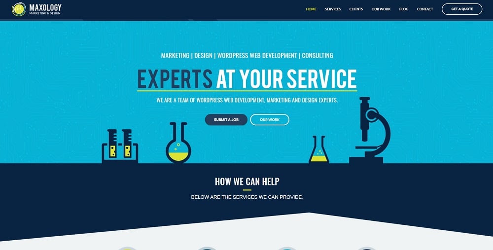
This Webydo’s site of the month contains a stunning parallax effect that enables an engaging visualizing. Slowly moving microcircuits on the background create an outstanding header and draw the attention of the visitors.
In addition, the home page includes other animations that don’t slow down the loading speed of the website but increase the UX.
* * *
Adobe Muse
 Along with Webydo, Muse is another web builder which caters more to the professional design crowd, rather than average website owners with no coding/design experience. In fact, Adobe’s original stated purpose for Muse is to provide graphic designers with a valid, code-free solution to putting together websites with stellar design. And that purpose is dynamically advancing.
This web builder is truly comprehensive. It allows users to build a website from the ground up, adding each and every image, element, content piece, button, header, footer, menu, form, tab, and any other on page add-on you can imagine. The font options in Muse are really something to behold. Since it’s an Adobe product, it has the benefit of being integrated with Typekit, and therefore has access to a gigantic selection of web fonts for you to easily implement in your designs.
The famously complex interface has added yet another feature which just so happens to be the subject du jour: parallax scrolling. Seeing as Muse is built for professional graphic designers specifically, the examples we’ve chosen are indeed a sight to behold (no pun intended).
Yslexperience.com
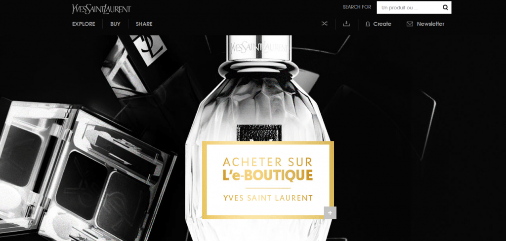
Here we begin to see why some software is slated for professional use. Multiple moving elements and manifold parallax animated effects make this site a must see.
* * *
Ok-Studios.de
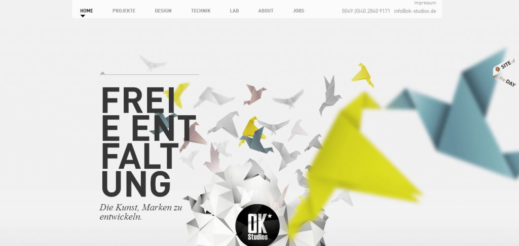
Out of focus origami in the foreground is only the beginning of the depth on this page. There are a ton of moving parts to this page that must be seen to be believed.
* * *
hdg-architecture.com
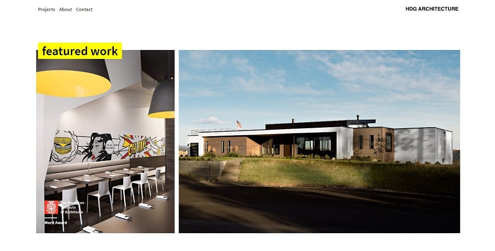
Seems like this page is completely built with parallax effect but it doesn’t look overload. Sometimes people tend to overdo with effects but this is not that case.
Gradually appearing texts and visuals look cool indeed and add stunning dynamics. This way, a user familiarizes with information on the website step by step. Moreover, it helps to set smart emphasis.
In other words, if you want to know how parallax actually looks like, this website gives an exact idea.
* * *
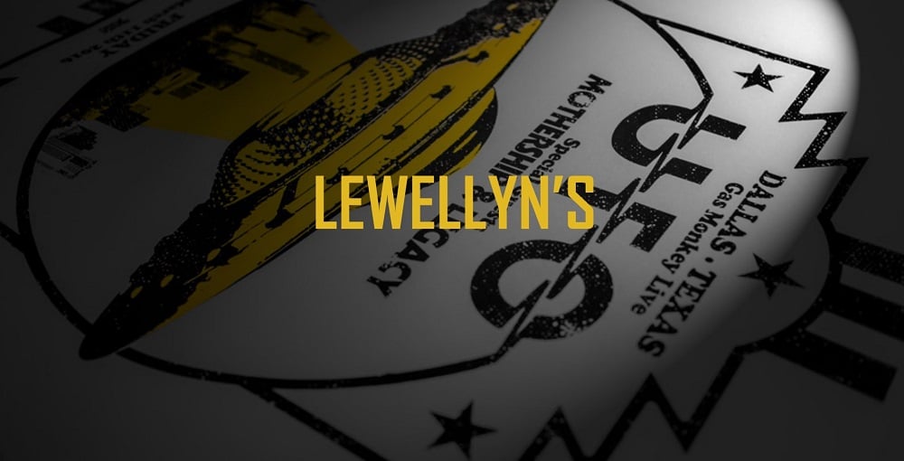
The concentration of the parallax scrolling on this page reaches a fever pitch. Seems like it is also built completely using this technique but it looks splendid indeed. Texts and visuals smoothly coming out of nowhere and the cycling bear help to create a website that doesn’t look boring.
The color scheme of the website also looks fresh. The combination of the black and yellow colors contributes to perception, so far.
* * *
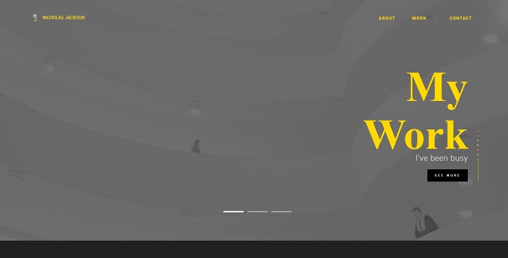
Another beautiful website with a similar color scheme also contains a high concentration of parallax effect. Seems like Nicholas Jackson prefers getting acquainted bit by bit, gradually revealing key parts of his activity.
As the person scrolls down, he/she finds out more about the designer and the channels with more information.
This trick contributes to a well-defined structure of the website. A visitor doesn’t have to roam through the website as such “journeys” usually end up leaving a website at all. With the help of the parallax effect, different pages appear right on the home page (About Me, Contact Me, Works).
* * *
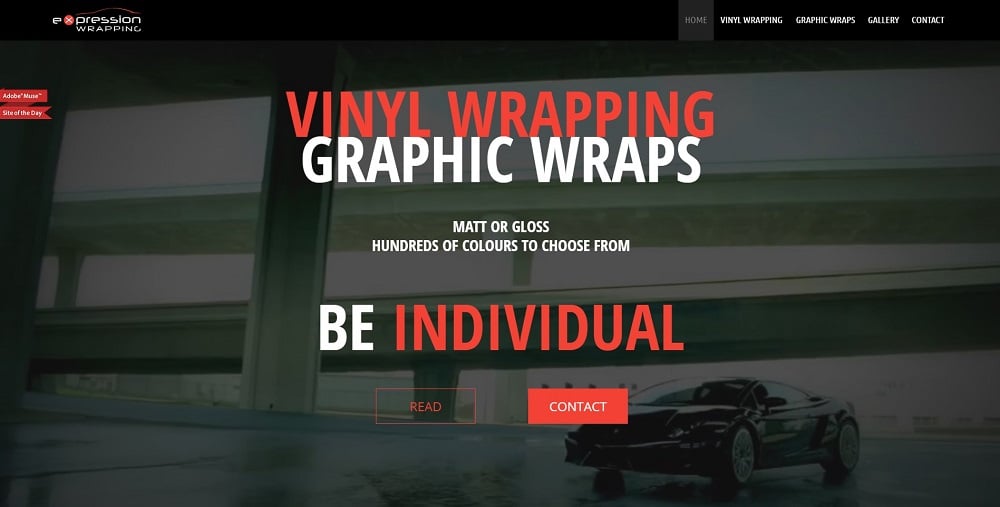
Wow! The parallax effect looks truly different on this website. Because of the brutal background video and the tough thematics of the website, the text appears unexpectedly and cheeky. This case shows that the parallax effect can be adjusted to the subject matter of any project and reflect the idea of the business/project/activity.
Still, the motto of the project “Be Individual” appears smoothly and, therefore, deserves particular attention. That’s the smart trick.
* * *

Bonjour from Nicolas Trudel. He knows how to turn the presentation of the activity into an exciting journey or a cartoon. Despite a childish way of presenting information, a parallax effect works out so good!
Those, who prefer an interactive way of presenting information, will definitely like this website. Those, who would rather make a choice in favor of the classy minimalism, will still highlight a couple of nice tricks that contribute to dynamics.
* * *
barbeariablackbarba.com
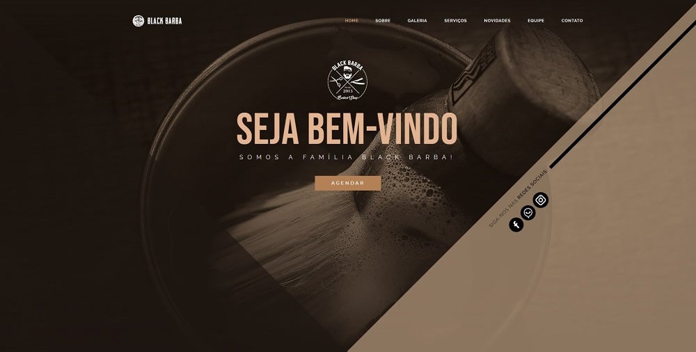
The website of the barber shop can look stylish and this example proves it.
In fact, smoothly appearing texts have already become commonplace in this selection. Still, there is a place for surprises. As a person scrolls down, the geometrical background starts changing and creating an effect of a kaleidoscope.
On the surface, it might distract the users. Nevertheless, the calm color scheme softens a little bit aggressive parallax effect and makes it look natural.
* * *
Amateur DIY Parallax Providers: Jimdo and Squarespace
For the final installment of our series of web builders with immersive capabilities we’re showcasing two services with enhanced functionality aimed at the amateur user: Jimdo and Squarespace.
Jimdo
Jimdo is a popular WYSIWYG web hosting service that also offers an online web builder. It was founded in 2007 and is especially well suited to editing in iOS. Unlike Webydo or Muse, however, Jimdo is more geared toward the amateur crowd, rather than professional designers.
They offer premium themes that require little to no coding or customization. Basically, it’s a minimalist turnkey service that will get you up and running with your web presence. Additionally, they offer some premium themes with parallax elements implemented.
While the service certainly isn’t as versatile as the other web builders in our list, Jimdo has everything the average user would need to produce a usable and navigable website, including drag and drop functionality and a blank canvas editor.
We’re switching gears from the advanced functionality of Webydo to a far more pedestrian parallax example utilizing Jimdo, courtesy of a Polish firm: Norla designs.
* * *
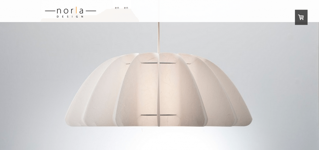
"Simple" is definitely the appropriate term to apply in this instance. An uncomplicated background image serves to highlight the site’s content, which scrolls quite naturally in front of the image. The light fixture is briefly obscured only to reappear once you’ve scrolled further down the page. This minimalist design is dominated by white space while the parallax scrolling gives it a little extra oomph.
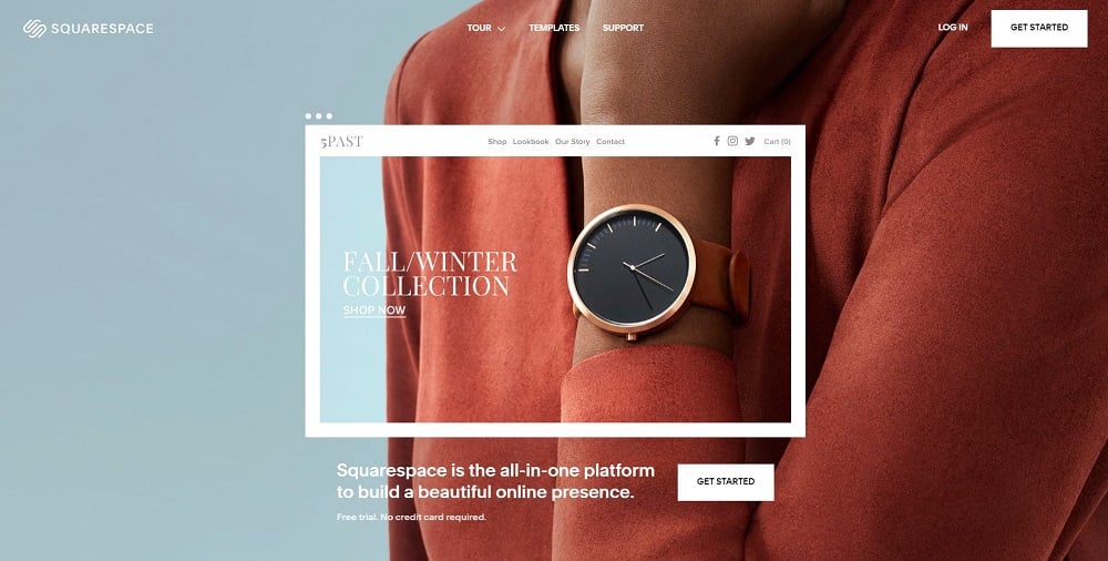
Squarespace
 Now that you’re familiar with what’s possible from the higher end web builders (Webydo/Muse) and the lower end parallax providers (Jimdo), it’s time we accelerated things a bit with the creme de la creme of DIY web builders that are targeting amateurs as their main market: Squarespace.
Squarespace works via the use of three separate editing systems. The layout editor is the most impressive as it allows a great deal of flexibility in adding, deleting, and rearranging on page elements via drag and drop functionality. The Editing mode helps you customize your headers, footers, and sidebars to spec, and the Style mode lets you choose your fonts, sizes, colors, and so forth. This web builder is perfect for the design layman, who couldn’t code to save his/her life, and doesn’t want to shell out the cash for a professional designer.
Recently, Squarespace unveiled its new Marquee theme, which offers parallax functionality. The following examples showcase some of the impressive results possible with the parallax-enabled theme.

A quick note from the creator of this admittedly impressive Squarespace offering:
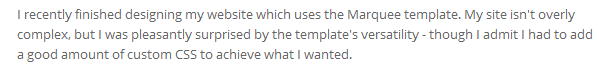
Imposter! Yes, one parallax site with a few lines of CSS added in managed to sneak into our list, but this will serve as a good control for you to judge against the completely code-free solutions. Even with the added CSS the site is relatively uncomplicated. A full page image adorns the background while an image grid covers it up as you scroll down, revealing the standard “About me” info at the bottom of the page. All in all, an attractive entry, regardless of the cheating.
* * *
Mademybump.org
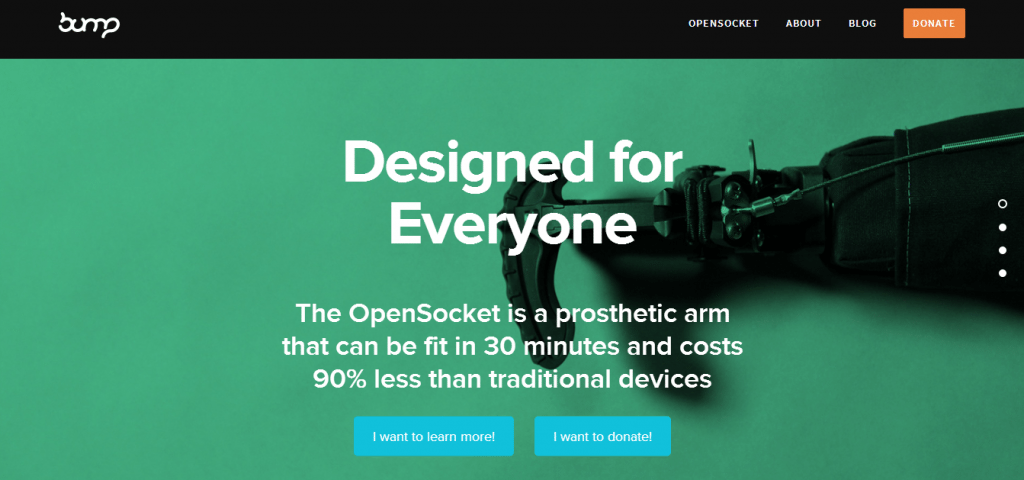
Now we’re getting to the good stuff, namely multiple images moving at noticeably different speeds. This Marquee theme website by Bump (a nonprofit dedicated to providing high quality prosthetics to the disabled, go donate!), also provides a powerful example of just what kind of parallax scrolling Squarespace is capable of offering.
* * *

I don’t want to lie to you people. This website is on here because “Salvation Taco” is the coolest name for a restaurant I’ve ever heard. The attractive and artful combination of mexican food and Catholicism strikes just the right chord of sacrilege to give me a healthy hankering for some authentic Tex-Mex.
But don’t let my affinity for fish tacos disqualify this site from receiving an honest appraisal. The color scheme is a sexy triadic, the imagery is classically gorgeous, and the parallax scrolling adds depth and movement to a delightful bit of satire that really benefits from both.
* * *
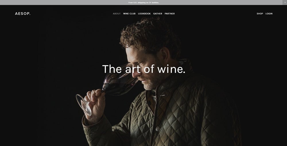
It’s a normal thing if you open a bottle of wine and take a sip tasting its rich bouquet after checking out this winery website.
Besides a wonderful home page with a centered layout and amusing product photo that creates a special atmosphere on the website, it has a modest parallax scrolling effect. It is absolutely unobtrusive but adds a sophisticated note.
By the way, the color scheme of the website is also splendid.
* * *
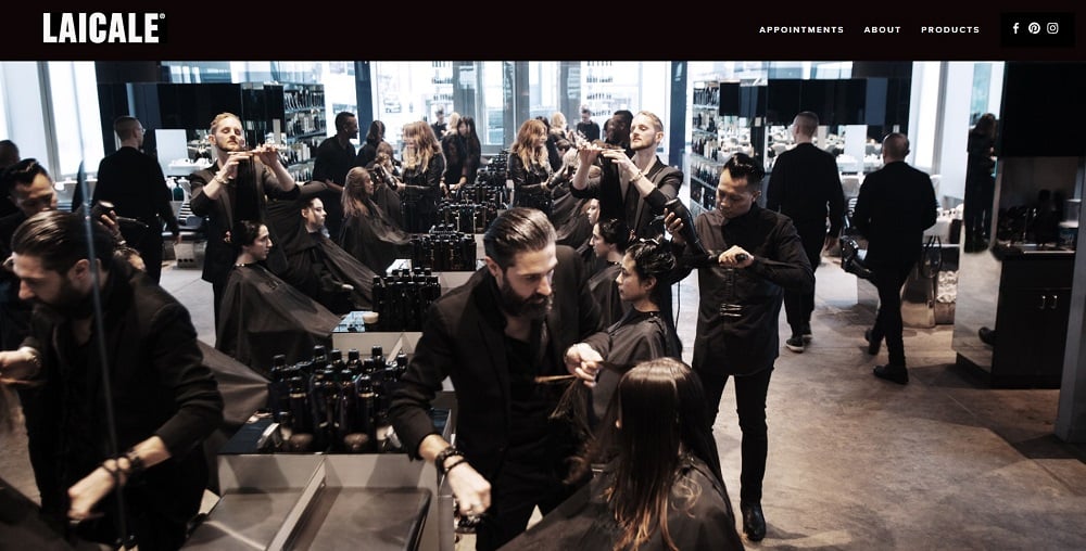
There is a place for creativity in every industry. Another sample of the hair salon is designed in a very creative way and parallax effect contributes to it. When a person scrolls down, the background photo is interrupted by the blocks of text just like scissors cut off the split ends and it looks amazing.
Other content is appearing on the page gradually but it already looks traditionally.
* * *
Speaking of the parallax effect, it is impossible to ignore the website of the builder itself. Without a doubt, it looks stunning. Together with high-quality visuals, awesome typography, unusual layout, and, of course, parallax scrolling, the website presents a fresh perspective to web design.
* * *
That’s our list. What are some of your favorite parallax sites? Let us know in the comments. Bonus points if they’re code-free!
Don’t miss out these all-time favourites
- The best hosting for a WordPress website. Tap our link to get the best price on the market with 82% off. If HostPapa didn’t impress you check out other alternatives.
- Monthly SEO service and On-Page SEO - to increase your website organic traffic.
- Website Installation service - to get your template up and running within just 6 hours without hassle. No minute is wasted and the work is going.
- ONE Membership - to download unlimited number of WordPress themes, plugins, ppt and other products within one license. Since bigger is always better.

A real WordPress fan and proud of it. I would be glad to share my vision and ideas with you! Come read me on Quora too.
Get more to your email
Subscribe to our newsletter and access exclusive content and offers available only to MonsterPost subscribers.

Leave a Reply
You must be logged in to post a comment.