Coding a Mobile-Responsive Website Layout Using Footer Navigation
There are so many different techniques for managing a mobile responsive website. Obviously the common issues pop up time-and-time again. Things like sidebars, navigation menus, and bigger pieces of content like video streams. Designers are constantly trying out new methods for handling these interface features.
The idea for navigation design is to duplicate your nav menu within a hidden footer block. Once the user resizes their browser window is small, it will replace the top nav with a menu link, jumping down to the new footer navigation. This will be visible right away on smaller devices like smartphones. It is a solution which requires no JavaScript and that is quite enticing to some web developers. Take a peek at my live sample demo to get an idea of how this works in a realistic website layout.
Live Demo - Download Source Code
Getting Started
Overall the technique really doesn't require a whole lot of code. What you need to understand is the premise behind why we are doing this, and how it translates into any other typical website. Generally I feel this technique works best if your menu contains less than 15-20 links. It can get crowded very quickly, especially by including multiple sub-menu links.
1 2 3 4 5 6 7 8 9 10 11 | <!doctype html> <html lang="en-US"> <head> <meta charset="utf-8"> <meta http-equiv="Content-Type" content="text/html"> <title>Responsive Layout with Footer Navigation - Template Monster Demo</title> <meta name="author" content="Jake Rocheleau"> <link rel="shortcut icon" href="https://www.templatemonster.com/favicon.ico"> <link rel="icon" href="https://www.templatemonster.com/favicon.ico"> <link rel="stylesheet" type="text/css" media="all" href="css/styles.css"> </head> |
The webpage header only includes a reference to my external stylesheet. Within CSS we can organize media queries for updating the navigation menu beyond a certain resolution. This will change based on your own layout, so keep this in mind throughout the tutorial.
In the page body I have split up each internal section based on the contents. We have a large header with the top page navigation, followed by some inner content and a footer area. Within the footer I've contained a hidden navigation which only displays using media queries. Obviously we could include other text which never gets hidden, such as copyrights or attribution. This technique is very flexible because we choose what gets hidden and how it's displayed properly.
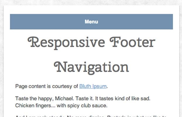
1 2 3 4 5 6 7 8 9 10 11 12 13 14 15 16 17 18 19 20 21 22 23 24 25 26 27 28 29 30 31 32 33 34 35 36 | <div id="w"> <header> <nav id="navbar"> <ul class="clearfix"> <li><a href="#">Home</a></li> <li><a href="#">About</a></li> <li><a href="#">Services</a></li> <li><a href="#">Catalog</a></li> <li><a href="#">Blog</a></li> <li><a href="#">Contact</a></li> </ul> </nav> <a href="#footnav" id="footnavlink">Menu</a> </header> <section id="content"> <h1>Responsive Footer Navigation</h1> <p>Page content is courtesy of <a href="http://bluthipsum.com/">Bluth Ipsum</a>.</p> .... </section> <footer> <nav id="footnav"> <ul> <li><a href="#">Home</a></li> <li><a href="#">About</a></li> <li><a href="#">Services</a></li> <li><a href="#">Catalog</a></li> <li><a href="#">Blog</a></li> <li><a href="#">Contact</a></li> </ul> </nav> </footer> </div> |
I went and removed a lot of the inner page body since it doesn't affect the code at all. You will see in the top page header there is also a small link using the ID #footnavlink. I keep this hidden by default using CSS display: none and it's meant to provide immediate access to the footer menu. Some designers choose to keep this link fixed at the top of the page, but it's not always the best idea when you have a lot of inner content with very small screen real estate.
Page Design Styles
First I want to check out the overall design for the page before jumping into media queries. I have the entire block wrapper situated in the center using max-width and min-width. This keeps everything flexible without requiring a percentage-based value. I also have a small imported web font Cherry Swash hosted by Google.
1 2 3 4 5 6 7 8 9 10 11 12 13 14 15 16 17 18 19 20 21 22 23 24 25 26 27 28 29 30 31 32 33 34 35 36 37 38 39 40 41 42 43 44 45 46 47 48 49 50 51 52 53 54 55 56 57 58 59 60 61 | @import url('http://fonts.googleapis.com/css?family=Cherry+Swash:400,700'); html, body, div, span, applet, object, iframe, h1, h2, h3, h4, h5, h6, p, blockquote, pre, a, abbr, acronym, address, big, cite, code, del, dfn, em, img, ins, kbd, q, s, samp, small, strike, strong, sub, sup, tt, var, b, u, i, center, dl, dt, dd, ol, ul, li, fieldset, form, label, legend, table, caption, tbody, tfoot, thead, tr, th, td, article, aside, canvas, details, embed, figure, figcaption, footer, header, hgroup, menu, nav, output, ruby, section, summary, time, mark, audio, video { margin: 0; padding: 0; border: 0; font-size: 100%; font: inherit; vertical-align: baseline; outline: none; -webkit-text-size-adjust: 100%; -ms-text-size-adjust: 100%; -webkit-box-sizing: border-box; -moz-box-sizing: border-box; box-sizing: border-box; } html { overflow-y: scroll; } body { background: #f7f7f7 url('../images/bg.png'); /* http://subtlepatterns.com/fresh-snow/ */ font-family: Helvetica, Arial, sans-serif; font-size: 62.5%; line-height: 1; color: #666; padding: 30px 15px; padding-bottom: 175px; } h1 { font-family: 'Cherry Swash', Tahoma, sans-serif; font-size: 4.1em; line-height: 1.75em; margin-bottom: 10px; text-align: center; } p { display: block; font-size: 1.45em; line-height: 1.4em; margin-bottom: 15px; color: #515151; } a { color: #7ca9d8; } a:hover { color: #98bde2; } /** page structure **/ #w { background: #fff; max-width: 820px; min-width: 300px; padding: 15px 18px; margin: 0 auto; -webkit-box-shadow: 0 2px 4px rgba(0,0,0,0.3); -moz-box-shadow: 0 2px 4px rgba(0,0,0,0.3); box-shadow: 0 2px 4px rgb(0,0,0,0.3); } #content { padding: 0 15px; } |
Moving down more into the file I've devoted a section for handling the top navigation and the footer nav menu. Remember that these should contain identical links if you want visitors to have access to the same pages regardless of screen size. But you may also choose to hide sub-links until the visitor has navigated onto the parent page(just to save room).
1 2 3 4 5 6 7 8 9 10 11 12 13 14 15 16 17 18 19 20 21 22 23 24 25 26 27 28 29 30 31 32 33 34 35 36 37 38 39 40 41 42 43 44 45 46 47 | /** navigation **/ #navbar { display: block; width: 100%; margin-bottom: 10px; height: 40px; font-size: 1.4em; text-align: center; } #navbar ul { display: block; margin: 0 auto; padding-bottom: 7px; border-bottom: 1px solid #ddd; } #navbar ul li { display: inline-block; } #navbar ul li a { display: inline-block; line-height: 35px; padding: 0 10px; color: #727f8c; text-shadow: 1px 1px 0 #fff; font-weight: bold; text-decoration: none; } #navbar ul li a:hover { color: #8d99a6; background: #eaf0f6; } #footnav { display: none; border-top: 1px solid #ddd; } #footnav ul { } #footnav ul li { display: block; width: 100%; border-bottom: 1px solid #eee; } #footnav ul li a { display: block; width: 100%; color: #727f8c; text-align: center; padding: 15px 10px; text-decoration: none; font-weight: bold; font-size: 1.4em; text-shadow: 1px 1px 0 #fff; } #footnav ul li a:hover { color: #8d99a6; background: #eaf0f6; } #footnavlink { display: none; } |
Each display property on #footnav and #footnavlink are set to none. They will still appear as part of the DOM but won't take up space on the page itself. We update this using @media queries for the device screen width. I have the value set at a maximum width so anything at that point or lower will trigger our responsive footer nav.
Responsive Media Queries
I have only written a single breakpoint for changing the navigation menu style. This happens once the window becomes 550px or smaller. At this point I am forcing the #navbar container to an automatic height value - as opposed to the fixed 40px I set earlier.
1 2 3 4 5 6 7 8 9 10 11 12 13 14 15 16 17 18 19 | @media screen and (max-width: 550px) { #navbar { height: auto; } #navbar ul { display: none; } #footnavlink { display: block; padding: 15px 25px; background: #7391af; color: #fff; text-align: center; font-size: 1.4em; font-weight: bold; text-decoration: none; } #footnavlink:hover { background: #84a0bd; } #footnav { display: block; } } |
I specifically allocated the CSS styles for these bottom links to be displayed once they are visible. We could have appended all of these properties onto the links themselves, and then updated with a display value so they appear in the webpage. Either way is fine and typically it won't matter unless you notice bugs in certain web browsers.
You can easily see how this technique would be implemented for any common webpage. Responsive footer navigation menus are one of the easiest solutions aside from just re-scaling the nav menu smaller. Responsive web design has grown into a huge topic that is certainly advancing with new trends every year. This design could be thought of as a bare template for building your own custom responsive footer navigation.
Live Demo - Download Source Code
Closing
I know there are so many techniques for responsive design, it is tough picking a single choice which makes sense. I truly love studying design trends and mobile responsive navigation has been advancing for years. This tutorial offers a method for quick & efficient navigation to handle traffic from mobile devices. Feel free to download a copy of my source code and try implementing this nav solution into your own web projects.

First it was design, then writing, and now affiliate marketing. Over a period of 6-7 years he wrote a lot of content for many websites. You can reach Jake on Twitter.
Get more to your email
Subscribe to our newsletter and access exclusive content and offers available only to MonsterPost subscribers.

Leave a Reply
You must be logged in to post a comment.