Coding a Responsive Horizontal Posts Slider using CSS3 and jQuery
When designing a custom magazine-style homepage there's a lot of ideas worth considering. Visitors are looking for the most interesting posts, and you want to provide a wide array of categories to choose from. I've often felt that dynamic sliders and content rotators are one of the best solutions to fill up widget space.
Download Source Code | Live Demo
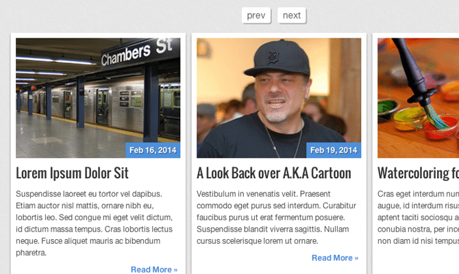
In this tutorial, I want to demonstrate how to build a unique article/blog post rotator using jQuery. It can fit anywhere on a homepage or archives page and it offers plenty of links within a tiny amount of space. My design is more simplistic but you can obviously fit this into any layout style. Take a peek at my live demo to see the final design.
Getting Started
Let's begin with an overview of how to set up the page so we can structurally manage a content rotator. I've encapsulated everything inside a wrapper div centered on the page. At the top, you'll find a next/prev link setup for rotating between content sections.
For the rotation, I'll be using this responsive carousel plugin built on jQuery. It's possible to code the animation from scratch but it also requires more time to handle bugs and laggy rotations. All we need is a copy of the latest jQuery library and the carousel plugin from Github.
The navigation links are contained inside their own element. The plugin can check any container for next/previous links based on the ID. In this case, I'm using #navbtns which you can see is the value for data-navigation in the following div. This container .crsl-items is the fixed wrapper while .crsl-wrap will be dynamically resized using jQuery. The plugin will calculate the total number of content items and dynamically set the width based on the size in pixels.
These classes are used by the plugin and should be kept with identical naming conventions. Since they're classes you could embed multiple rotators on the same page. Take a look at the plugin documentation to understand more about how this works.
CSS Page Styles
Moving over into my stylesheet I'd like to cover how we can design the layout using a few nested containers. You're allowed to customize the boxes any style because the plugin has no default CSS. Everything is set up inline to simply resize the carousel wrapper and keep it responsive.
/** page structure **/
#w {
  display: block;
  max-width: 830px;
  min-width: 300px;
  margin: 0 auto;
  padding: 2px 3px;
}


/** posts slider widget **/
.crsl-items {
  display: block;
  padding: 5px;
}

.crsl-item {
  background: #fff;
  padding: 8px;
  -webkit-box-shadow: 0 2px 3px rgba(0,0,0,0.4);
  -moz-box-shadow: 0 2px 3px rgba(0,0,0,0.4);
  box-shadow: 0 2px 3px rgba(0,0,0,0.4);
}

.crsl-item .thumbnail {
  display: block;
  position: relative;
  margin-bottom: 10px;
  cursor: pointer;
}
.crsl-item .thumbnail img {
  display: block; /* fix 1px image space http://stackoverflow.com/q/5804256/477958 */
  -webkit-transition: all 0.3s linear;
  -moz-transition: all 0.3s linear;
  transition: all 0.3s linear;
}
.crsl-item .thumbnail:hover img {
  opacity: 0.8;
}
The overall page wrapper maxes out at 830px. But since this is a responsive layout I'm compensating with a minimum width value. Notice that I haven't customized too much on the carousel wrapper or container. I want the carousel to fit 100% of the page body width, otherwise the CSS is used for basic styling.
The navigation links are positioned using inline-block so they don't need to float alongside each other. I'm also including CSS3 codes for rounded corners and box shadow effects.
/** posts slider nav **/
.slidernav {
  display: block;
  text-align: center;
  margin-bottom: 5px;
}

.slidernav a {
  display: inline-block;
  padding: 5px 8px;
  margin-right: 8px;
  font-size: 1.4em;
  background: #fff;
  color: #666;
  text-decoration: none;
  -webkit-border-radius: 3px;
  -moz-border-radius: 3px;
  border-radius: 3px;
  -webkit-box-shadow: 2px 2px 0px rgba(0,0,0,0.2);
  -moz-box-shadow: 2px 2px 0px rgba(0,0,0,0.2);
  box-shadow: 2px 2px 0px rgba(0,0,0,0.2);
}
.slidernav a:active {
  -webkit-box-shadow: 1px 1px 0 rgba(0,0,0,0.2);
  -moz-box-shadow: 1px 1px 0 rgba(0,0,0,0.2);
  box-shadow: 1px 1px 0 rgba(0,0,0,0.2);
}
Speaking syntactically there isn't a whole lot of structure-based CSS. As long as we have an outer container with a fixed width holding an inner container of variable width, everything should lay out properly.
Rotation with jQuery
This plugin is truly magnificent and does not require a lot of fancy code. You'll be able to customize each carousel by passing options into the function. Here's what my JavaScript code looks like:
$(function(){
  $('.crsl-items').carousel({
    visible: 3,
    itemMinWidth: 180,
    itemEqualHeight: 370,
    itemMargin: 9,
  });
Since I only have one carousel I'm using the generic .crsl-items class for the selector. If you have multiple carousels with different options then you'll want to give them IDs for individual function calls. Inside the main plugin function are the options passed as key:value pairs.
You'll find a complete options list from the plugin documentation page. I've been thoroughly impressed with the level of customization for such a minimalist plugin. From my code above visible sets the total number of items we see at once. As the layout gets tighter this will break down to make room.
So then we set up itemMinWidth to allow each item the space to shrink in a responsive setting. The list items are typically 270px but can shrink down smaller when resized. Similarly itemEqualHeight will set the height of each list item to hold the carousel in proper vertical alignment. itemMargin is merely the size in pixels of the margin between items.
 $("a[href=#]").on('click', function(e) {
    e.preventDefault();
  });
});
At the bottom, you'll see this small block of code targeting every anchor link with href="#". In website demos, I'll start coding with empty links that don't lead anywhere. Clicking them often causes the page to jump by appending a pound symbol onto the URL. This click event will stop the empty links but still allows other links to load just fine.
Download Source Code | Live Demo
Closing
This plugin is quite interesting because you could even restructure the layout to build an Ajax-powered content rotator. WordPress comes with hooks for dynamic content such as wp_ajax() which is a perfect solution. But even with static content this rotator is simply fantastic. You might even use this on a smaller blog or portfolio website to showcase a number of recent posts. Feel free to download a copy of my source code and toy around with this idea in your own project work.

First it was design, then writing, and now affiliate marketing. Over a period of 6-7 years he wrote a lot of content for many websites. You can reach Jake on Twitter.
Get more to your email
Subscribe to our newsletter and access exclusive content and offers available only to MonsterPost subscribers.

Leave a Reply
You must be logged in to post a comment.