With the introduction of CSS3 media queries, web developers can create CSS which enables web page to adapt and respond to whatever device renders it. Creating a responsive design, where elements on the web page are fluid, has never been simpler. If you have a basic understanding of CSS, then you possess all skills needed to get started with your own responsive design.
For this purpose we've created simple cheat sheet with most helpful media queries that will turn any website into a real "responsive marvel".
Prohibition of resizing for mobile devices
body{-webkit-text-size-adjust: none;}
Stylization of links for mobile devices
<a href ="tel:"]{
color: inherit;
text-decoration:none;
}
Hide the text in Slider pagination in e-note
.class{
width:..; /*sets fixed width*/
height:..; /*sets fixed height*/
text-indent:-100%;
overflow:hidden;
font:0/0 a;
color:transparent;
}
Resizing the background (except for IE8 )
* For full width
.bg{background-size:100% auto; }
* Full height
.bg{background-size: auto 100%;}
Media queries
They can be changed according to the needs
* For tablets only
@media only screen and (min-width: 768px) and (max-width: 995px) {}
* For tablets and mobile devices
@media only screen and (max-width: 995px) {}
* For mobile album resolution
@media only screen and (min-width: 480px) and (max-width: 767px) {}
* For mobile devices
@media only screen and (max-width: 767px) {}
* For mobile portrait resolution only
@media only screen and (max-width: 479px) { }
Some other functions
Scripts
Below you will find descriptions of scripts used in TemplateMonster's responsive templates:
* Script for similar columns
(function($){
    $.fn.equalHeights=function(minHeight,maxHeight){
        tallest=(minHeight)?minHeight:0;
        this.each(function(){
            if($(this).height()>tallest){tallest=$(this).height()}
        });
        if((maxHeight)&&tallest>maxHeight) tallest=maxHeight;
        return this.each(function(){$(this).height(tallest)})
    }
})(jQuery)

$(window).load(function(){
    if($(document).width()>767){
        if($(“.maxheight”).length){$(“.maxheight”).equalHeights()}
    }
})
$(window).resize(function(){
    $(“.maxheight”).css({height:’auto’});
    if($(document).width()>767){
        if($(“.maxheight”).length){$(“.maxheight”).equalHeights()}
    }
})
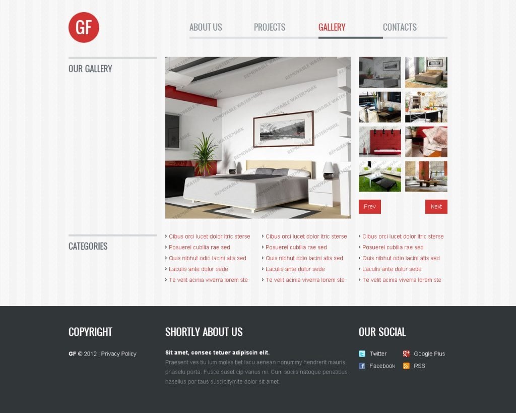
Example: Interior Design Template
* Kwicks-slider for responsive
Hybrid of kwicks and flex slider (in case of resolution lesser than 998 px, kwicks slider turns into flex slider)
Example: Industrial Web Template
* Script for conversion of the menu to select (authors)
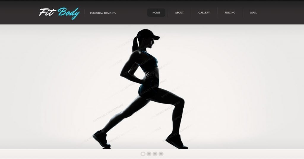
Example: Sport Website Template
* Adaptive content slider
The downside is that the width of the li is counted is percents, that's why one pixel may come out from the right, as a recommendation - change the width of li-s in CSS file with !important;
The source, example of usage: Fashion Web Template
***
If you have anything to add or to change feel free to use comments section, it's always ready to accept your claims and suggestions.
***
Let's thank our developer Kate for providing these coding tips.
Get more to your email
Subscribe to our newsletter and access exclusive content and offers available only to MonsterPost subscribers.


Leave a Reply
You must be logged in to post a comment.